Choosing and Brainstorming
The first thing I had to do with this new project was decide on the actual theme, which obviously I decided on layers but here Is how I came to that decision whilst I was going through the externally set assignment pages:
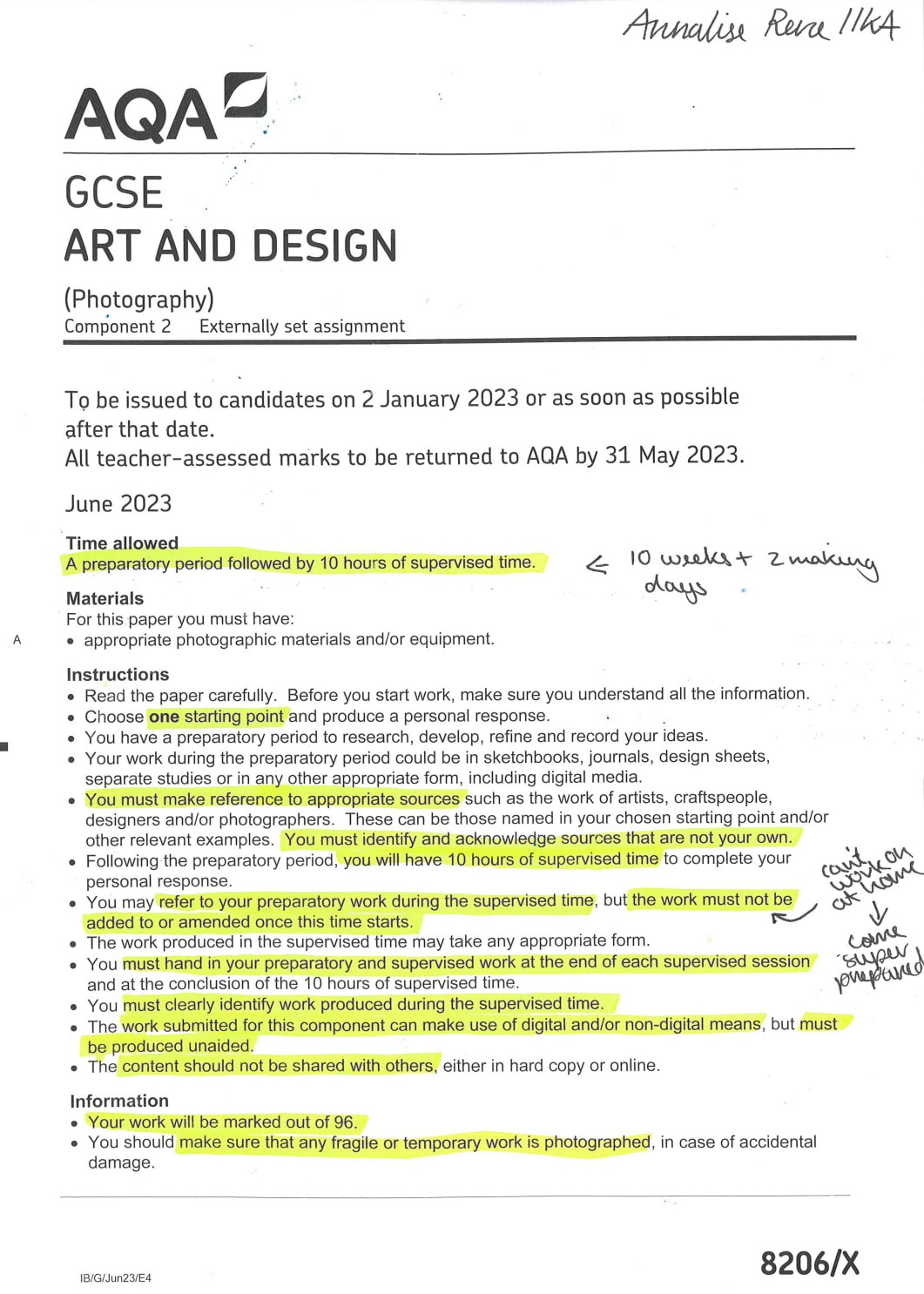
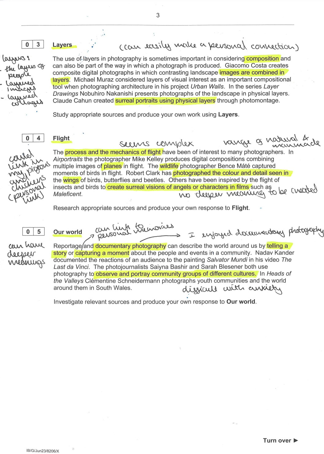
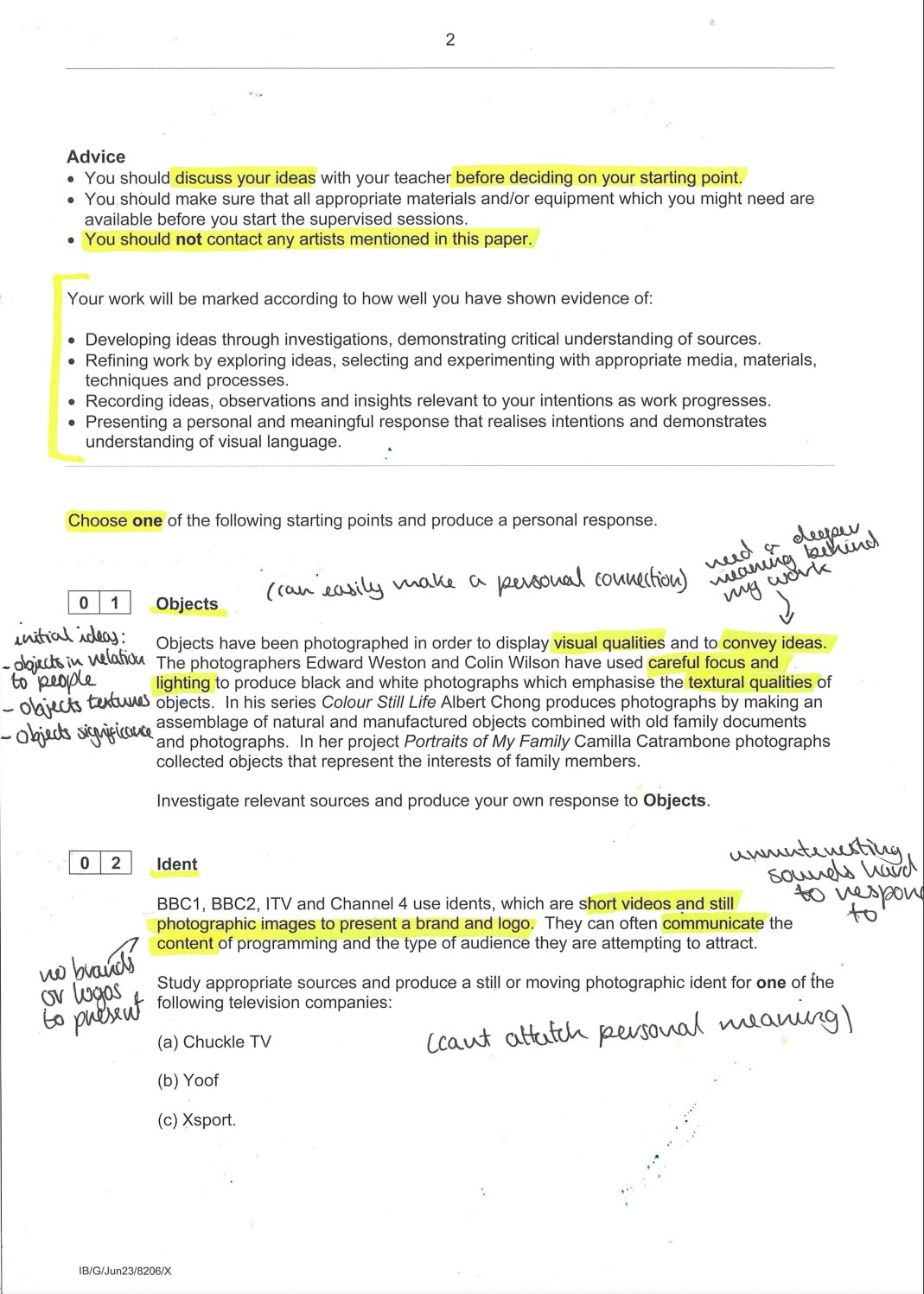
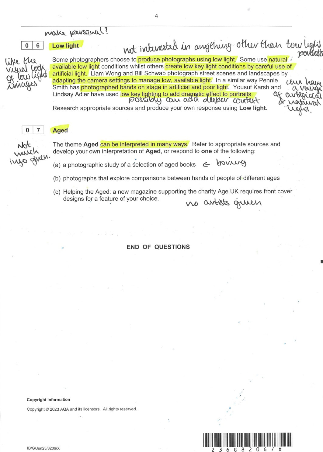
Choosing was rather difficult, as I didn't want my theme in photography to cross over with my theme in art, however I hadn't chosen my art theme yet so I had to think of what would work in photography but also if it would work even better with Art. That was the first hurdle, the second was actually deciding which ones I thought had significant potential. There were quite a few that I had a couple ideas for, but only 2 with multiple, solid ideas tied to them. I was heavily drawn to layers and objects as they both seemed to have good paths that I could take, but the issue was which on should I choose. I thought that objects would be fantastic for photography, it was the one i had the most ideas for however, it would work way more as a starting point in art so by default i picked the second best option, layers.
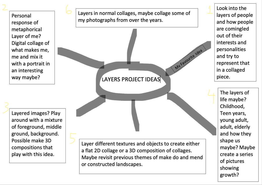
The ideas for Layers were definitely flowing, I thought about processes and deeper meaning that I could attach/use in my work. I decided to get all these ideas out, and create a mindmap:
I also made a list of potential artists that I may decide to respond to and use as inspiration:
Detailed Image Analysis
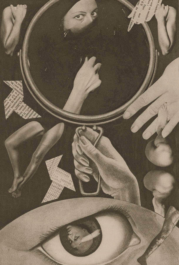
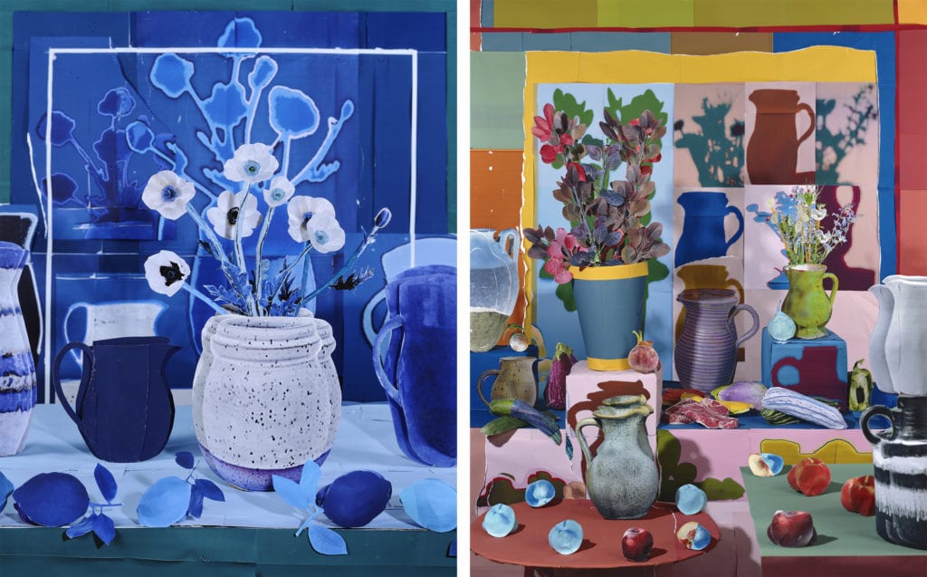
Claude Cahun - Disavowed Confessions, 1930
|
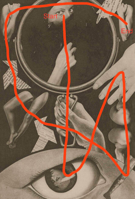
How my eyes travel across the image
|
In my opinion this piece of work is an interesting collage piece that has many layers to it (hence the studying and analysis of it).
This piece is what I can only assume is a collage that incorporates; various body parts (arms, legs, eyes, feet, heads, faces), objects and what looks to be words cut up into shapes. It uses a less intense, and more grey scale, black and white filter, that is more of a beige like grey - which gives it an almost textured grainy look to it. I feel like the main focuses of the image is the mirror with the woman reflected inside of it and the giant eye towards the bottom of the photo - as my eyes travel from those two things mainly, and then outwards to the rest of the details. The composition of this image is actually very interesting and effective. I view the composition to be relatively balanced and even in a way. The image is definitely bottom heavy and the right side is slightly more full then the left, however other than that the collage pieces seem to be all evenly spaced out with minimal but some, overlapping. I think the artist has purposefully spaced out and organised the layout to be like this in order to almost frame the middle of the image. As well as this the artists had used a somewhat even amount of body parts on either side; a full length arm on either side, 2 hands in the middle, 2 pairs of legs on either side - there are a couple things that are not evenly reflected on both sides like the cut up words there is 2 on the left side but only one on the right and there is an extra singular leg on the right side - besides those minor things, its all even.
When I look at this image I feel unsettled. The vibe its giving is definitely an ominous and chilling one. It almost reminds me of the concept of being insecure and being uncomfortable within your body and your looks. I think the main reason this link has been created in my mind when looking at this image is because of the mirror and the close up "zooms" of the separated body parts. I definitely feel like emotion was purposefully evoked by this piece, due to it's specific nature if that makes sense. I also feel like I'm being watched/judged whilst analysing this photograph, which leads me to further believe that unsettled insecurity was the basis behind the image. I feel like I would have more context on the intended emotion behind the piece If i were able to read the pieces of text within the piece, however they are either blurry or in a different language.
The History of Collages
I knew that I wanted to create collages straight away - as I have always enjoyed making them, but also it works very well with the theme layers - so I decided to look into the history of collages.
The term collage derives from the French term papiers collés/découpage - which is a term used to describe the technique of pasting paper cut-outs onto various surfaces. It was first recognised as an artists' technique in the early twentieth century.
This is deemed one of the earliest collages created:
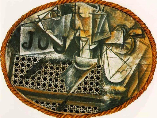
Pablo Picasso's "Still Life With Chair Caning" (1912)
It must be said that collaging did exist before the creation of this piece, however collage is said to have truly emerged as a recognised medium during the early 20th century, because of the Cubist experiments of Pablo Picasso and Georges Braque. This collage is a piece from the cubist experiments of the incredibly famous and very well known Pablo Picasso. This piece I believe is an oil painting that has a real rope and material of a chair incorporated/blended into it, which differed from the norms of collaging at the time as people tended to collage paper and card rather than like real physical everyday objects.
These collages are similar but different to that of a collage of today. They are similar because we do still mix and match media together, we definitely use a lot of physical everyday objects in our modern collages however I feel like we do it in a less subtle way and we also sometimes create very bitty collages. A big difference is definitely our use of digital collaging (as this type of technology didn't exist at the time) - I would also say collaging with actual art is a much less common type of collage.
These are examples of some modern day collages (sourced from google):
In comparison to these collages, Pablo Picassos piece also feels much more dull, and old timey (which is fitting as it was made in the 1900's) whereas the modern ones really incorporate bright colours. Another dissimilar aspect of these collages vs Picassos one, is that the modern ones feel much more simplistic and clean with a clear view of what is being formulated out of all the collaged bits, even the ones with great detail feel quite clean, whilst Picassos feels much more crowded and overwhelming with no clear picture - its more just shapes.
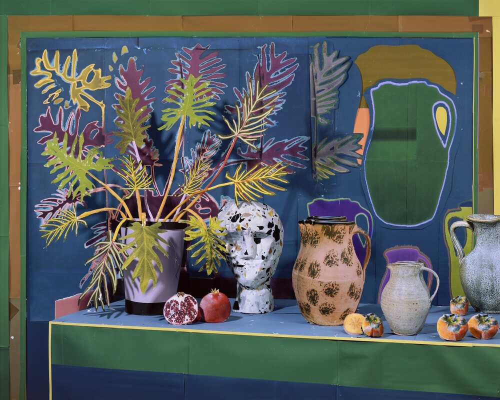
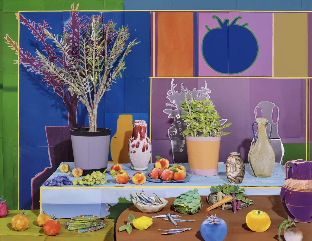
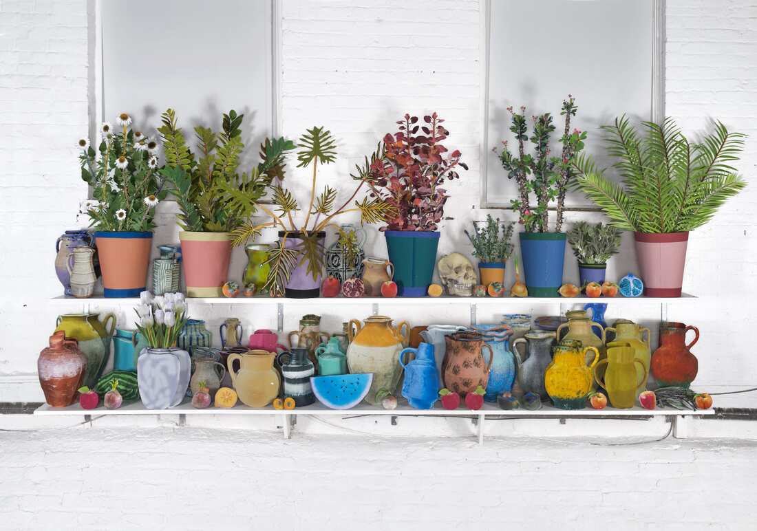
Daniel Gordon
I decided to start off this journey by revisiting Daniel Gordon (an artist we researched and looked at in year 9 during make do during our and mend project) and study his work first. I decided on him first because his work links to one of my average ideas, I thought i should start of relatively strong but not with my best final piece idea.
|
Daniel Gordon is an American artist from Brooklyn, New York. He is best known for producing large color photographs that can be described as collage set-ups. His work, as described by The New York Times, "Involves creating figurative tableau's from cut paper and cut-out images that Mr. Gordon then photographs." He has exhibited his work in solo exhibitions as well as in exhibitions at the museums and galleries. His work links very well to my theme of layers, as that is all his work really is, layers and layers of paper and photos that come together to form one singular piece of work. |
Notes from the video:
- Very chaotic
- Thrives in mess
- Likes to mix fiction and truth
- Works in a studio majority of the time
- Worked on his process of creation for years
- Very colourful
- Mass amounts of paper
- Uses found images
- Loves crazy looking photographs
- "Transplanting images from online into physical space"
- Wanted to give these images that only have a life online a physical body
- Blends the images so that the history of the images are unimportant, views this as positive appropriation rather than negative appropriation
- makes meaning through allowing physical relationships between the images
- takes "shoddily" made pieces and creates actual respectable art
- photographs, then prints
- majority of his time is spent processing
- final thing doesn't matter as much as the process
Some of his work that I find interesting:
Aspects that I like:
I personally really love Gordon's work, it is so incredibly creative, I never would have thought to create something so elaborate. The use of foreground, middle ground and background is what ties it into layers as well as the fact that the entire piece is made up of images stuck to one another. The lack and presence of reality is so interesting, It is like I can identify what the image is of and can relate it to real life but at the same time I know what I am looking at can't be physical non-paper objects and is very unrealistic. Its almost trippy in a sense. The colours are the main unrealistic aspect, as they are so bright and bold and colourful that it almost hurts my eyes but at the same time its enticing to stare at.
I personally really love Gordon's work, it is so incredibly creative, I never would have thought to create something so elaborate. The use of foreground, middle ground and background is what ties it into layers as well as the fact that the entire piece is made up of images stuck to one another. The lack and presence of reality is so interesting, It is like I can identify what the image is of and can relate it to real life but at the same time I know what I am looking at can't be physical non-paper objects and is very unrealistic. Its almost trippy in a sense. The colours are the main unrealistic aspect, as they are so bright and bold and colourful that it almost hurts my eyes but at the same time its enticing to stare at.
My response to Gordons work:
I decided to create my own version of a collage object piece in response to Daniel Gordon's work:
The Process:
Step 1: Set up a base background:
Step 2: Create a base set up with objects
Step 3: Photograph each individual object
Step 4: Photograph background alone
Step 5: Edit background image
Step 6: Cut out the individual images in picsart and then print them out
Step 7: Edit the photograph of the printed out objects
Step 8: Merge the edited background with the edited object images
Step 9: Set up plain background
Step 11: Photograph composition
Step 12: Edit photographed composition
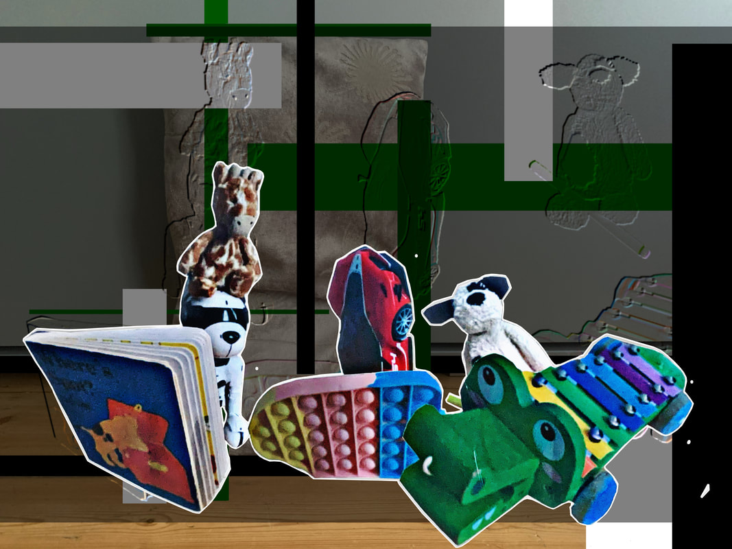
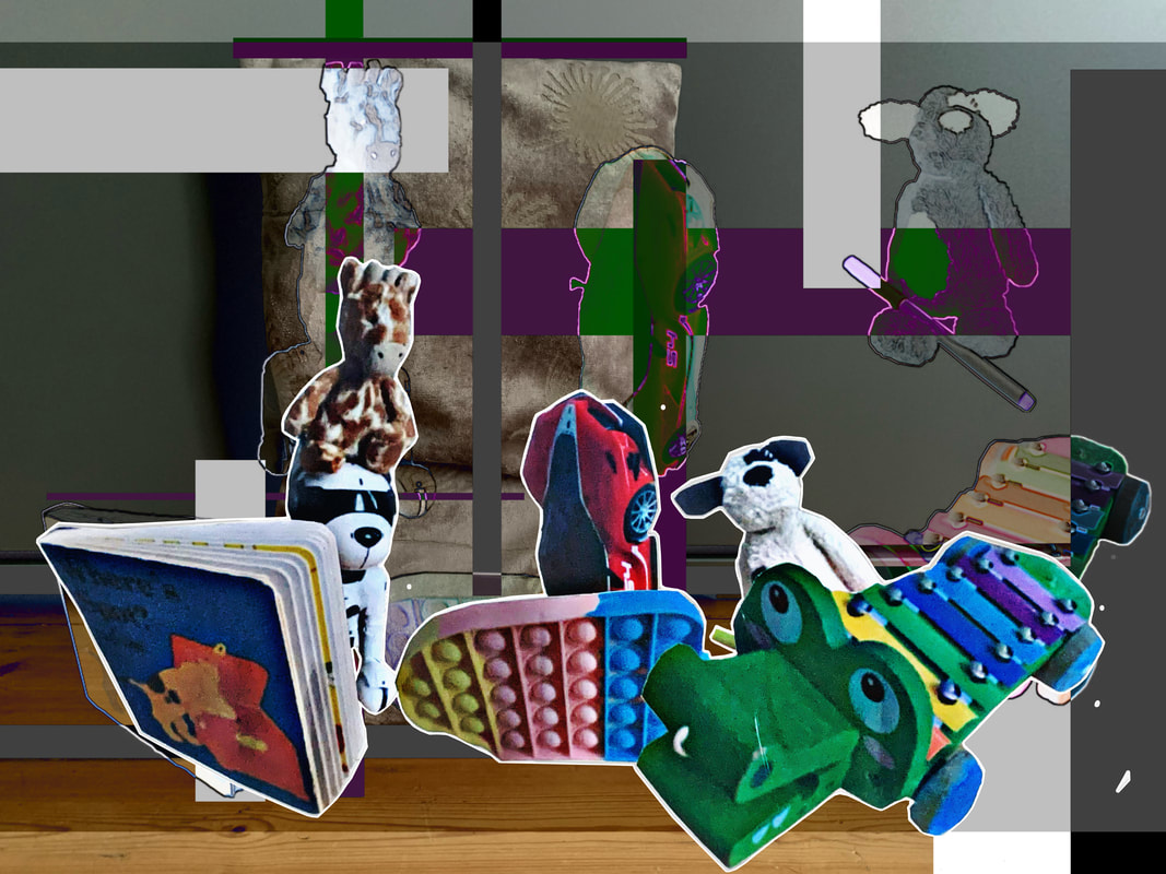
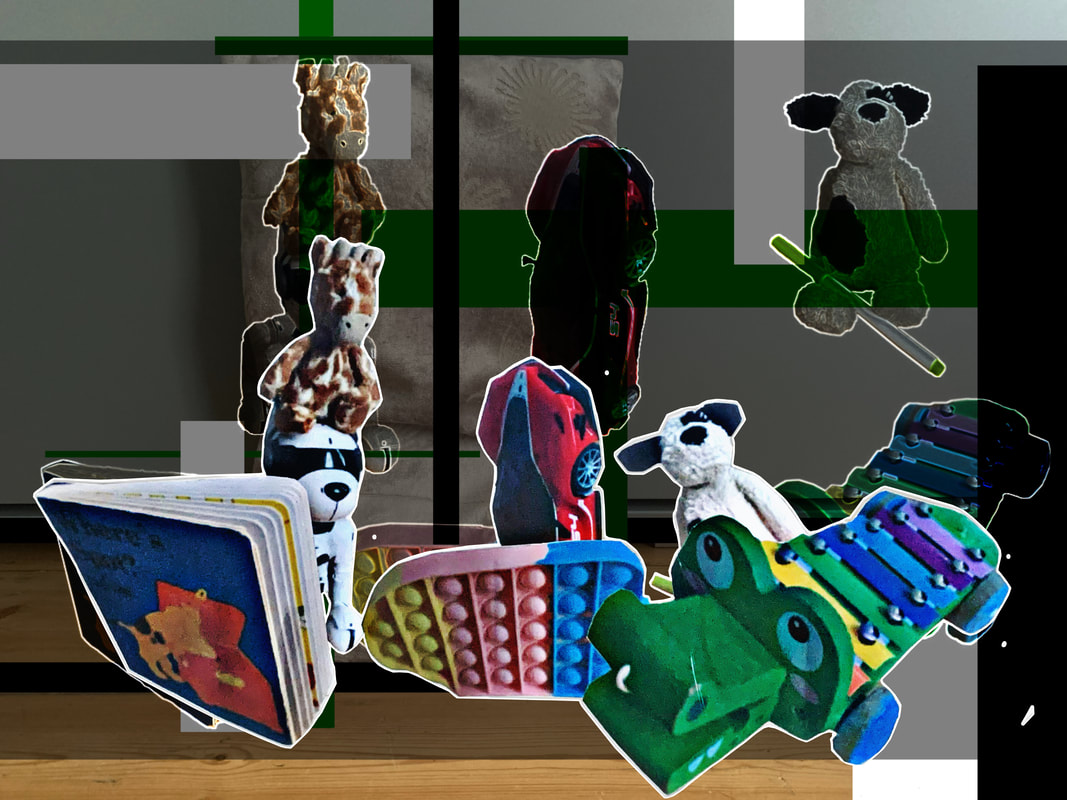
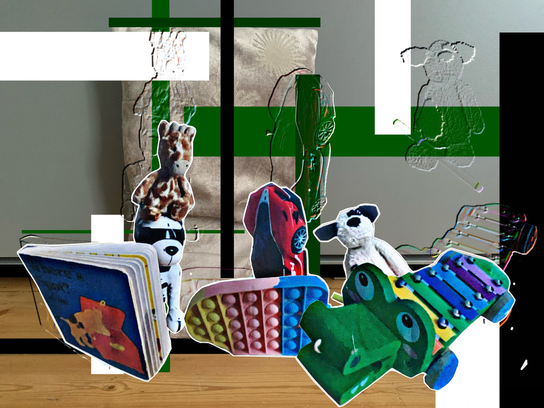
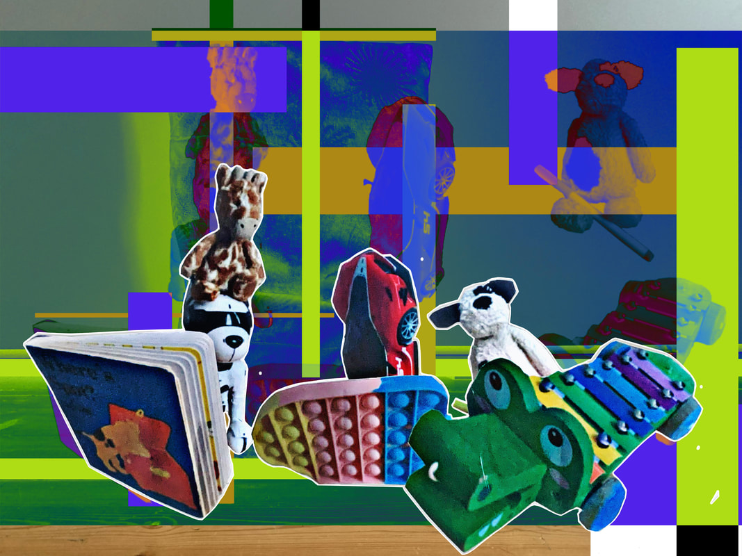
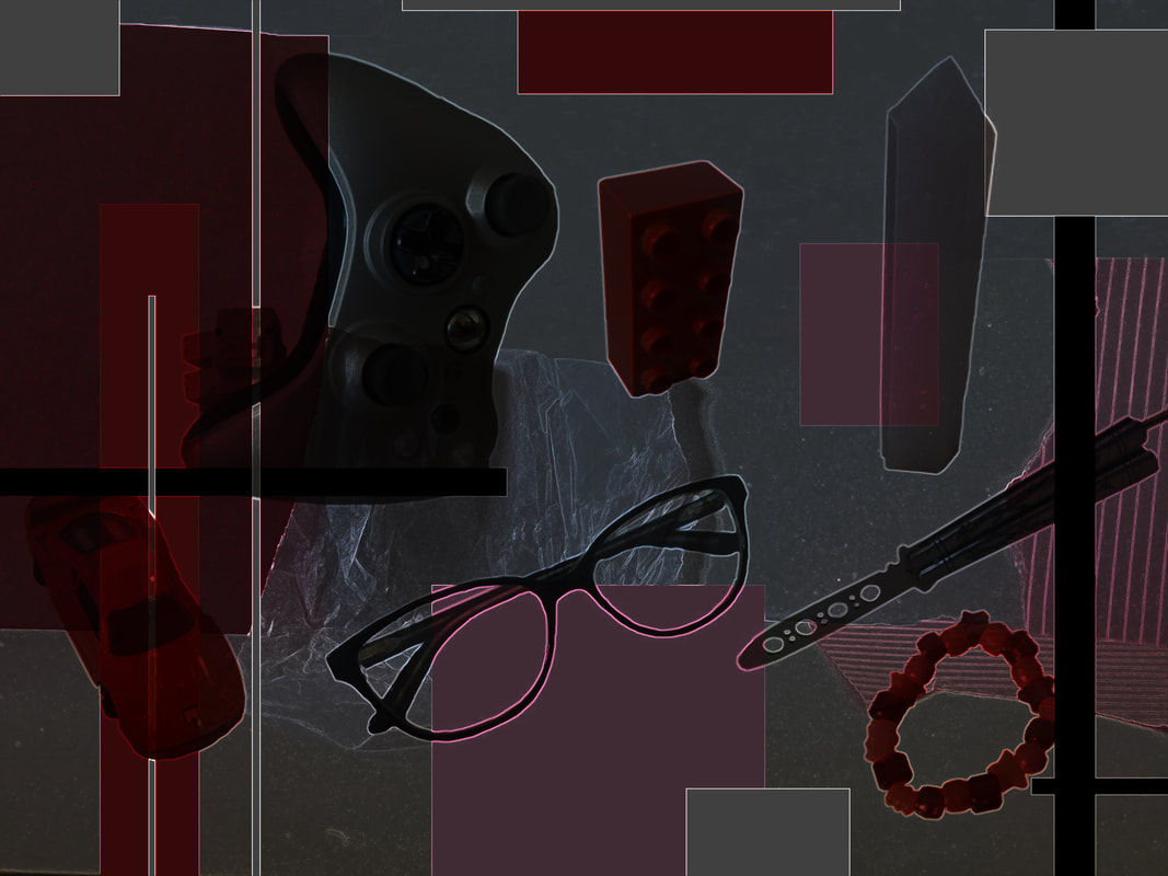
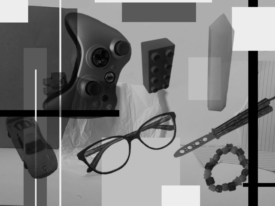
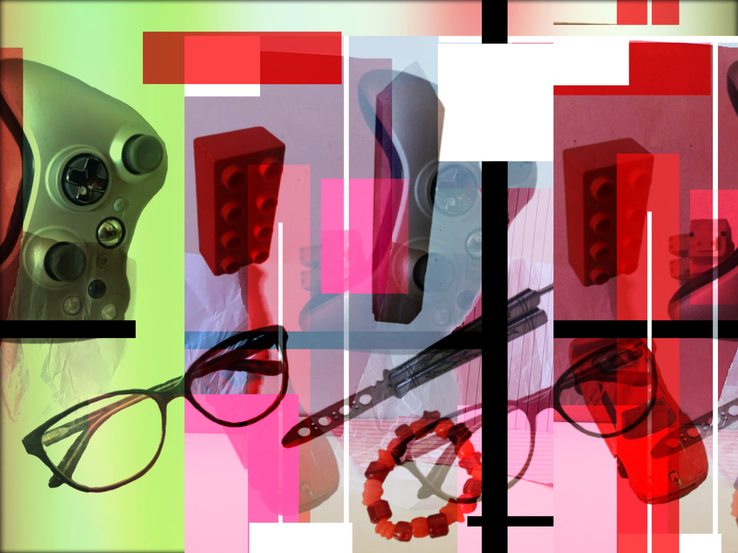
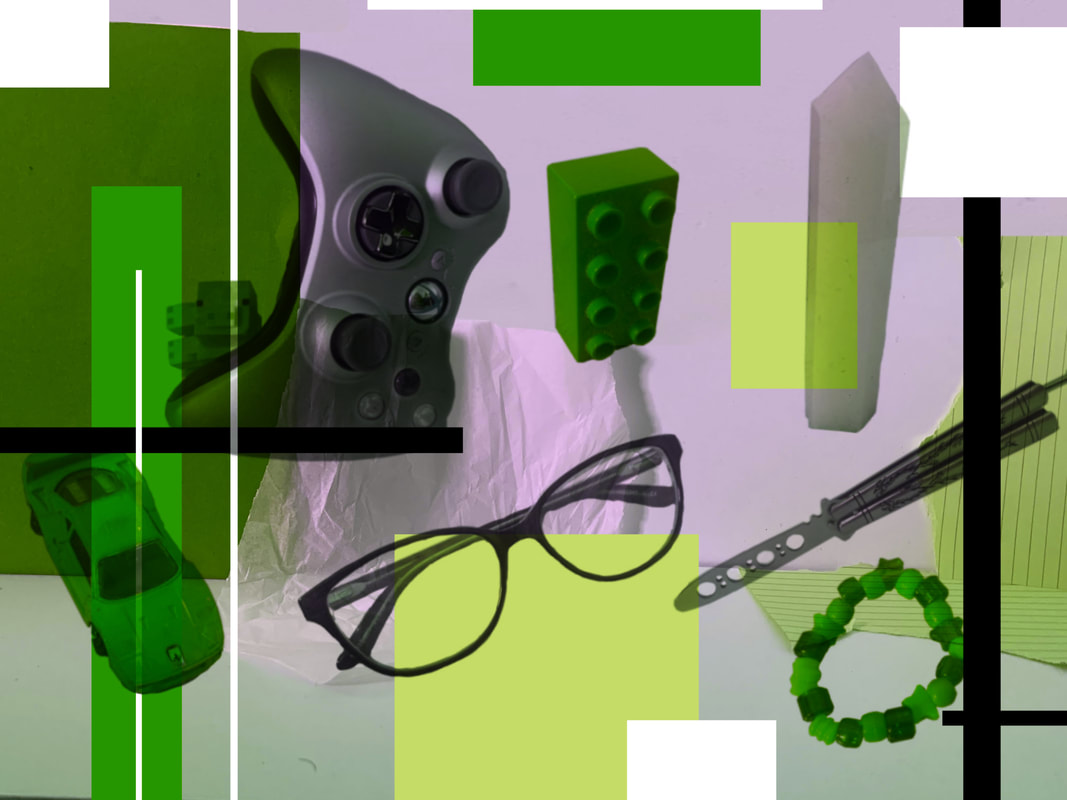
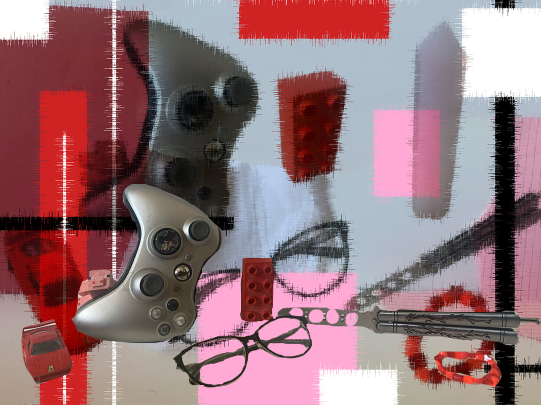
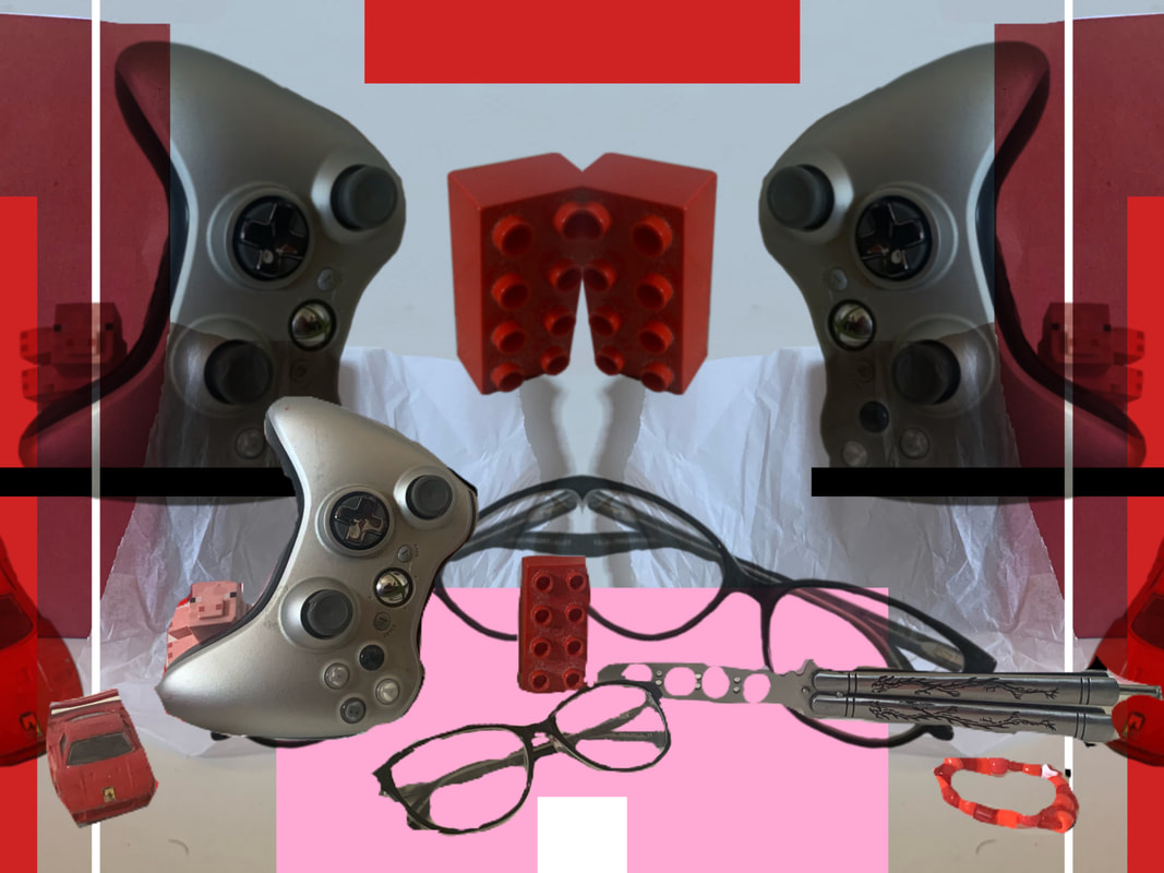
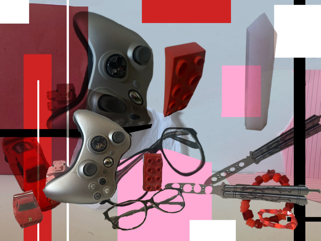
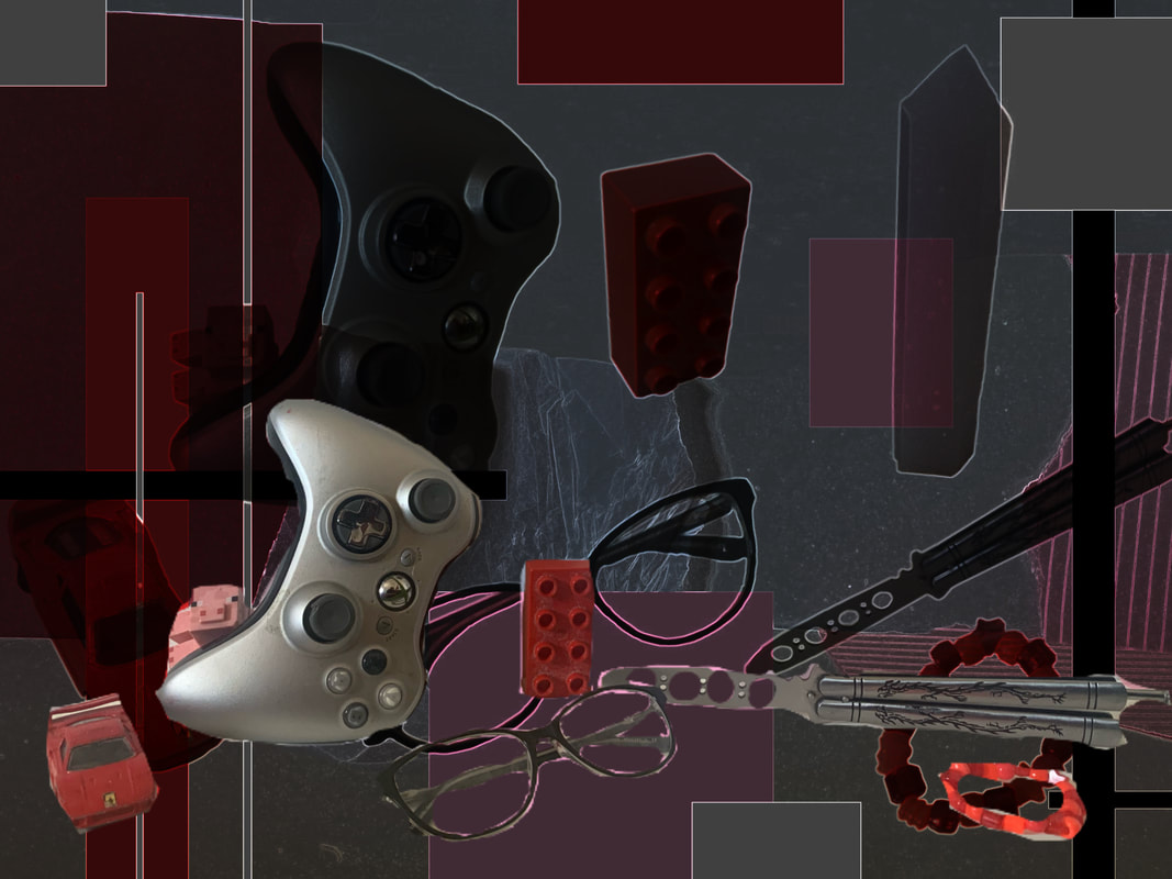
Final Results:
|
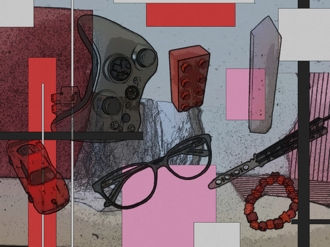
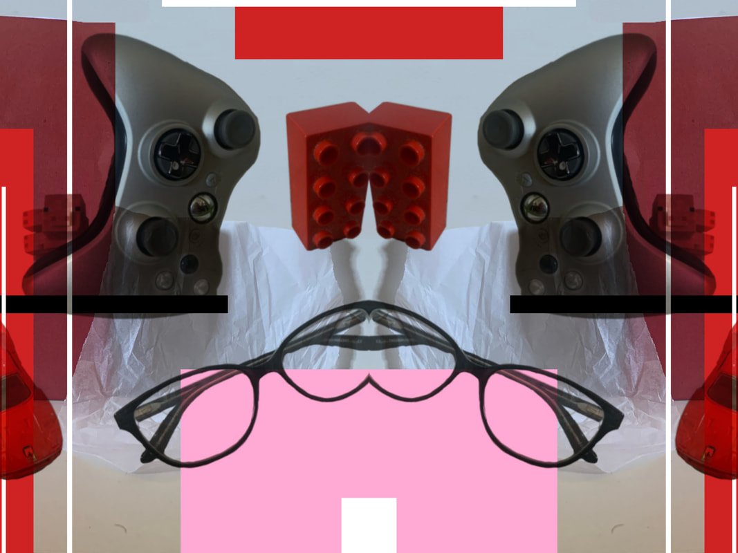
WWW: I love the colours and the intensity it brings. I think I successfully responded to Gordon's work but I made it very much my own, with my own aspects such as; digitally making the collage, adding in blocks of colour, not printing the final photographs, layering photos ect. I quite like the composition as well, there is a clear divide between the layers and the objects feel well spaced out and placed.
|
EBI: This would have been so much better If i had made a variety of set ups, so I want to refine this process by creating more compositions and producing more of these type collages. I also think the image quality on these may be slightly less than I hoped, so next time I will try use better lighting so the images will appear less blurry.
|
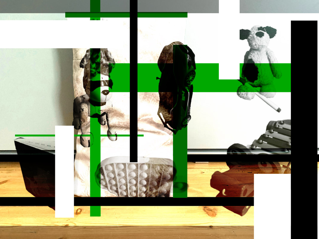
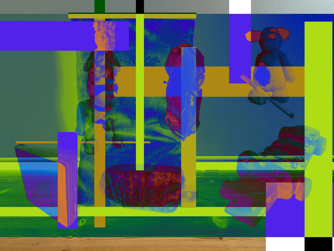
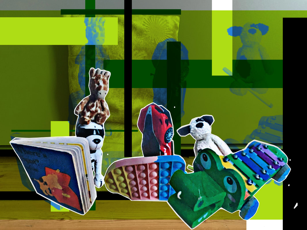
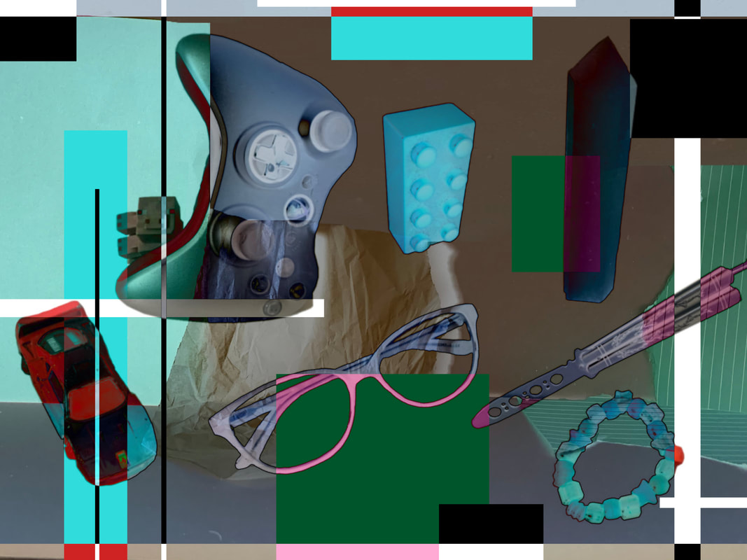
My most successful image:
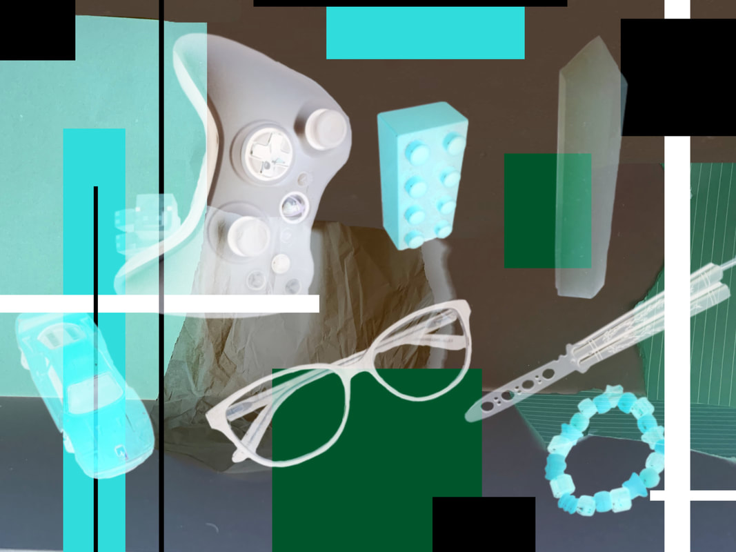
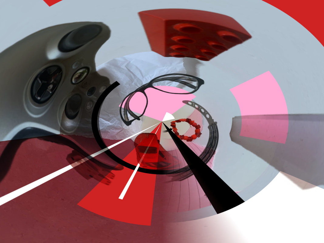
Evaluation: This is my favorite/most successful image in my eyes due to its balanced colour intensity and how it balances the lack of colour, the clear layering and the echo affect that is almost created in it is really visible and effective, at least to me. In regards to the entire process, I found it interesting and very eye opening in a way. I feel like I managed to produce a very interesting and well formulated piece on the smallest budget, with little to no resources, just paper and everyday objects, with a little bit of basic technology which makes feel like I can fake it till I make it. I always thought money was the key to successful photographs but that's not necessarily true. I definitely want to do this process again, maybe make a couple prints out of the final pieces or print them out and mount them into an even more cohesive piece.
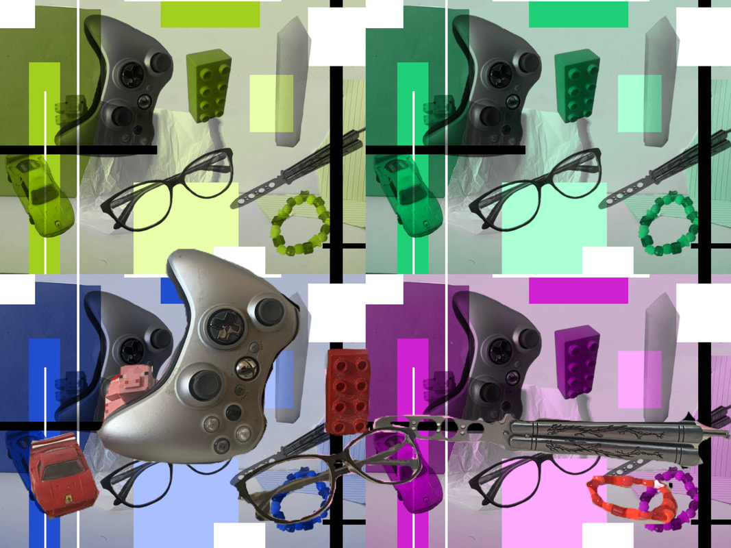
Refining and Developing
I decided to repeat the process of my Daniel Gordon response and create even more compositions (with other peoples objects) and collages in a more refined way.
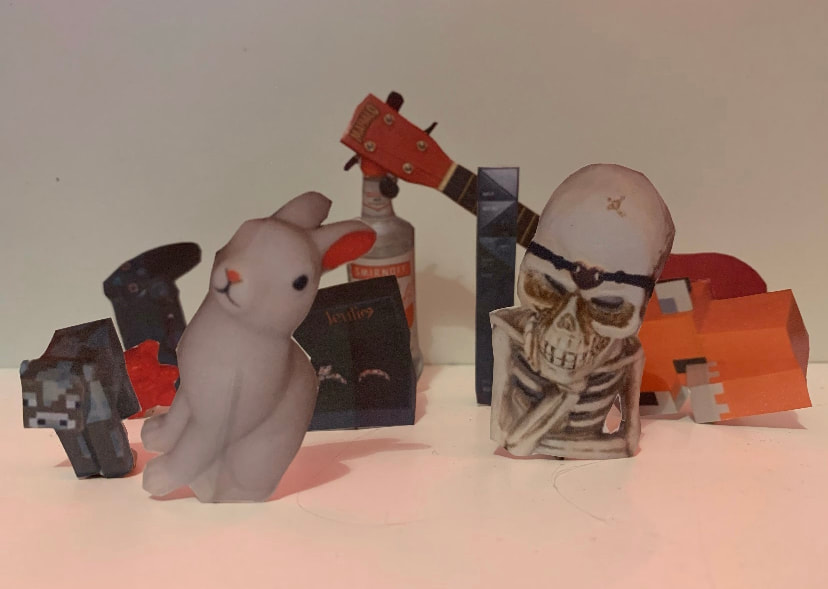
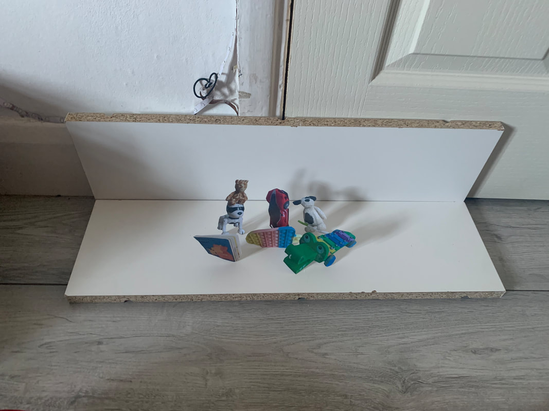
Attempt 2:
The process
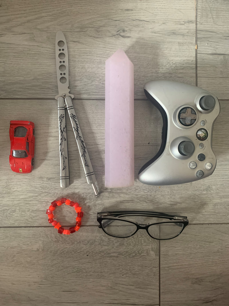
Step 1: Find objects
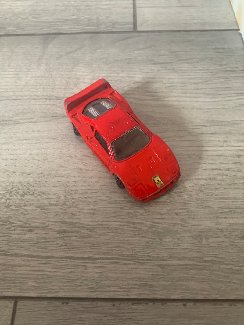
Step 2: photograph each object individually
Step 3: Photograph base background:
Step 4: Arrange and Photograph
Step 5: Edit background
Step 6: Digitally cut out each object and arrange them
Step 7: Edit the digitally cut out objects
Step 8: Merge the edited digitally cut out object images with the edited background image

step 9: Print off the object images, cut them out, create stands for them, arrange them, and photograph
Step 10: Edit composition
Step 11: Merge the backgrounds with the composition
The finished products
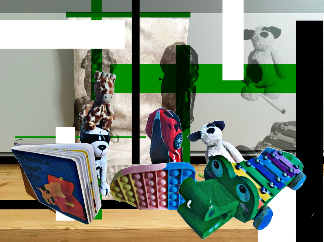
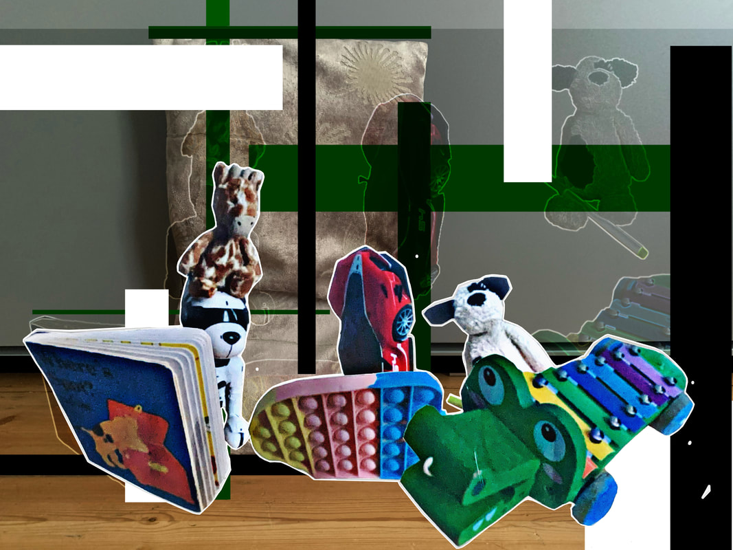
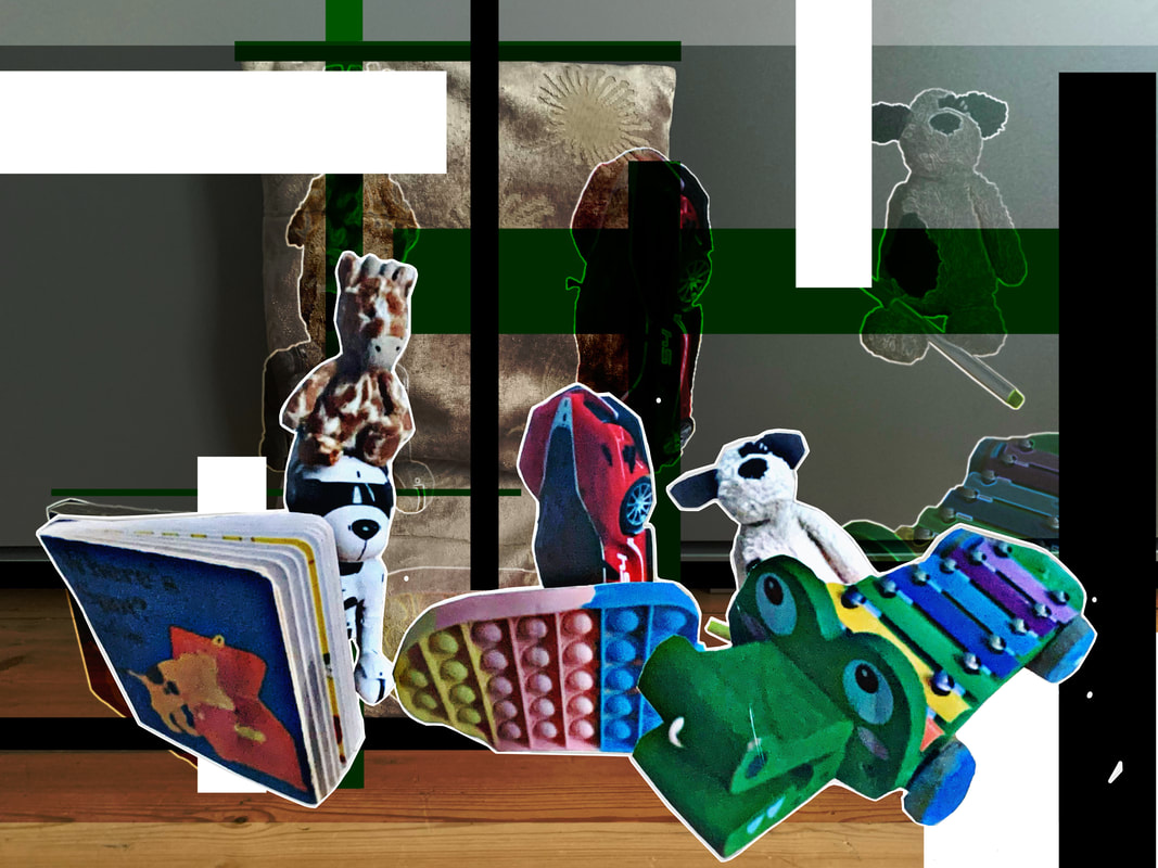
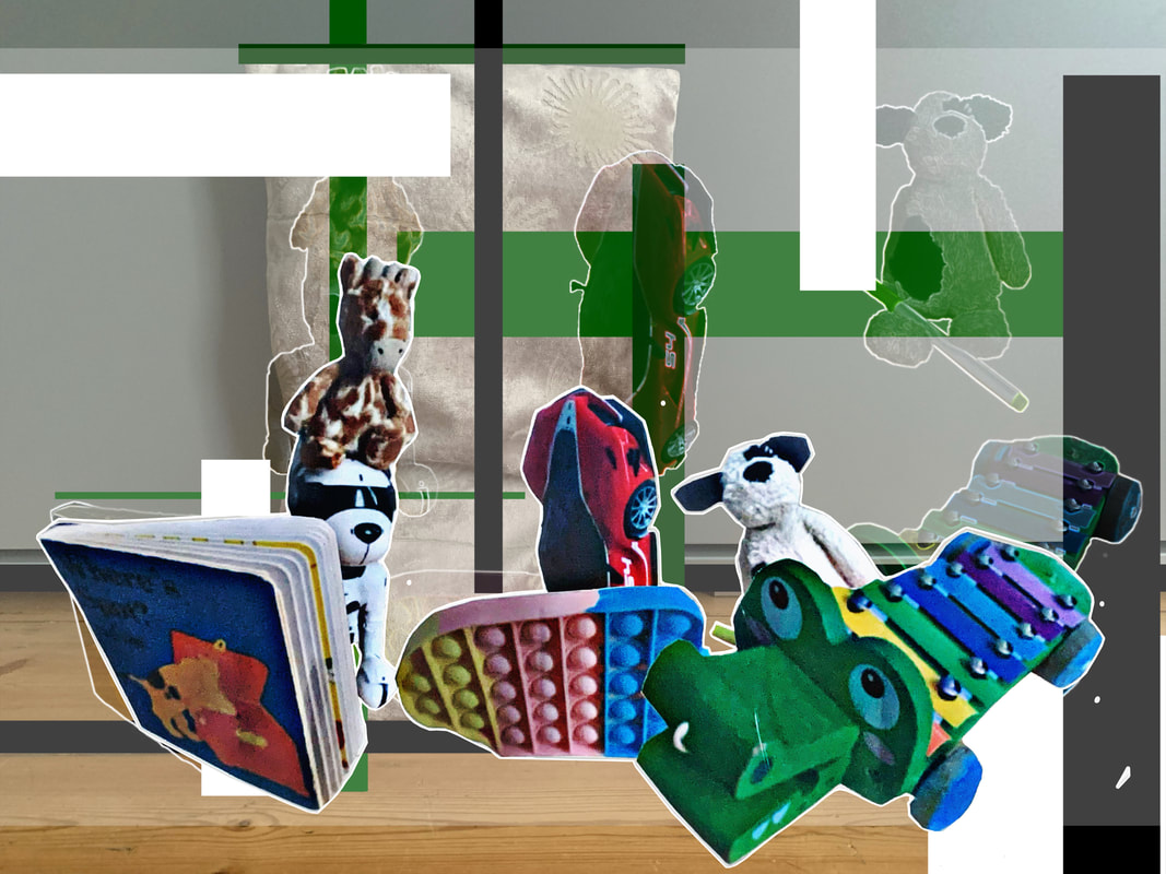


|
WWW: I definitely thought it was worth the re-trying and trying out different filters and a slightly different process as well. The work i produced is somewhat decent, and I think the process documentation was even better this time.
|
EBI: I want to retry this process for a 3rd and final time, possibly on a larger scale, with even more layers because these are really small scale projects with only 4 layers so I think even more layers would give me a better result. I definitely prefer some of the images I created in the first attempt, which says to me that this attempt may have been missing something, so I definitely want to try again.
|
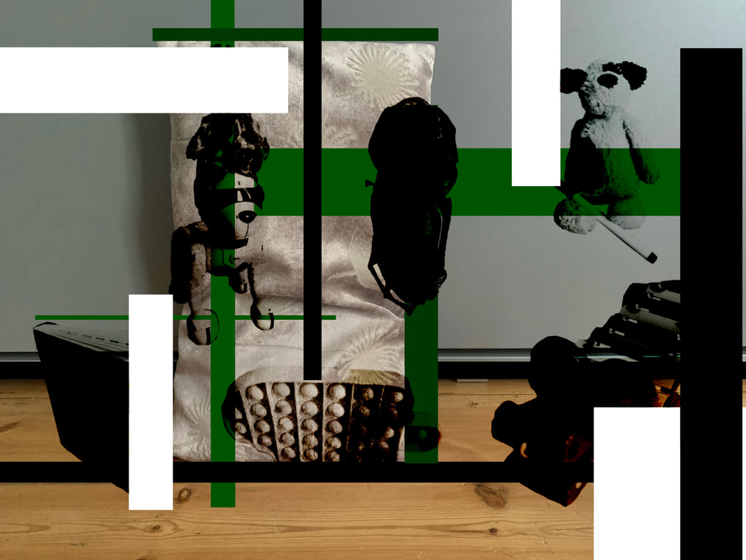
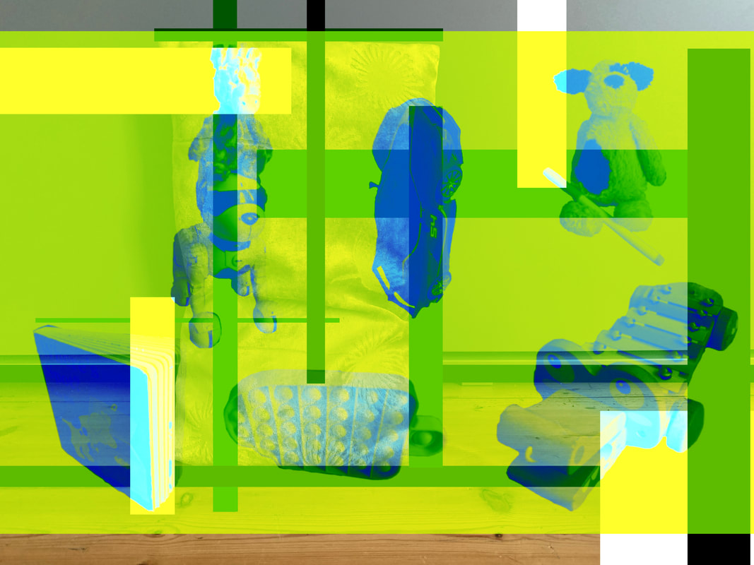
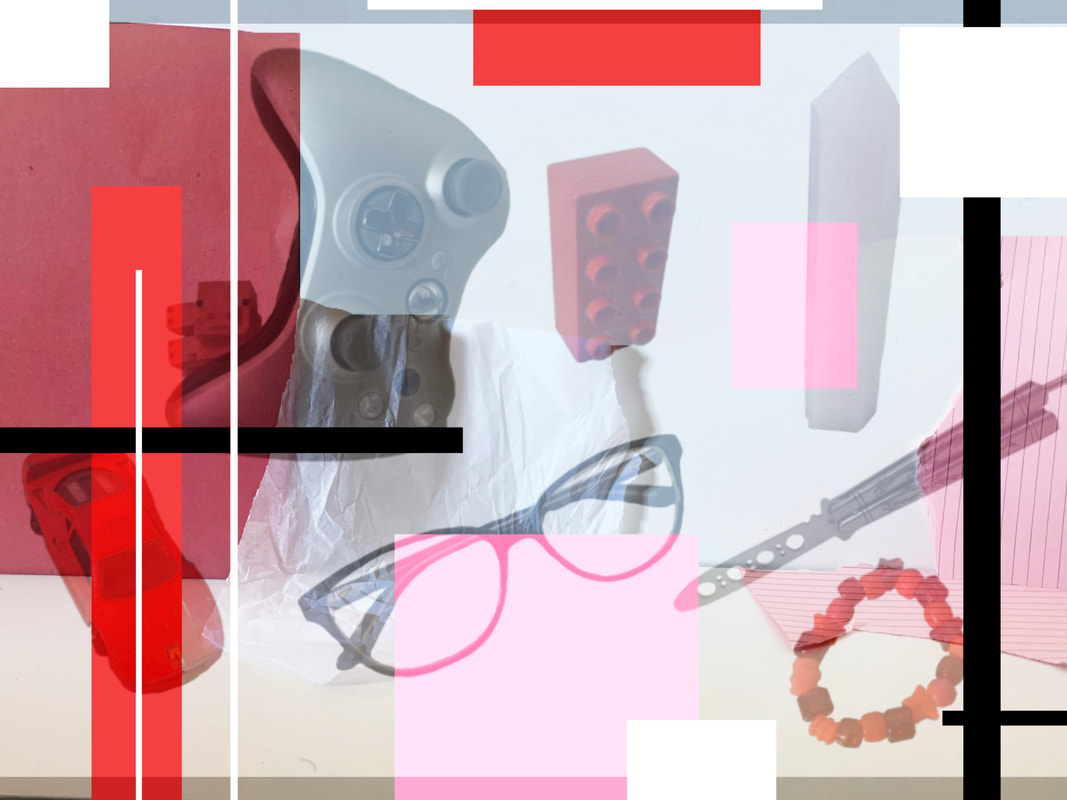
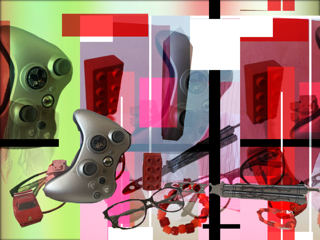
My Favourite Image:
Evaluation: Again, I really love the colour balance of this photograph, the mix of light and dark is almost perfect in my eyes. As well as this, the collaged objects look like they have really been cut out, its conveyed so well ( at least in my opinion ). I also quite like this image specifically due to the mainly green background, but also because of its mix with blue with the objects almost 'shadows'. Whilst this attempt at the project is not my favourite overall, its still good out of the ones from the 2nd attempt.
Further Development
I decided to carry out the process for a 3rd time just for the fun of it
Attempt 3:
The process
Step 1: Find objects
Step 2: photograph each object individually
Step 3: Photograph base background:
Step 4: Arrange and Photograph
Step 5: Edit background
Step 6: Digitally cut out each object and arrange them
Step 7: Merge the edited digitally cut out object images with the edited background image

Step 8: Merge the backgrounds with the composition
The finished products


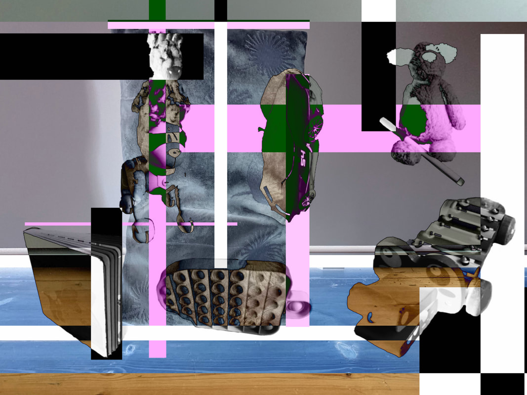
|
WWW: I feel like this was an interesting way to take the previous process and try and do something slightly different with it. I find the produced images relatively pleasing in terms of the layout, spacing, colours and abstract aspect of it.
|
EBI: I feel like the combined physical print outs of the objects worked better than the digital, as it made it feel more layered so I think this experiment may have been a step in the wrong direction, however trying and failing is all part of the refinement process.
|
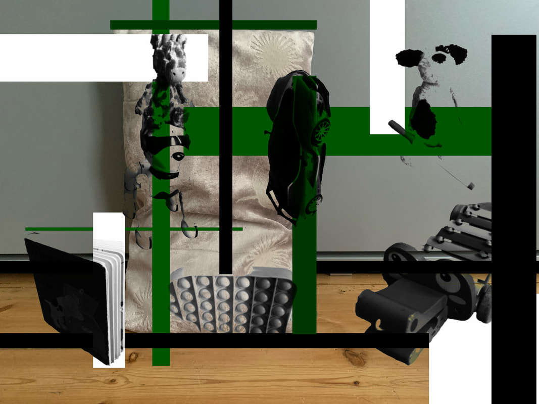
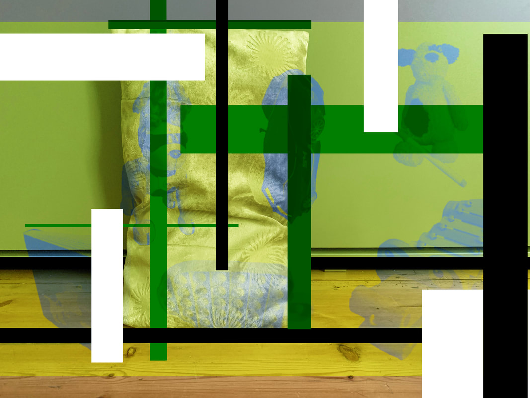
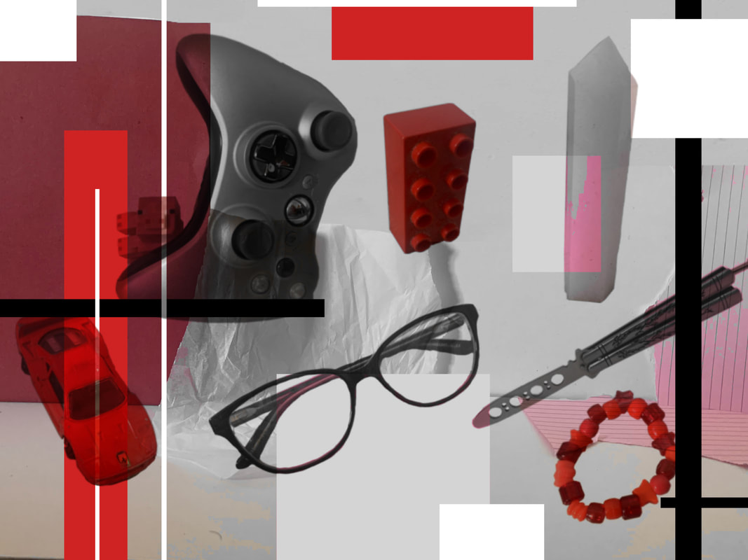
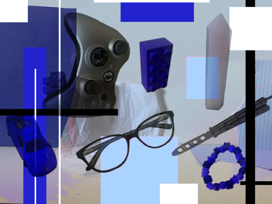
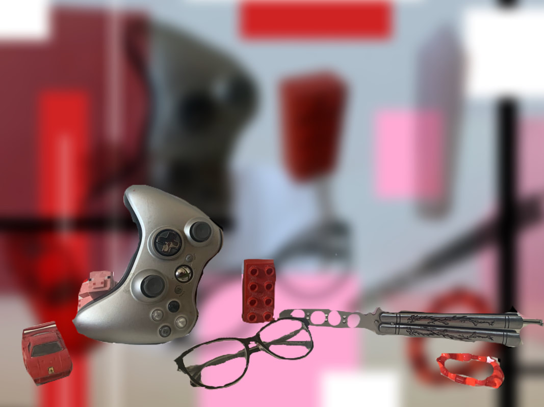
My Favourite Image:
Evaluation: This image is my favourite purely because of the cartoon like/grainy filter applied to the "shadows" of the objects. I think it just makes for a more interesting visual and it makes the image feel that much more surreal. As much as this is my favourite image, I feel like its my favourite out of no good options - all of the images are not to my liking and i wouldn't say that I am very pleased with any of the outcomes. I feel like my previous attempts at this process worked much more effectively in producing work that I was pleased and proud of.
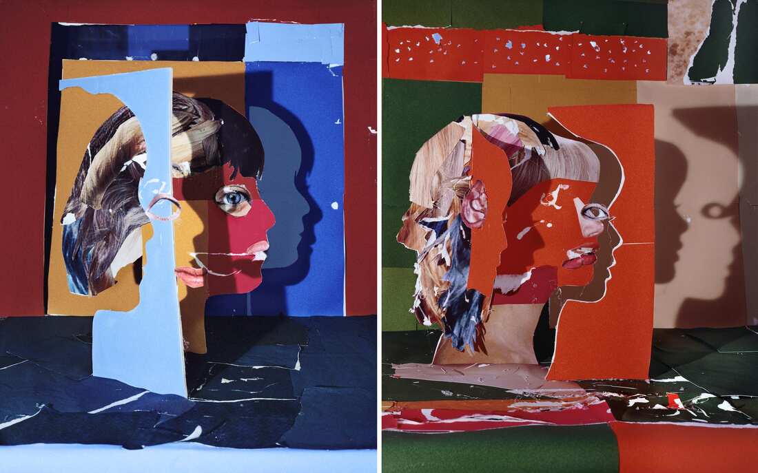
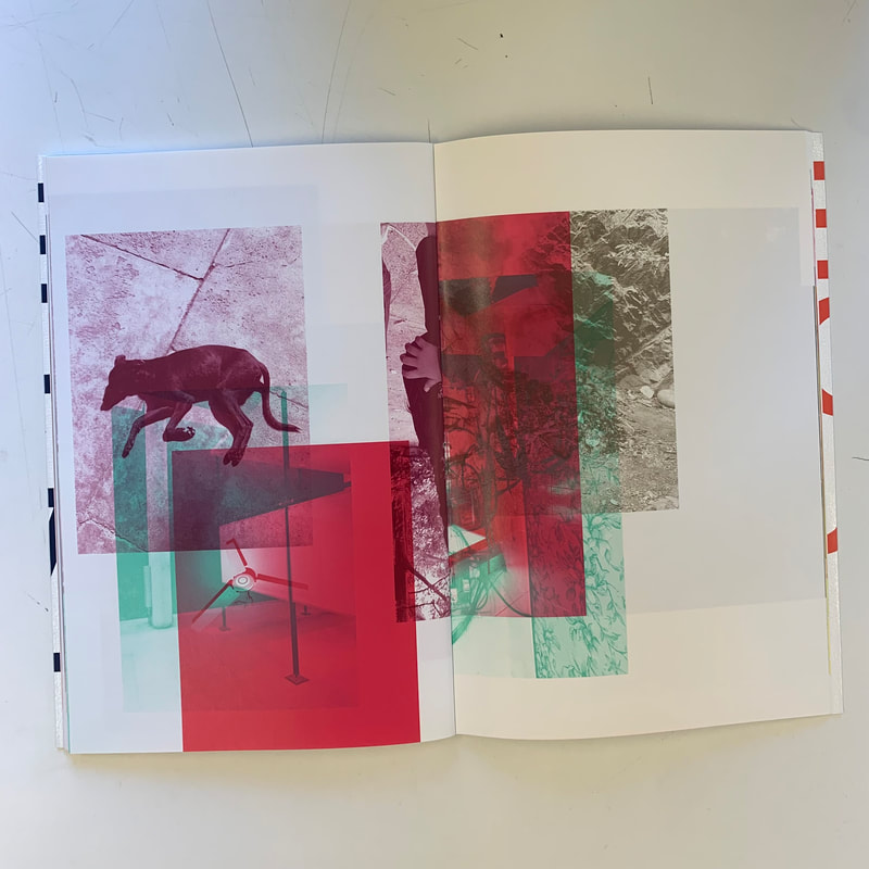
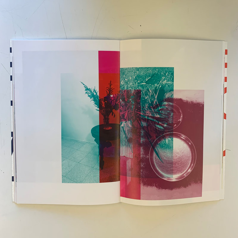
Shirana Shahbazi
I decided to look at Shirana Shahbazi because I found her work to be significantly layered, which obviously links to my theme perfectly and as well as that, I really loved the vibrancy of it.
|
Shirana Shahbazi is an Iranian photographer who lives in Switzerland. Her work mainly consists of installations and large prints of conceptual photography - which means photography that illustrates an idea. She is a very successful photographer and her work has been widely exhibited all over the world. She has also had her own solo exhibitions displaying her incredible work. Not only has her work been in exhibitions, they are displayed in a museum (The Museum of Modern Art, New York). She is well known for her experimentation and manipulation of normal photographs. |
|
|
|
Video Notes: - Wants to have a complex visual language through her work - likes depth in photography (hence the collaging) - Uses black and white images as starting points - Views photography as simplistic, and wants to dominate by creating her own version of photography - Takes exhibition spaces and makes it her own - Thinking about how to depict reality - Opens up opportunities for multiple interpretations and ideas through collaging |
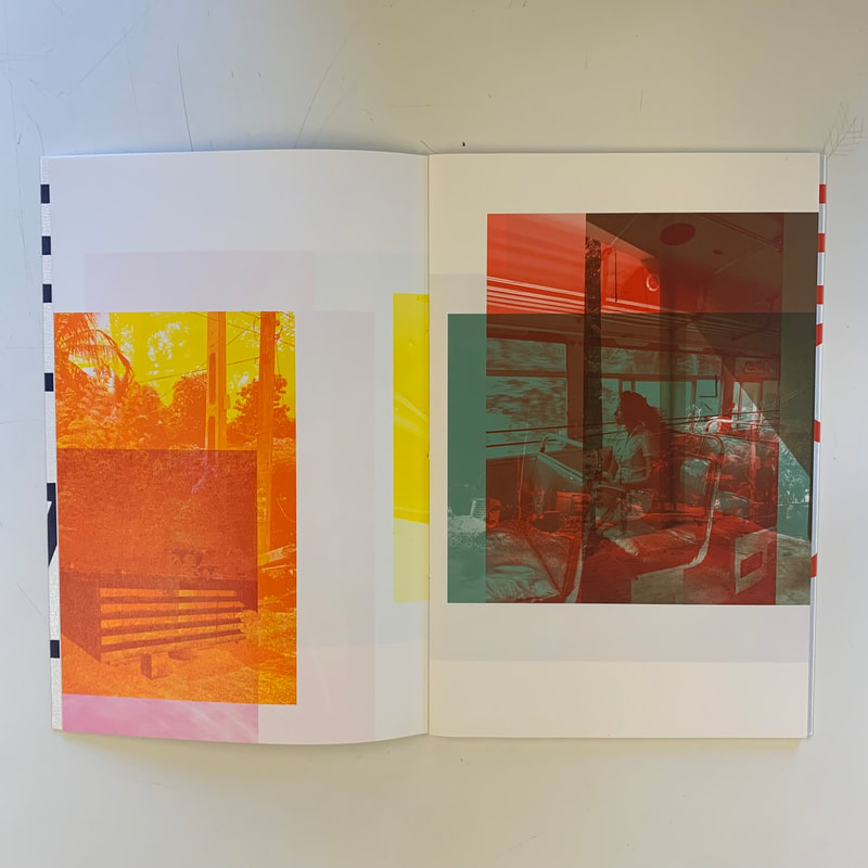
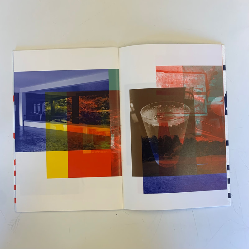
Pages of her book that Inspire me:
Some of her online work that I find interesting:
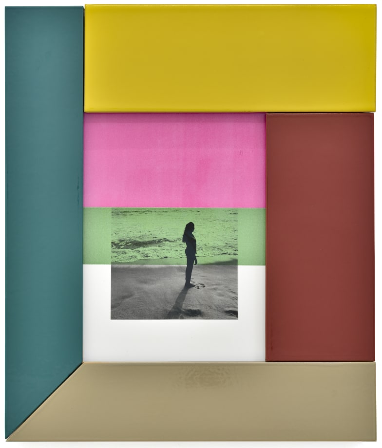
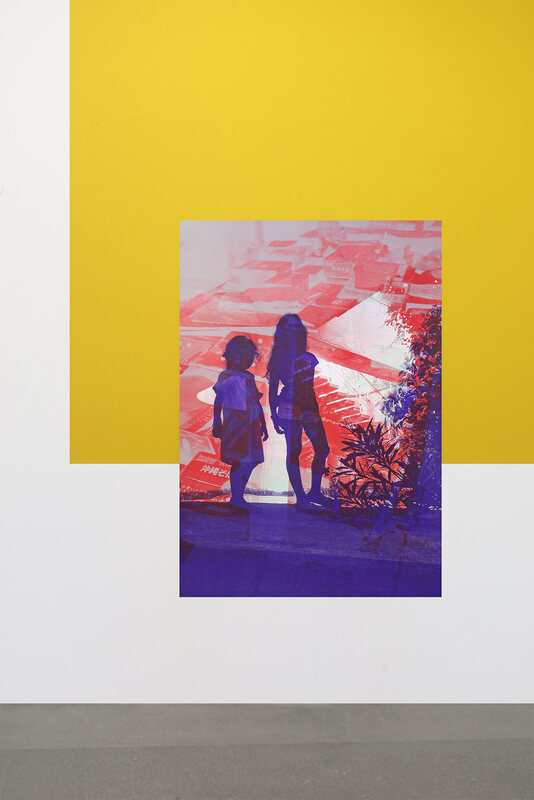
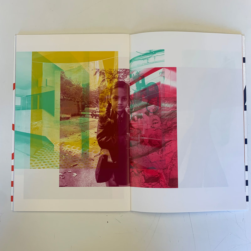
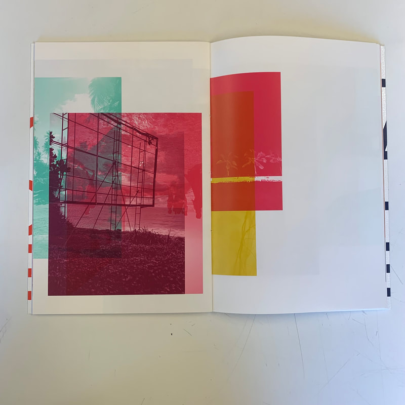
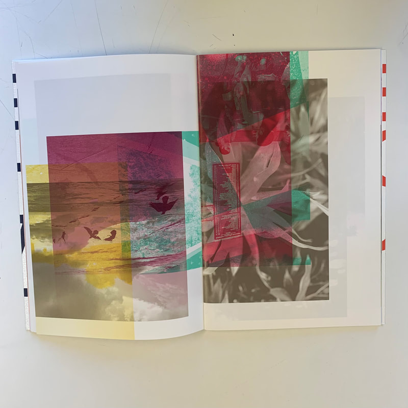
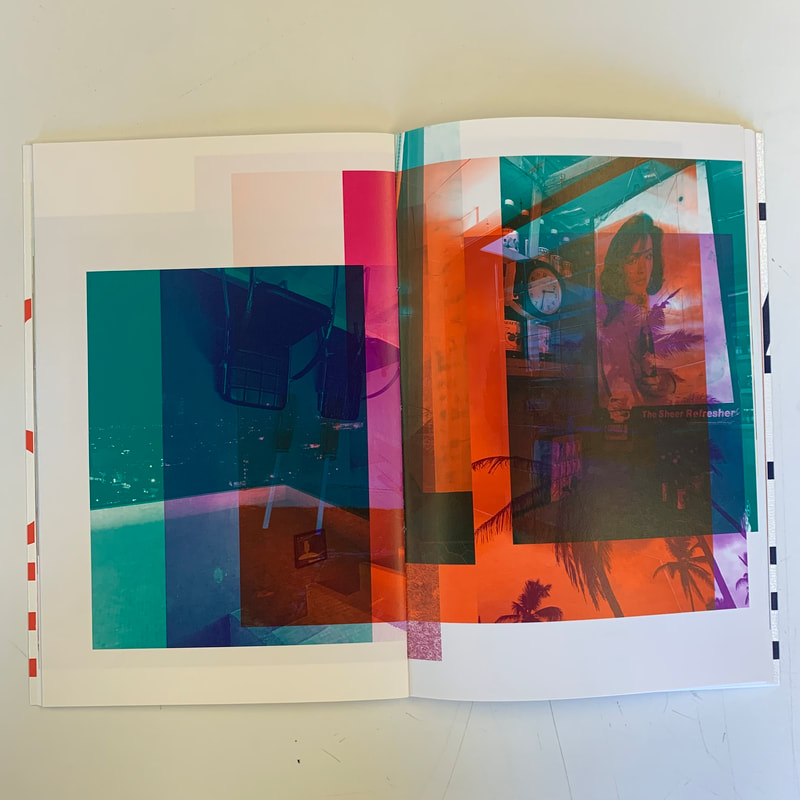
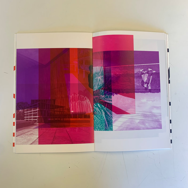
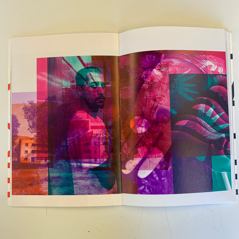
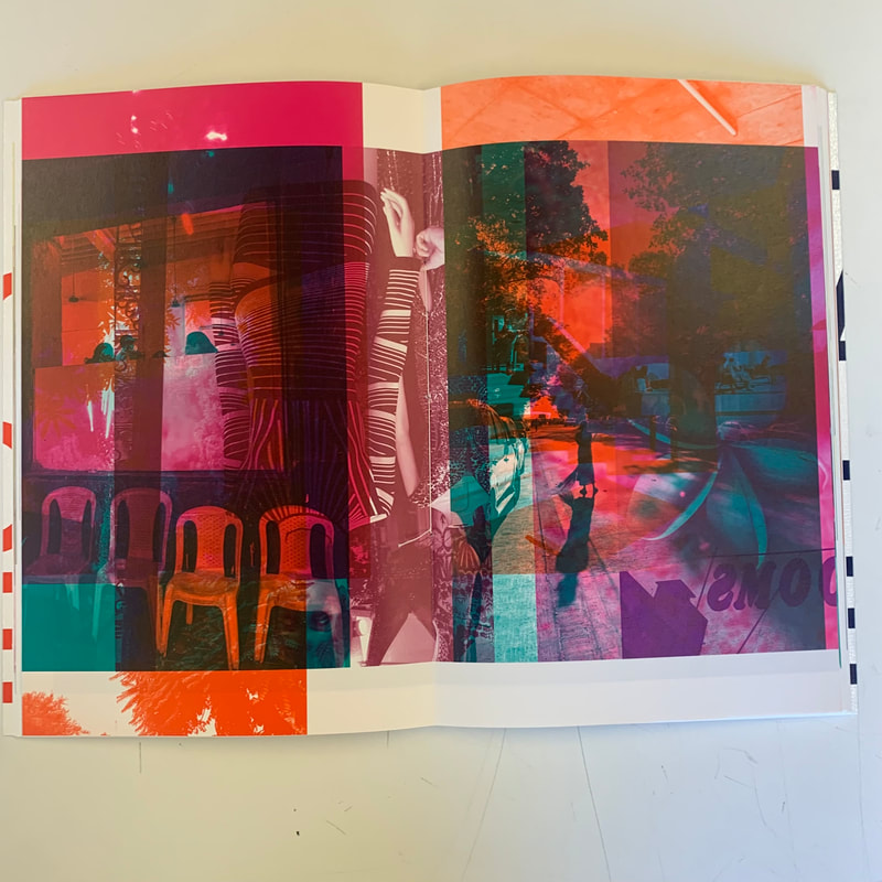
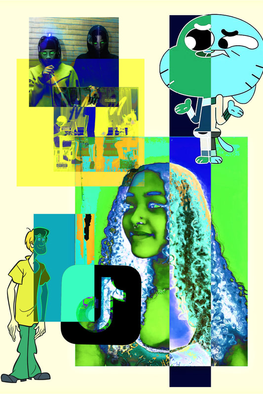
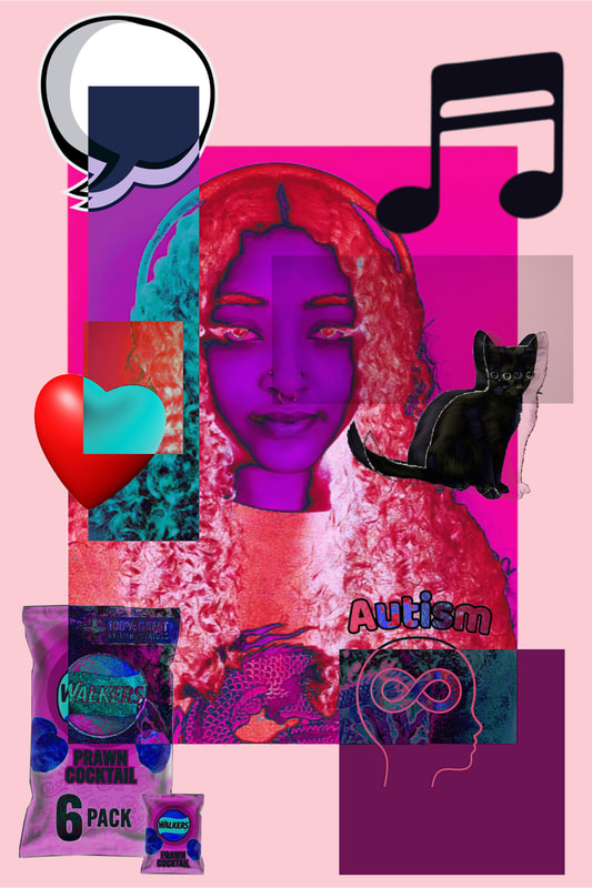
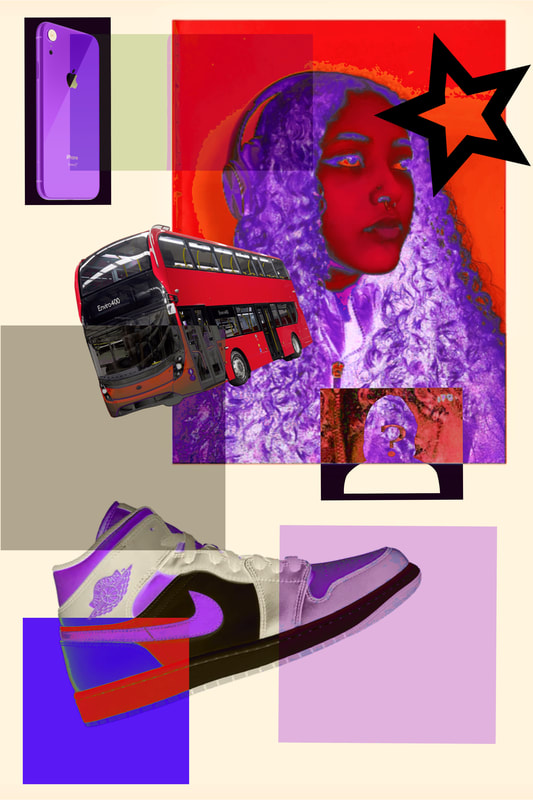
My thoughts: I really like the mix of photographs layered on top of one another as well as the blocky coloured backgrounds and monochromatic aspect of the photographs. The use of contrasting colours is also interesting as it makes it feel more layered and less cohesive which is something I think is beneficial for me to try out. That being said I absolutely love the pages of the book that have cohesive colours, they are just so aesthetically pleasing. I also really love the way that the framed images are displayed, as well as the book, not so much the plain photographs where the work is shown but not the physical display. I think the display is an aspect I could include in my response but in my own way, as I don't have that kind of budget to be producing books or buying frames. I think her work links very well to my theme, and it looks like what i initially think of when i imagine layered photographs.
My Response:
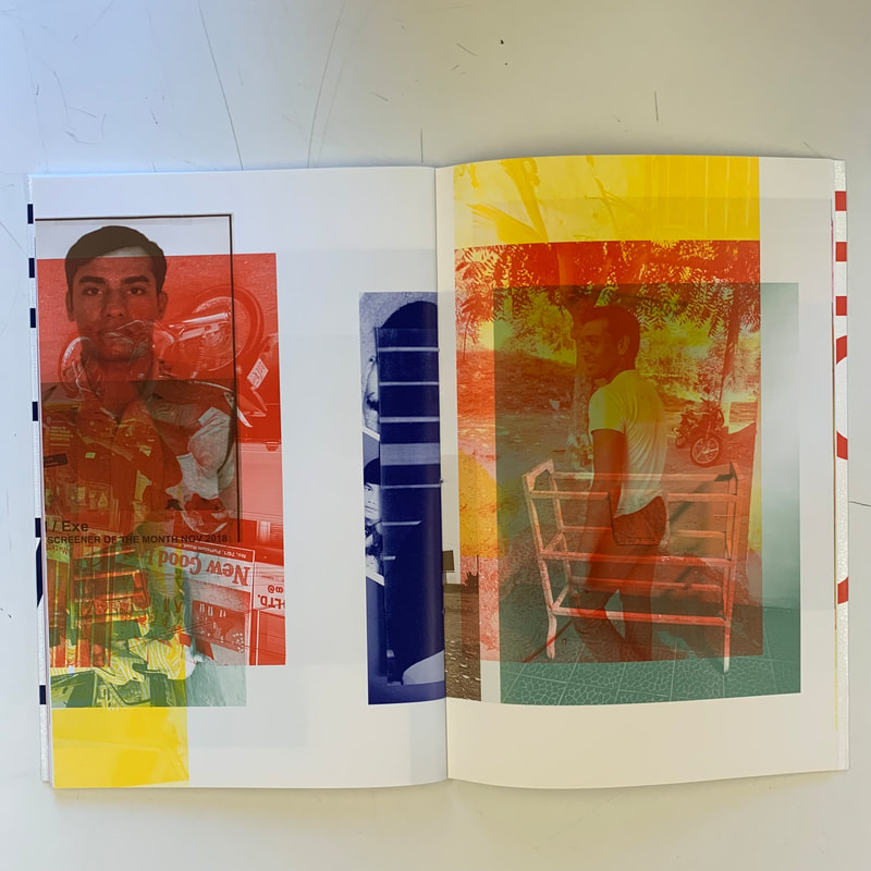
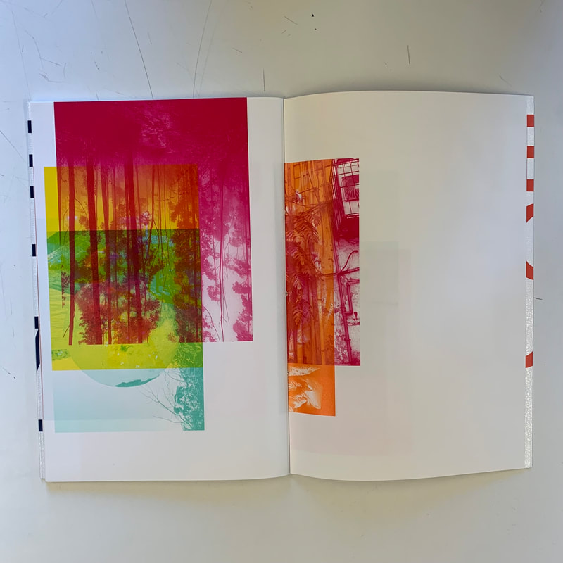
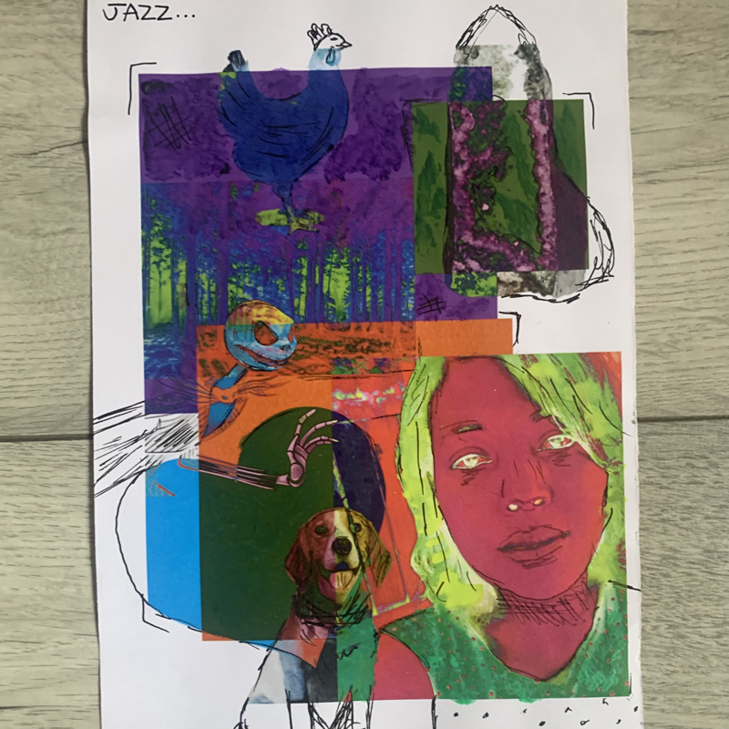
For a response I decided to create my own layered photographs, similar to the style of Shahbazi's - using blocky colours, layering photographs, "physical display". However I am going to link mine to people ( their feelings, personalities, interests), using portraits and make it more fantasy like rather than "realistic" like Shahbazi's.
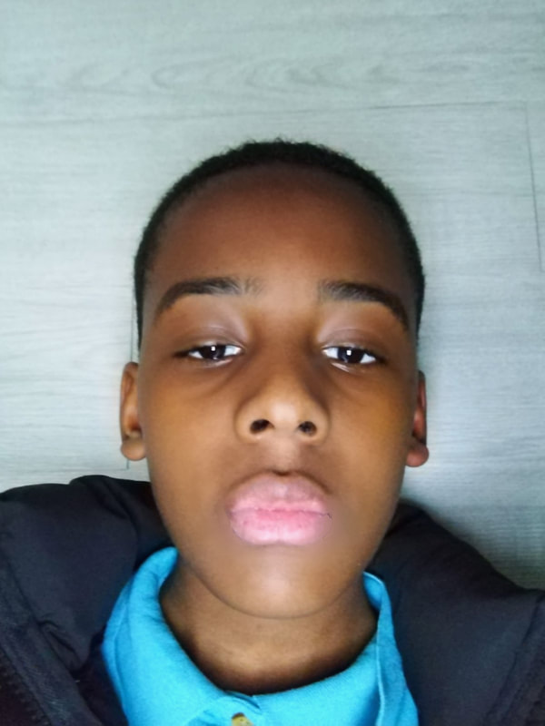
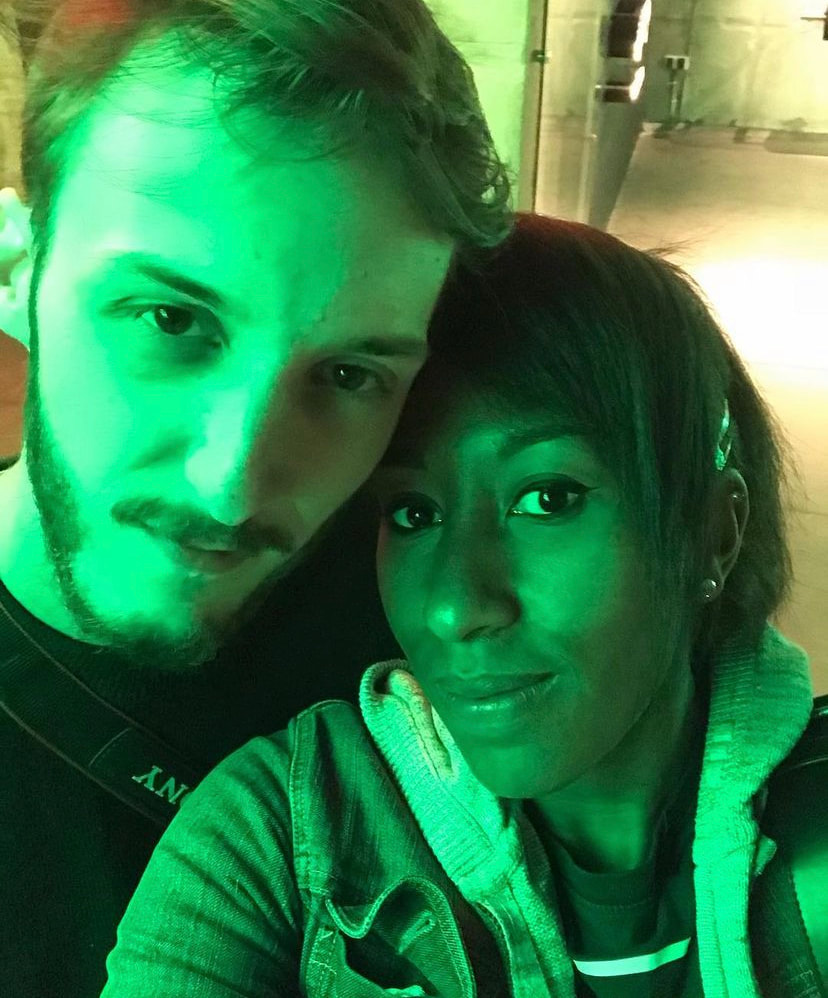
Collecting portraits:
Deciding colour themes to create emotion/ personality:


Collecting online photographs to represent personalities/interests:


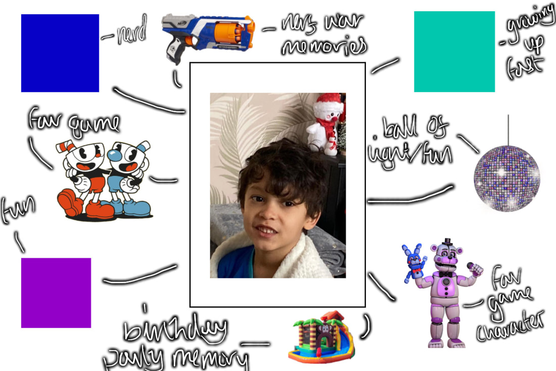
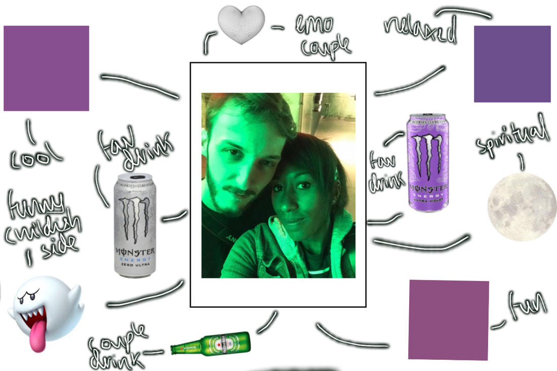
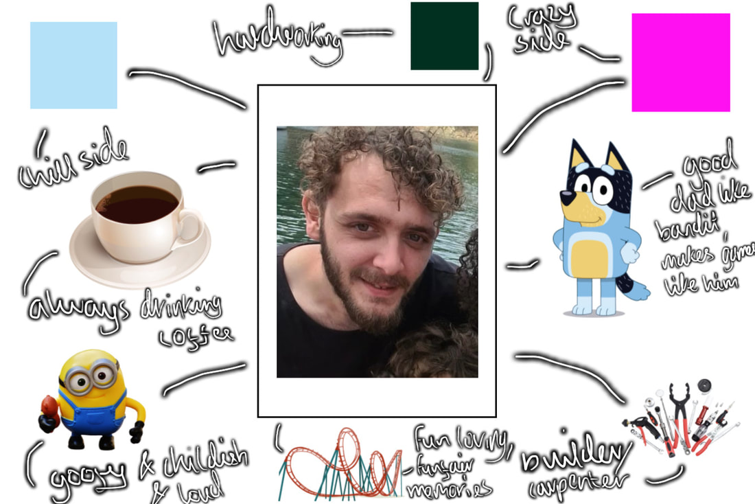
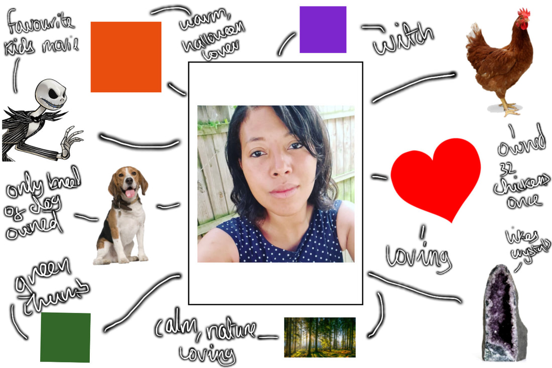
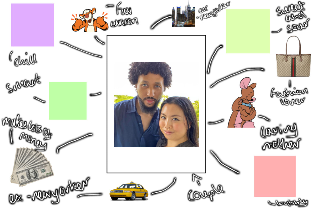
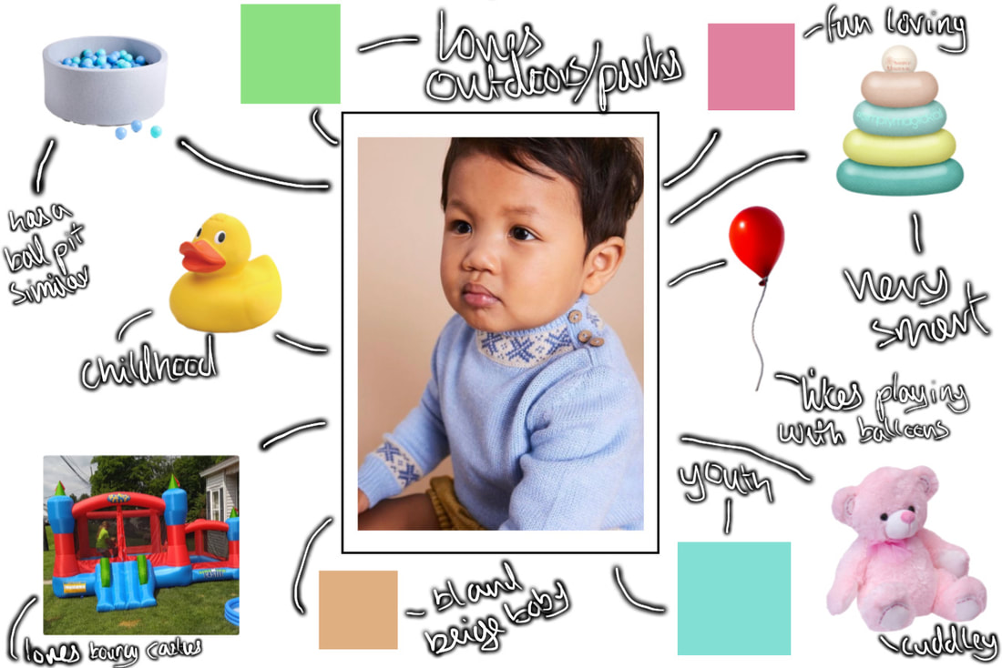
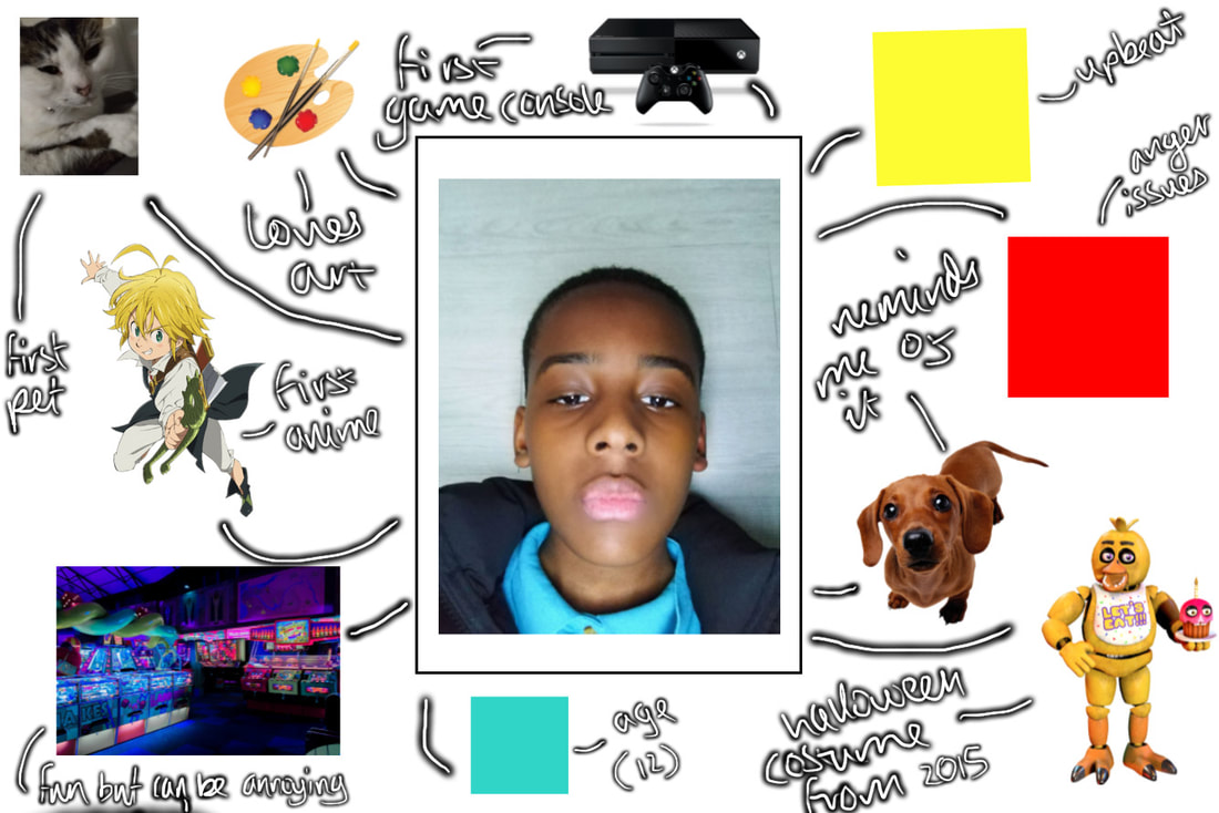
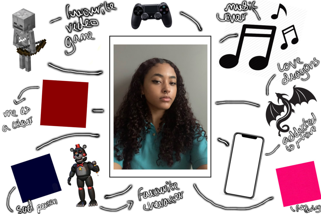
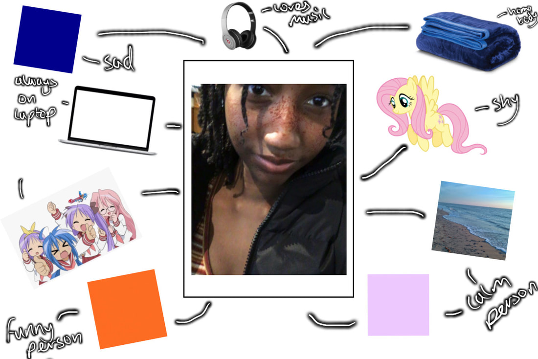
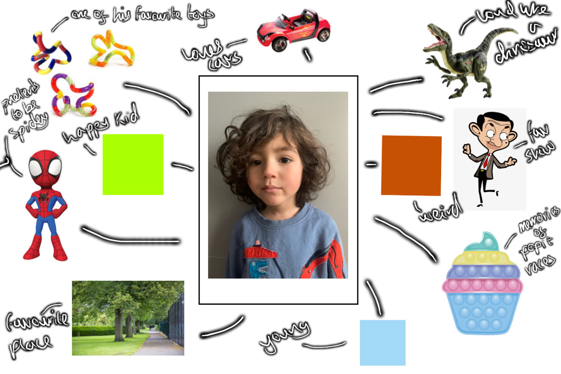
Assigning sourced images to each person through mind maps:
Process of assembling the collages:
Thoughts on the process: This process was very lengthy to say the least, It took me an awfully long time to the point where majority of these clips are sped up almost 200x. I played around for hours, but despite the length, it was worth it. I would be happy to do it again, it was a lot of fun and memory inducing/nostalgic. I would go as far to say it has been my favourite process of photography that I have ever done.
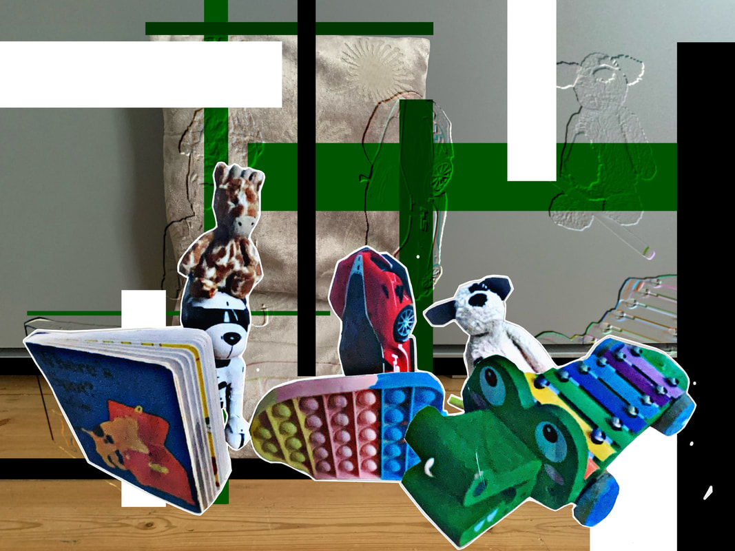
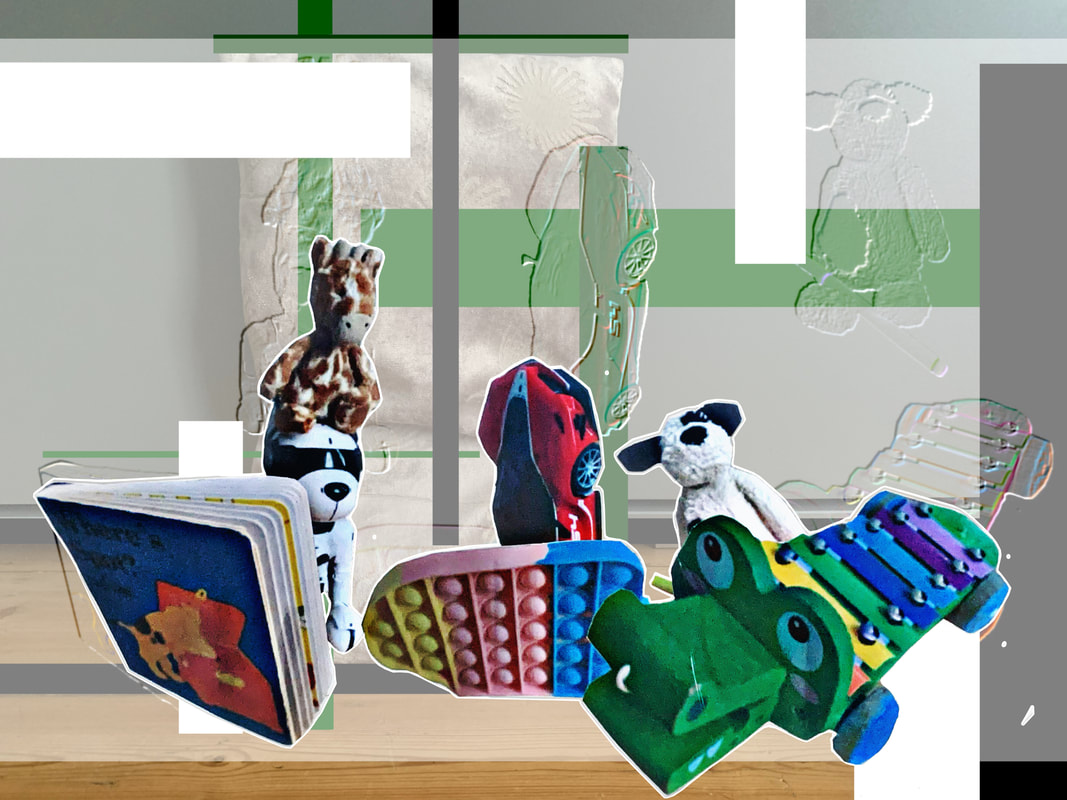
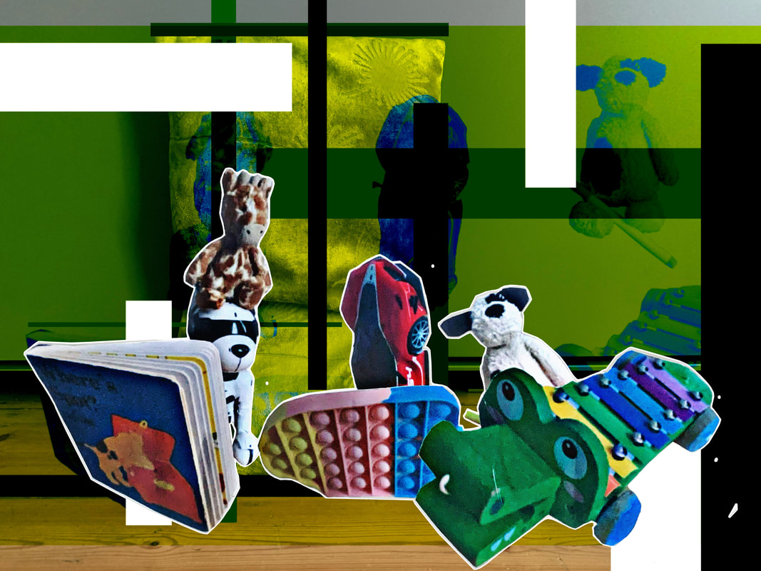
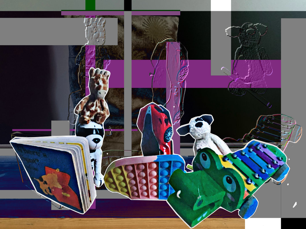
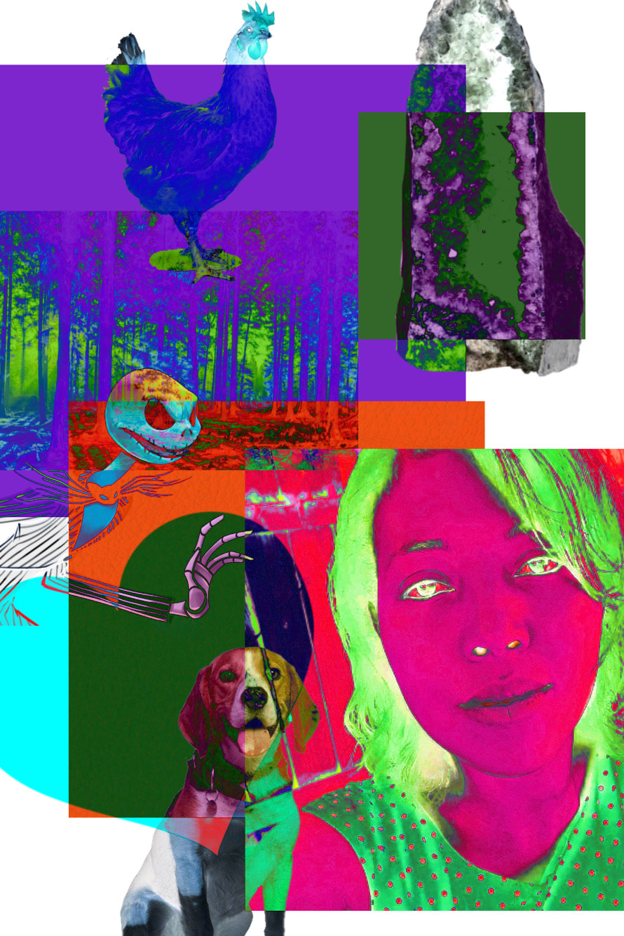
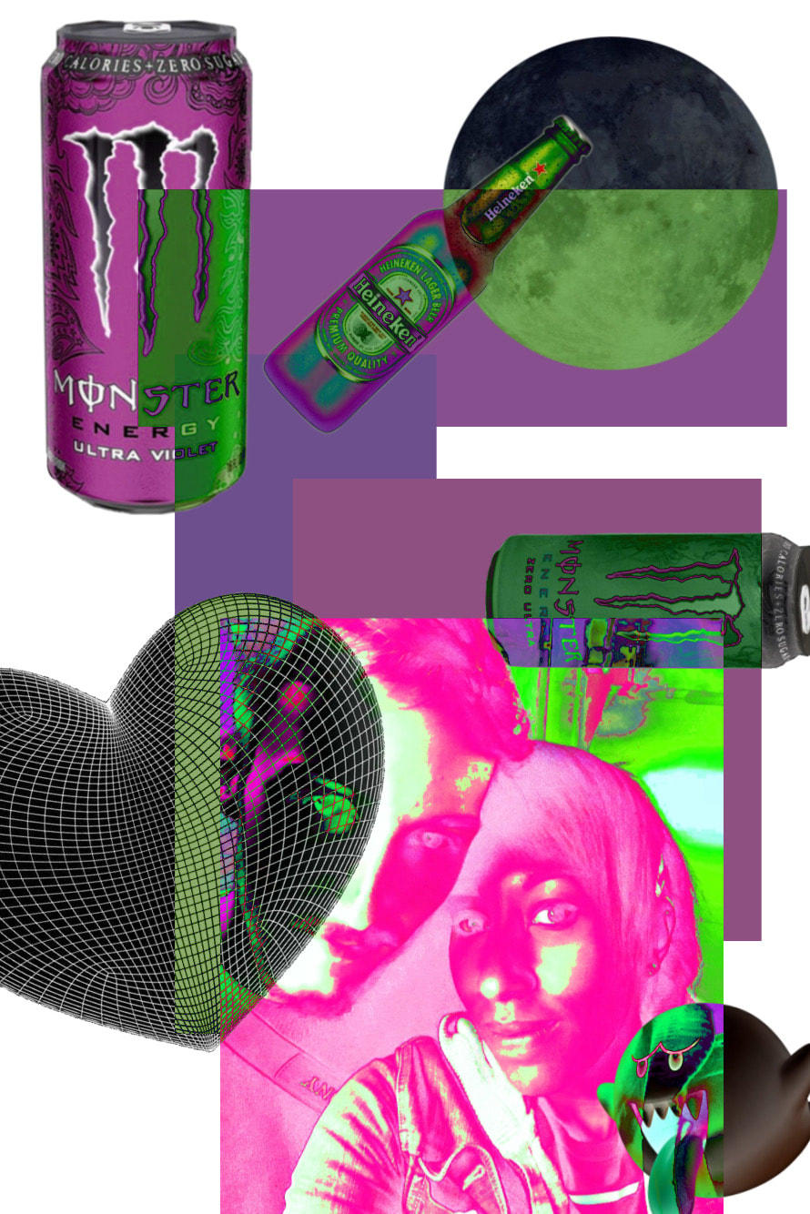
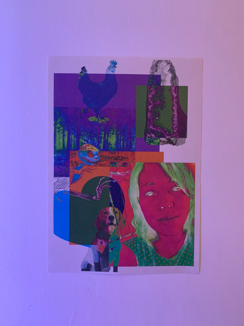
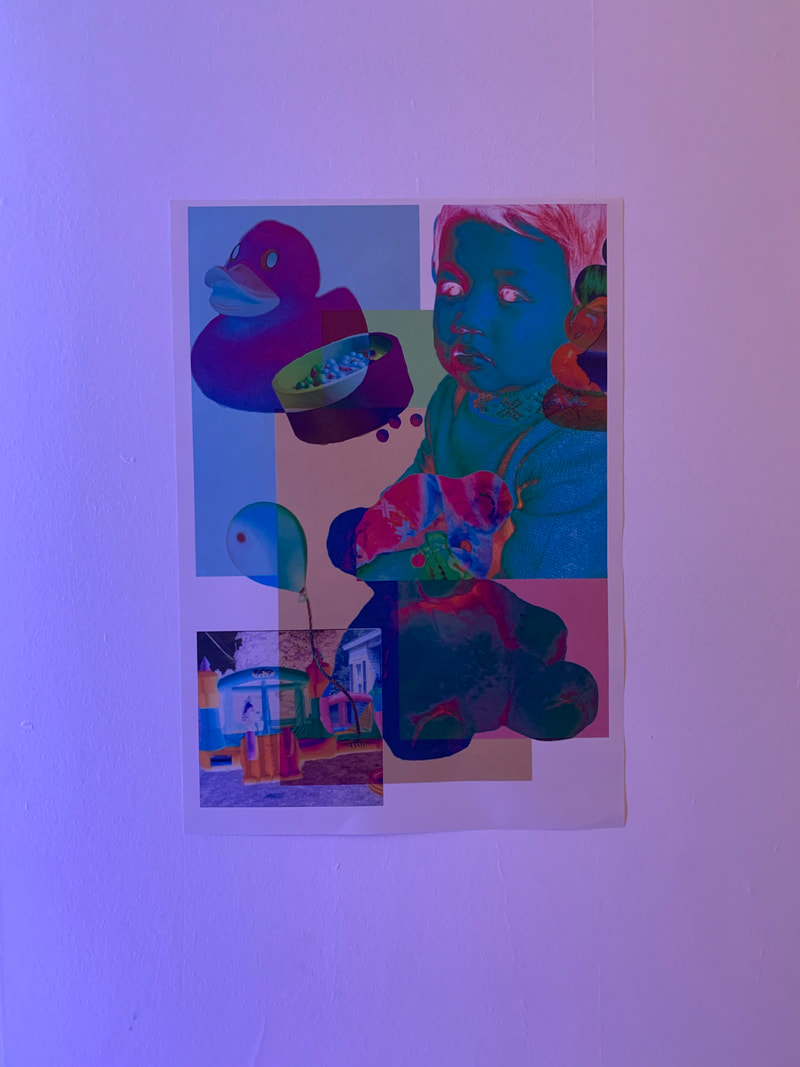
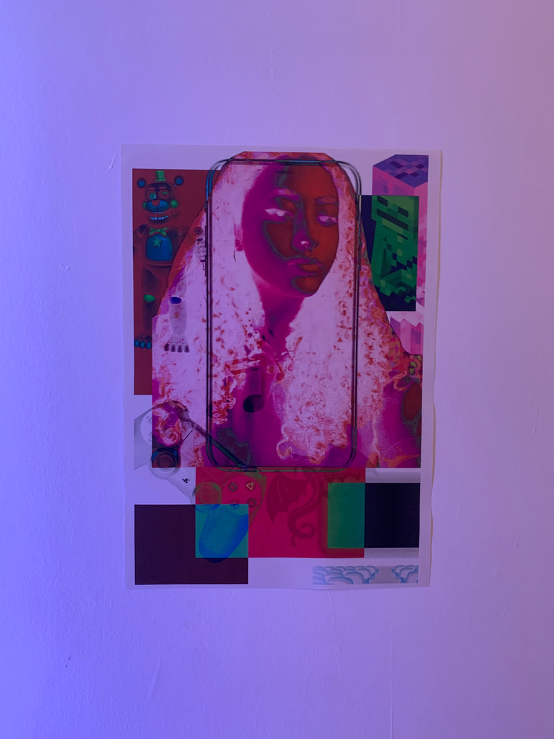
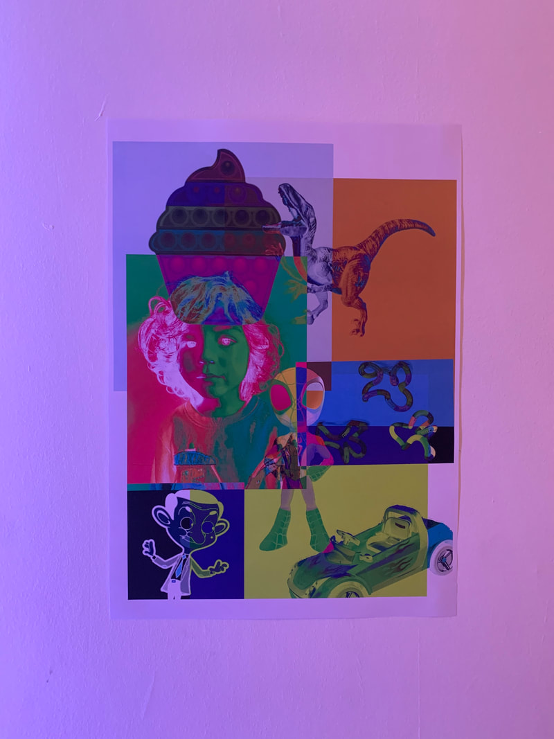
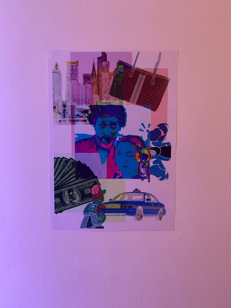
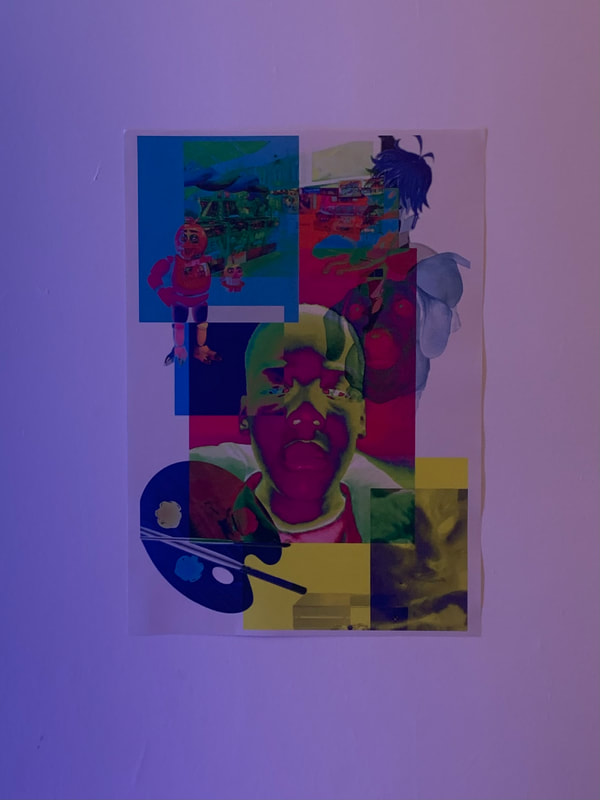
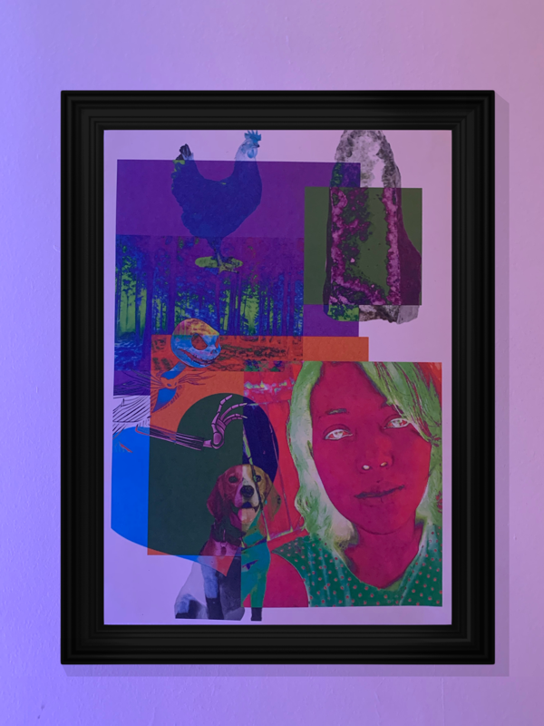
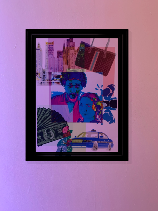
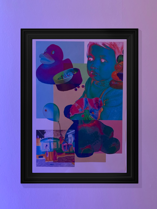
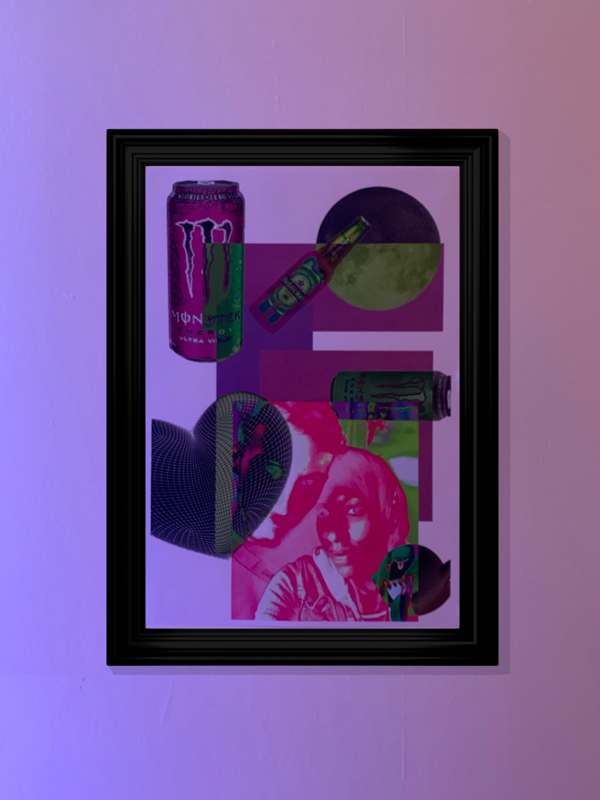
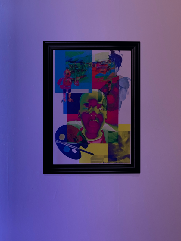
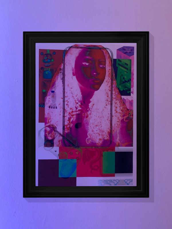
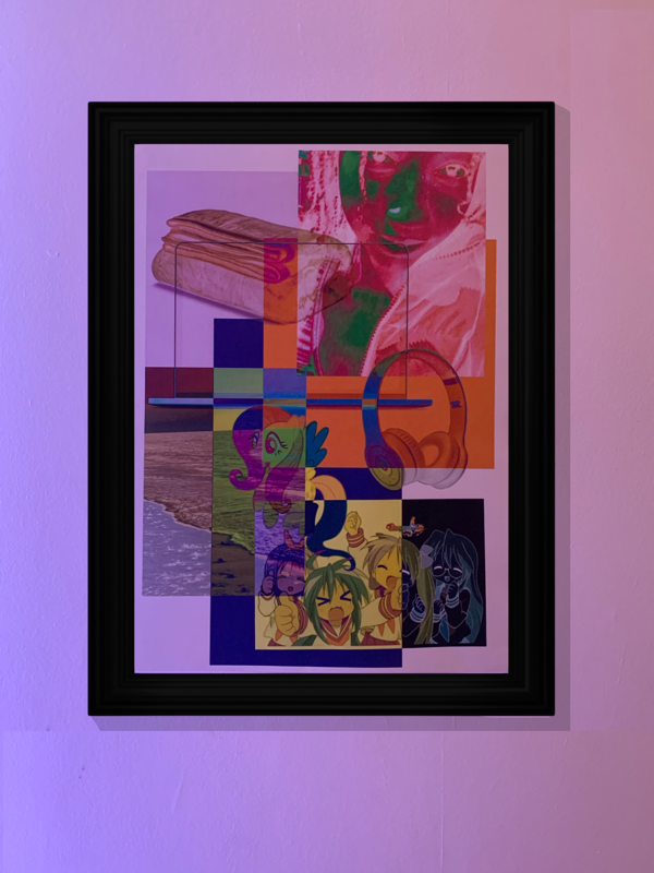
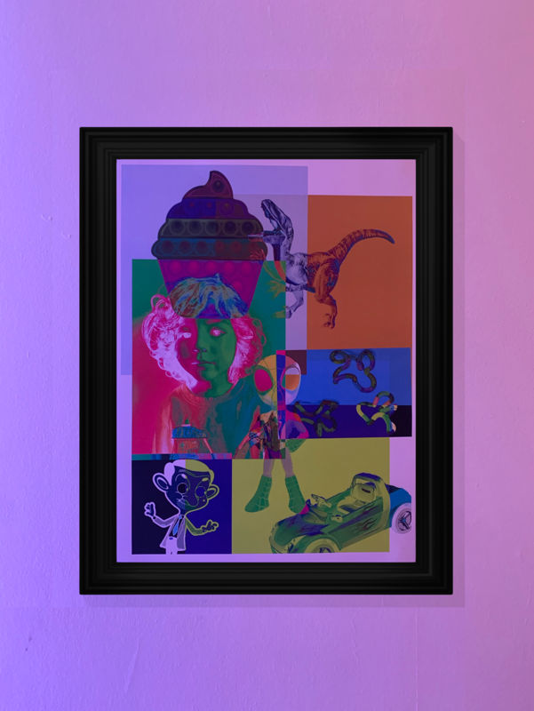
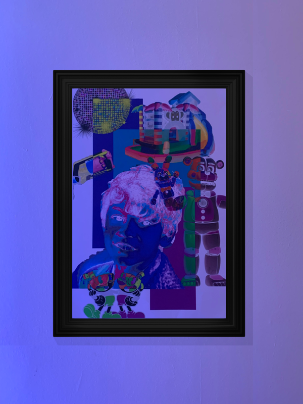
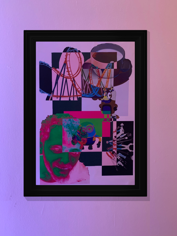
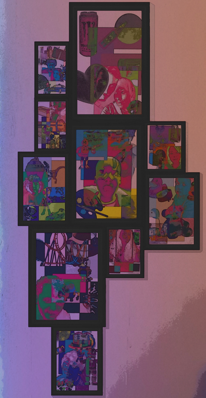
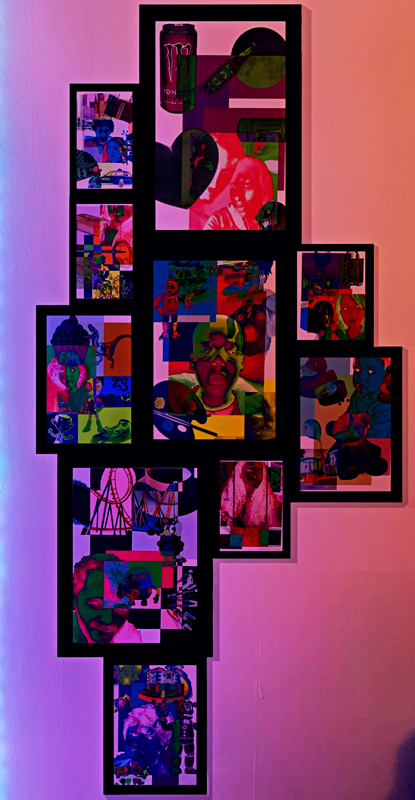
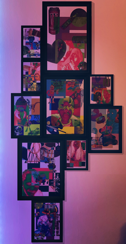
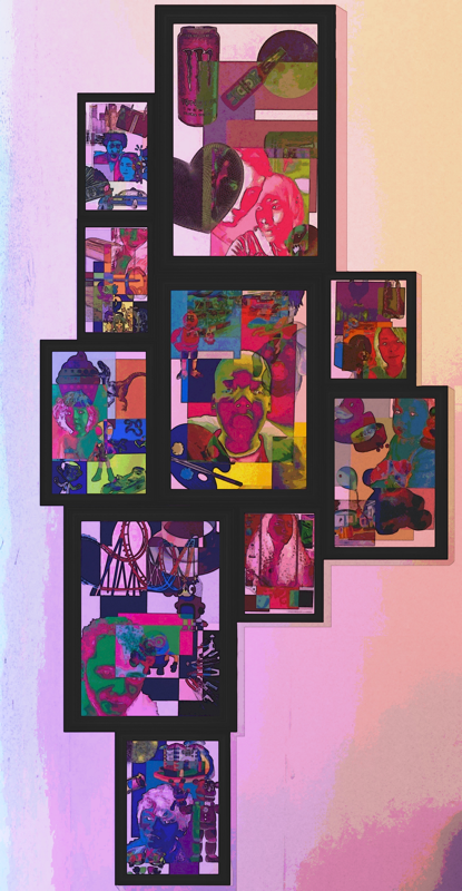
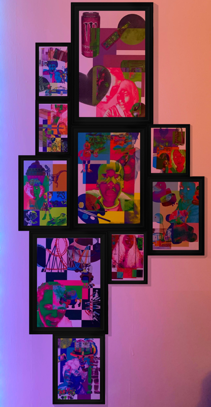
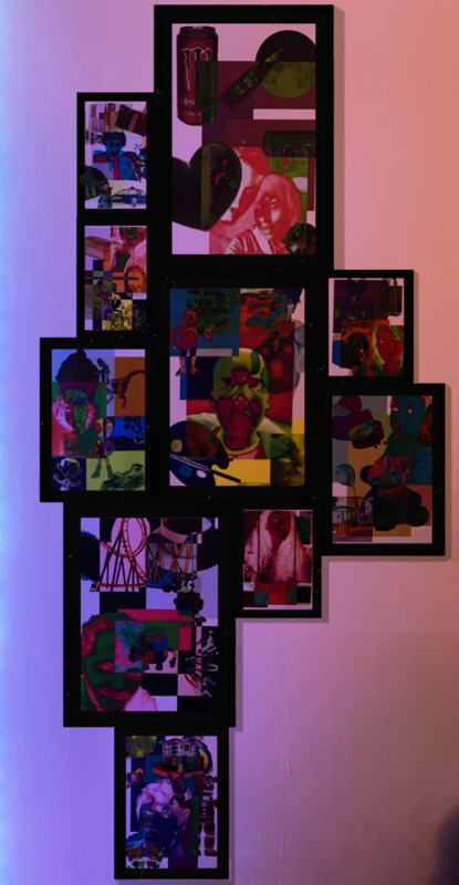
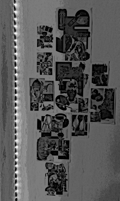
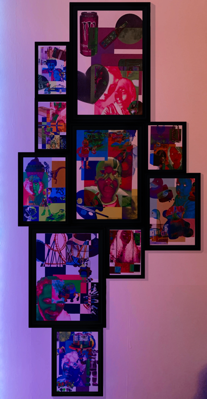
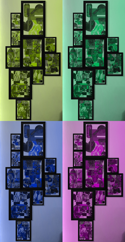
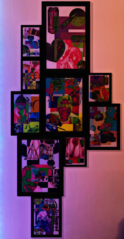
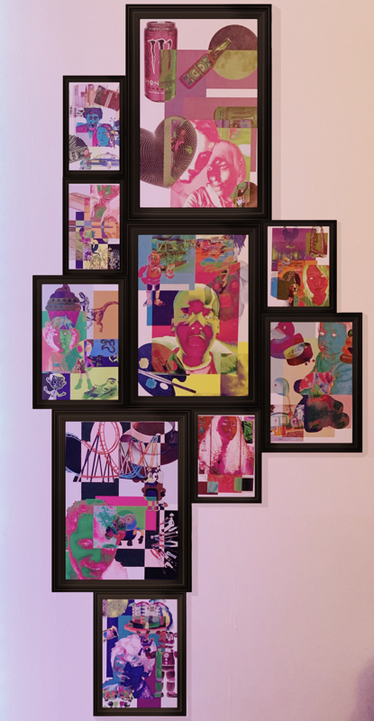
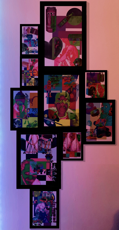
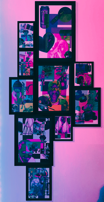
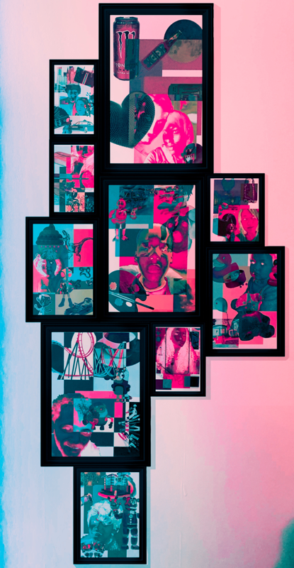
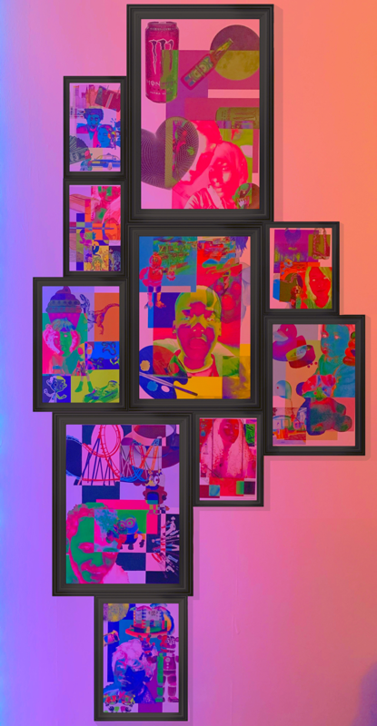
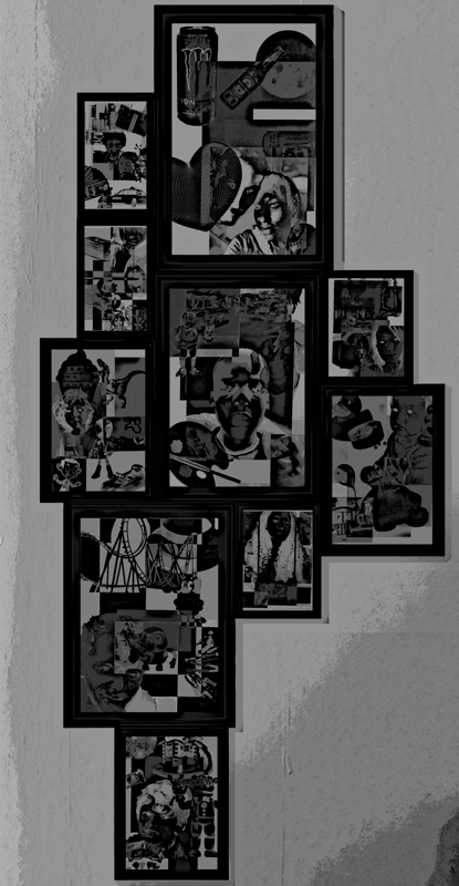
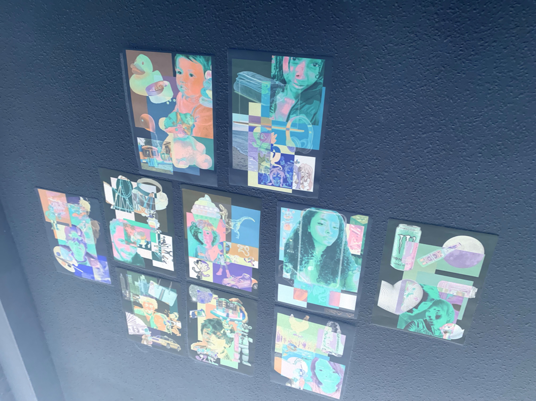
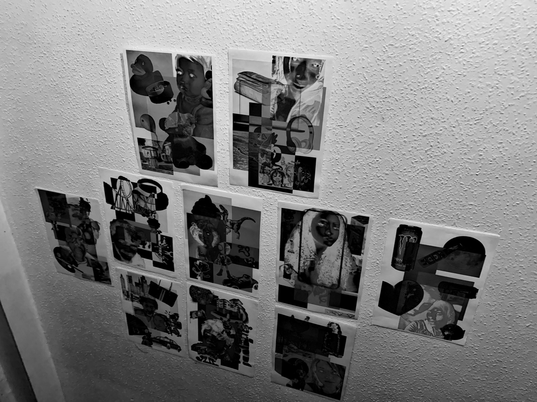
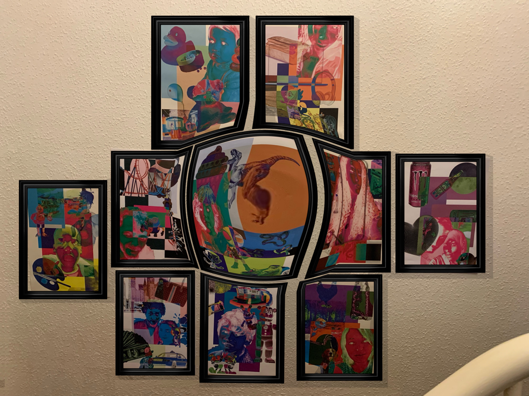
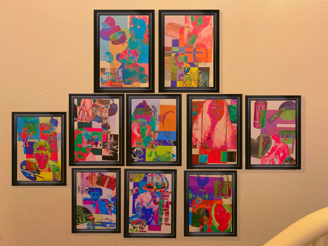
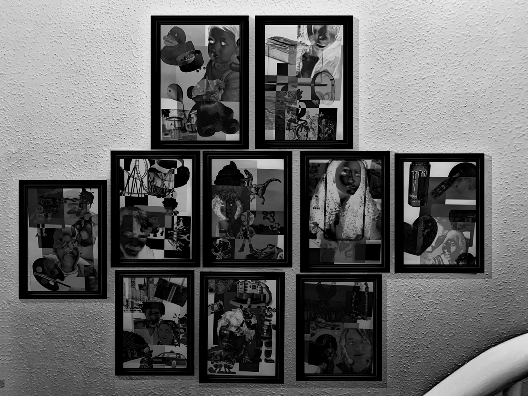
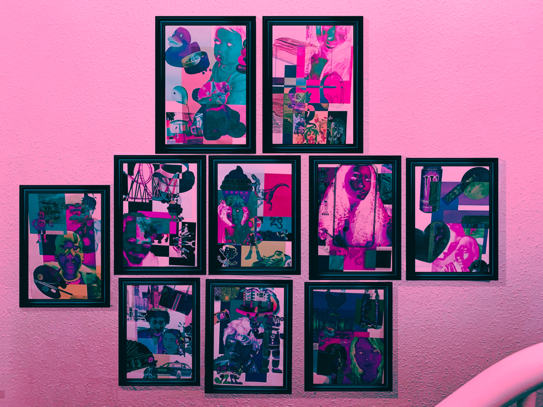
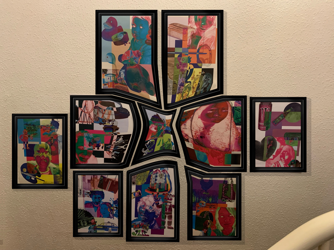
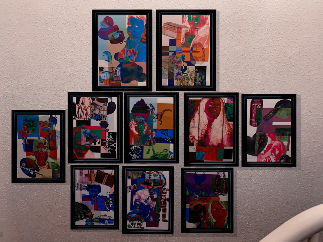
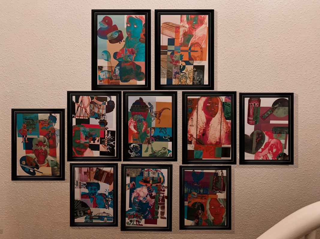
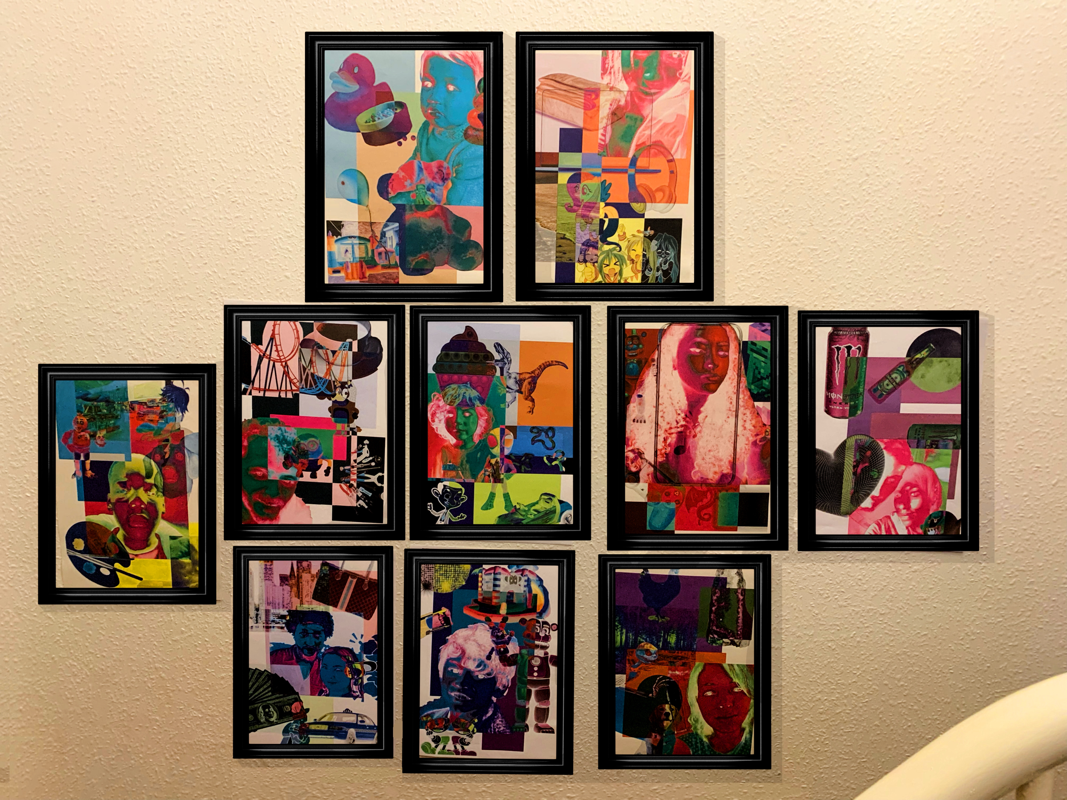
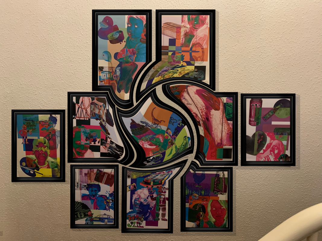
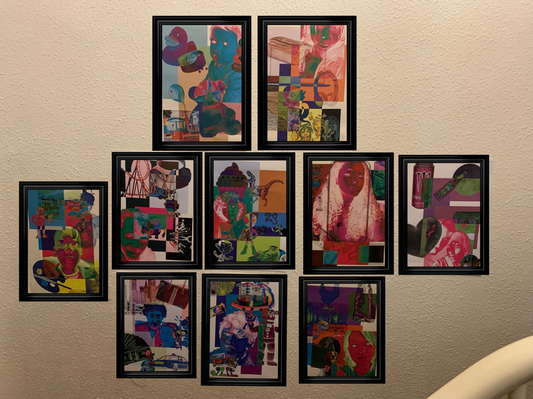
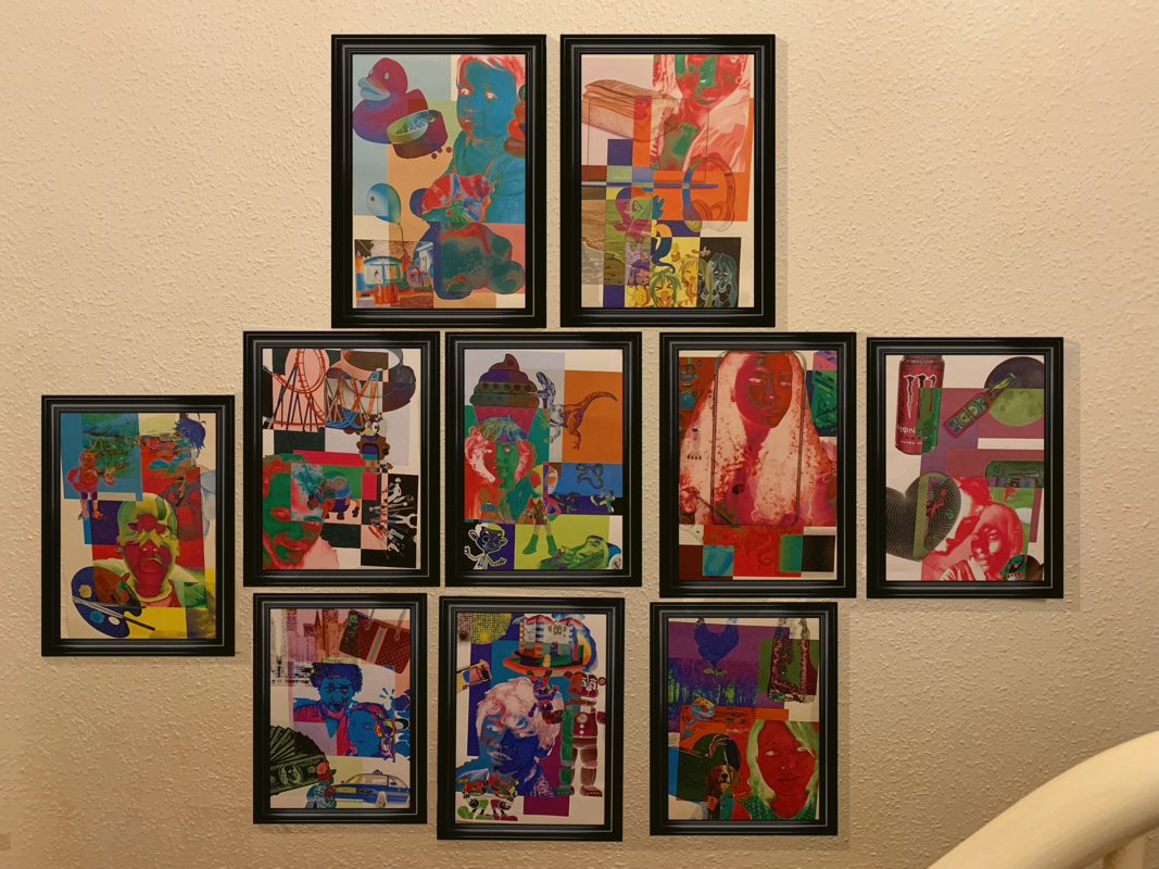
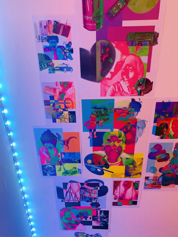
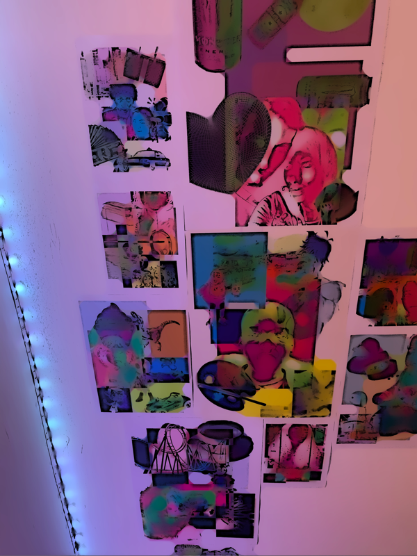
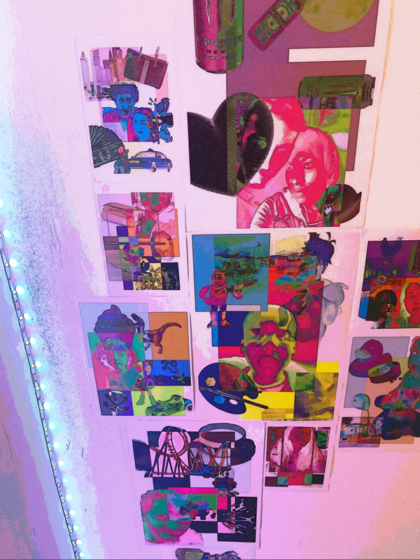
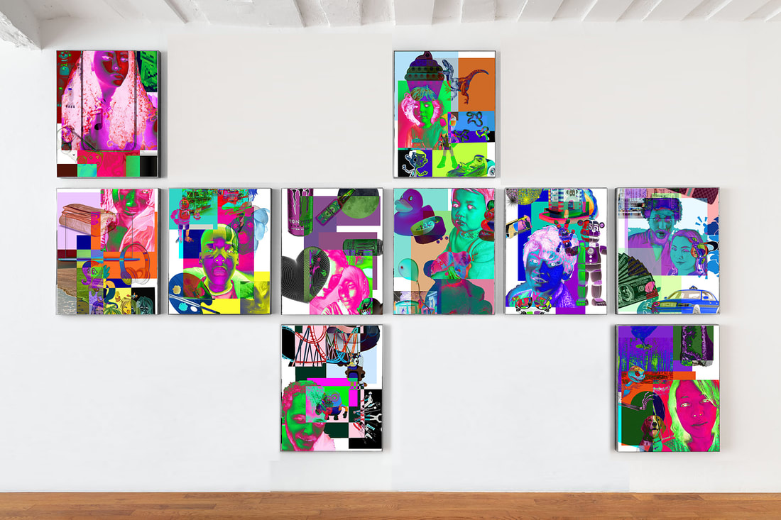
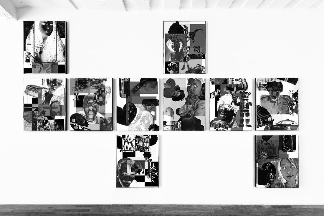
Final Products:
|
WWW: I love the vibrancy and the distinctive layering of each of these pieces, which were the two main aspects i wanted to incorporate into my work. I also really love the personal aspect of it, as it makes it really feel like my work despite the adding of various images that I do not own/have not created. The varied composition of each piece is also quite nice, all the images definitely have their own feel to them which makes each of them feel unique but at the same time they still feel like a collective because of the colours and contents.
|
EBI: Maybe I will redo this process, but use all of my own images instead to make it more my photography and less of a composed piece of other peoples work. I also don't like the colouring. of some of these images, they just don't work as well together as some of the others. I was also thinking about drawing on and cutting into some of these and then rephotographing.
|
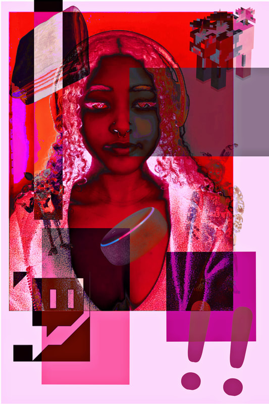
My most successful image:

Evaluation: This image is 100%, without a shadow of a doubt, the best one that I created. The balance and mix of colours scratch my brain in all the right places. It is so random yet so pleasing to look at. It feels minimalistic but full at the exact same time. The colours are so different yet so cohesive. The composition gives equal amounts of objects in every area. The balance in my eyes is perfect and is significantly better than all of the other pieces I created. I also really think I captured this persons personality perfectly with this, I can look at this and instantly it provokes my memories to come flooding back. For me it's quite powerful to look at, of course for other people it is not as significant, as they don't know the person but to me its so significant and brilliant.
Refining My Shirana Shahbazi Response
Now that I have responded to Shirana Shahbazi a whole realm of opportunities to refine have come up and became available. I am going to carry out 4 of the strongest refinement ideas - Printing and displaying the photographs, drawing/painting onto the images and creating a mini book similar to the one that Shirana Shahbazi created and seeing how coloured lights affect the images.
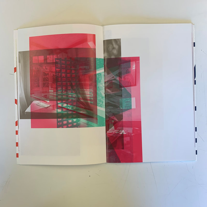
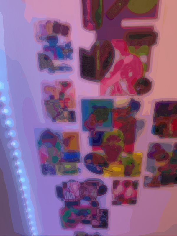
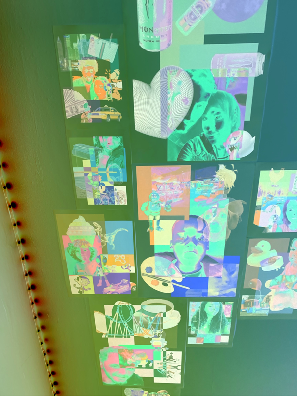
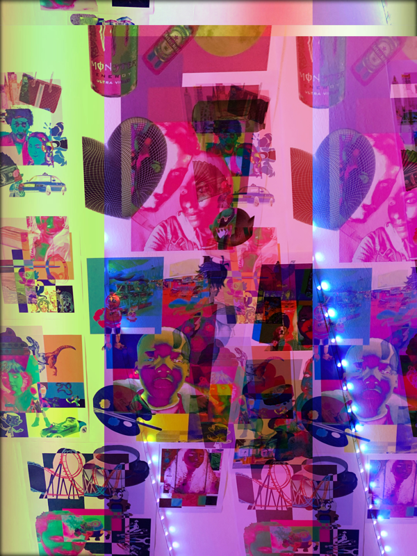
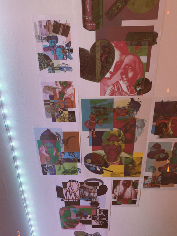
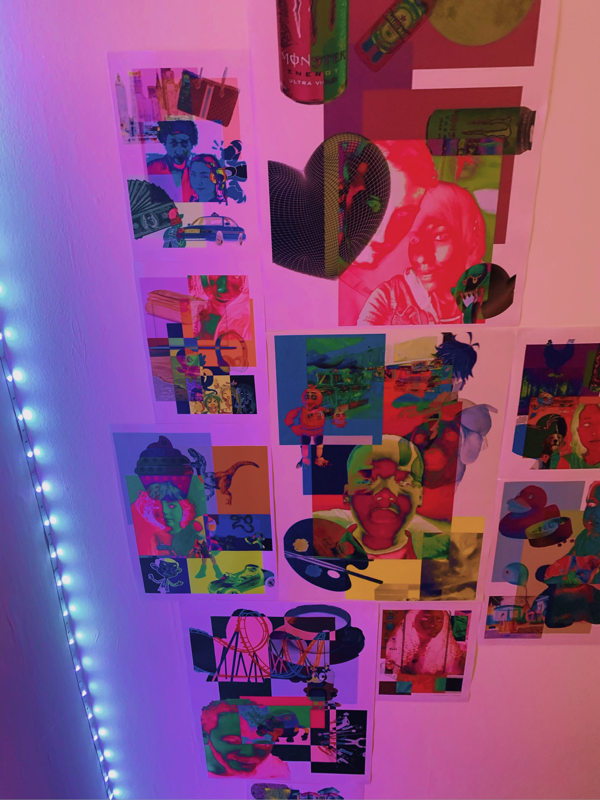
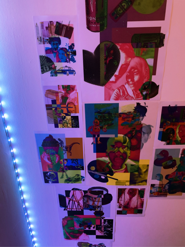
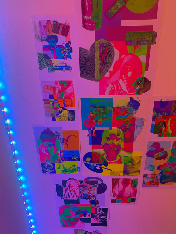
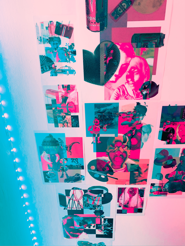
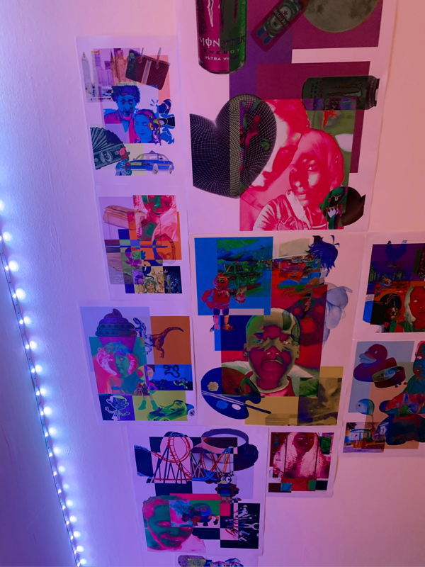
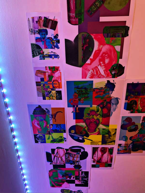
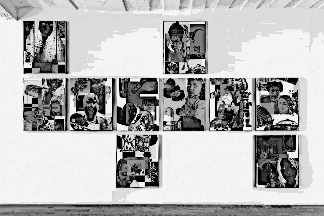
Displays Of The Photographs
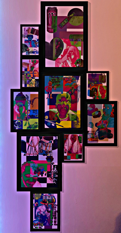
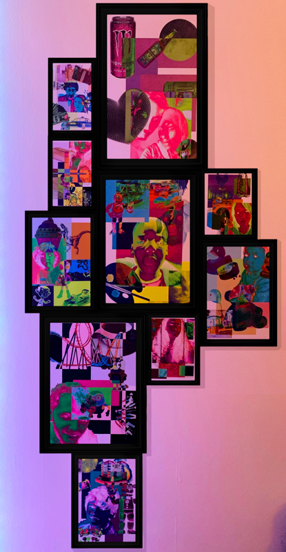
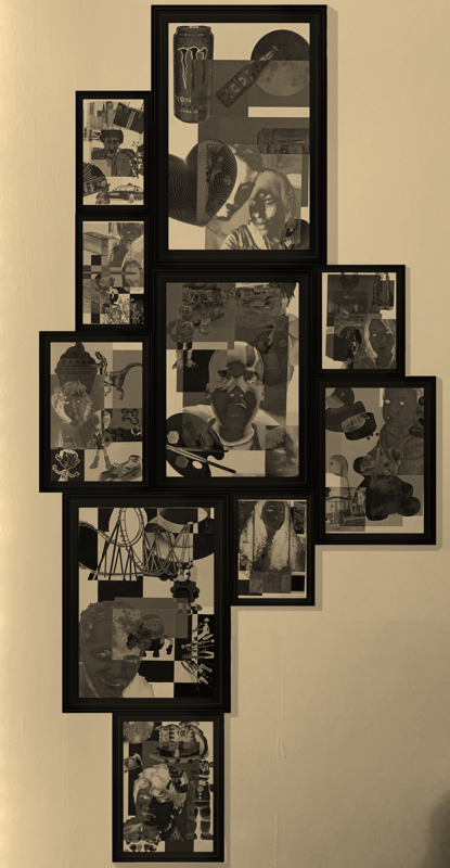
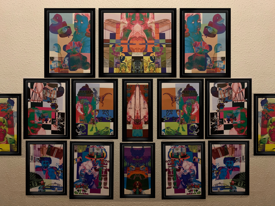
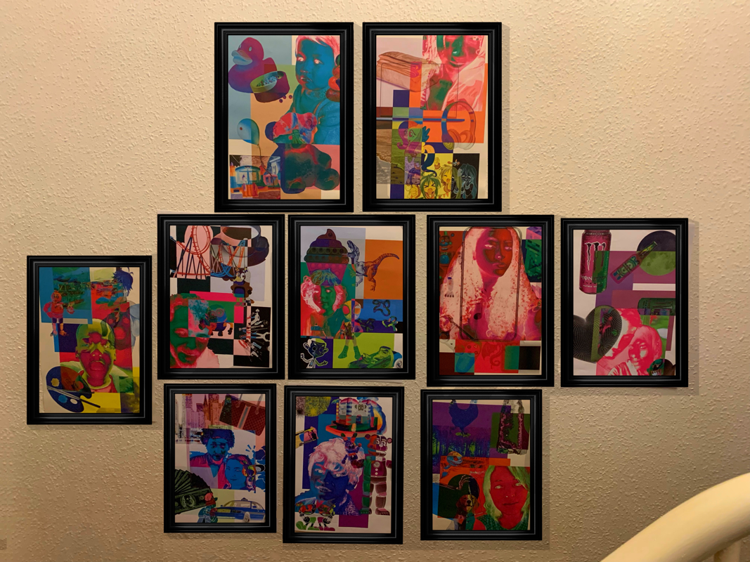
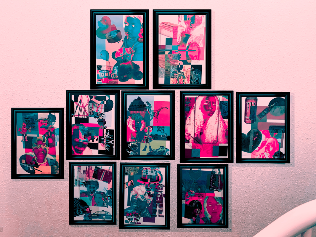
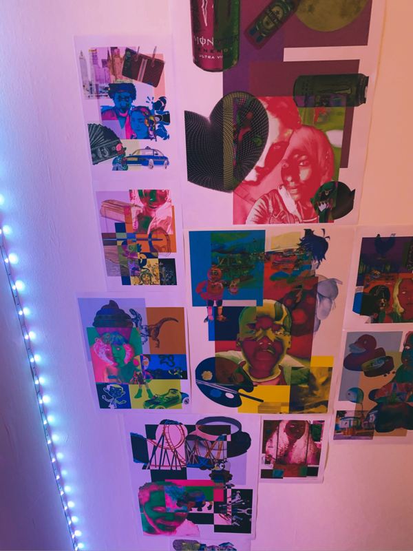
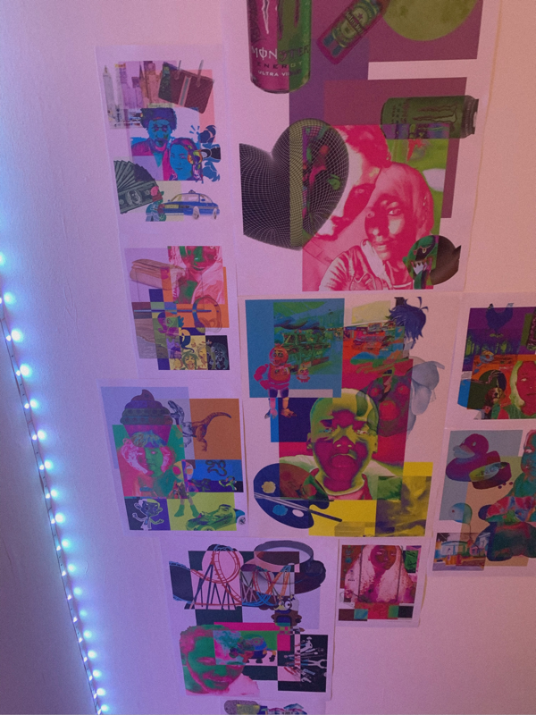
Singular displays unedited:
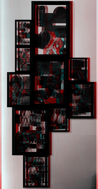
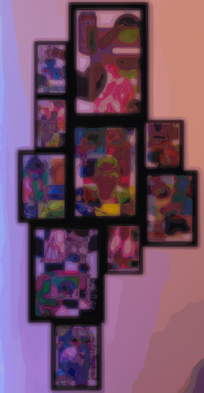
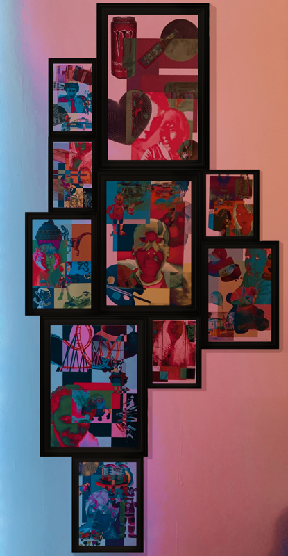
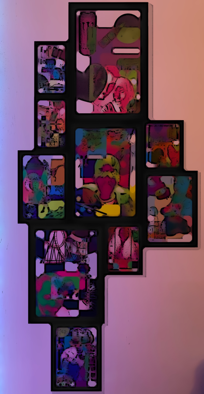
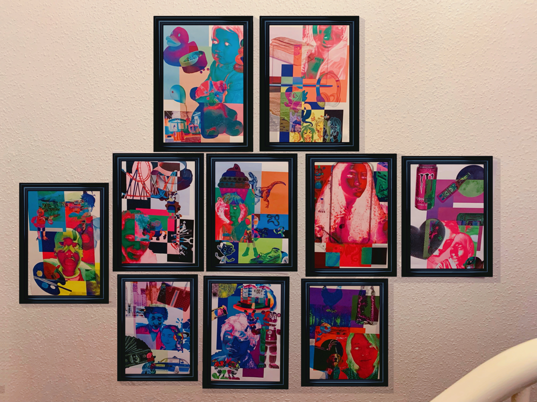
Singular displays edited:
(editing process)
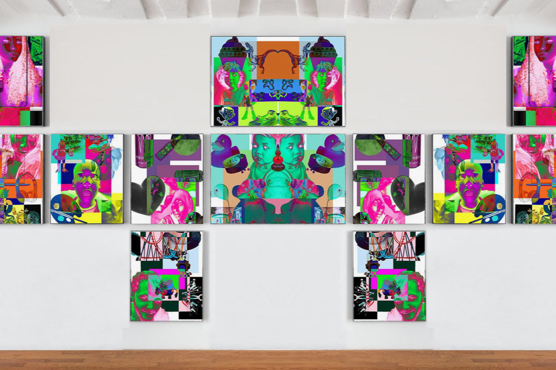
Group displays unedited:


Group displays edited:
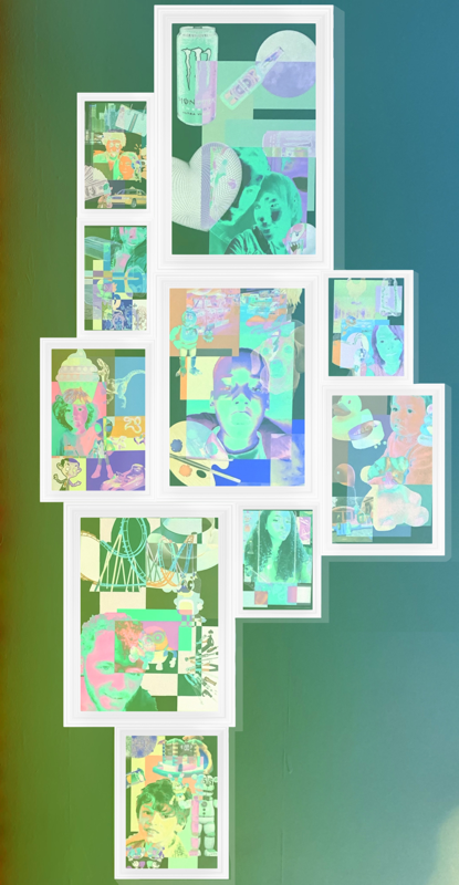
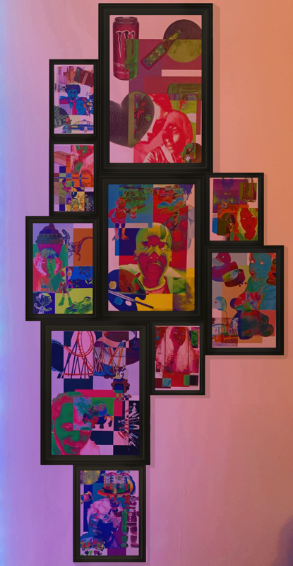
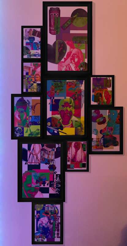


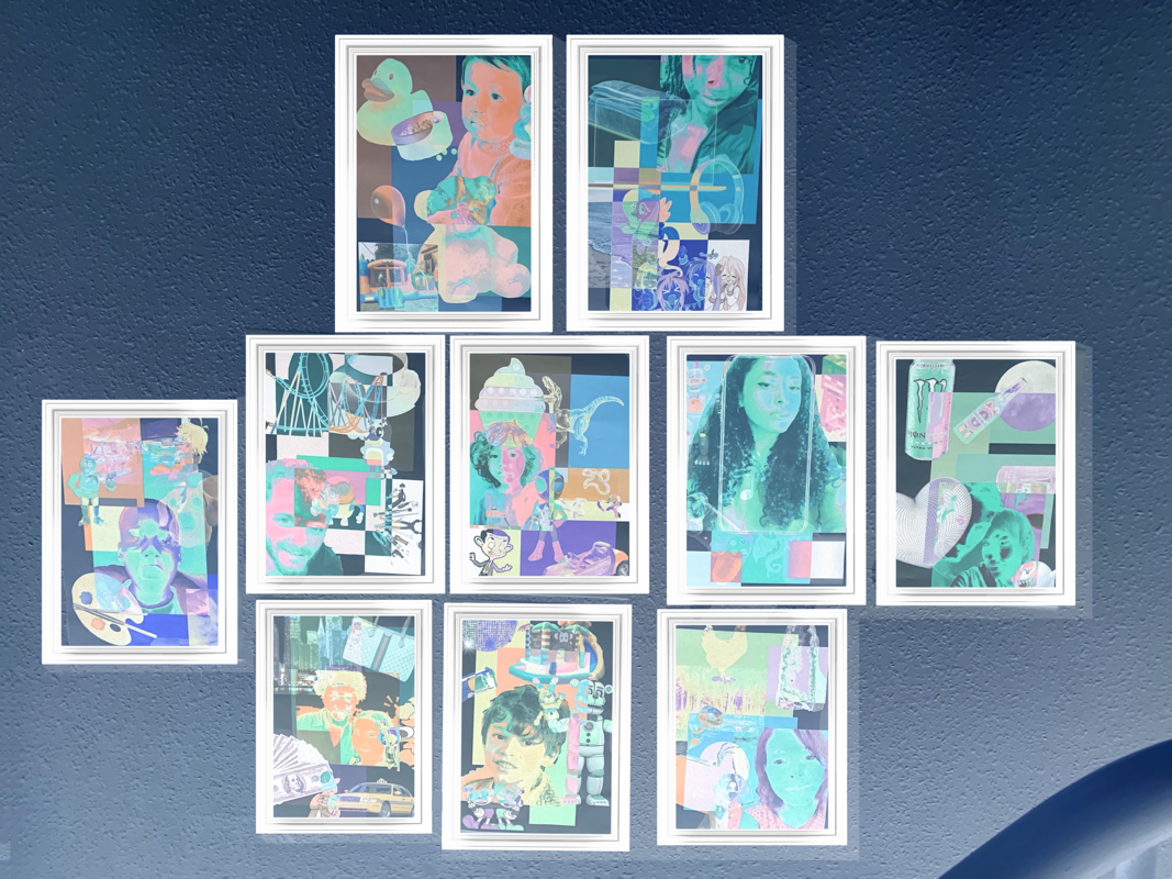


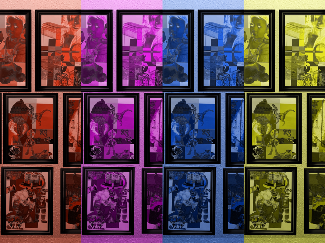


(editing process on Picsart)
|
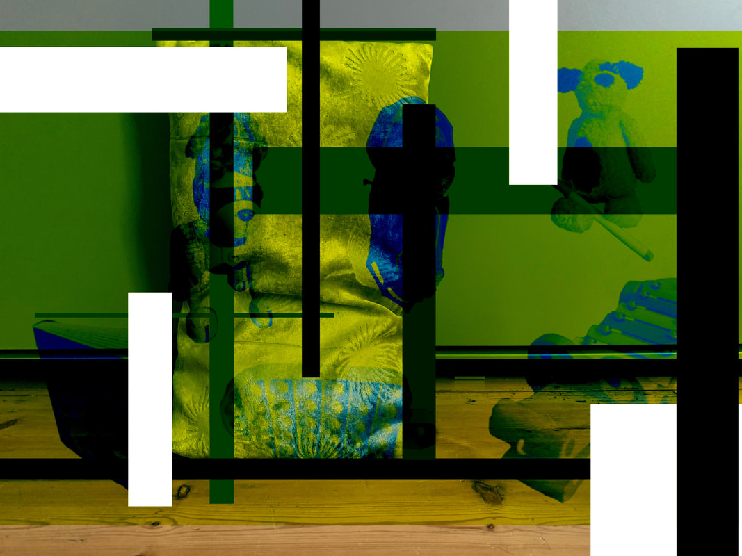
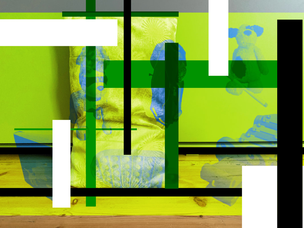
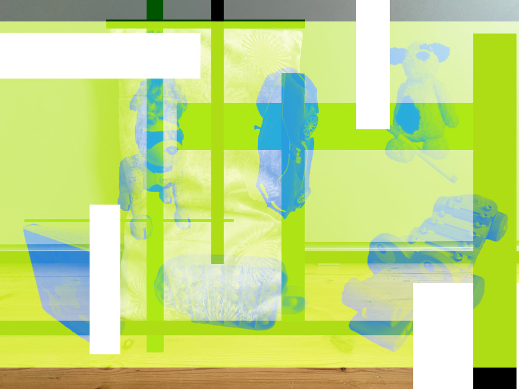
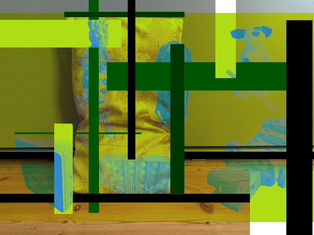
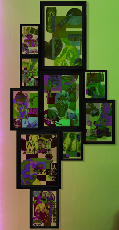
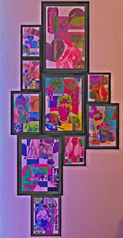
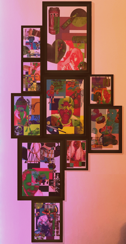
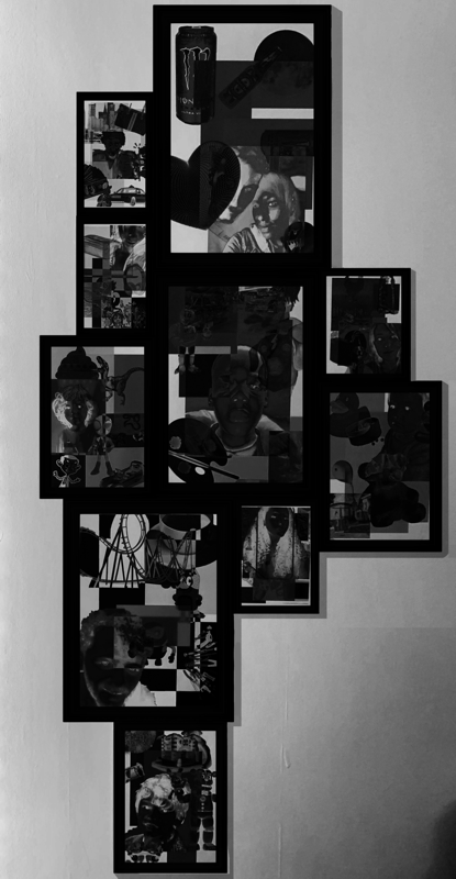
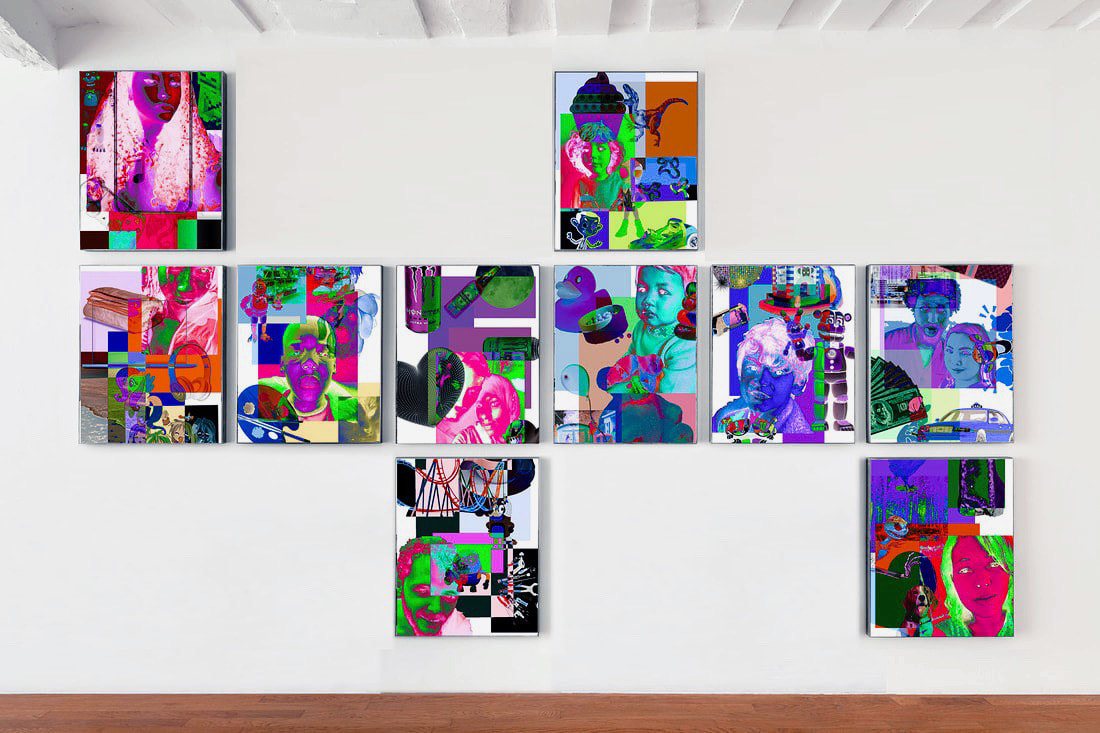
WWW: With the edited singular displays I feel like i made the images look very questionable to put it bluntly. I have asked various people whether the image looks real or edited and I have had varied responses from yes it does to no the entire image looks AI generated. It's hard to tell whether or not it is affective with such varied responses but majority said it looked real so I will go with that being a success. I love the simplicity of it as well, as it really allows for the printed piece to be the centre focus. With the edited group displays I am quite pleased with the colours and amount produced, it's all very weird and wacky but I kind of like it. I also think the editing process is very well documented which is always a plus.
|
EBI: I think I could create more professional looking layouts as these ones seem more fun and creative rather than professional and exhibition like, like Shirana Shahbazi's displays work. I also think natural lighting may be a good thing to try incorporate as the artificial lights create hues that in turn make it more "fun" looking display if that makes any sense.
|
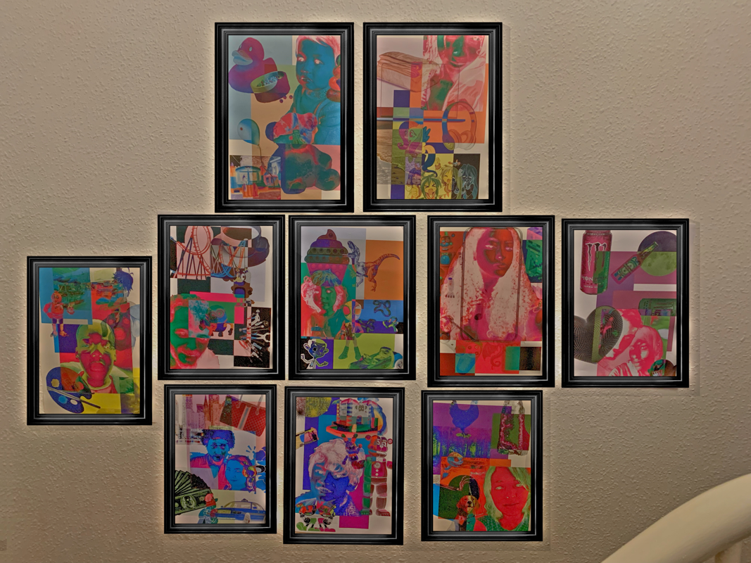
Displays Refinement
The process

|
WWW: I feel like these images look more like a real exhibition, unlike my other attempt which looked more like a display in my house (which it was) which is a plus because that is exactly what I was going for. I also quite like the colour edited versions, despite them not looking realistic
|
EBI: I would like to try this process again, with a more ambitious/unique exhibition set up, as this one is rather mundane. I also would like to use an exhibition with no people, as this person kind of distracts I feel like.
|
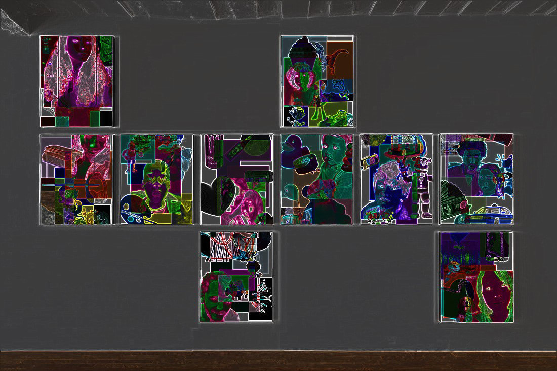
The best image in my opinion
Evaluation: I love the neon aspect of this specific image, even if it doesn't look as realistic as some of the other images. The outlines on the work really bring out the colours and images in a new fun way. I feel like this doesn't look realistic but at the same time, the darkness of the image kind of makes the neon outline look intentional, as if it were part of the original piece and it illuminates once the lights are out. I don't know it my be far fetched, but thats just what I see when I look at it. This one is the most visually appealing in my eyes as well.
Further Display Refinement:
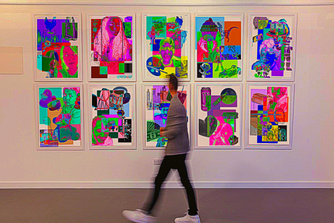
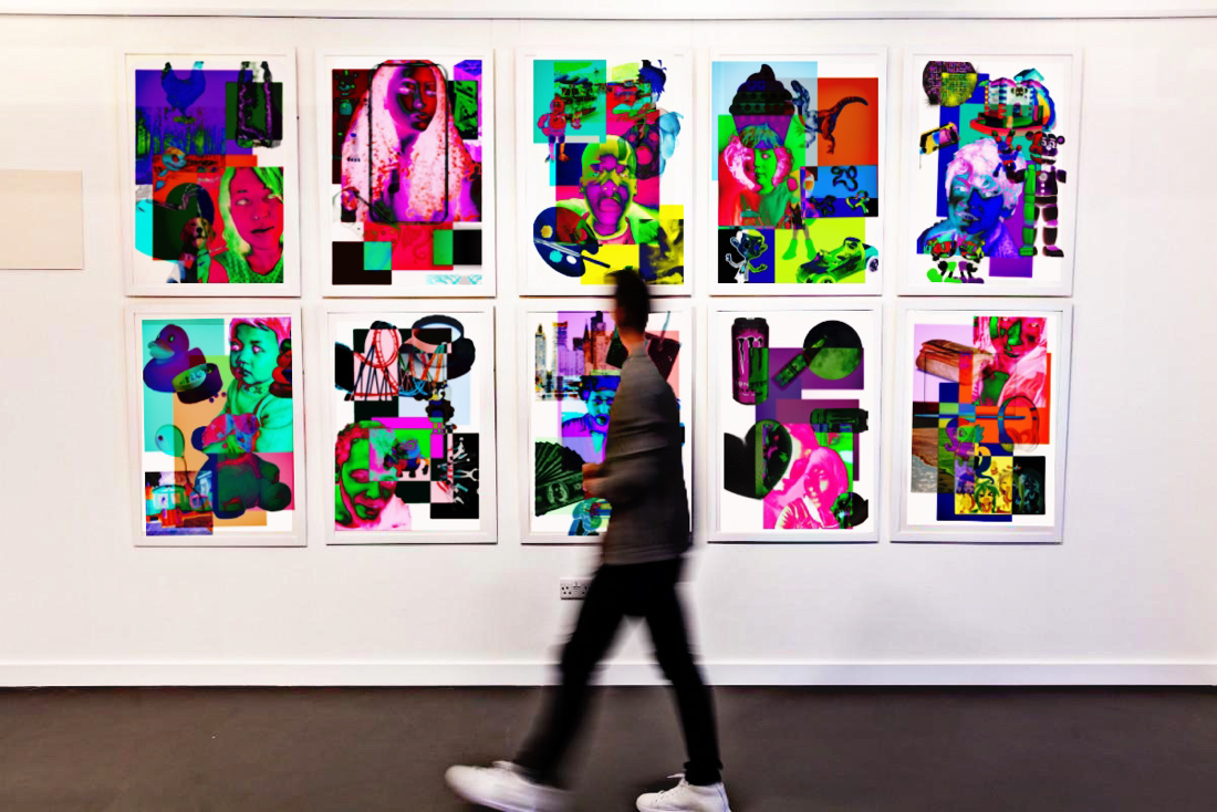
I wanted to further refine the displays that I created by making one last display, but this time using photoshop instead of Picsart
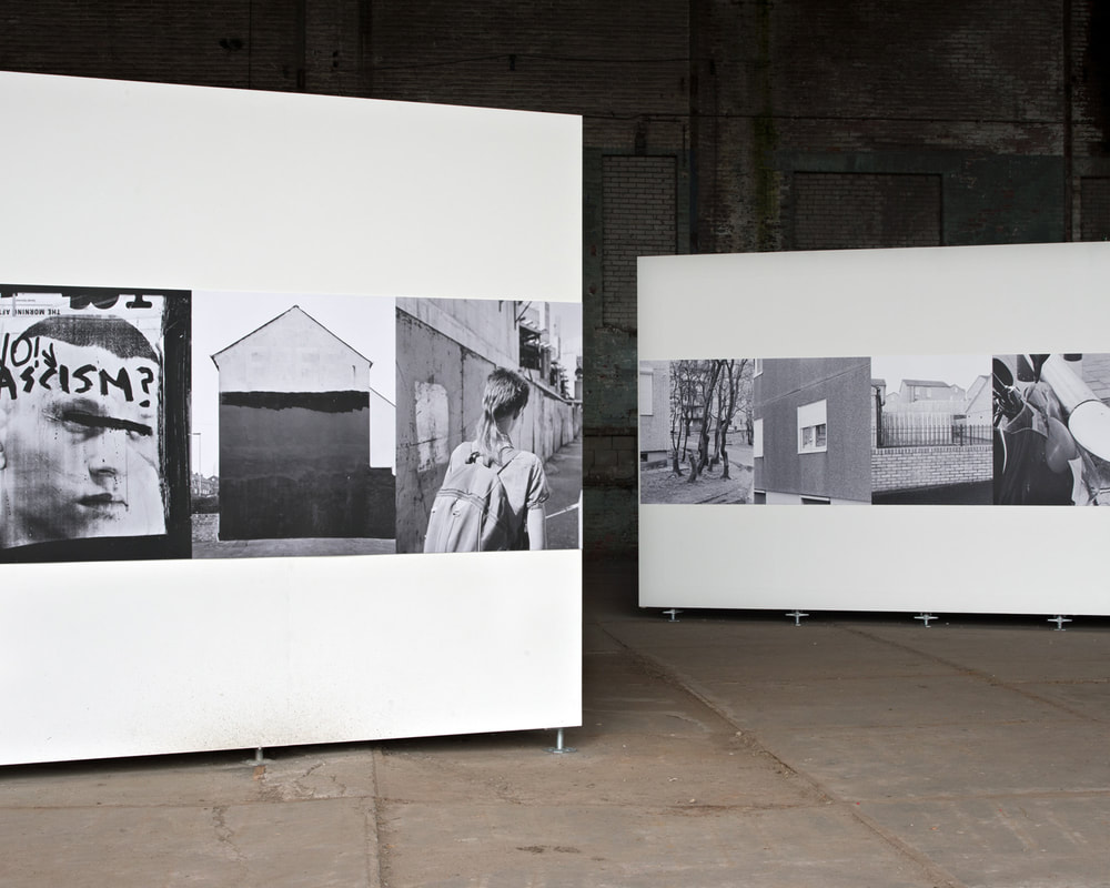
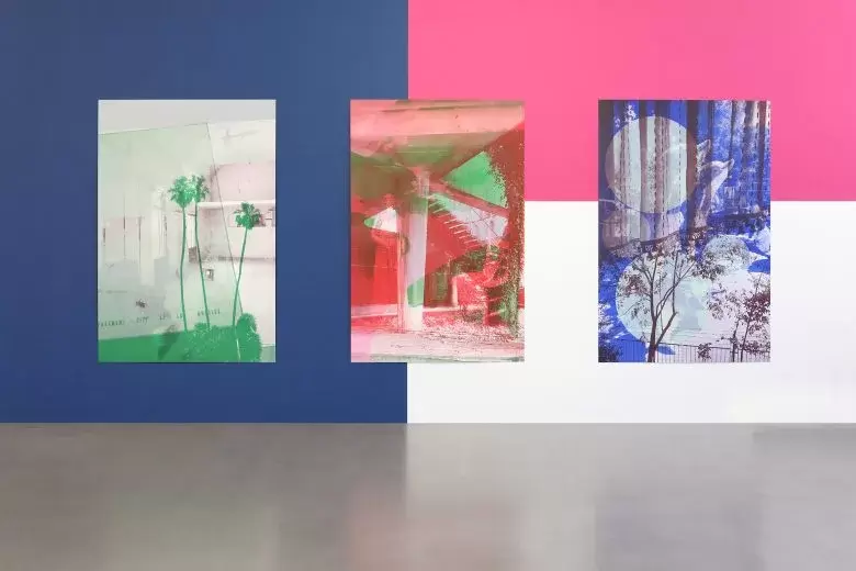
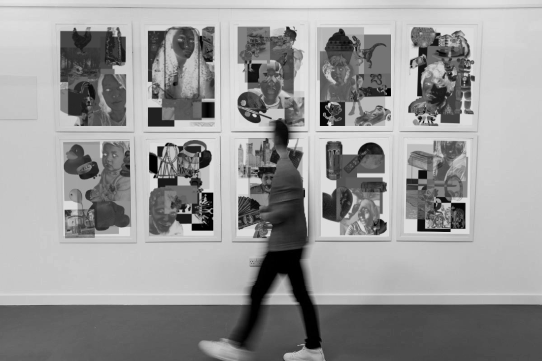
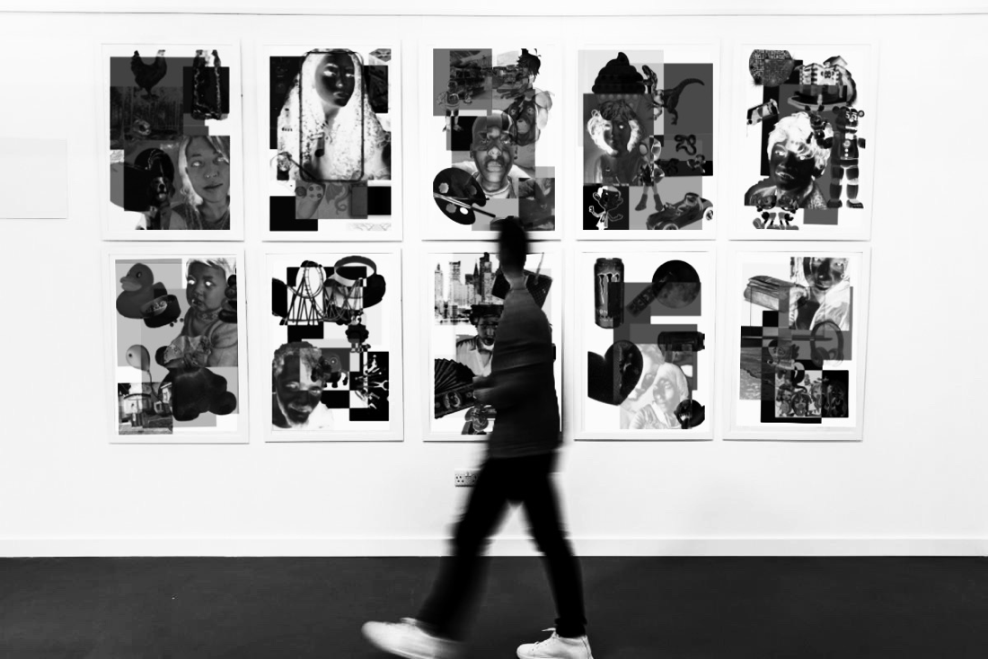
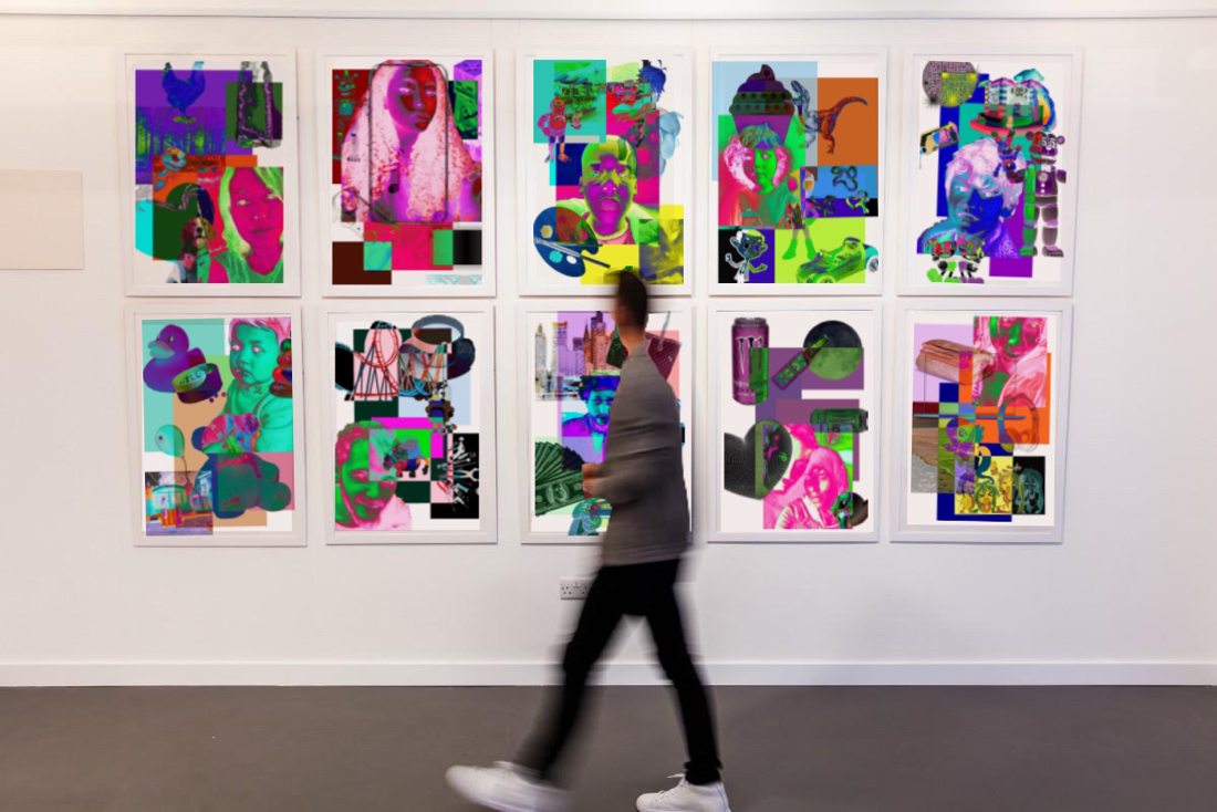
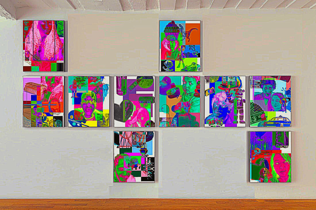
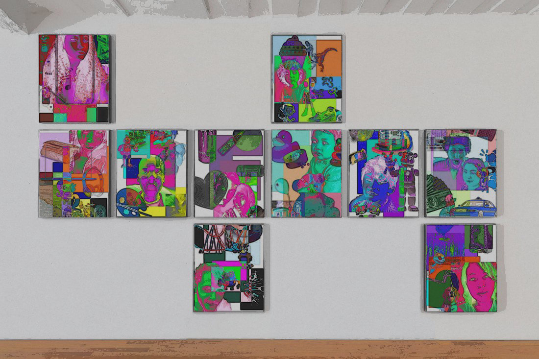
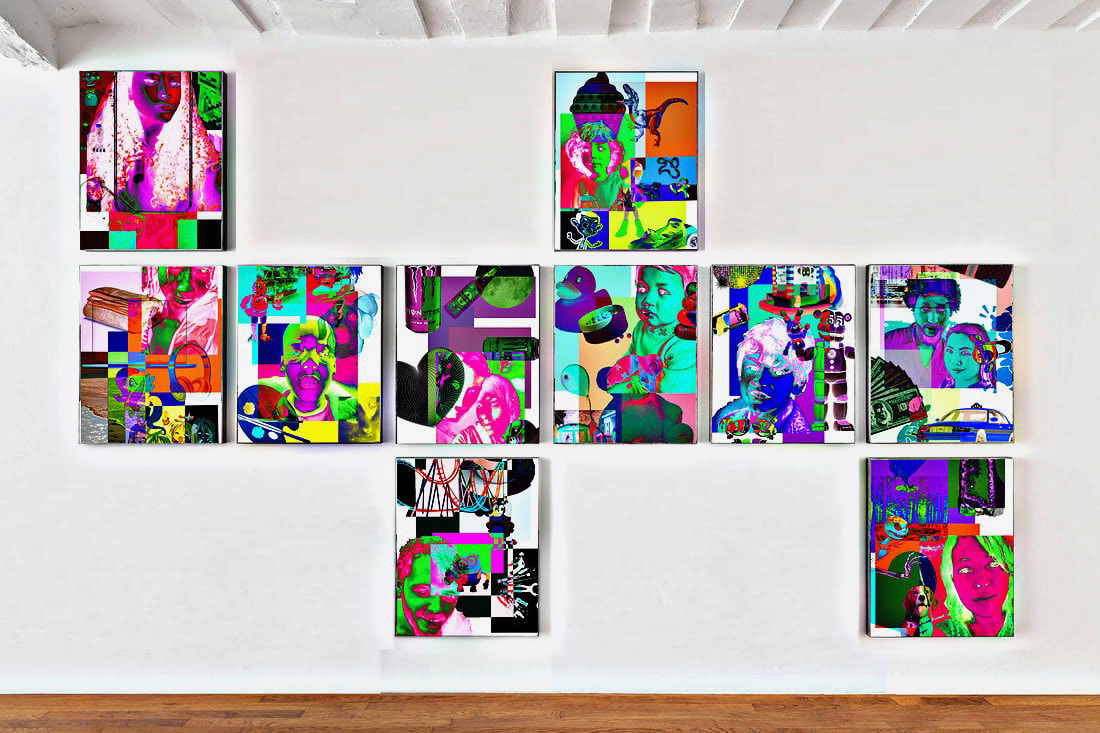
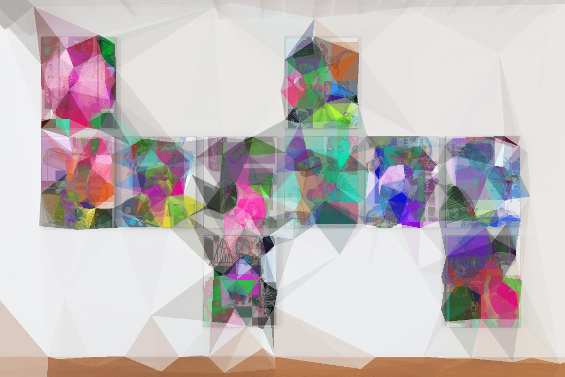
This is the original exhibition/installation image that I decided to use, it is from Bertrand Cavalier's website.
I replaced some of his images with my own digital collages by using the polygonal lasso tool and pasting my images in
This is the finished installation after I removed the excess images through the selection of plain parts of the image layered on top, as well as the blurring and colour matching of said layered parts.
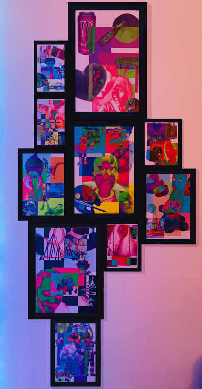
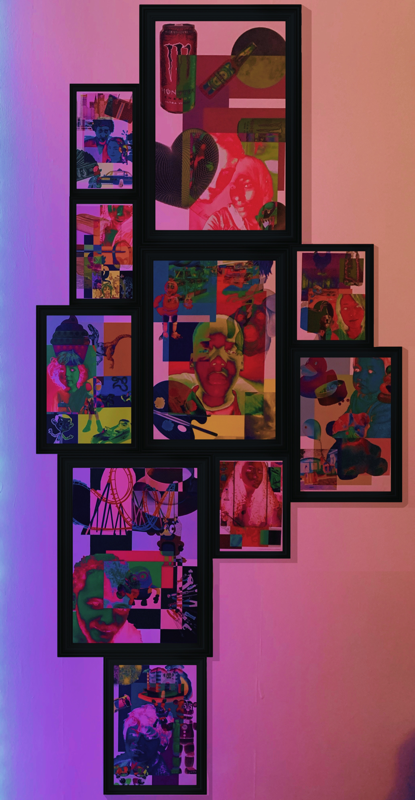
Evaluation: I definitely think doing this for the 3rd time using photoshop was the right move, this looks very believable and real compared to the other 2 attempts I did. I think the composition of this one is also much more interesting and clean, it's safe to say that I am very pleased with the outcome. The images, I feel look way more vibrant in this than they looked previously as well, which is a bonus. What i have taken from this is that I would like to try this same process again, on photoshop but with a more ambitious template, rather than just flat images on a wall. I also would like to bring a little more me into this piece and play around with this image in PicsArt, as I tend to do that for everything.
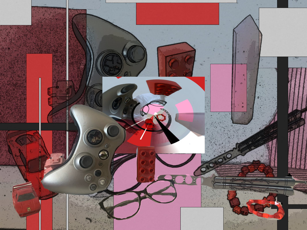
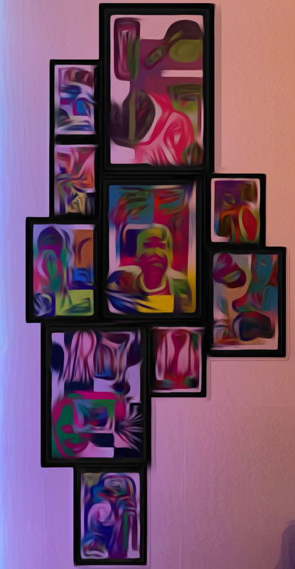
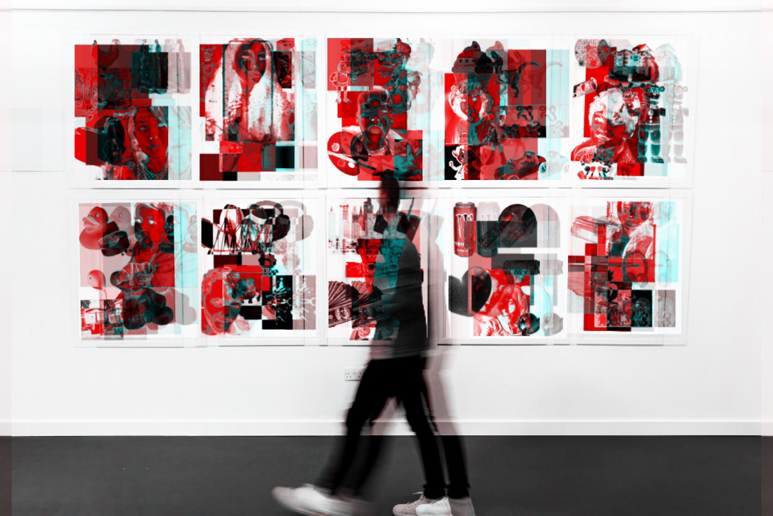
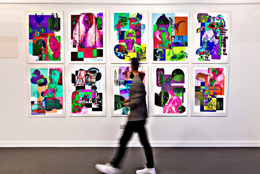
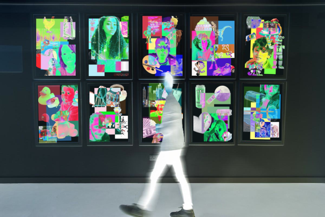
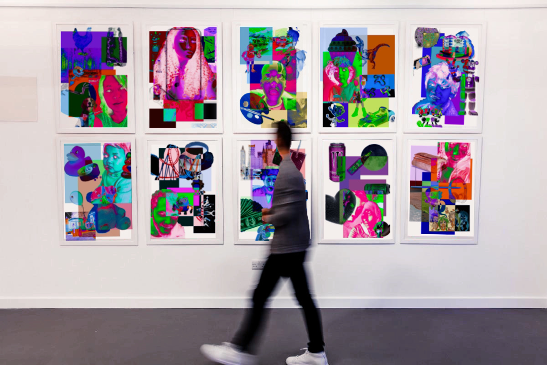
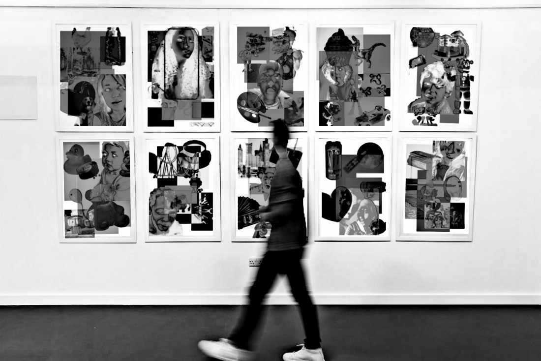
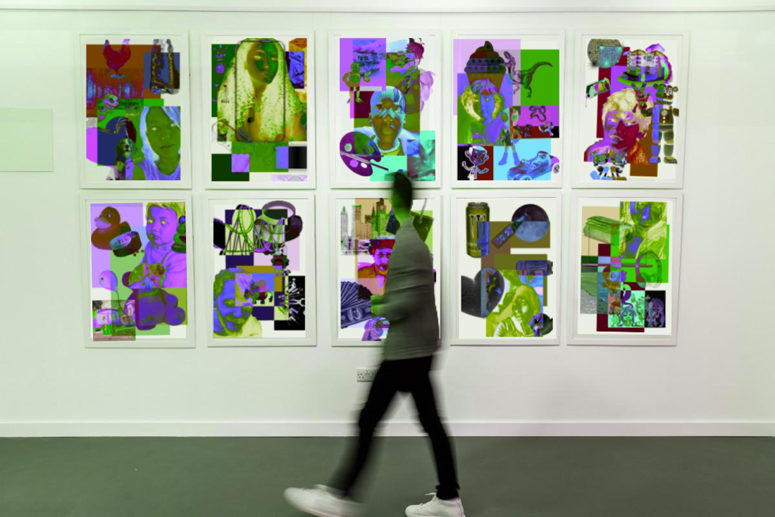
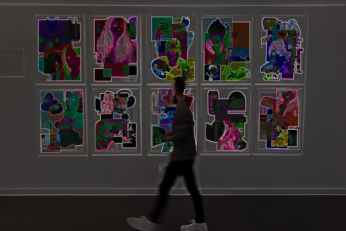
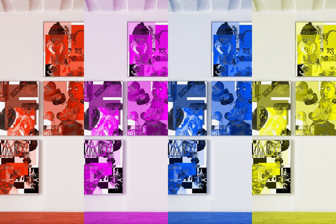
Playing around with PicsArt:
|
|
|


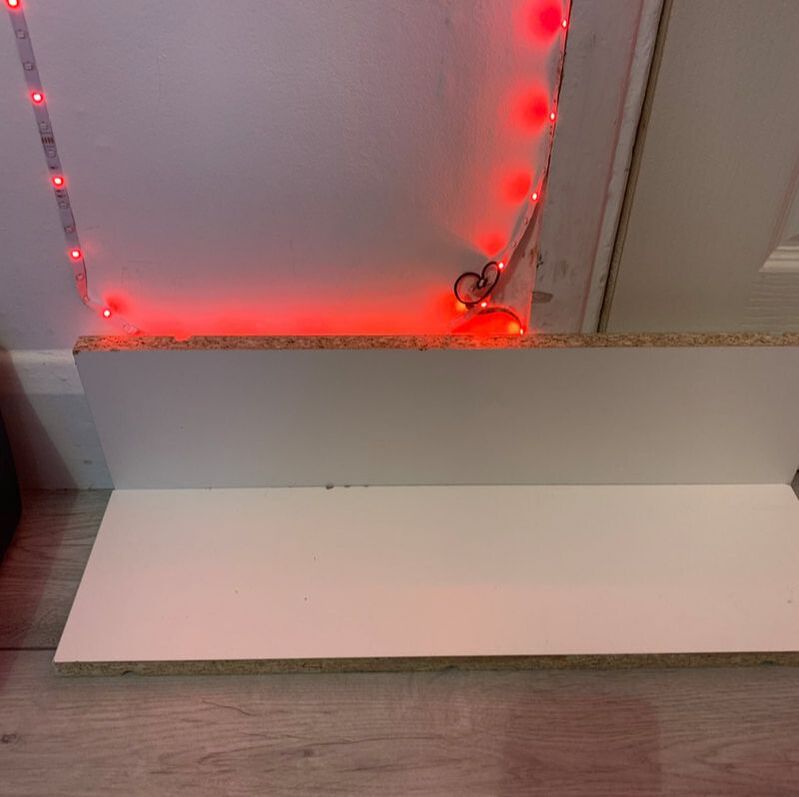
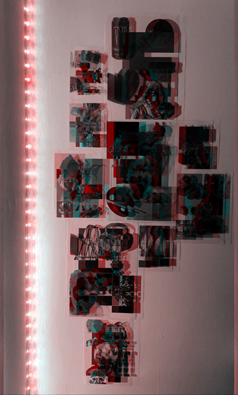
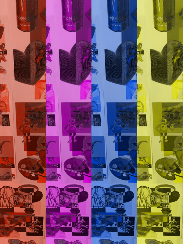
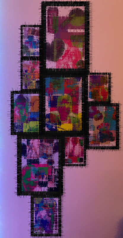
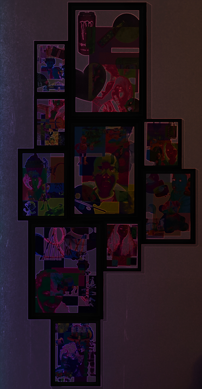
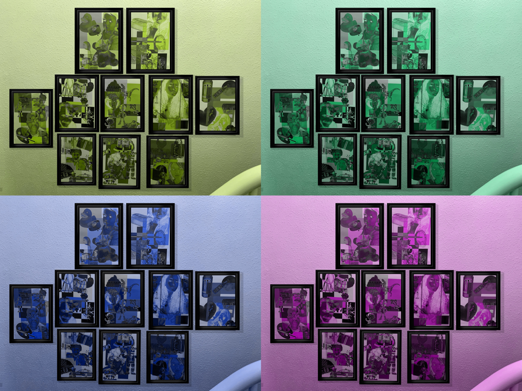
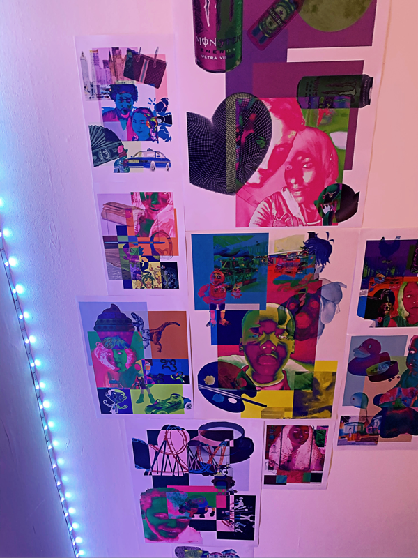
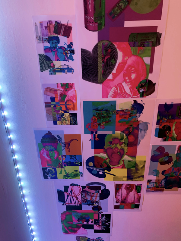
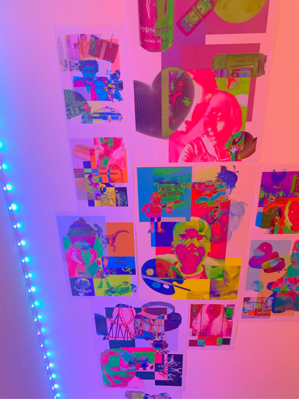
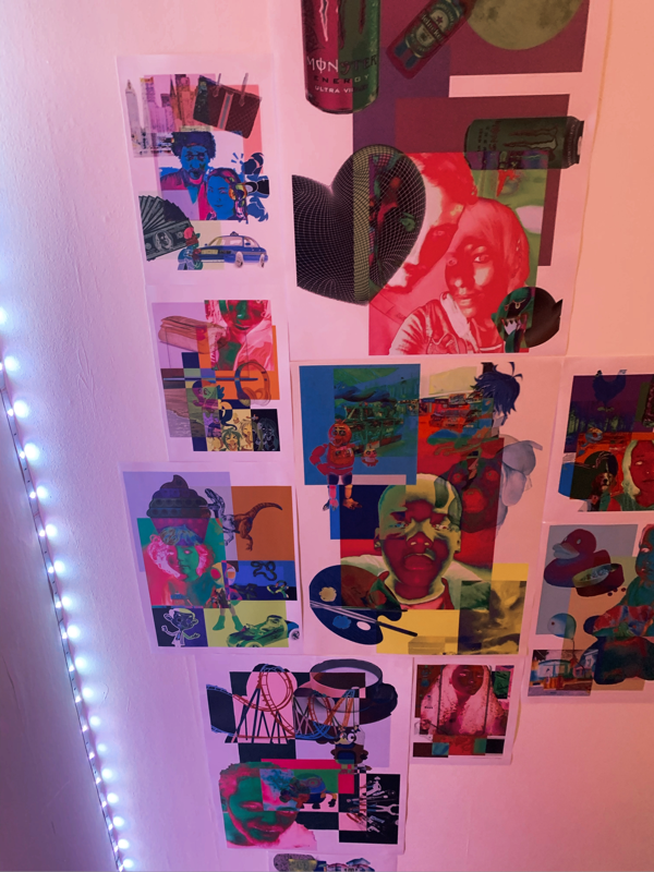
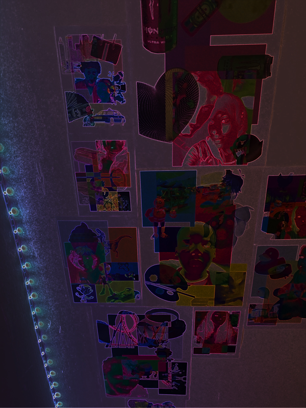
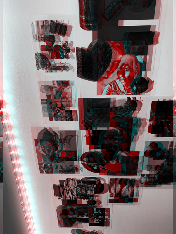
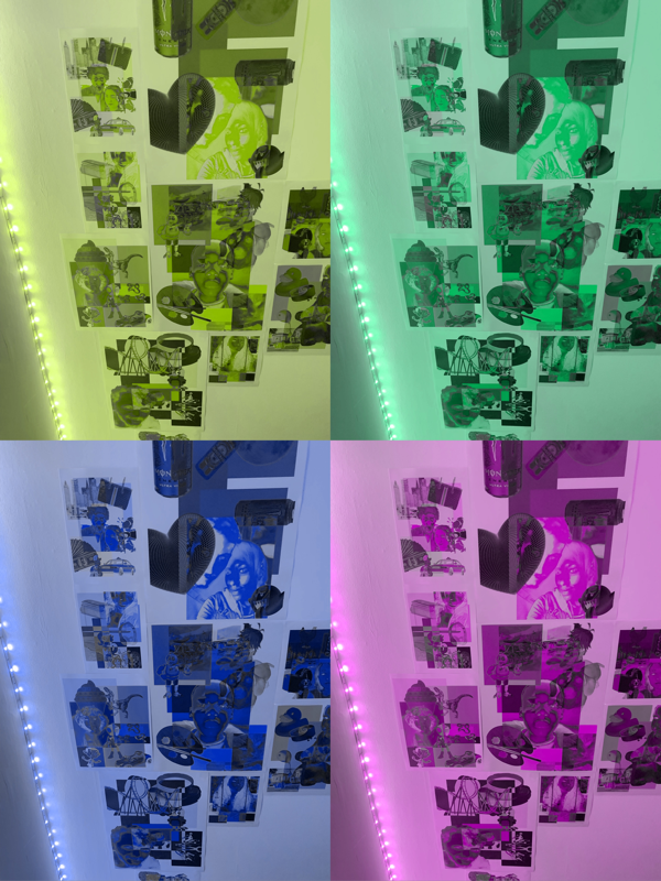
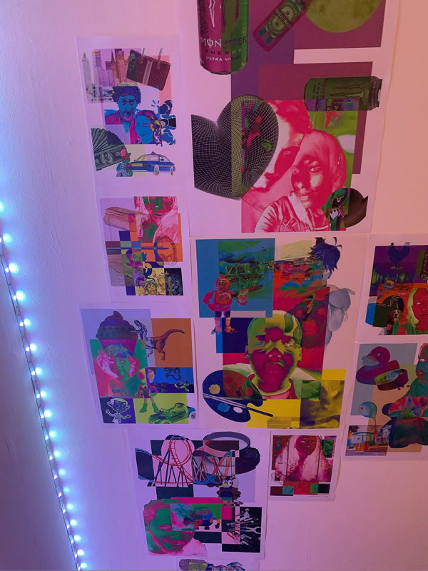
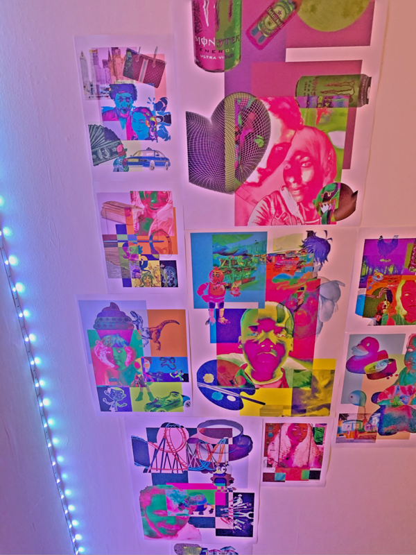
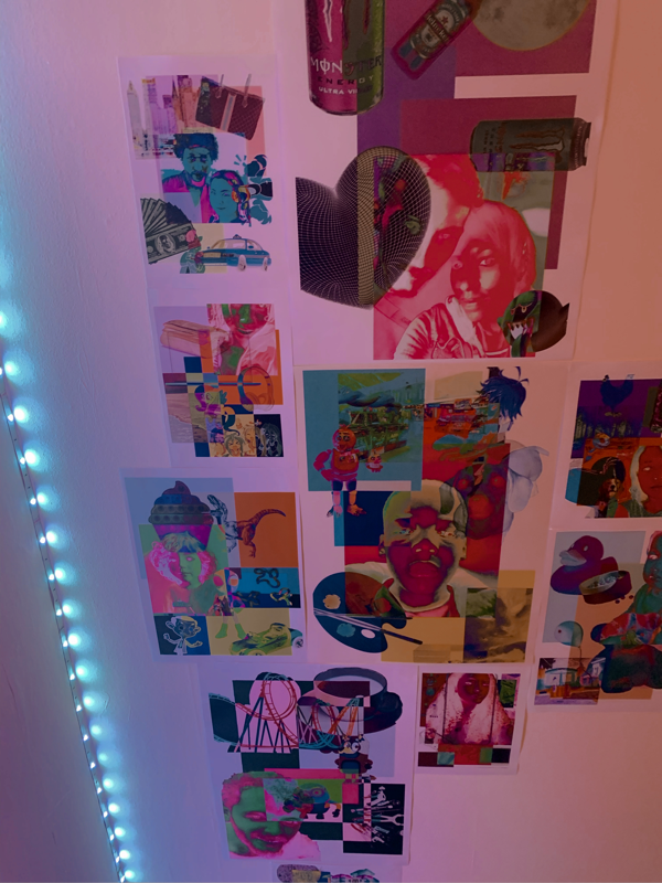
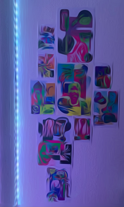
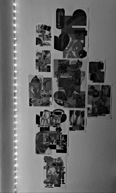
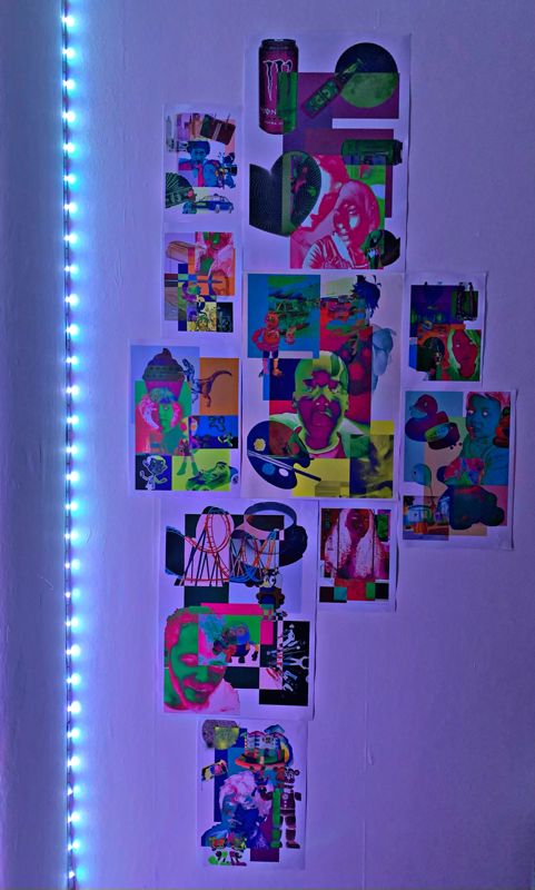
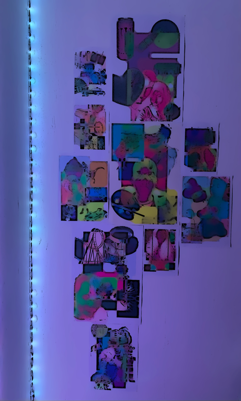
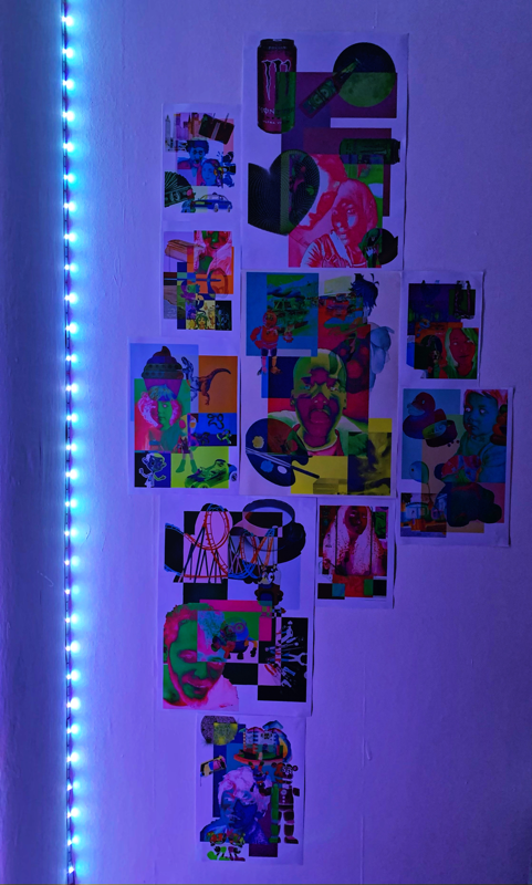
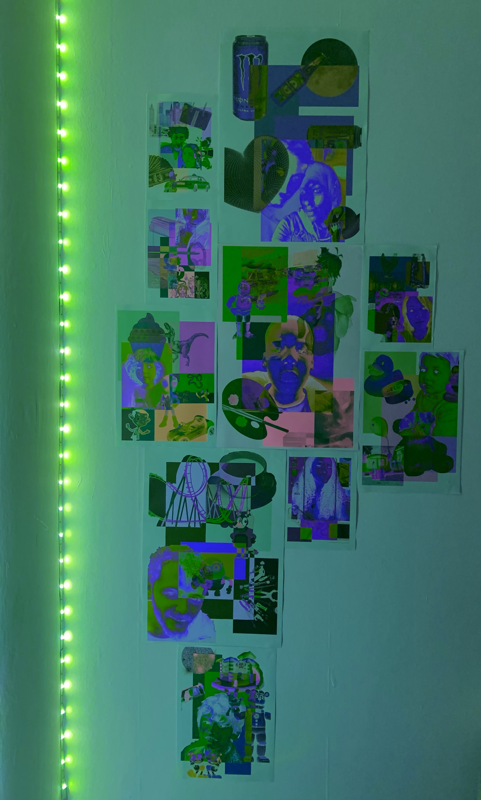
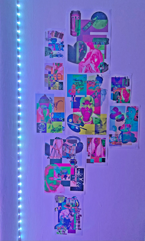
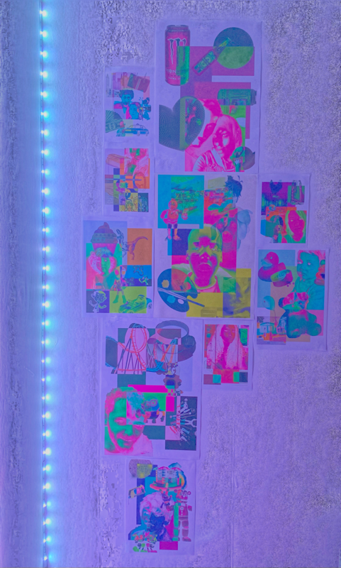
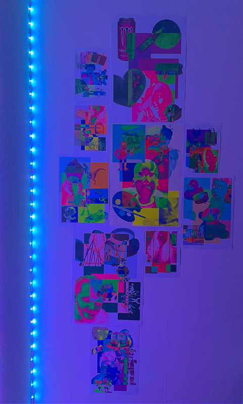
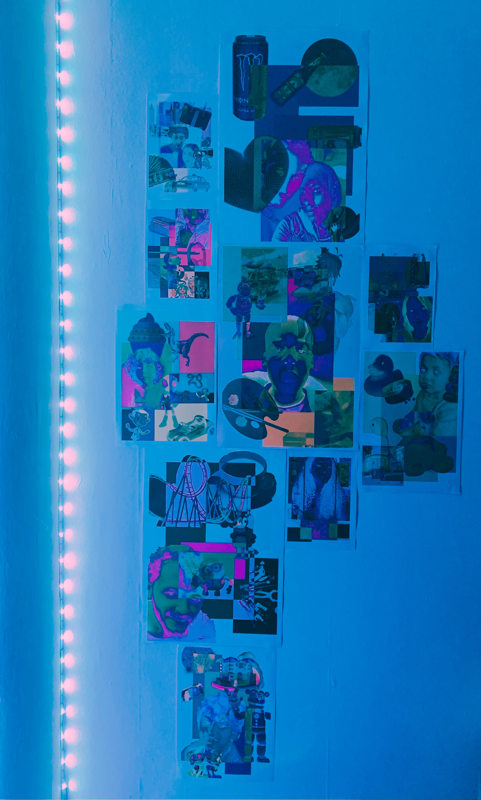
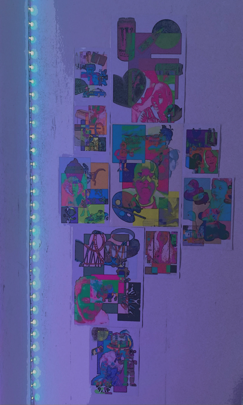
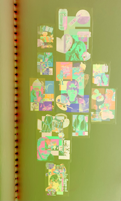
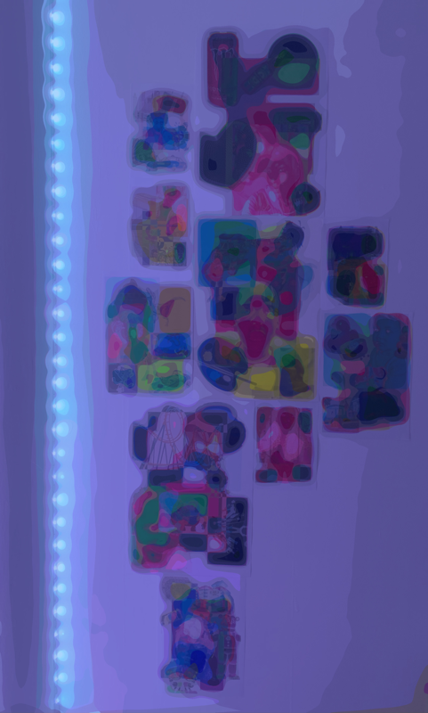
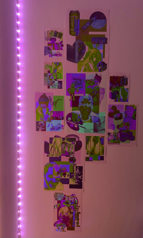
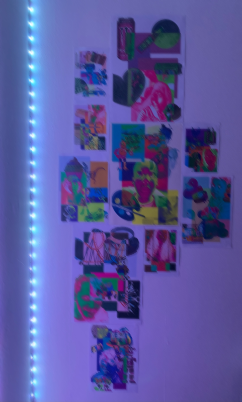
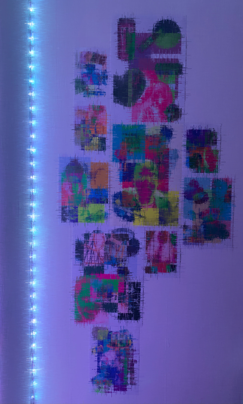
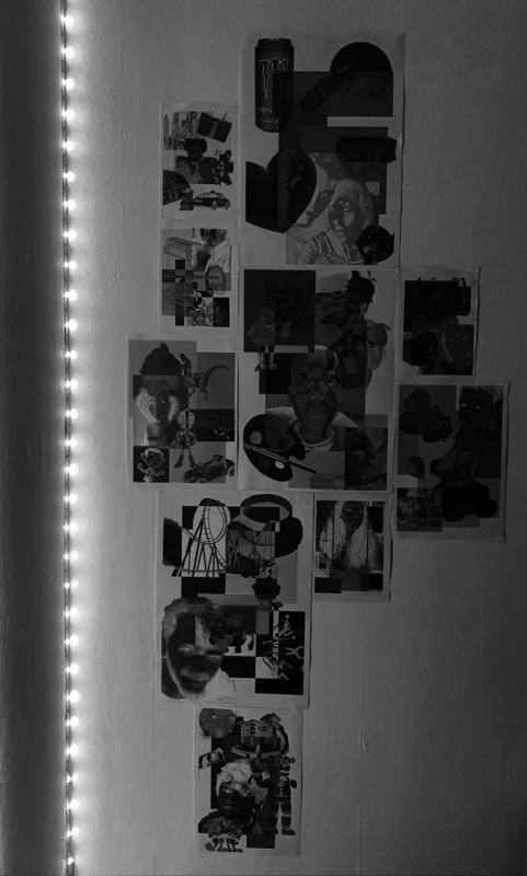
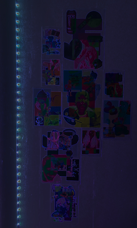
Playing With Light
|
WWW: The light definitely interacts with the images in a weird and interesting way. It was a fun process to carry out, I love flashing lights so to incorporate it into my very personal work, makes the work feel even more near and dear to my heart.
|
EBI: I think I could have maybe used a tripod, as it would make the framing more consistent in a way, and i would also like to maybe play with different types of lights as well, like torches, natural light, lamps, ring lights ect.
|
Drawn/painted on versions
|
WWW: I definitely think it was an interesting choice of development, which is always good as trying things out is a main component of photography. I also think the paint adds a select few of the images, it also creates an additional layer which aligns with my theme. The pen creates 'accents' to the images, which I think adds well to all of the images. This also feels more like physical work that i have created rather than digital (which I have done a lot of)
|
EBI: In quite a few of the images you can't tell that there is paint, or you can but it's not very effective in adding to the image in a positive way, so that was a bit of a fail but trying is important. I wish I had taken a bit more care as well, and spent a bit longer deciding the placements of the pen and paint and chose colours carefully. All in all I don't like this work nearly as much as the original images.
|
Mini Book
|
WWW: The layout is definitely reminiscent of Shirana Shahbazi's book which is what I was going for so that is a plus. The images look high quality and work quite well when side by side. The alternating between upside down and right side up is quite interesting as well, way more creative than everything being the right way up.
|
EBI: I wish the pages were easier to turn, as they get kind of out of place when trying to look through the book but that is because it is just paper and doesn't have a spine like her book does. Other than that, I quite like how this piece turned out.
|
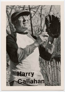
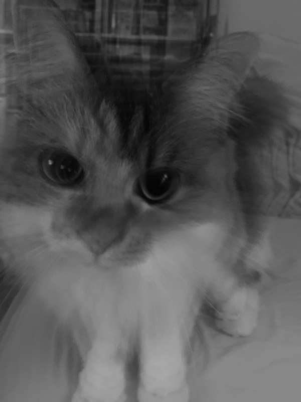
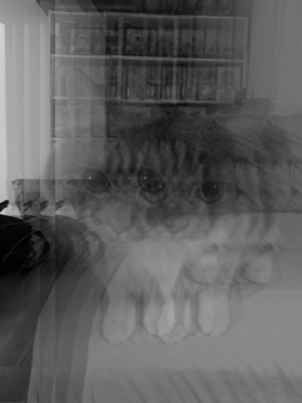
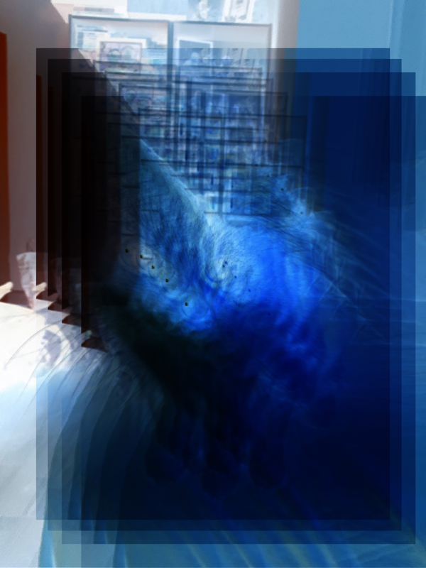
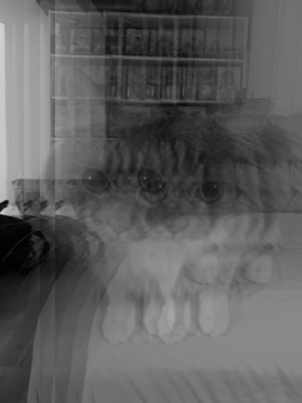
Harry Callahan
Harry Callahan is not the most influential or inspiring photographer, in terms of layers. However he does have 2 photographs that have a doable process that I think would be a fun to do as a little side quest, nothing monumental or ground breaking - just simple and basic.
|
Harry Callahan (Oct 22, 1912 – Mar 15, 1999) was an American photographer. Callahan was quite successful, he has done solo exhibitions, his work has been featured in museums, he even received multiple medals because of his photography. Callahan was a bit of a weird photographer in my opinion, he left almost no written records behind. He mainly worked in black and white, photographing the world around him; people, buildings, nature ect. Form what I have gathered, his photographic method was to go out almost every morning, walk through the city he lived in and take numerous pictures. He then spent almost every afternoon making proof prints of that day's best negatives. |
The Images that I take inspiration from:
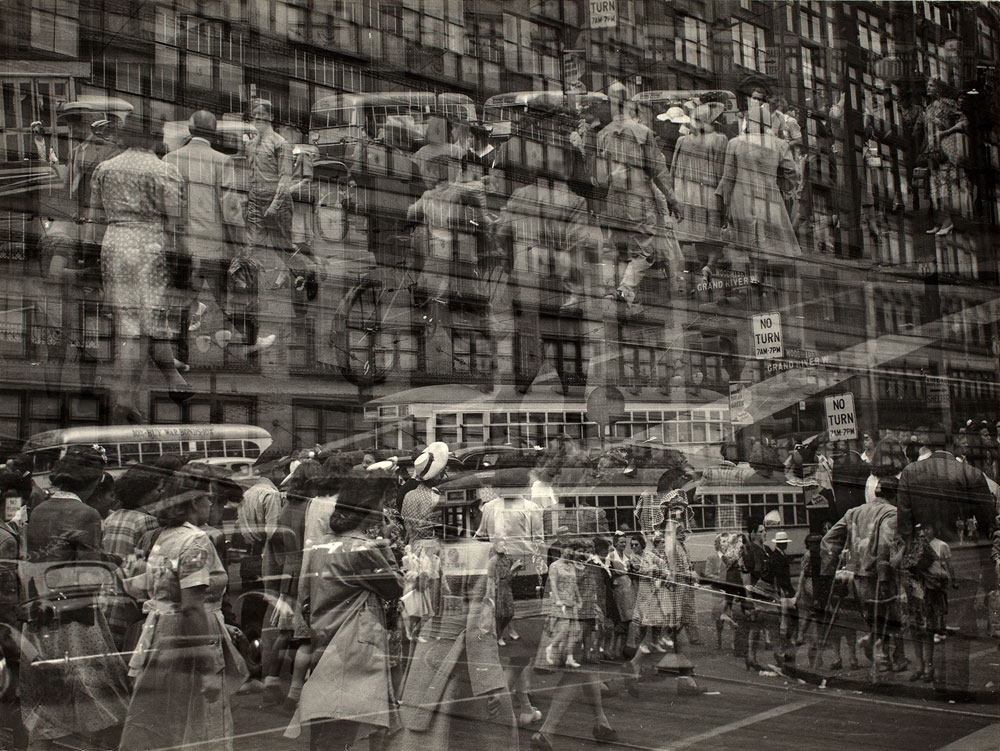
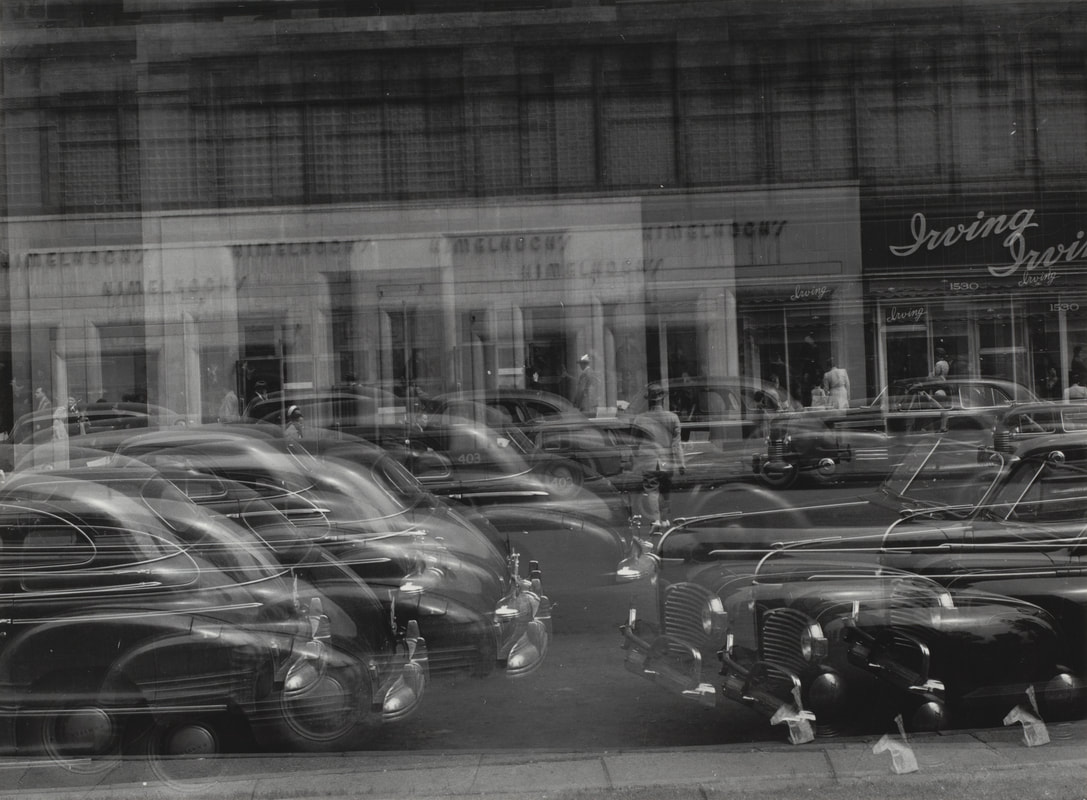
I like looking at these images, the composition is good, it feels very full, the detail is prevalent and the black and white aspect always makes for great contrast. As well as that this accurately represents simplistic layering, it is just the same photograph layered on top of its self multiple times. It's very simple but interesting to look at and I think I could make an interesting response to these both digitally, and by using his process of developing negatives.
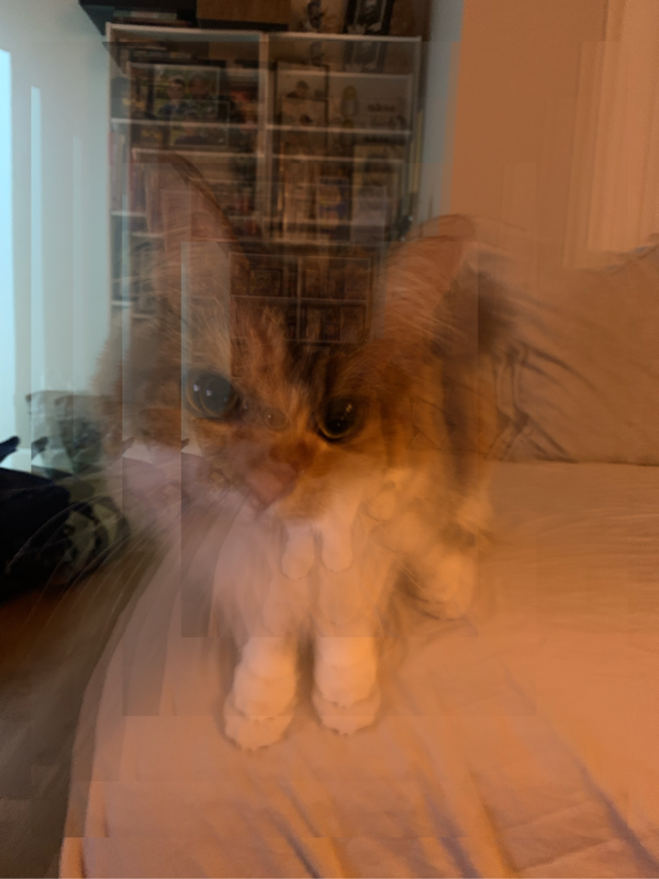
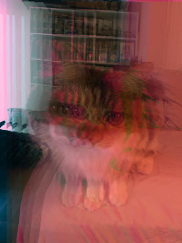
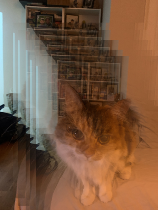
My Edited Response:
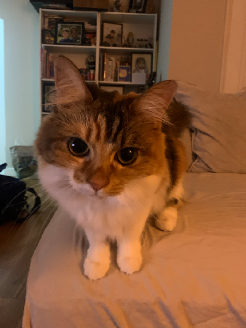
The Original Photograph
The process (on Picsart)
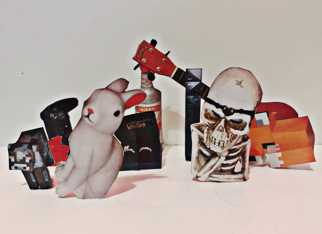
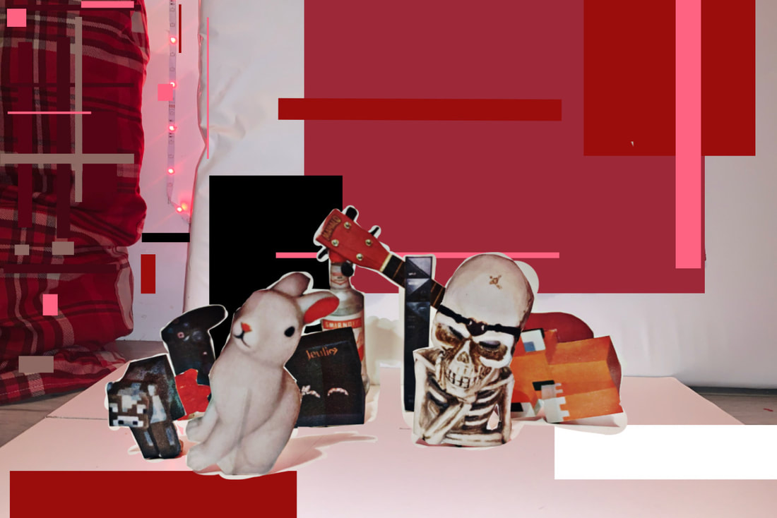
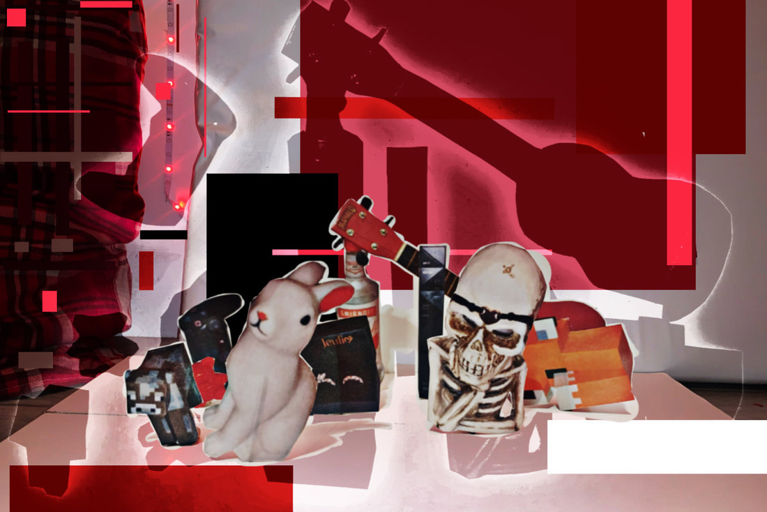
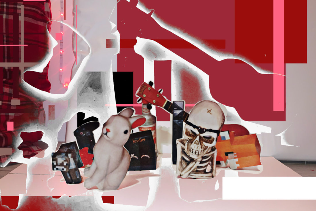
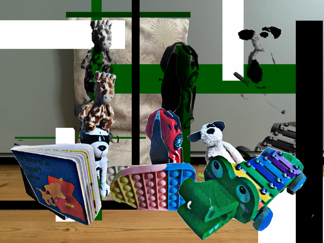
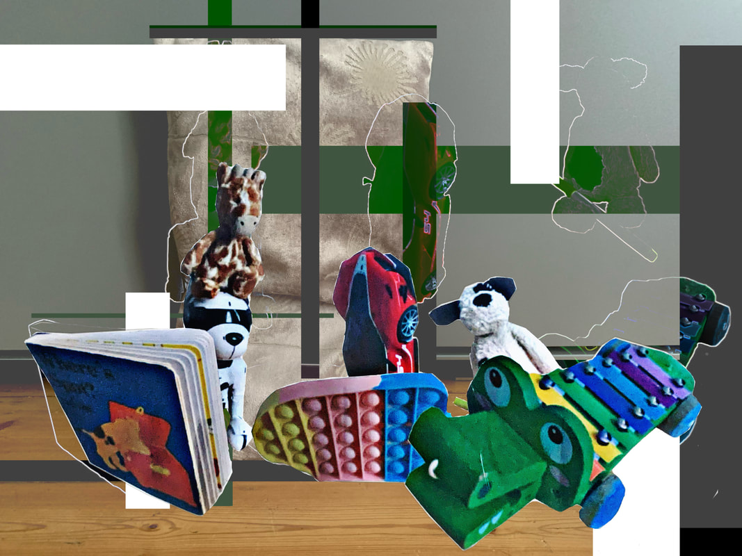
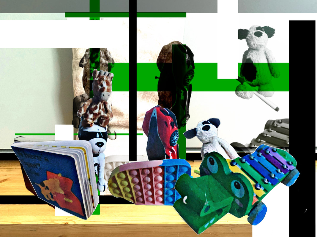
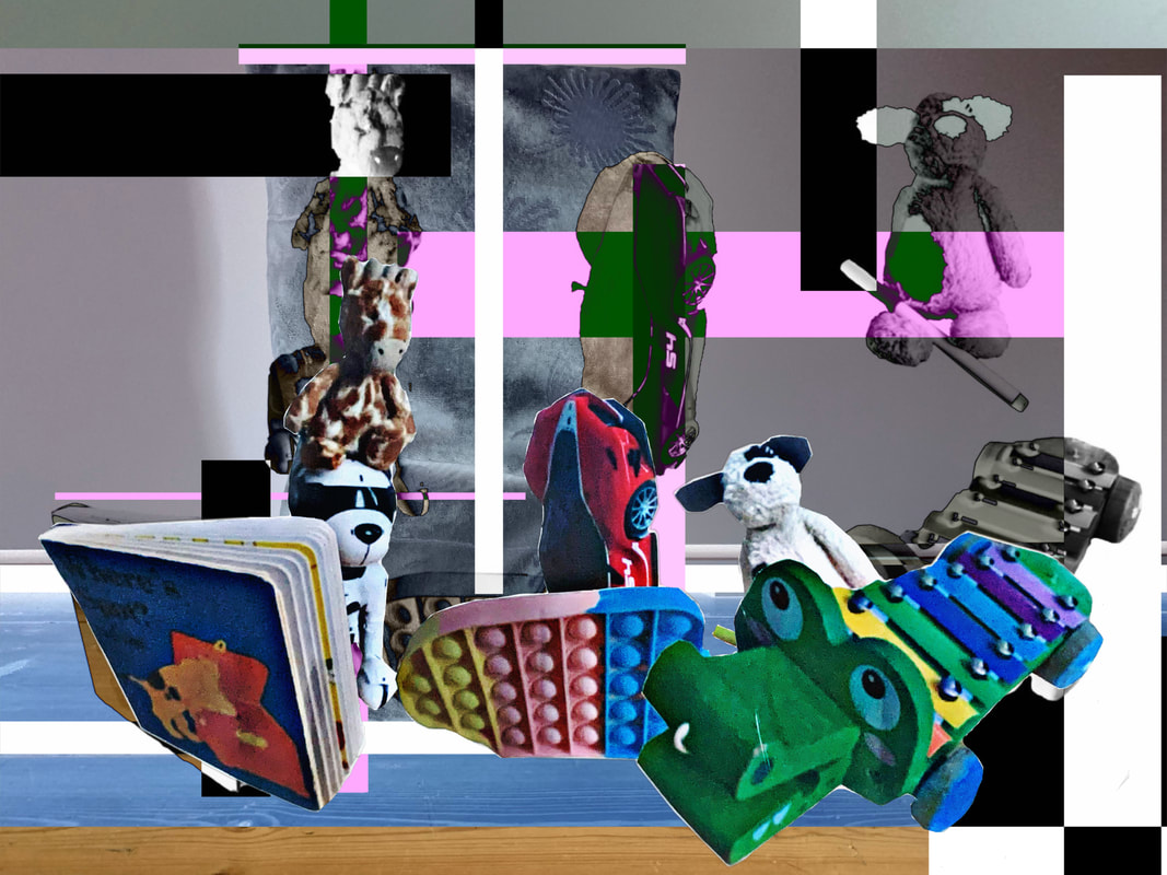
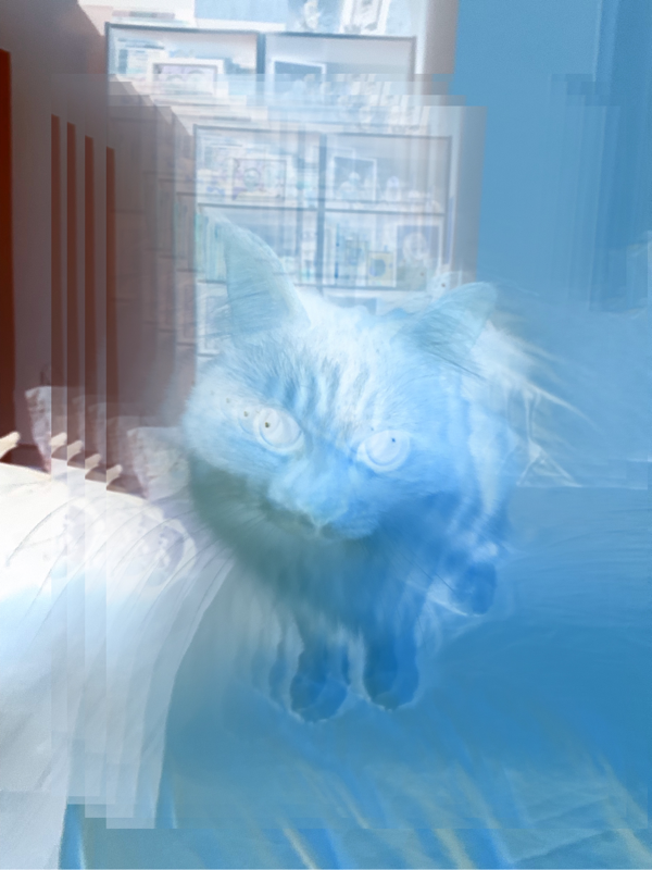
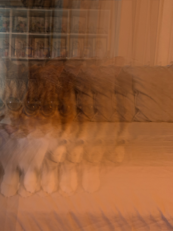
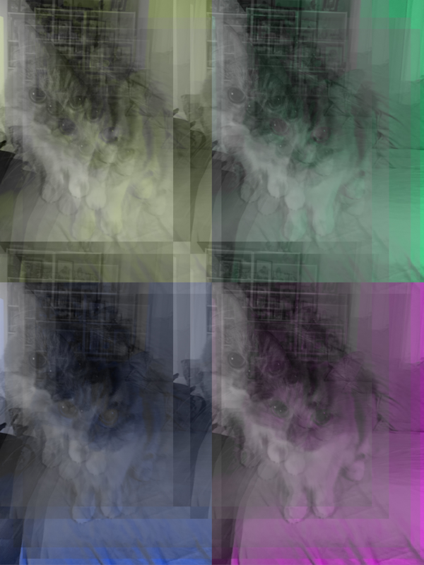
The Products
|
WWW: Again this feels very much like my work, and it feels very personal as that is one of my favourite cats in my family, the living room that its taken in has a lot of memories and the photographs and trinkets in the back have deep connections and meanings. In terms of the photographs I liked that I tried something different for each one, in terms of the composition/colours. I also like how I included the much more questionable and weird/ugly images that I would usually discard of, but I think I have come to terms with the idea that you have to show all the process, good and bad.
|
EBI: I don't think it gives off the same vibes as the images that I was inspired by, I don't know if it due to the fact that I did this digitally and he created the layers physically, but I am going to assume that is why.
|
The best image in my opinion
Evaluation: This image feels like the most successful to me due to it being the most reminiscent of the Harry Callahan images that I was inspired by. I also am very partial to a black and white photograph, I feel it just gives a whole new level of depth and tone that a coloured image could never bring. I wont lie, I also enjoyed how easy the process of this image was, it was very basic, just a black and white filter with layered images that shift slightly right every image - less than 5 minutes to create. I also think it just looks very clean cut (despite being a layered mess), which is one of my favourite aspects of images, i don't like the chaos unless it looks organised.
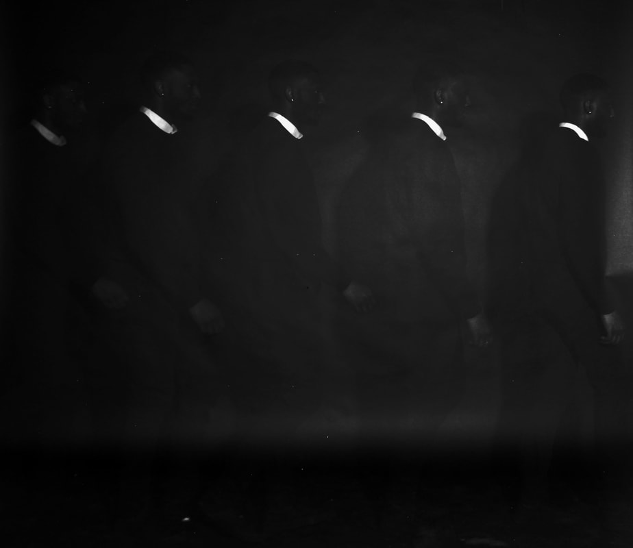
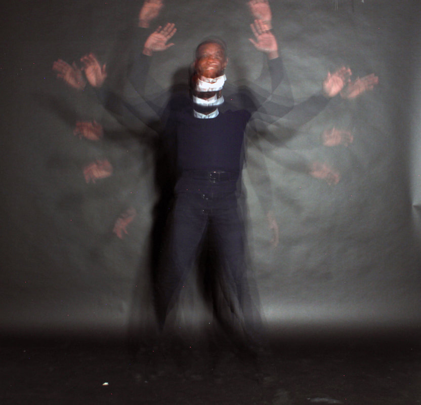
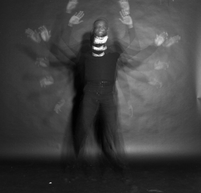
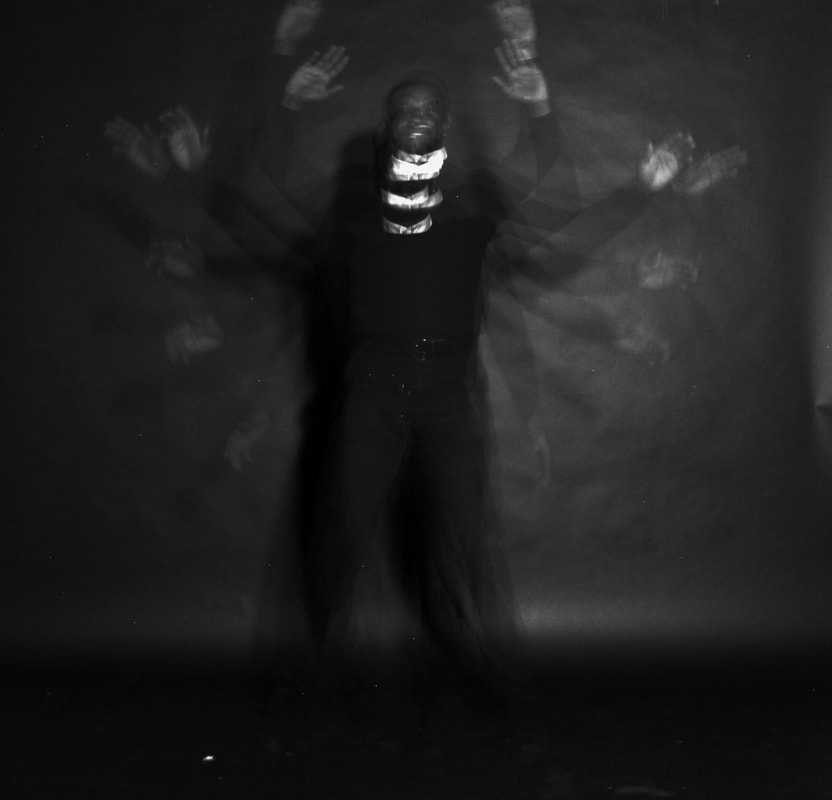
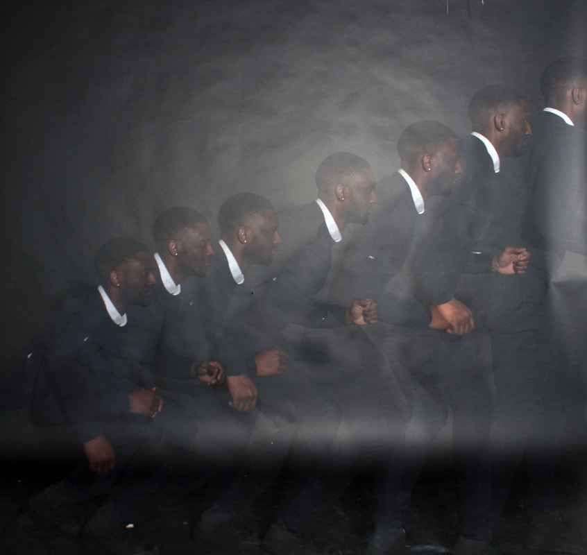
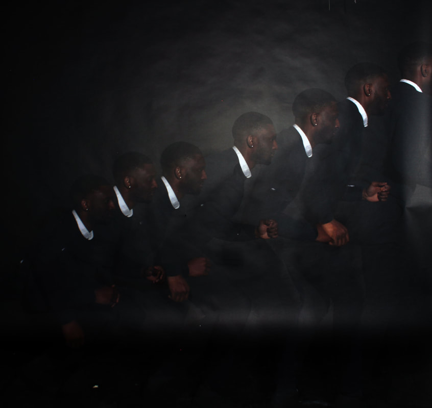
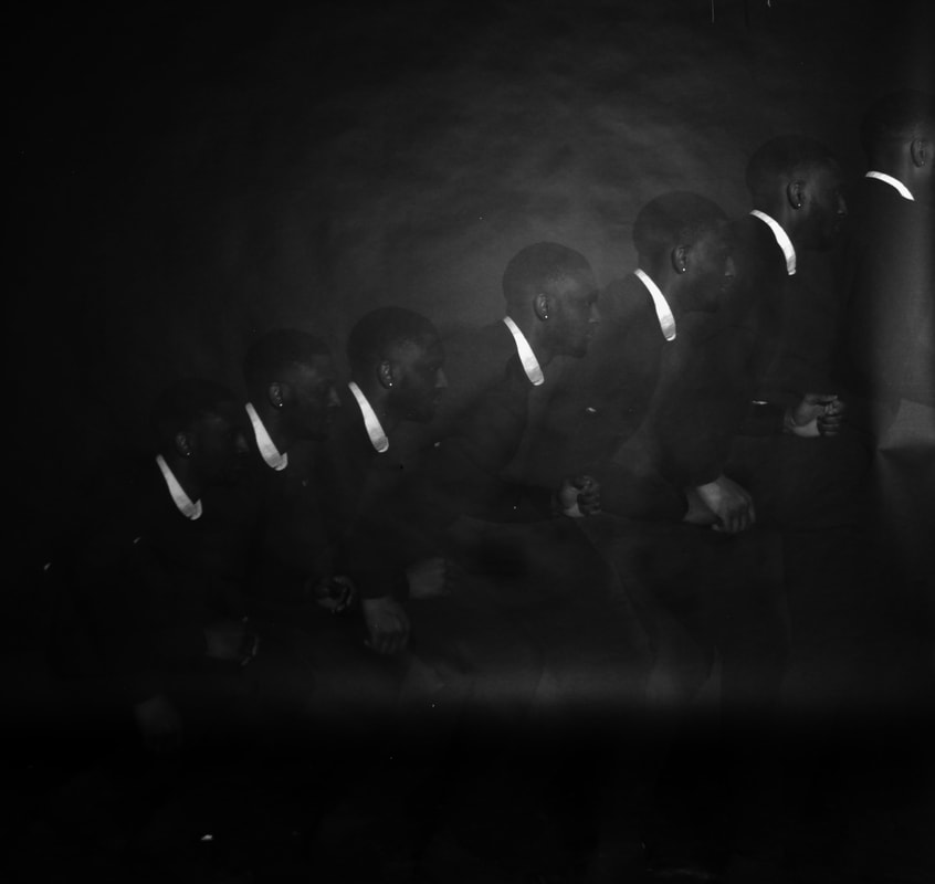
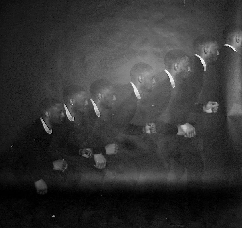
Gjon Mili
I decided to look at Gjon Mili because his work seemed to interlink with Harry Callahan's work (whom I previously looked at) very well, so I thought researching and responding to him would act as a sort of development.
|
Gjon Mili was a self-taught Albanian photographer from November 28, 1904 to February 14, 1984, who mad a name for himself in America. Gjon Milli is best known for his work published in Life Magazine, in which he photographed many artists including the very famous Pablo Picasso. His photographs of Pablo Picasso playing with light were the main images that he was know for. Since the 1930s, Mili used a "rapid-firing sequence technique in his photography, which allowed him to catch multiple images in a single frame" according to his Contessa Gallery biography. His photographs showcase the movement of dancers, athletes, and musical and theatrical performances. |
|
The work of Gjon Mili's that I found the most relevant/interesting:
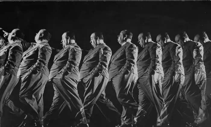
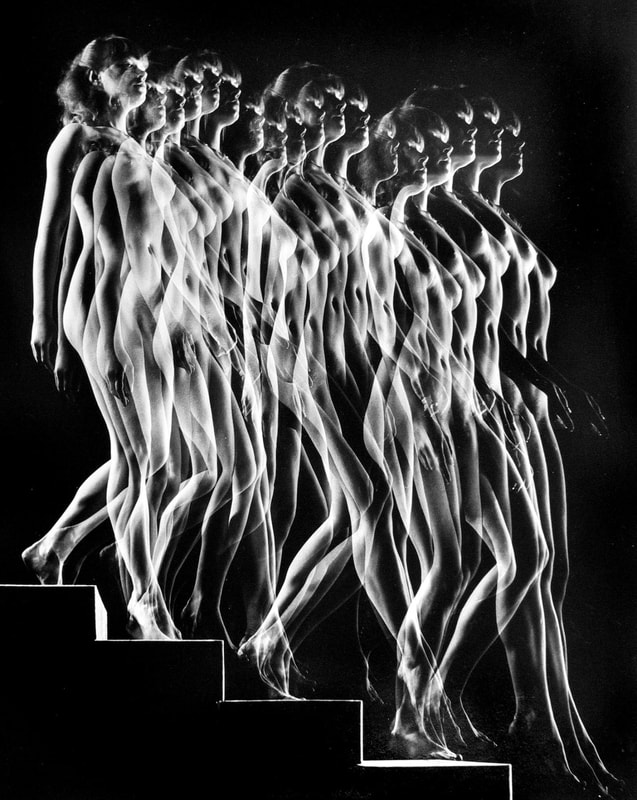
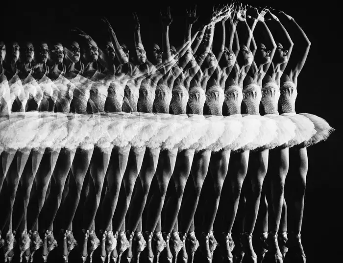
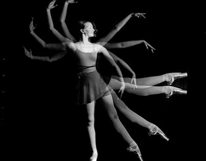
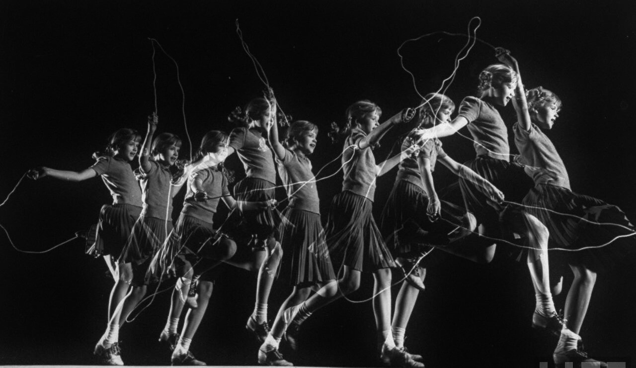
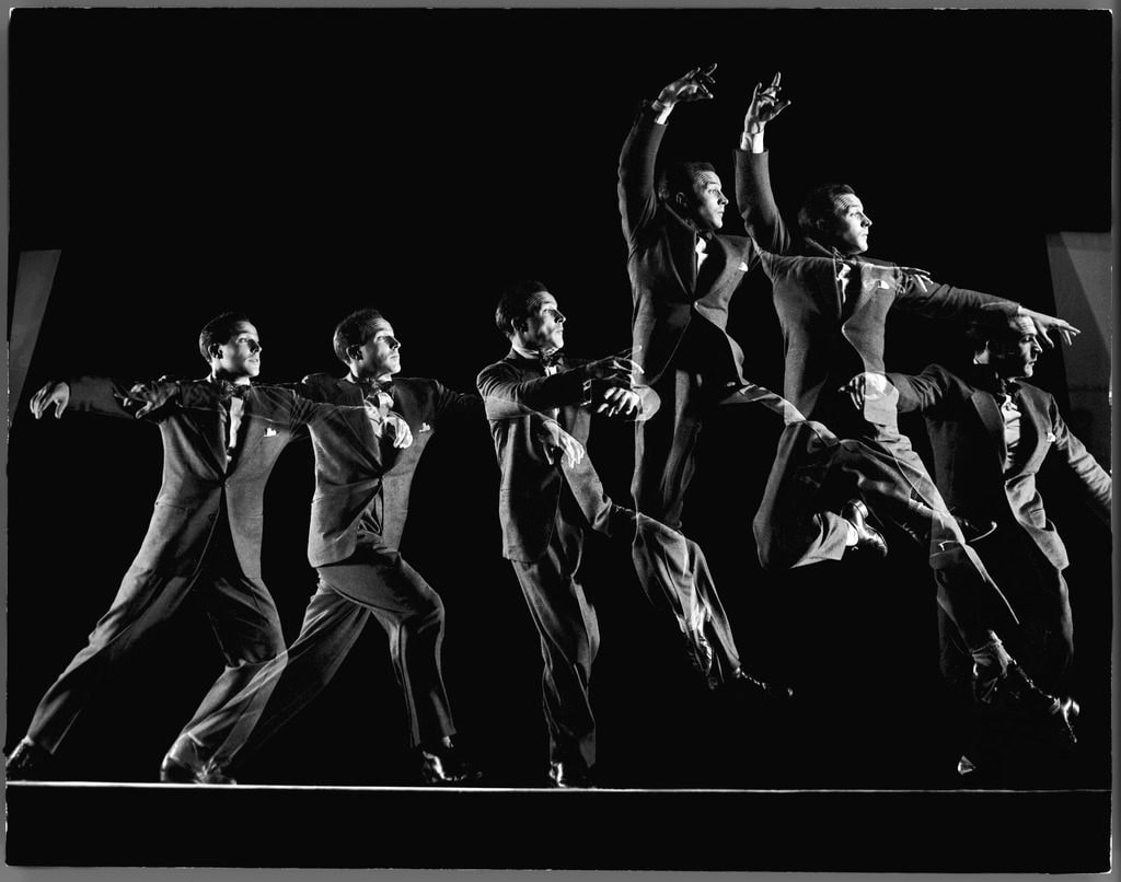
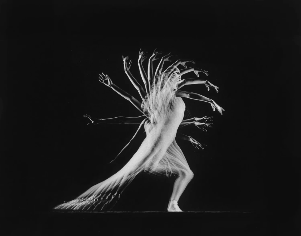
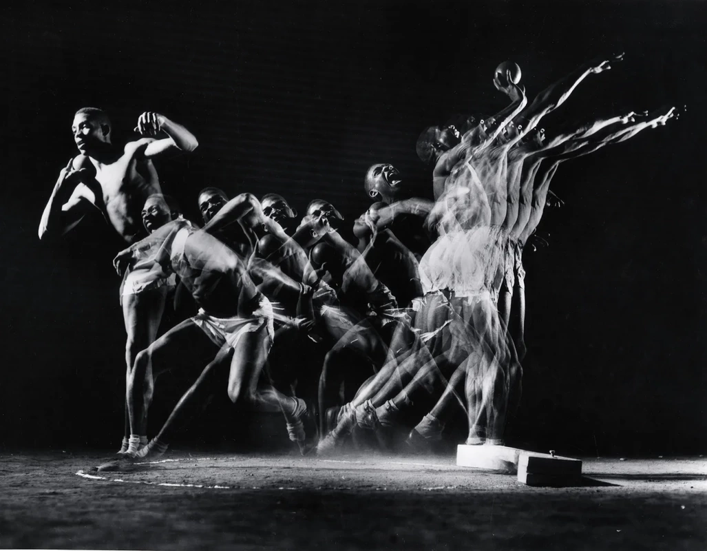
Thoughts that come to mind when looking at his work:
- water like
- smooth
- repeated
- contrast
- monotone
- action
- movement
- captured
- water like
- smooth
- repeated
- contrast
- monotone
- action
- movement
- captured
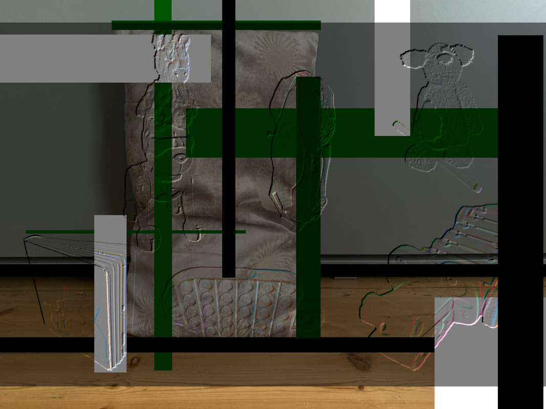
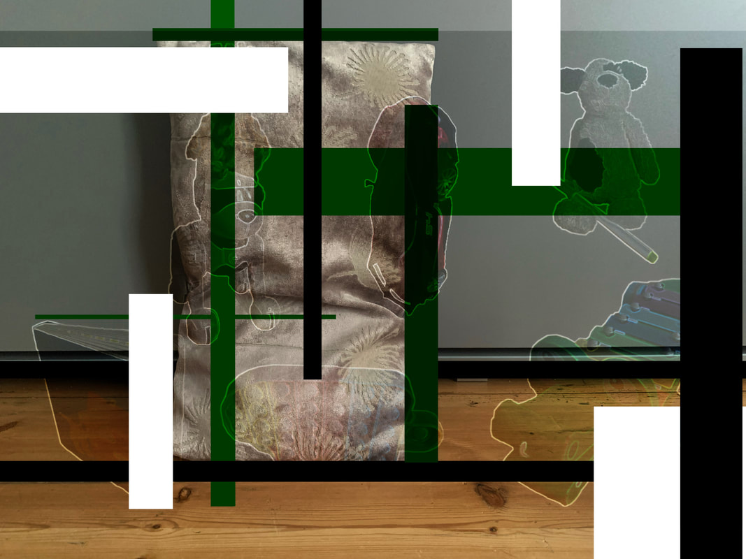
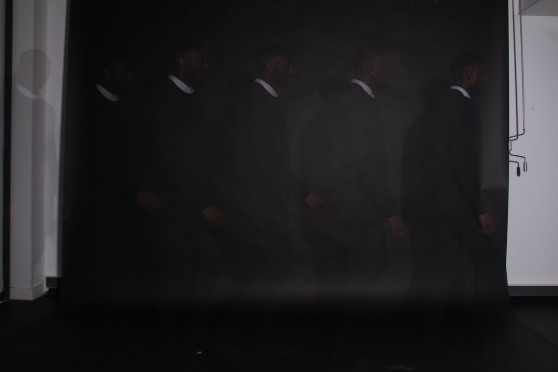
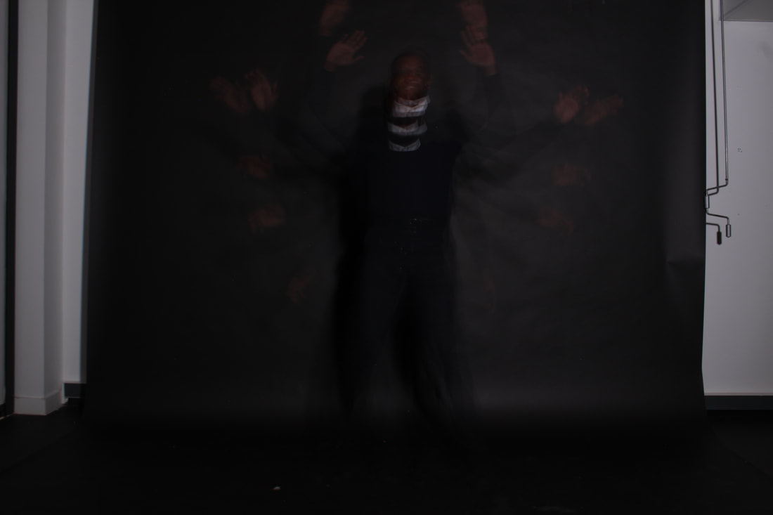
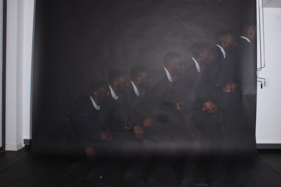
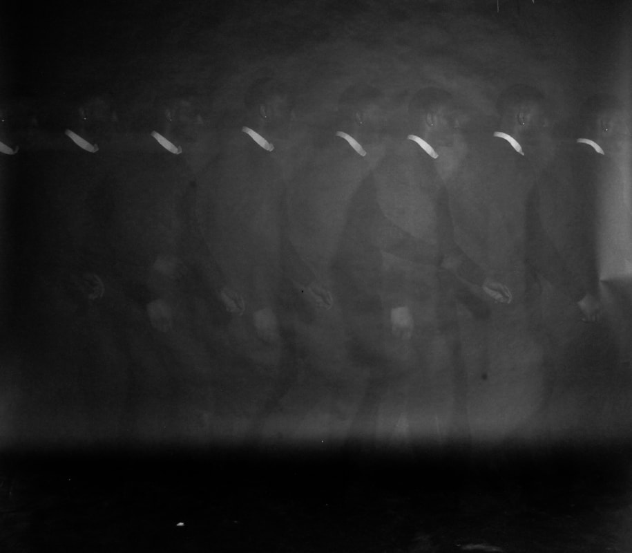
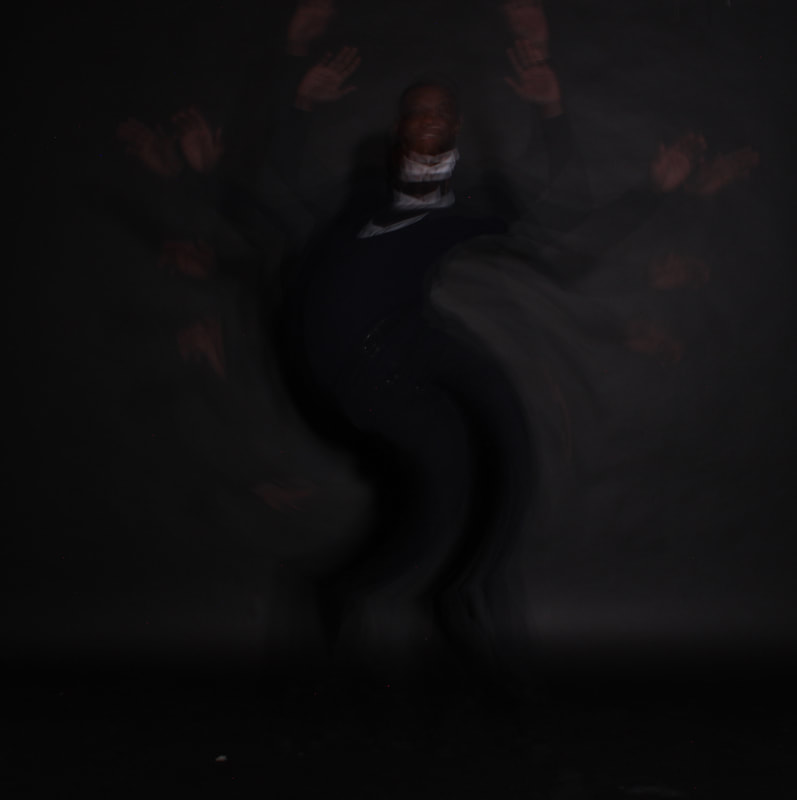
The set up for this experiment was relatively basic, I blacked out the classroom, and brought down the black backdrop. The studio light was set atop a table pointing towards the black backdrop and the camera was placed on a tripod, angled how I saw fit and changed the setting to suit the images I was trying to capture.
Test images to get the shutter time and ISO right:
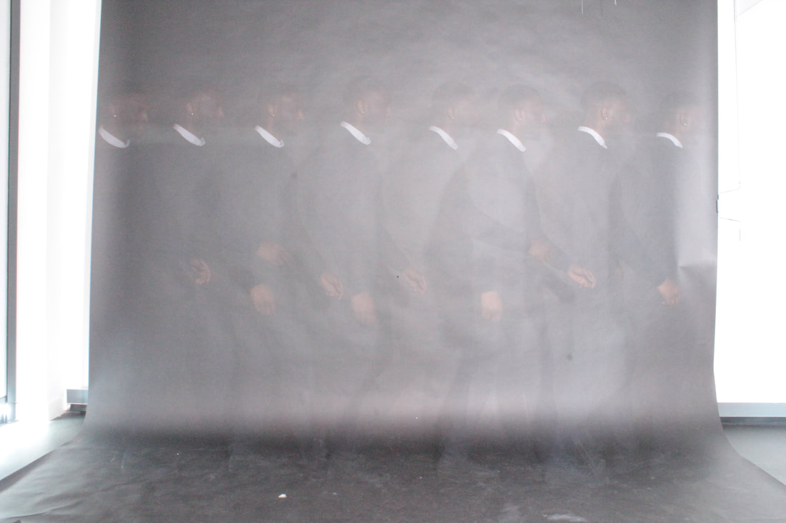
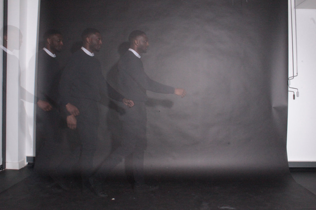
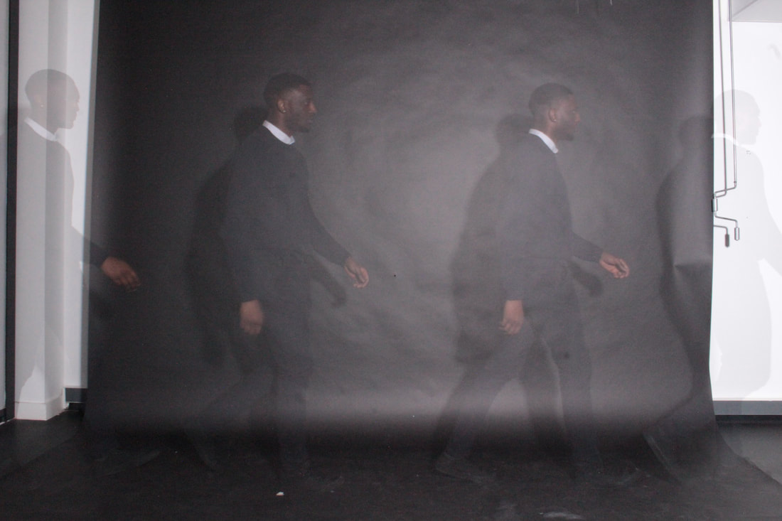
I ended up settling on 8 seconds for the shutter time and I put the ISO on the lowest setting possible.
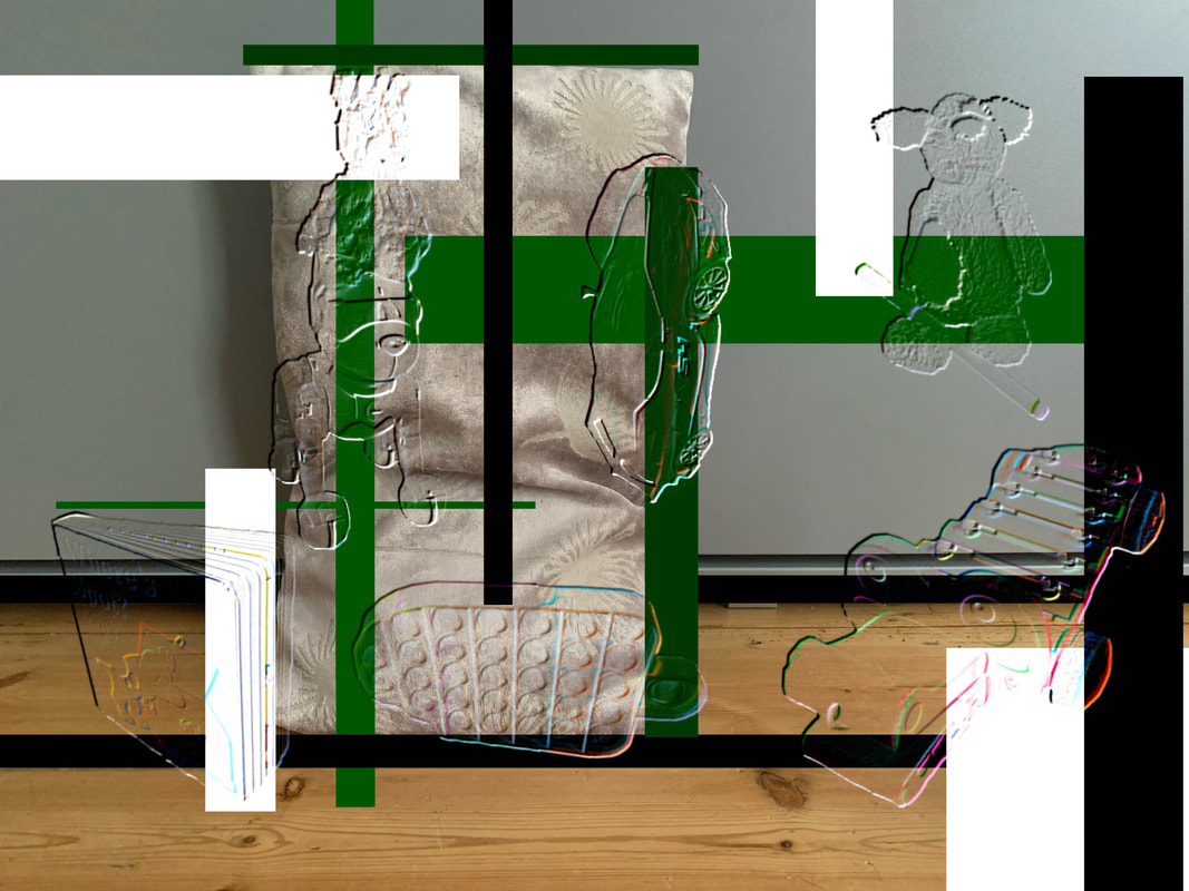
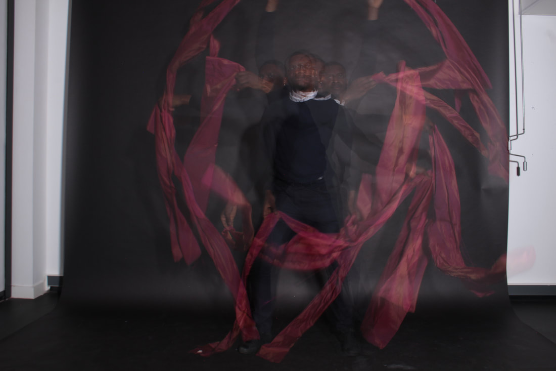
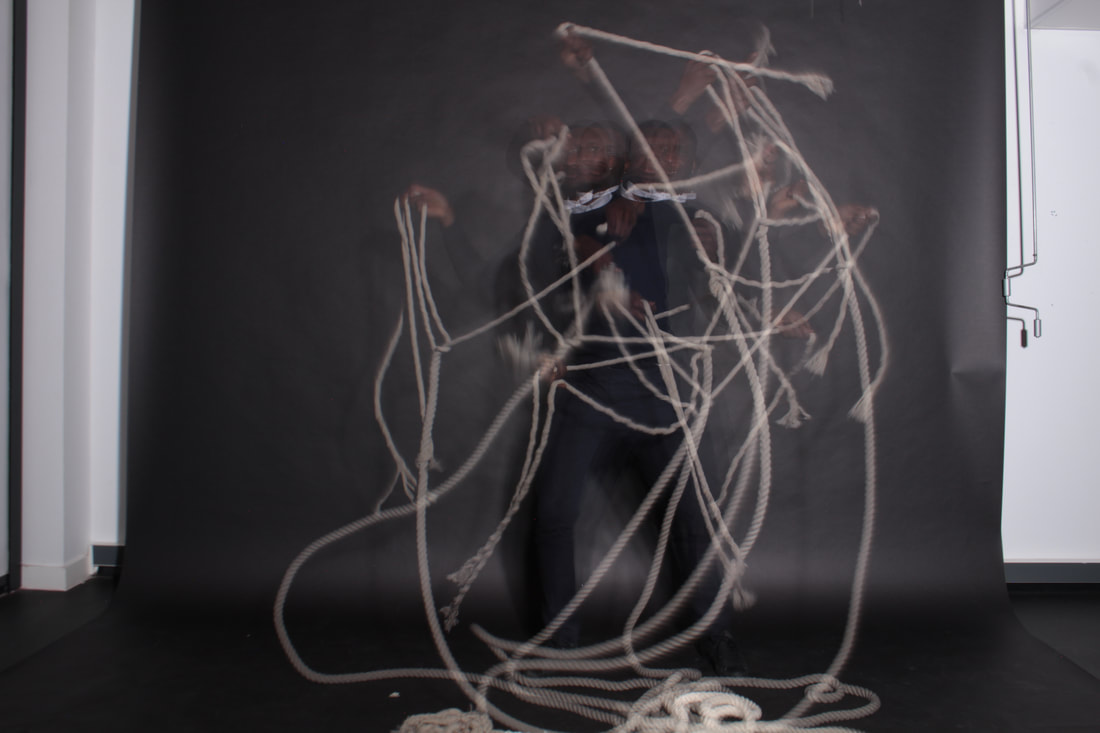
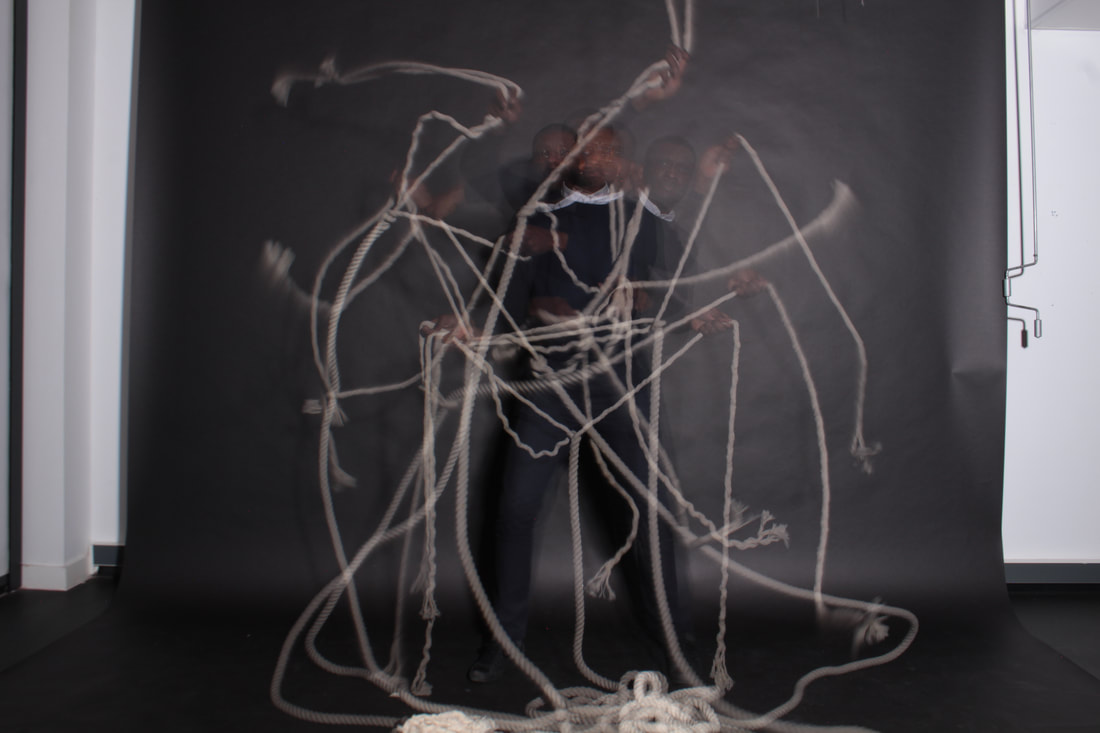
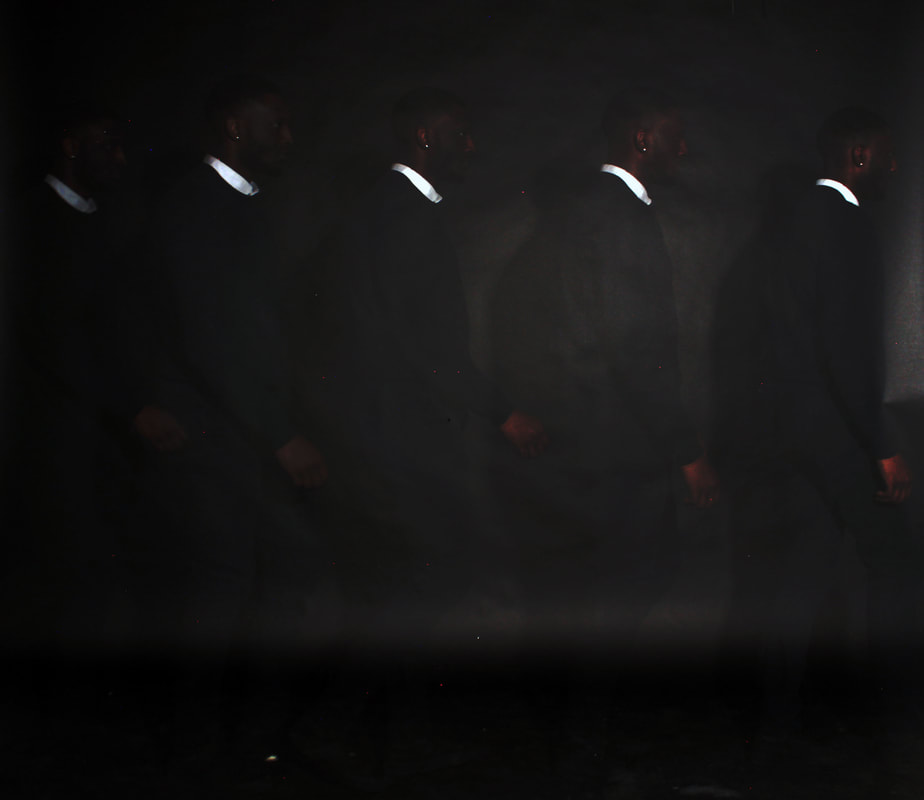
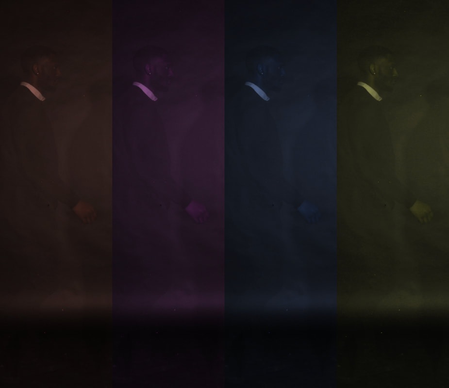
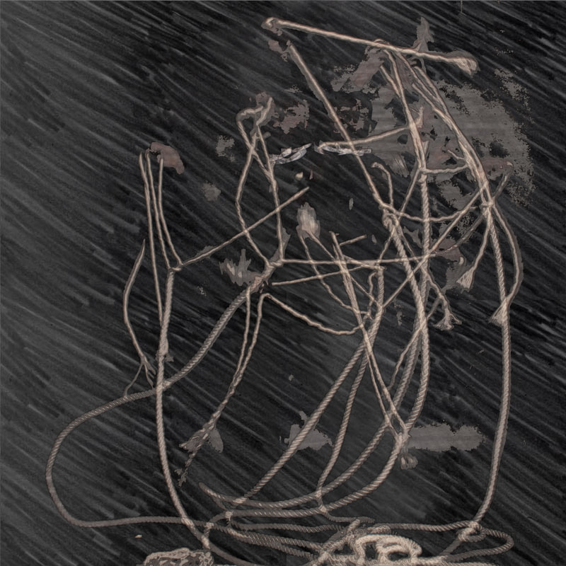
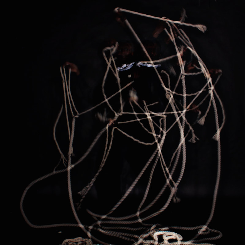
My unedited response:
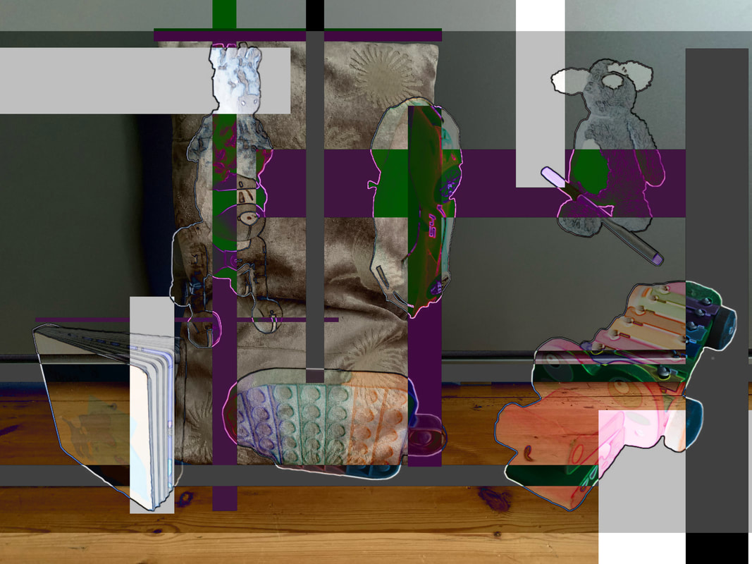
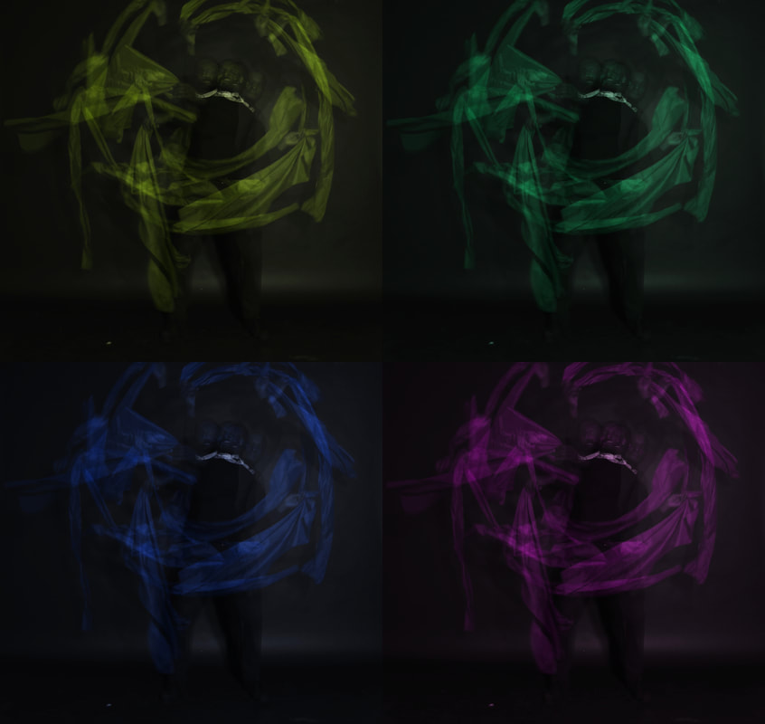
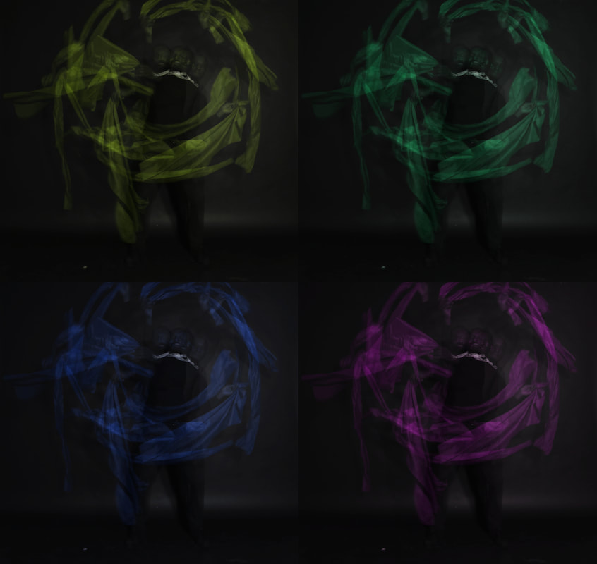
Editing:
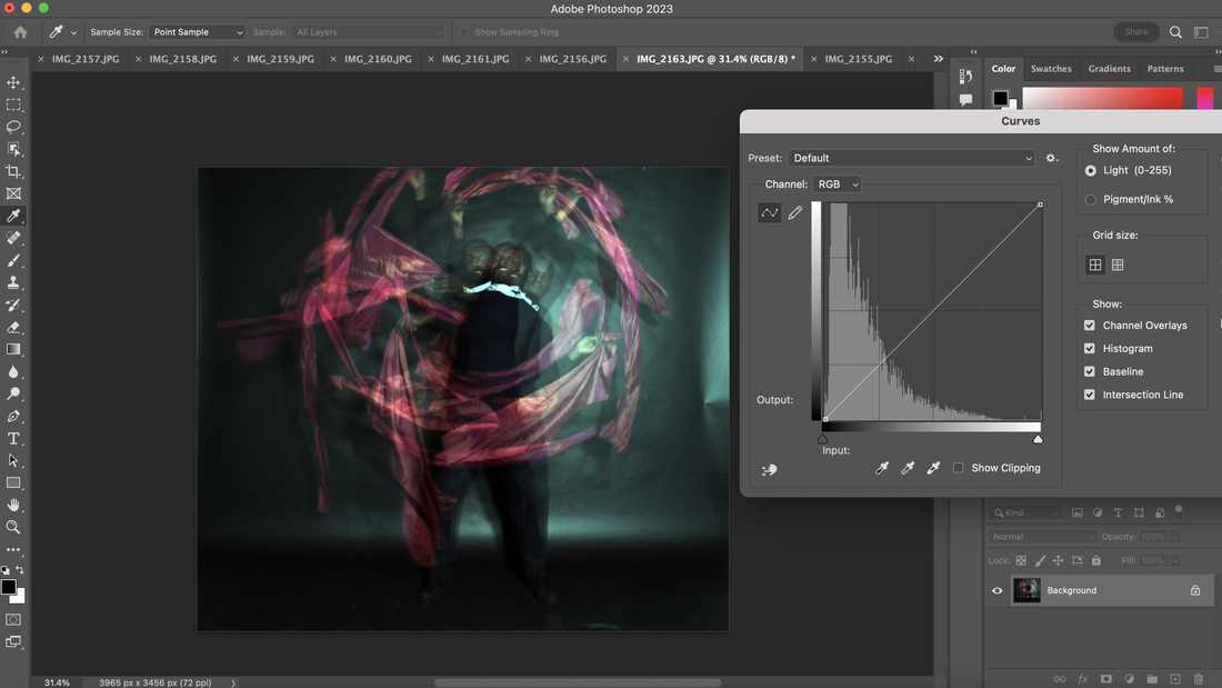
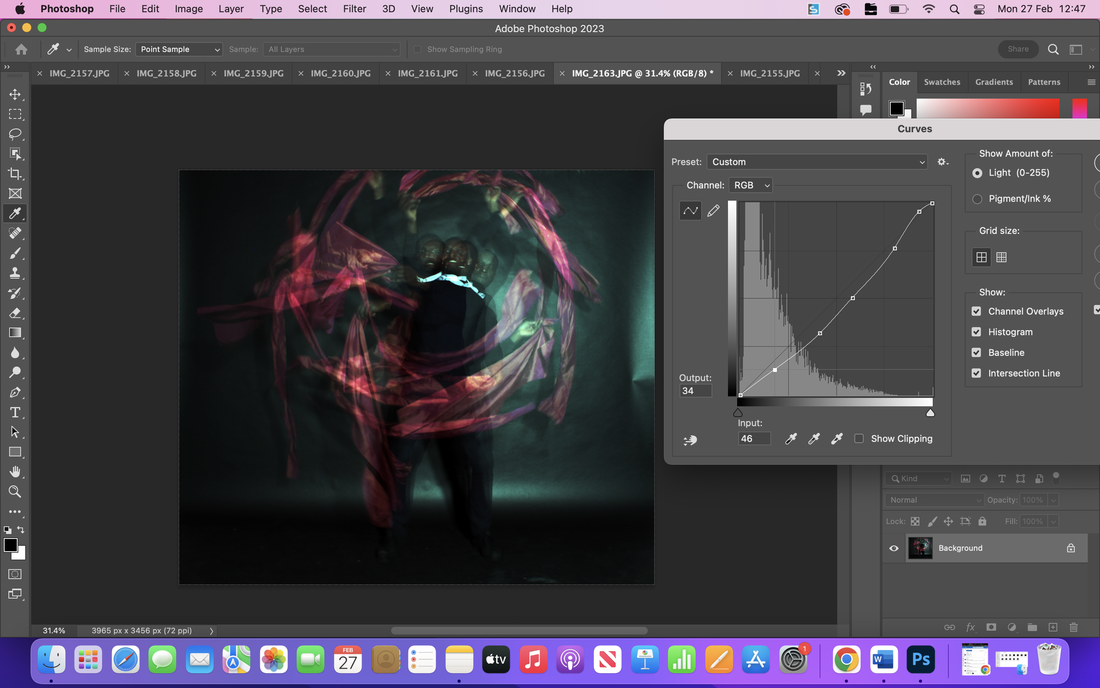
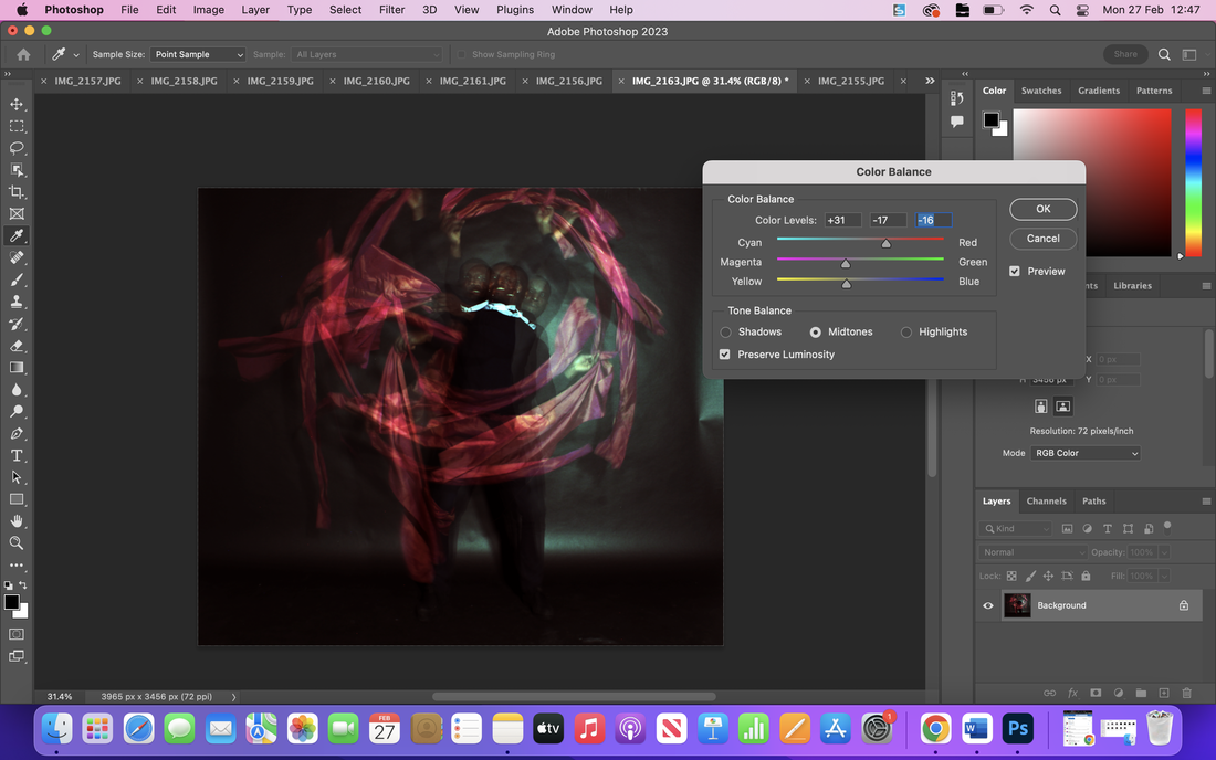
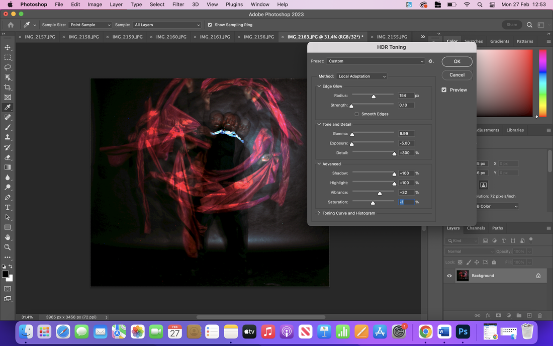
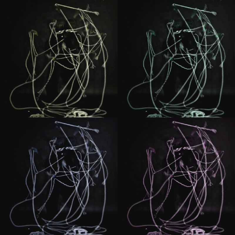
These are a couple of images of the editing process for these images. I decided to use photoshop to edit these images as I really wanted to get the colouring right on it. I learnt some new skills such as: cropping, auto contrast, auto colour, auto tone, curves, colour balance ect.
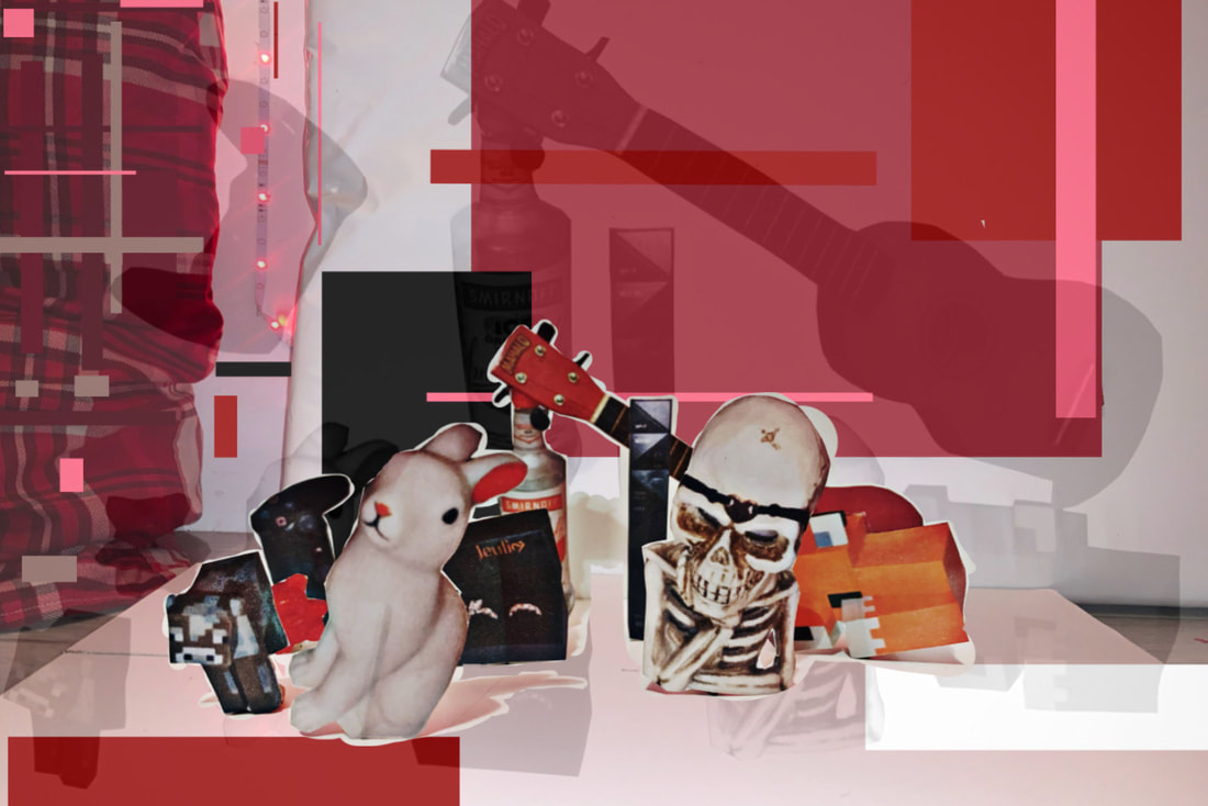
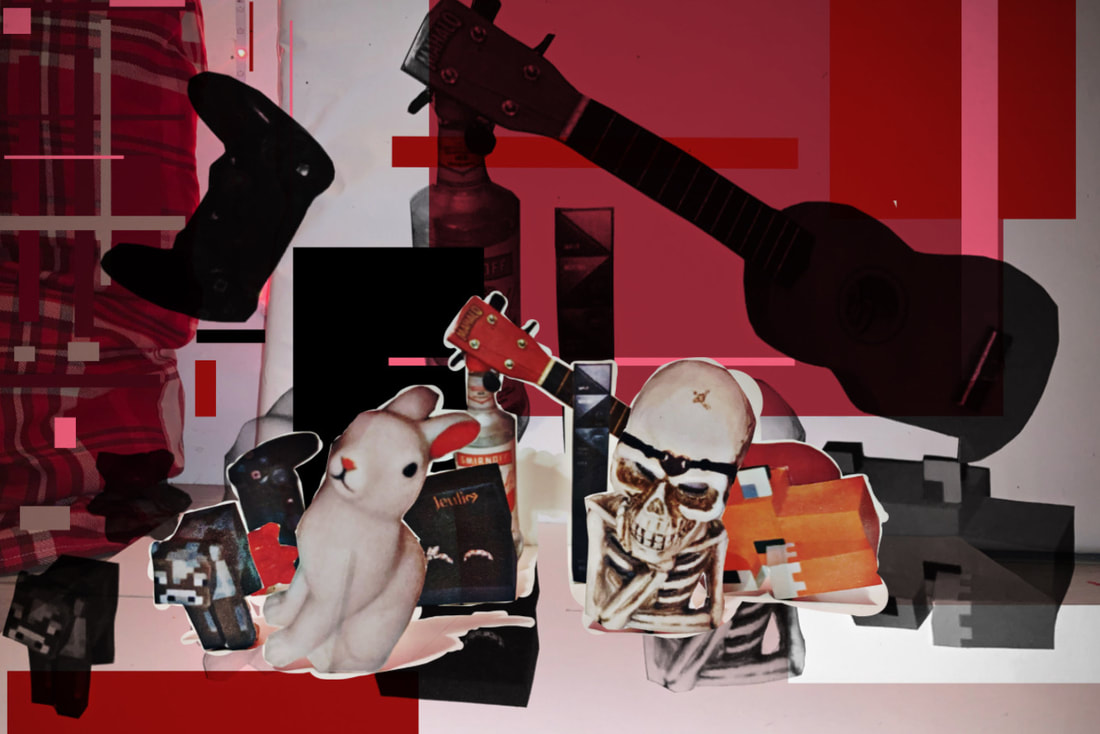
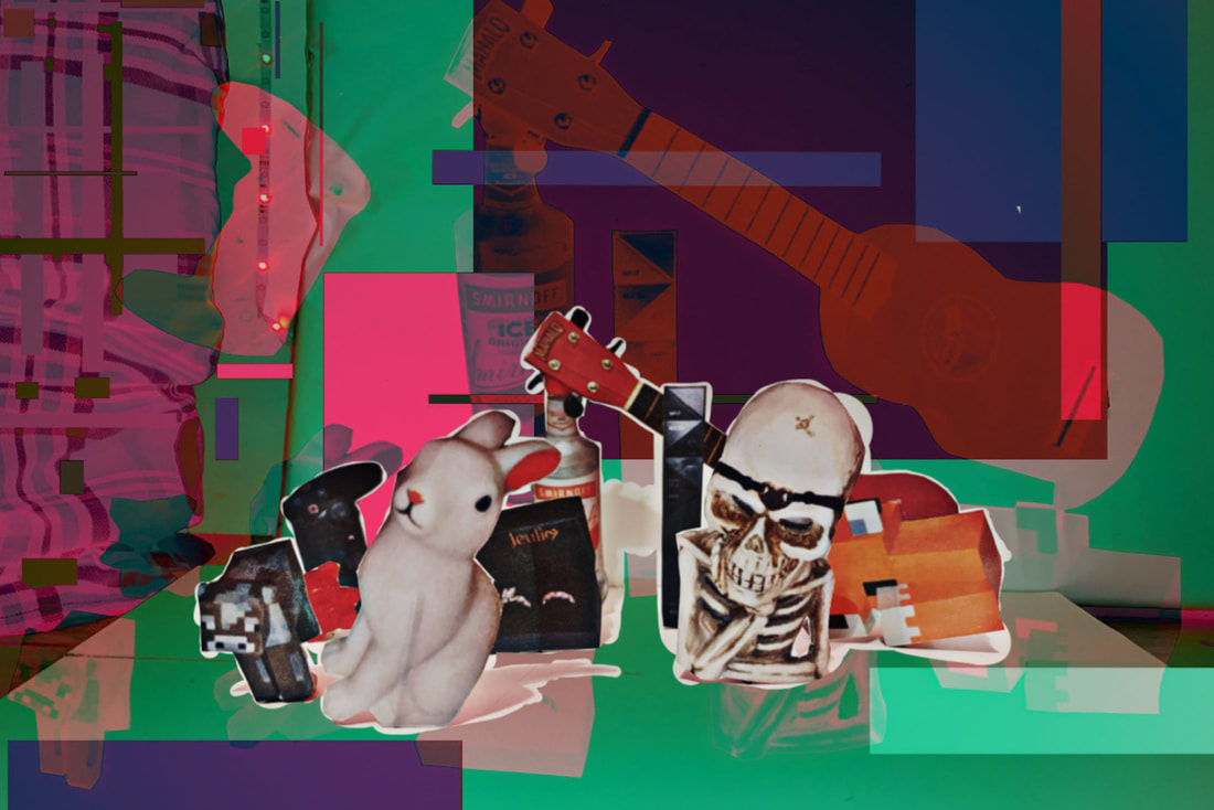
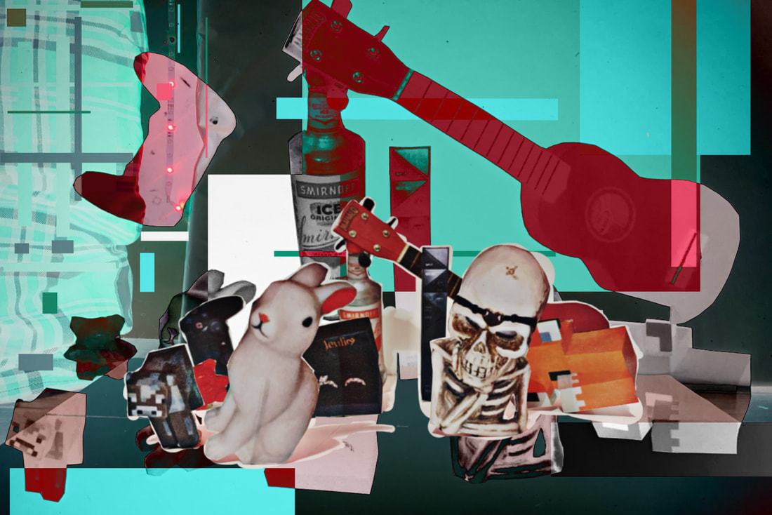
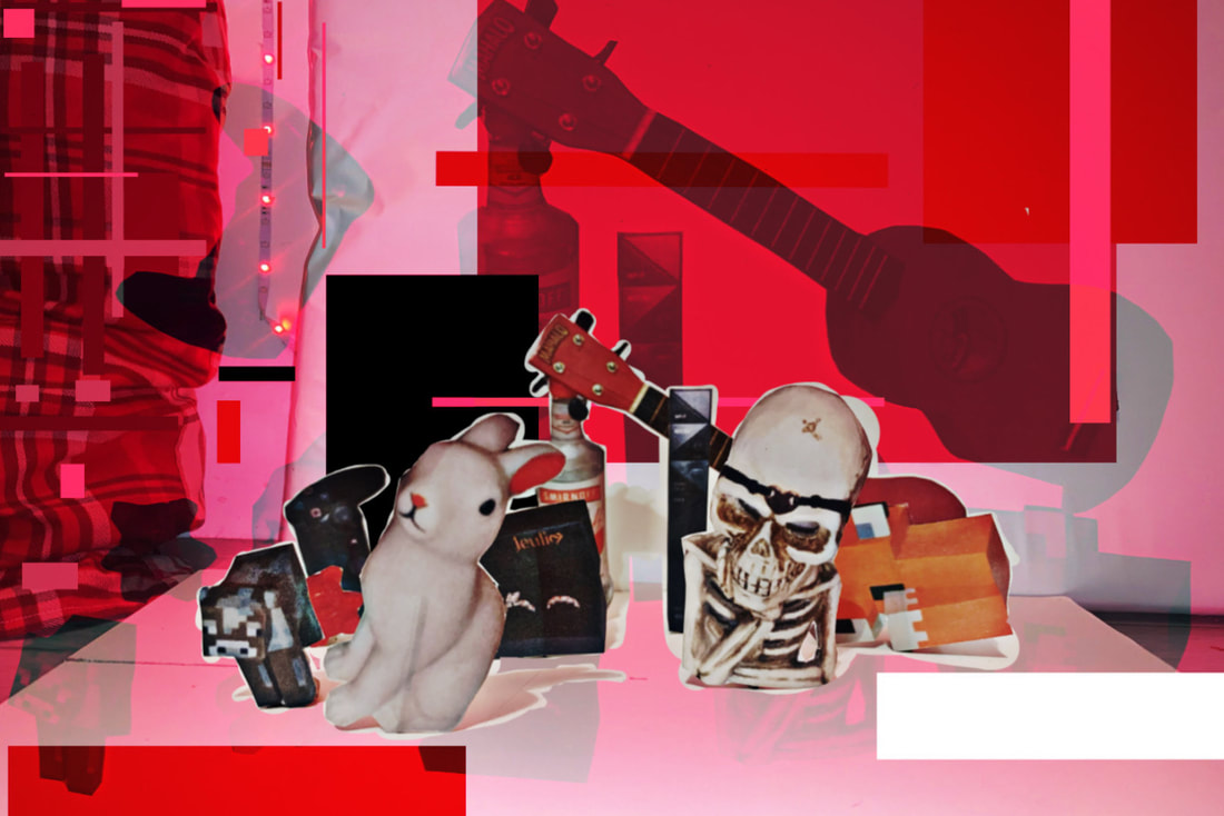
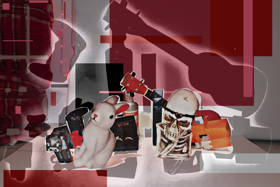
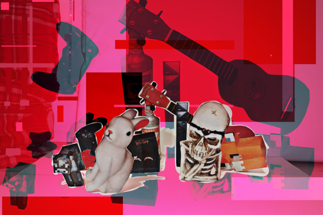
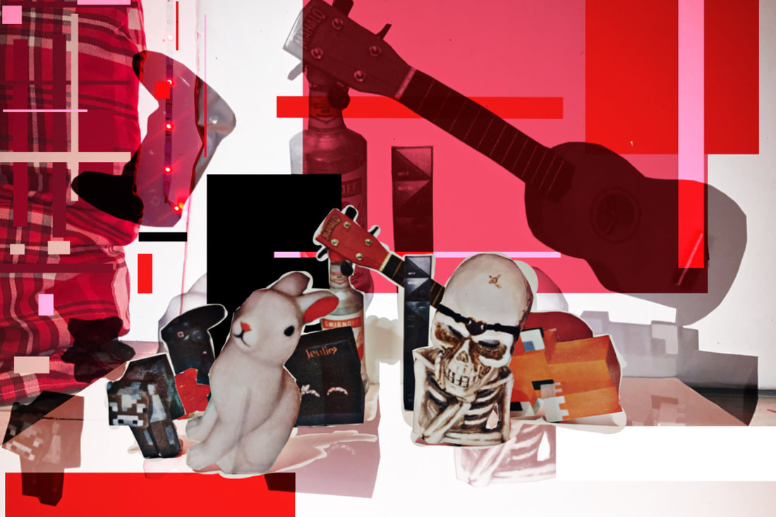
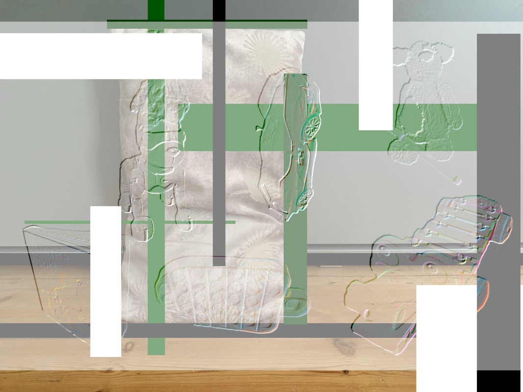
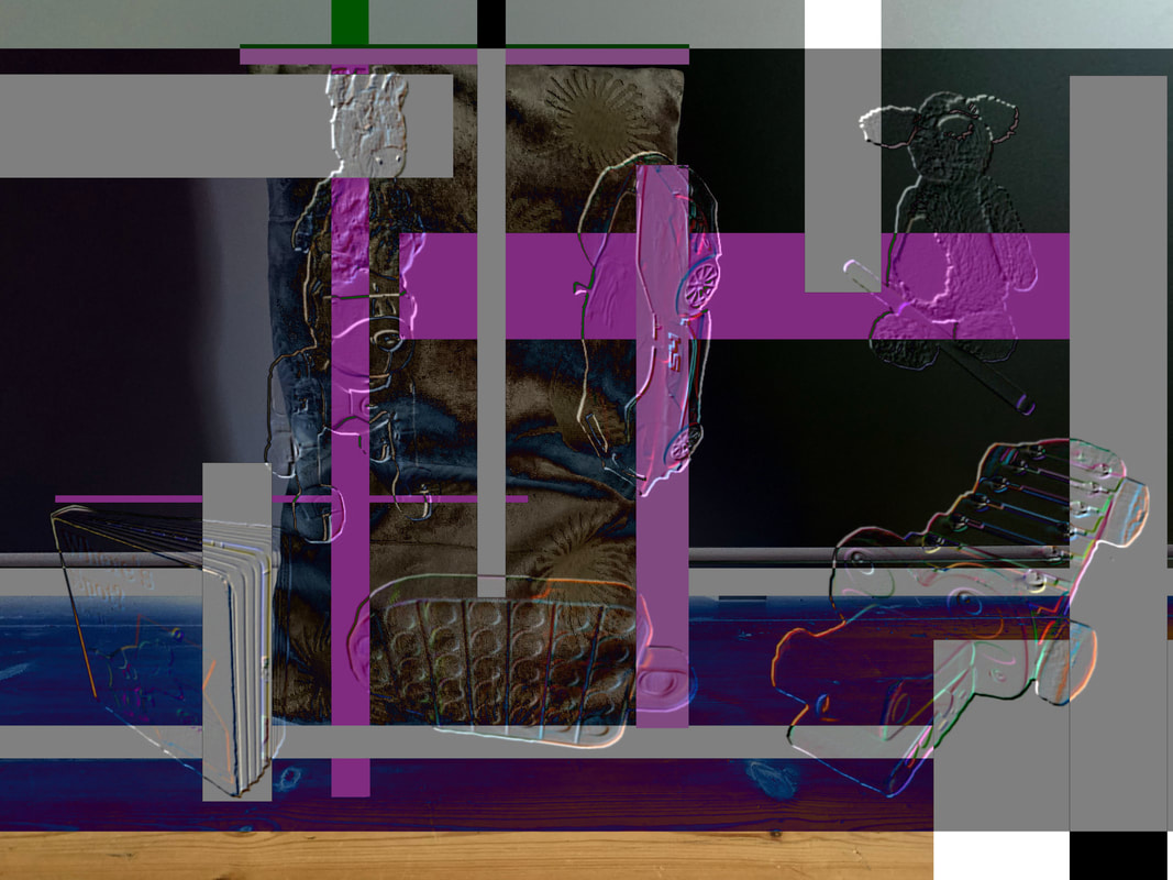
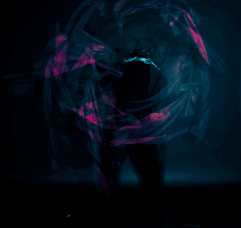
My edited responses:
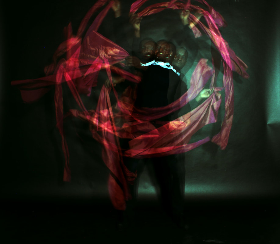


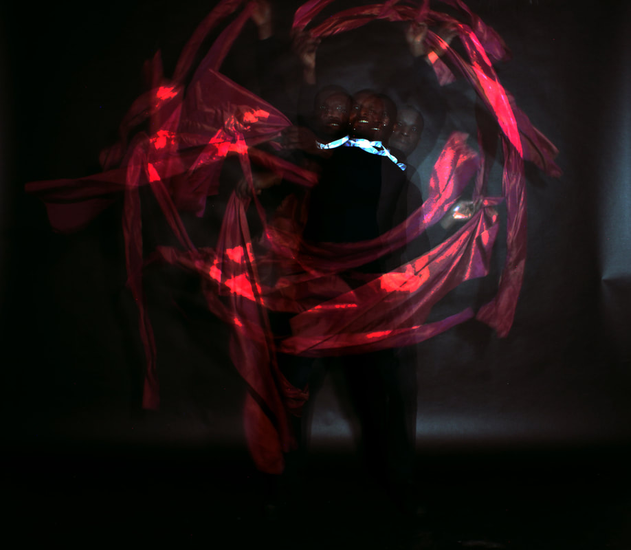
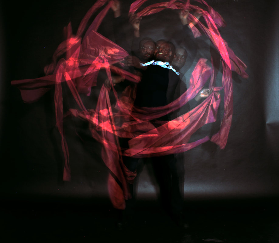
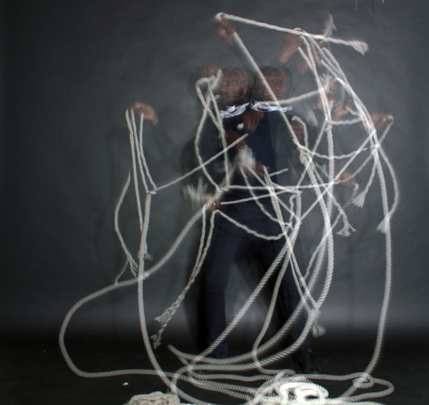
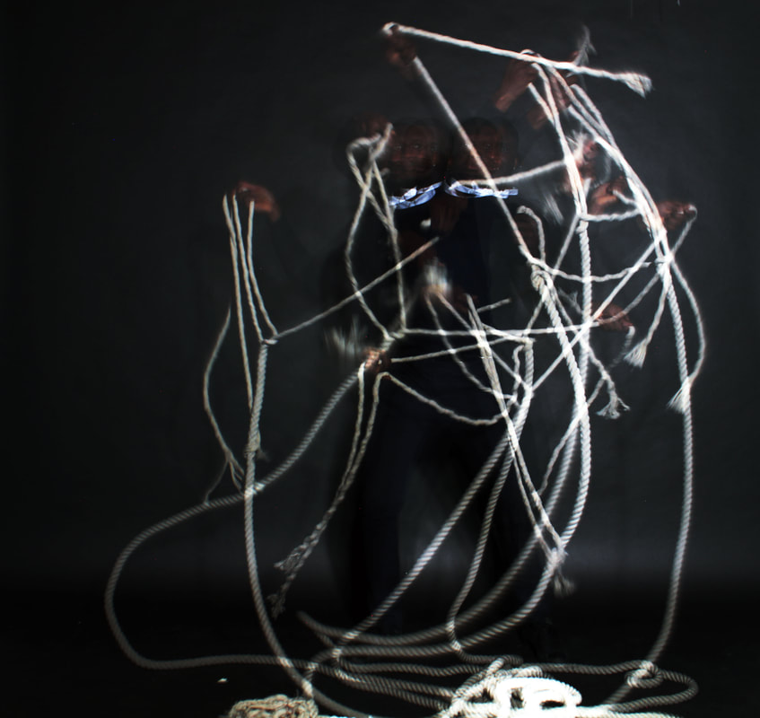
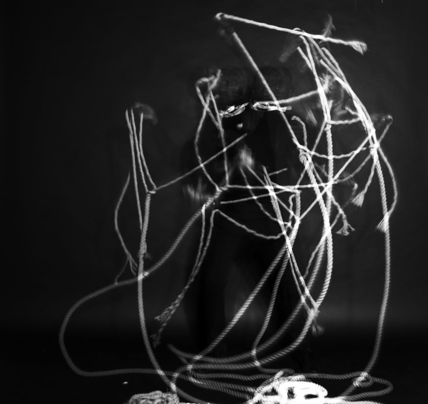
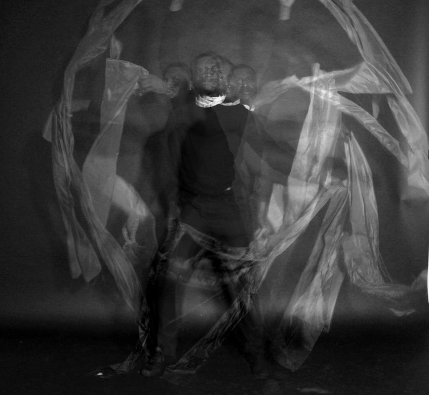
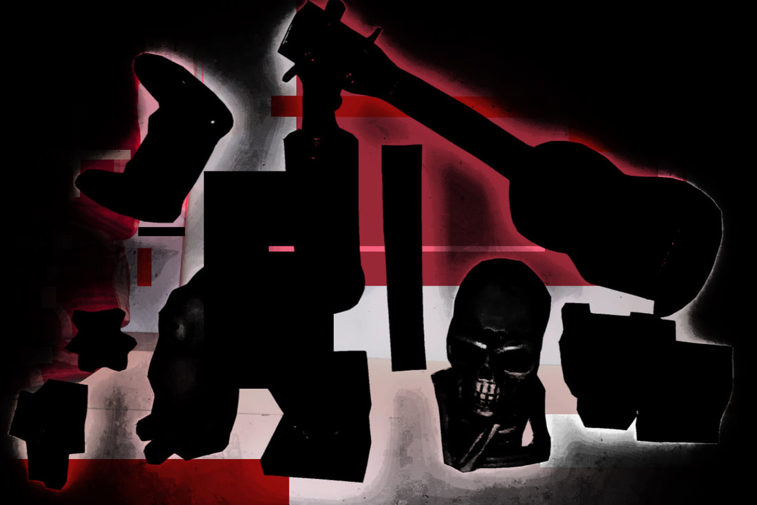
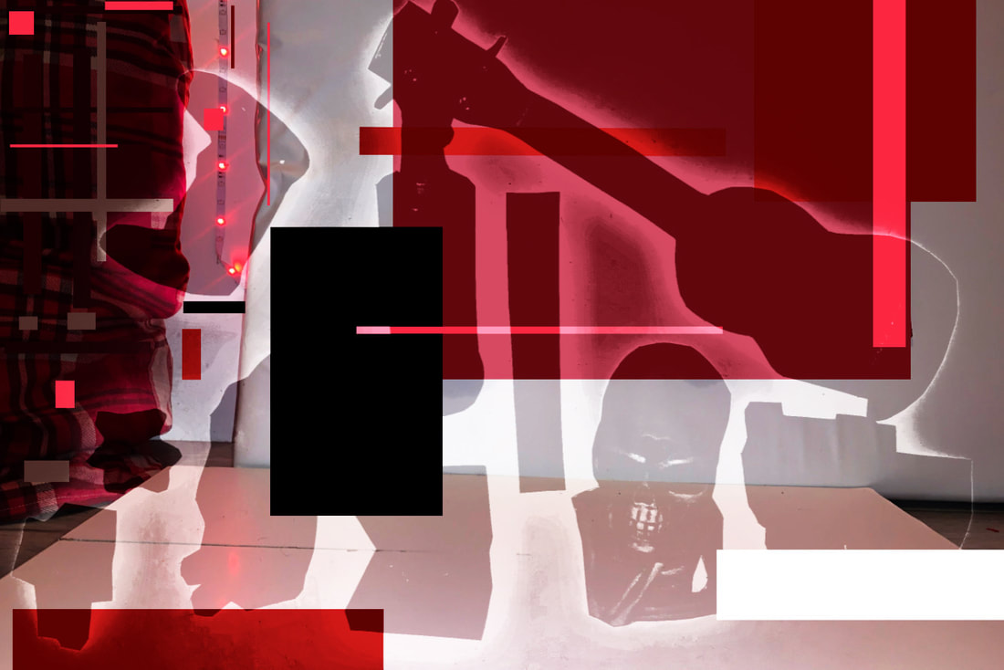
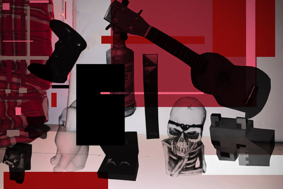
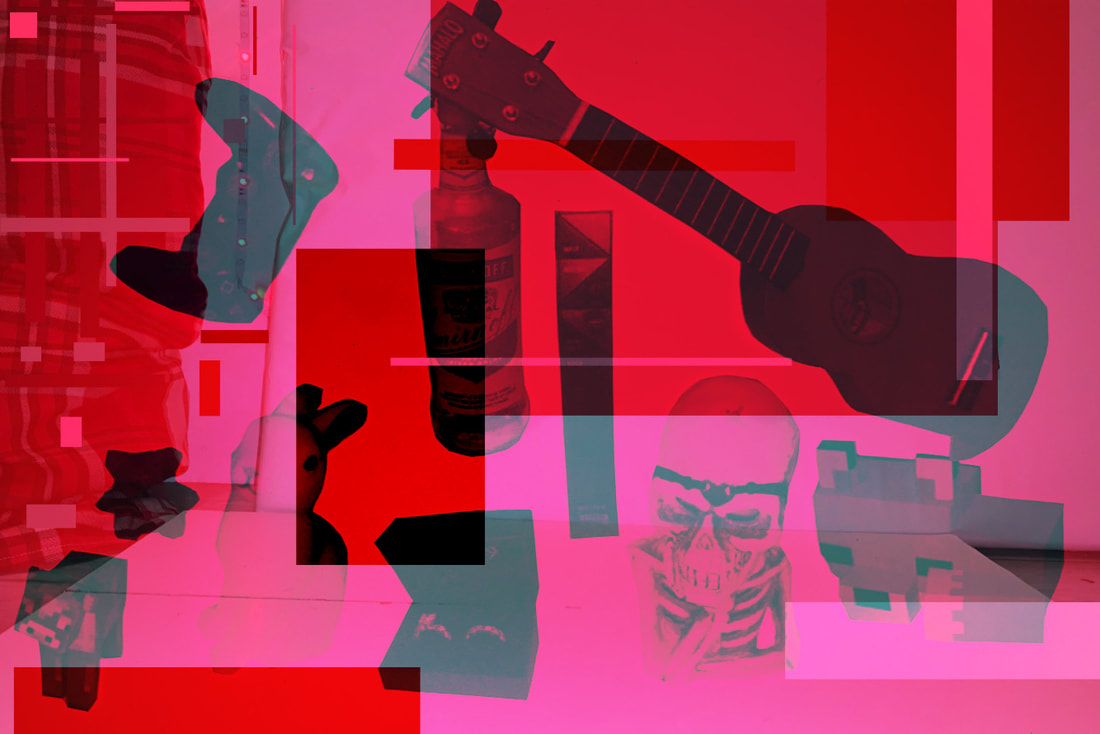
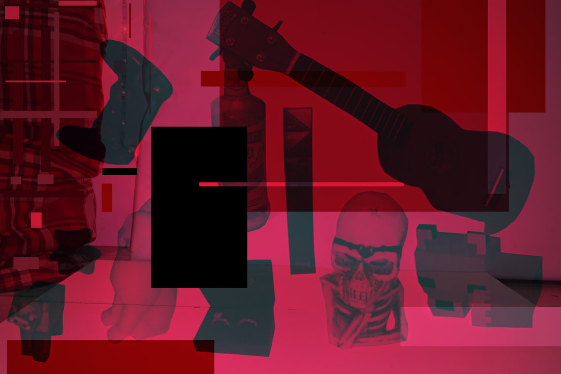
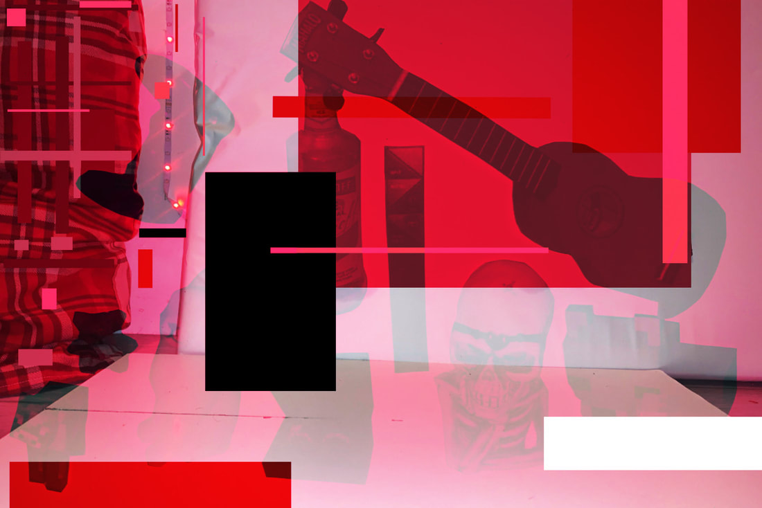
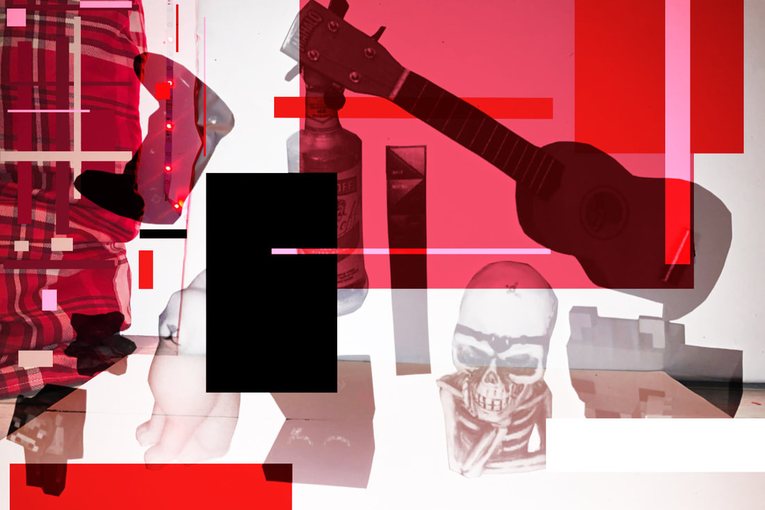
|
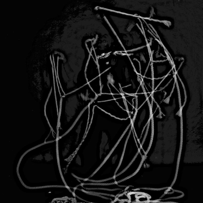
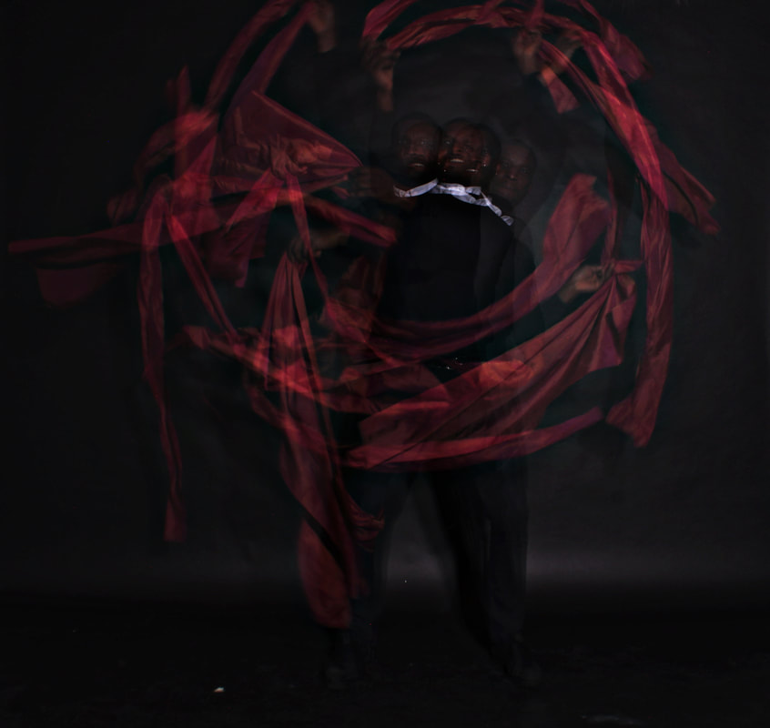
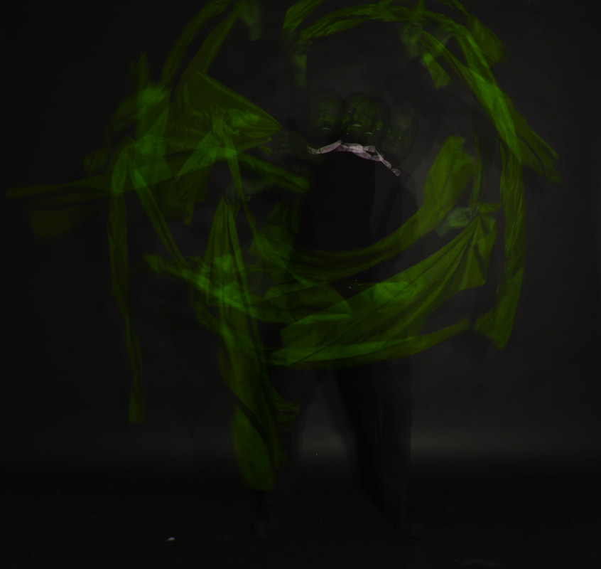
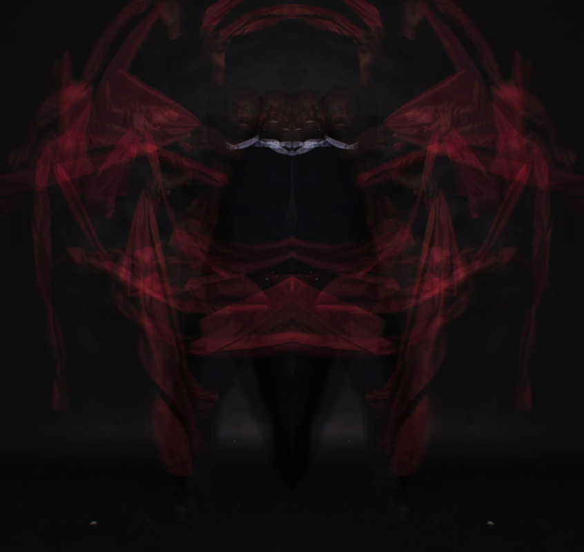
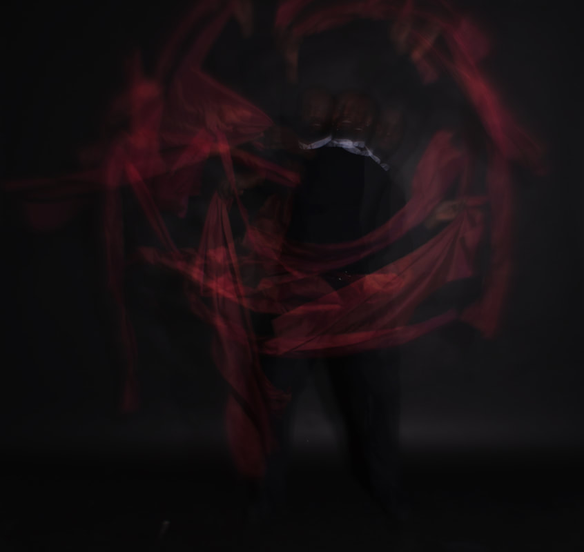
WWW: I think these images were a great success and a solid and clear response to Gjon Milis work. I love the images that incoorporate the objects (the cloth and rope) as I feel it gives the images a real flare/some pizzaz. I quite like the composition as well if I am honest, it varies from picture to picture but everything is well spaced.
|
EBI: I wish I these were darker, but any darker the details of the image would be lost. I also wish i tried more objects being incorporated as they made for really great images.
|
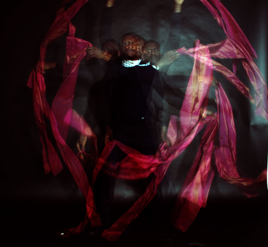
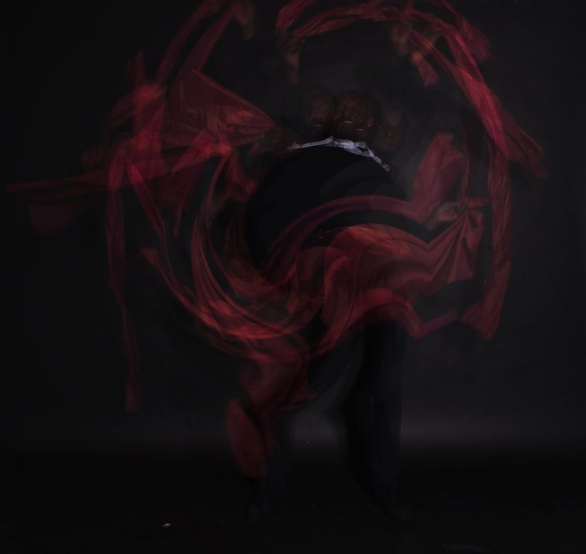
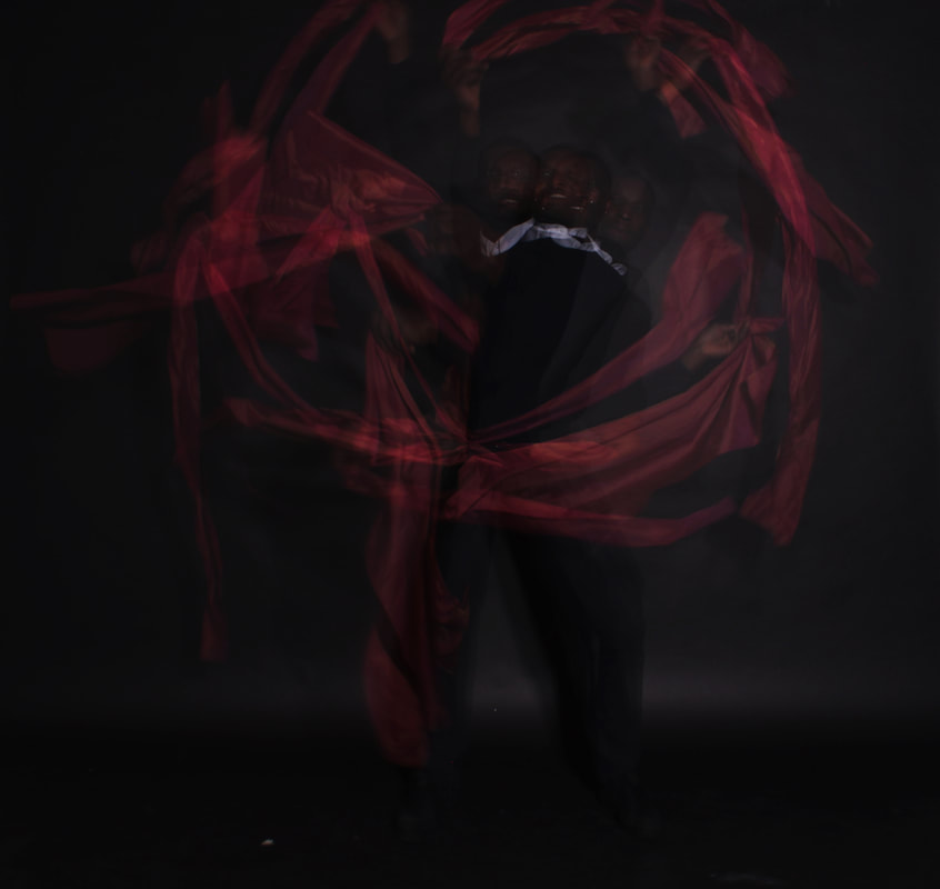
The best image in my opinion

Evaluation: I think this image is the most successful out of the bunch due to: the brightness of the red, how the darks contrast very well with the lighter parts of the image/the highlights, how visible the faces are whilst still having dark tones, the intensity of the values, as well as the the image spacing/balance. I also just think it is the most visually pleasing to look at in my opinion.
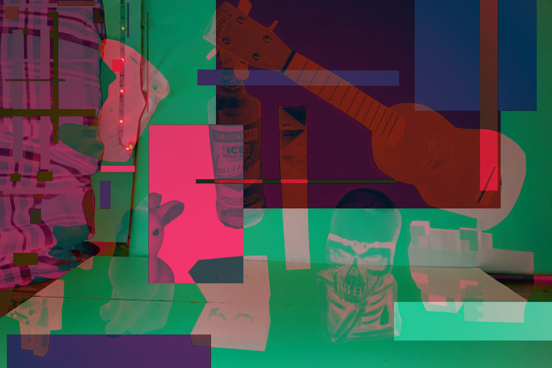
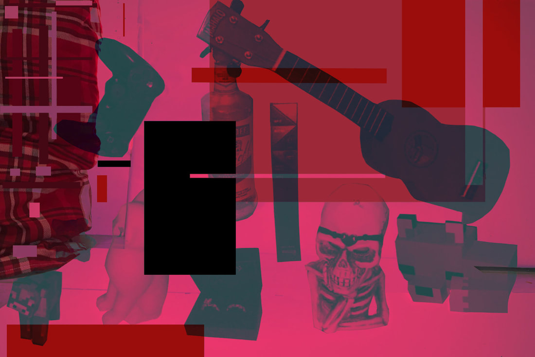
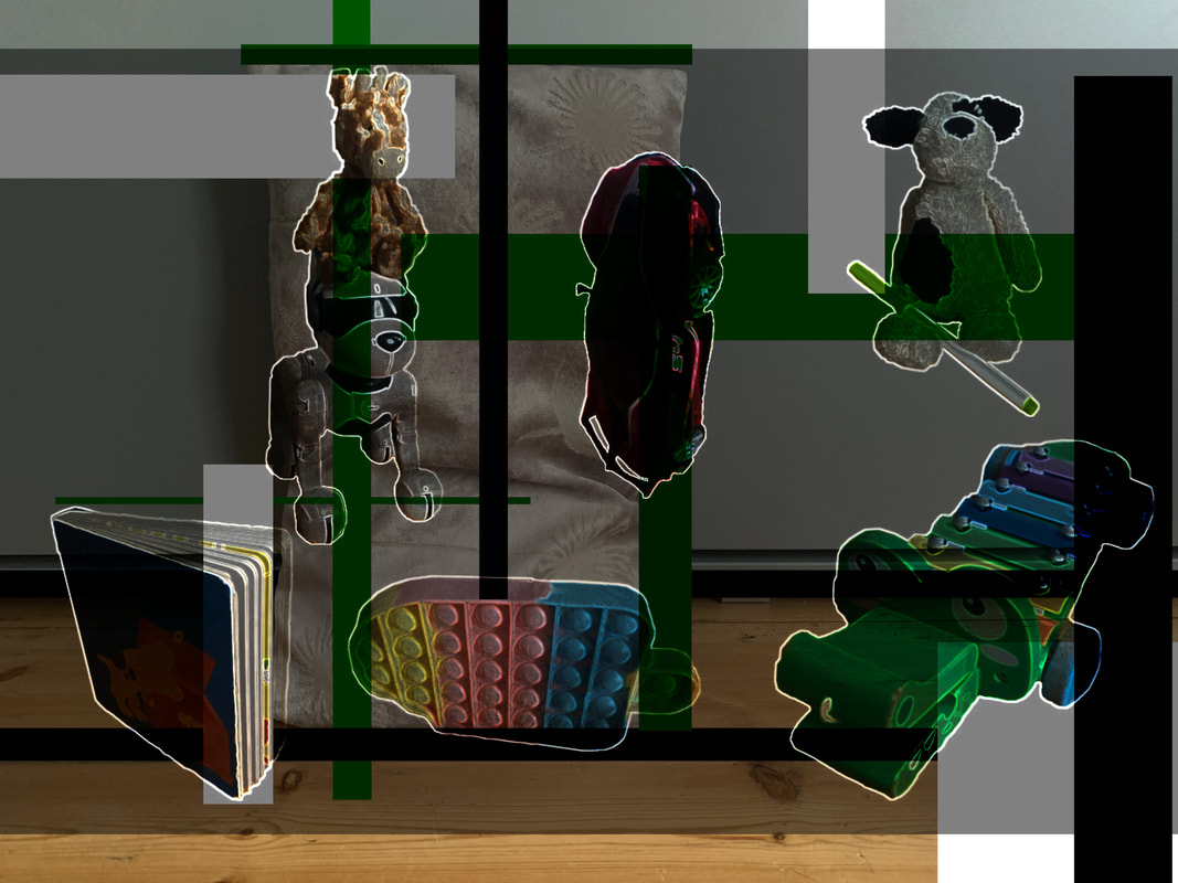
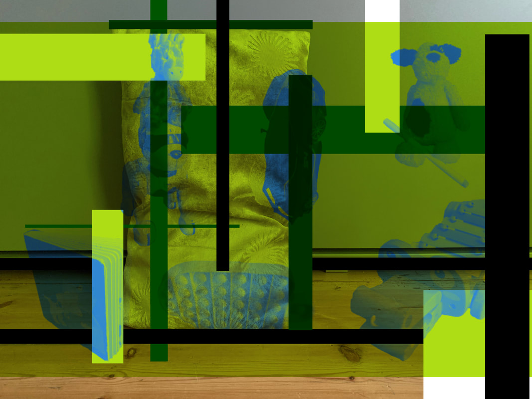
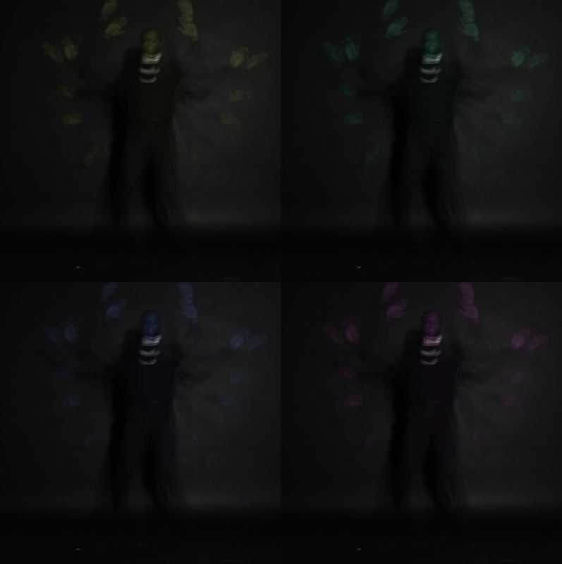
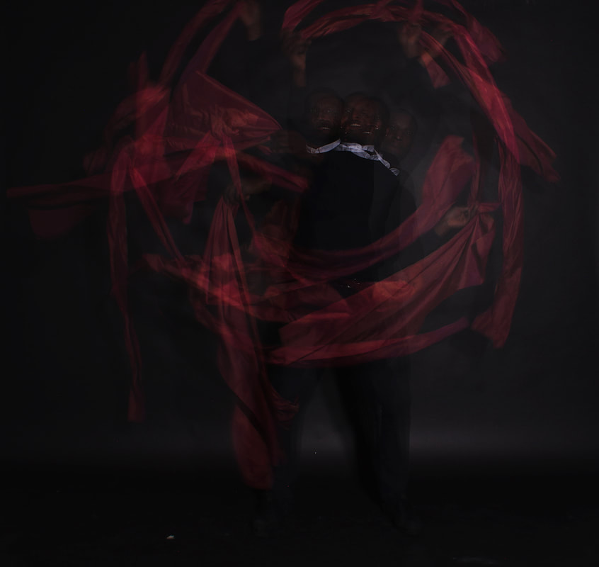
I wanted to play about with PicsArt as well just for fun, here are the results:

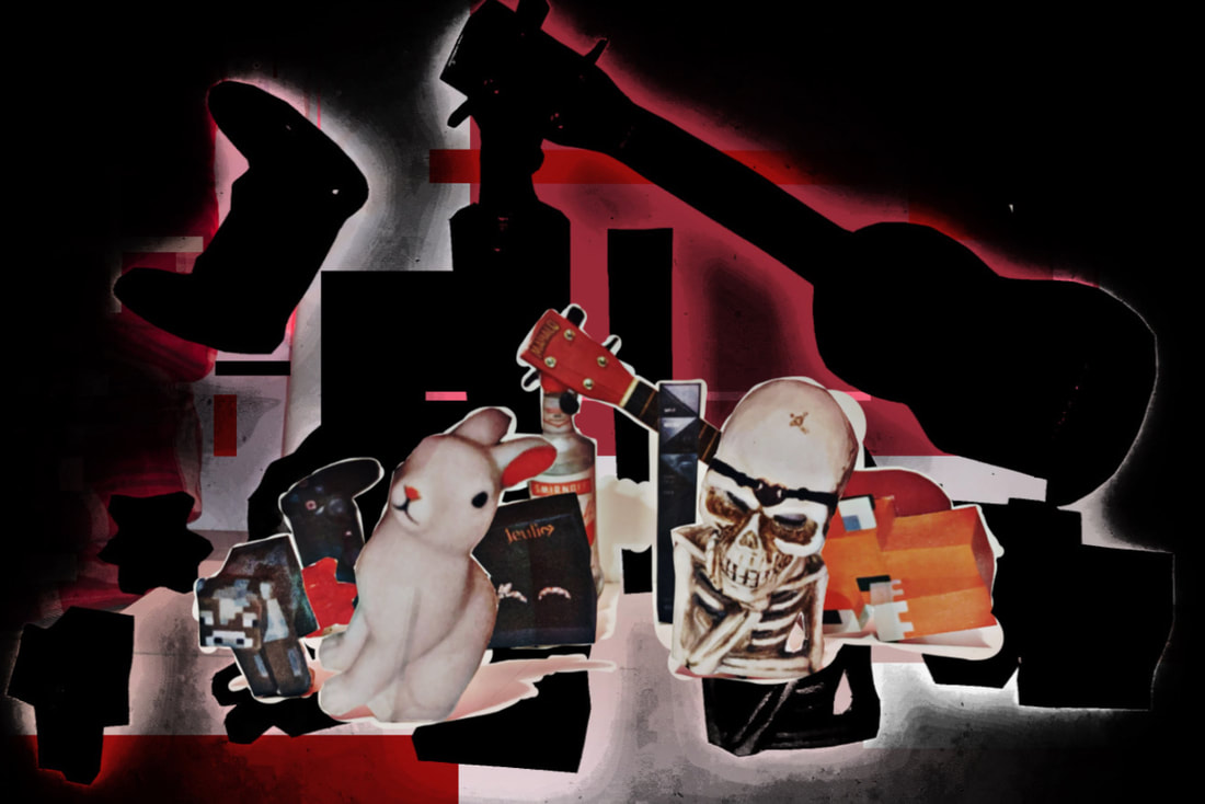
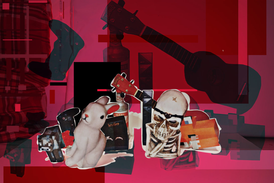
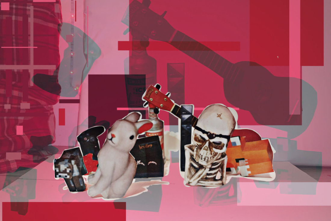
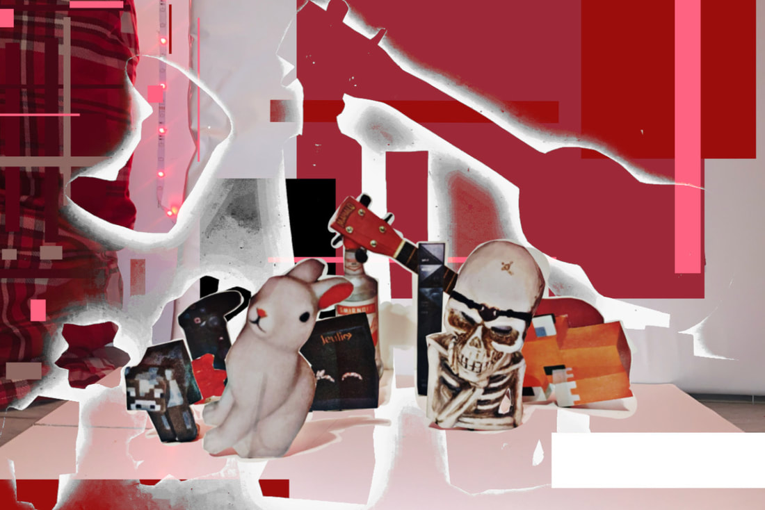
Generating Ideas For My Final Piece
Ive decided, 5 weeks before the making days, that I want to start formulating ideas for my final piece for this component.
Here is a mindmap of my initial thoughts and ideas:
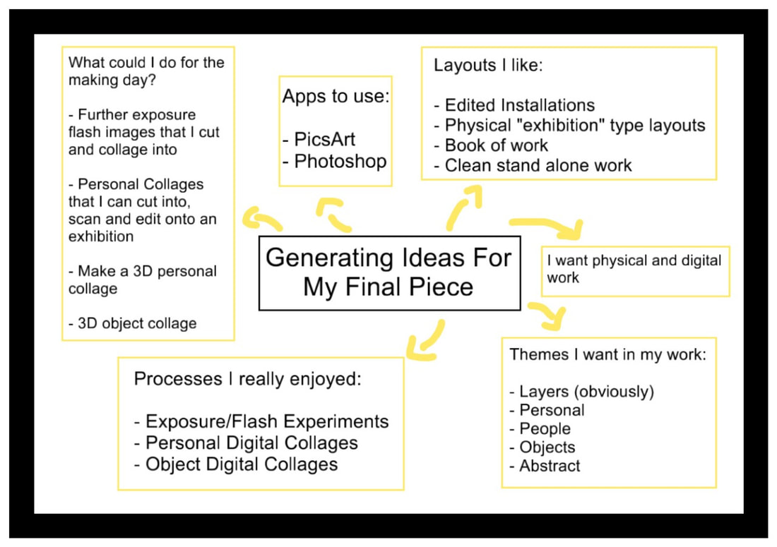
In depth thoughts:
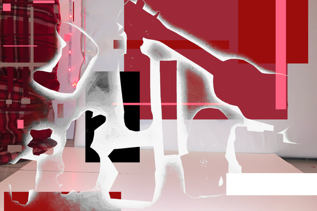
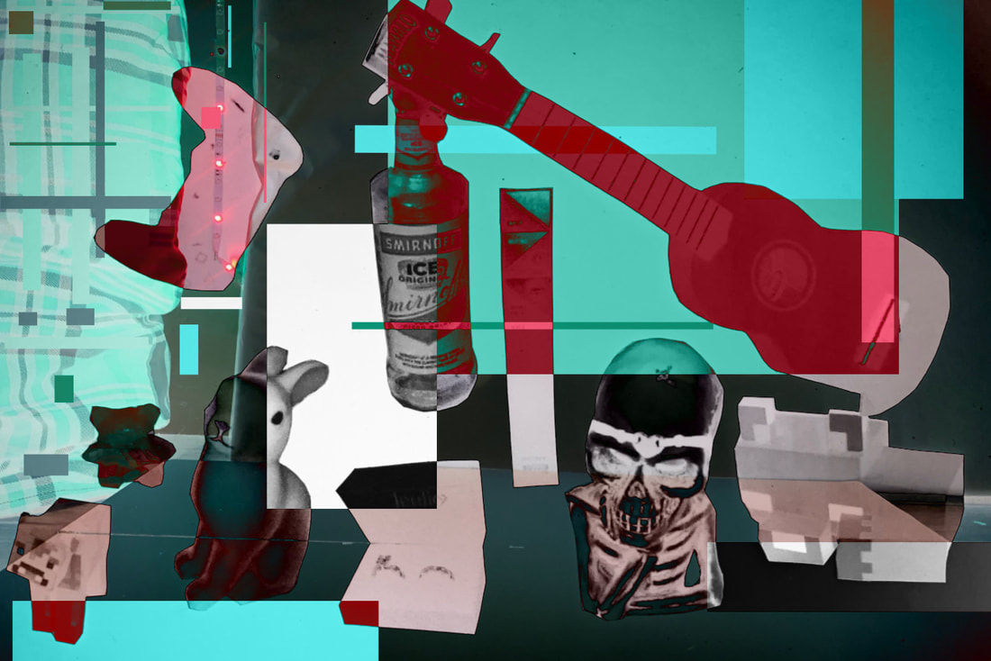
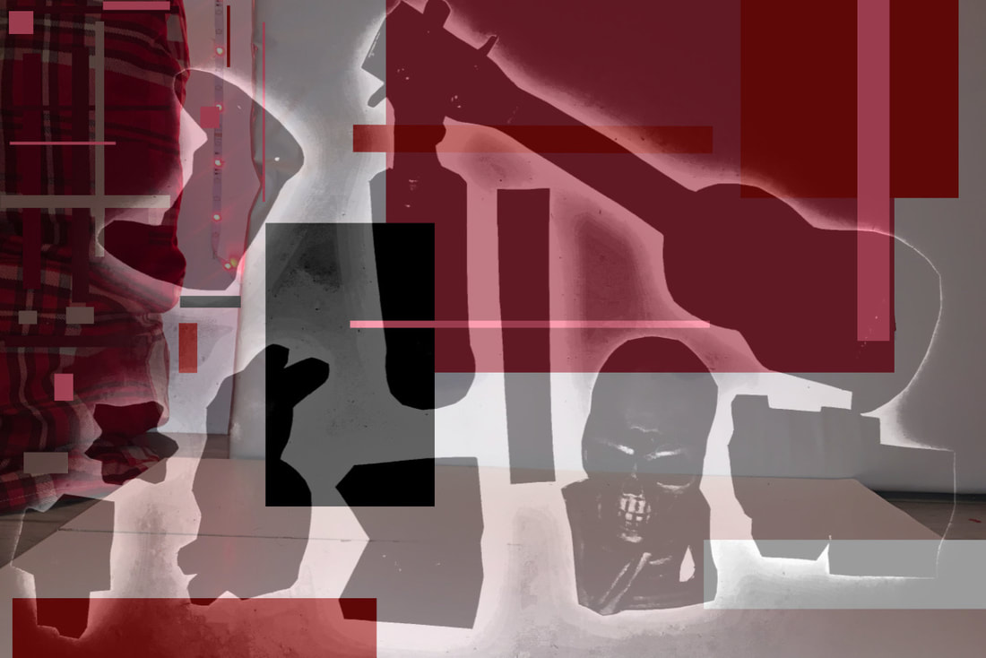
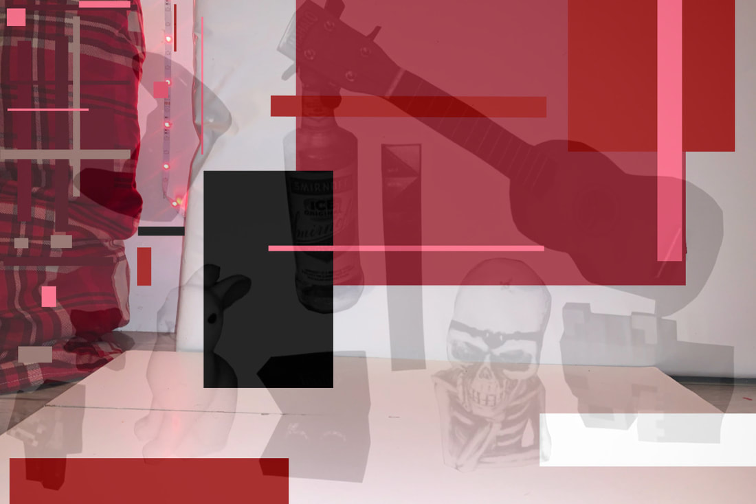
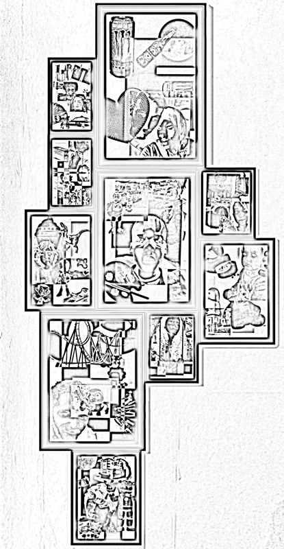
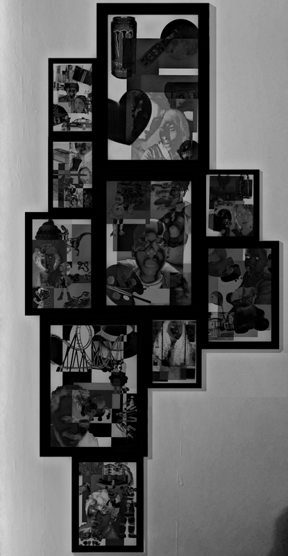
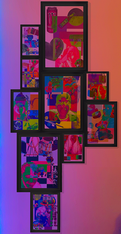
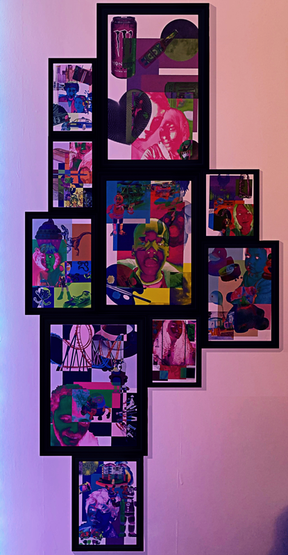
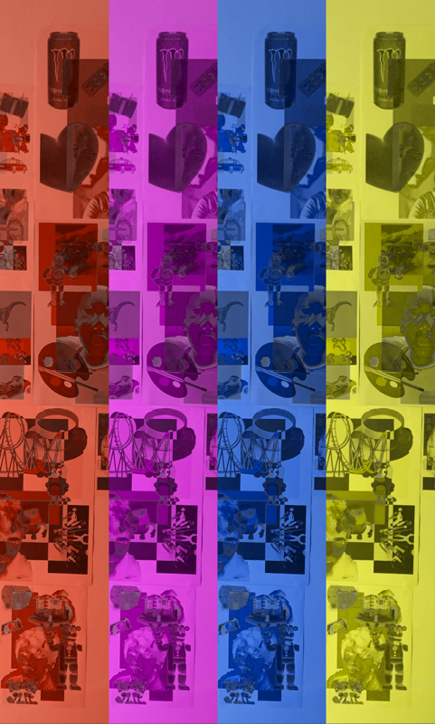
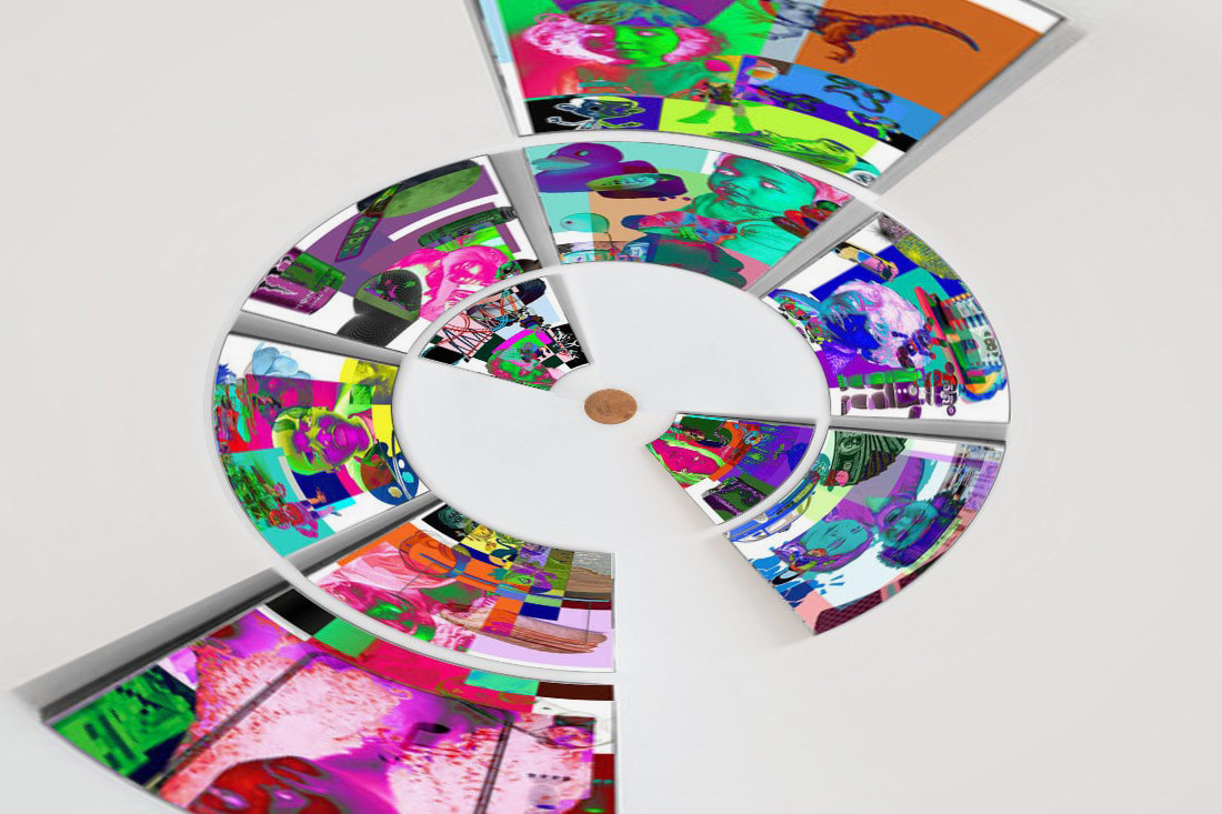
After generating these base ideas, I think I want mix the two ideas and create a 3D personal collage that i mix with personal objects - similar to the object collages I first created but mixing in people and the ideas of personality. This will allow for more layers and further meaning and deeper personal connection, which is exactly what I want. At this point in time I'm unsure wether I want the piece to centre around me, or other people. I think other people would be difficult as I used most of the close and personal people i know in my previous work, so it would be rather repetitive, but it would still be possible. Whereas if I did it about me it would be much easier to gather pictures, objects and I have an idea about creating like multiple collages that represent the "different personalities" I have around certain people, because I find it very interesting how much a person can adapt themselves in different settings. This also interlinks with the idea of layers, as it shows that people are complex and can have many layers to them. I would want to create a physical 3D collage but then also photograph and edit it on PicsArt - to add more layers, colours ect - and then, if I have the time, I would edit the digital collages onto a pre-existing installation image, to make the final outcome feel more put together and professional.
So in short: I want to create multiple 3D collages that incorporate edited/cut into/collaged portraits of me, along side personal objects of mine which are intended to represent the changeability of my personality/how people have layered personalities and can adapt according to their situations. I then want to photograph said collage, edit it to add further layering and colouring, which i then will edit into pre-existing exhibition installation photographs. Leaving me with a total of 3 different outcomes/final pieces ( The physical 3D collages, The edited 3D collages and the Edited Installation images).
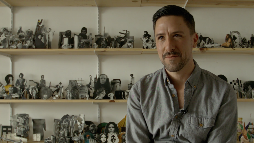
Matt Lipps
I think Matt Lipps work is a prime example of the type of final piece I want to create, obviously not exactly but its along the lines of what I am thinking in my head.
|
Matt Lipps is an American photographer and artist whom I have previously researched because of his sculpture work. He creates a lot of 3D collage pieces which he photographs in various effective and interesting ways, as well as that, he mixes people with objects which is similar to what I want to do for my final piece, so I thought he would be the perfect person to research and gather inspiration from. |
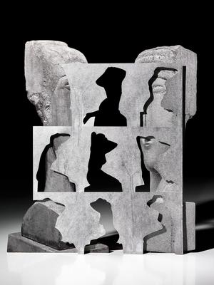
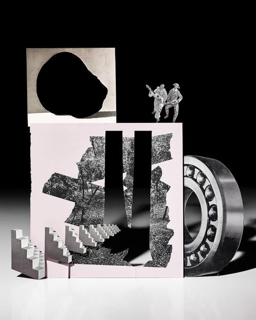
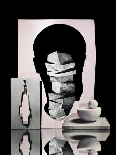
This is Lipps's work that I am referencing:
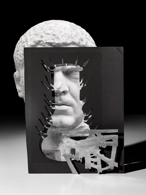
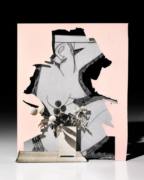
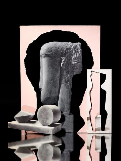
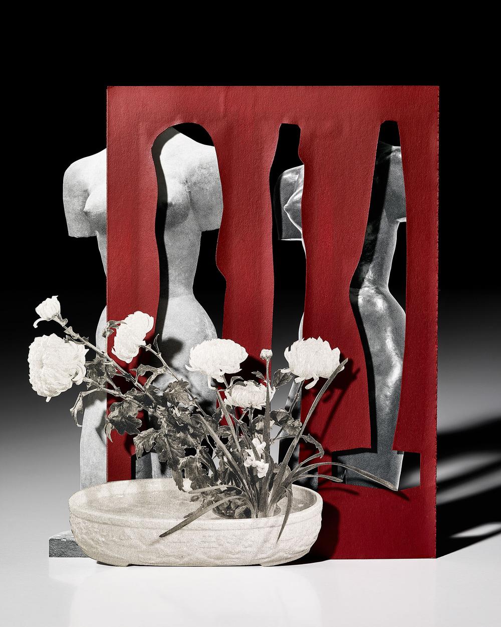
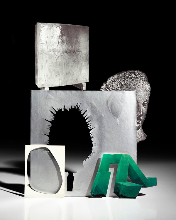
My thoughts on these pieces/ what I like/ notice:
- I love the black and white aspect with a splash of colour
- They look very clean and concise
- Shadows are incorporated
- Relatively solid background
- Foreground, middle ground and background prominent
- Range of image sizes
- I love the black and white aspect with a splash of colour
- They look very clean and concise
- Shadows are incorporated
- Relatively solid background
- Foreground, middle ground and background prominent
- Range of image sizes
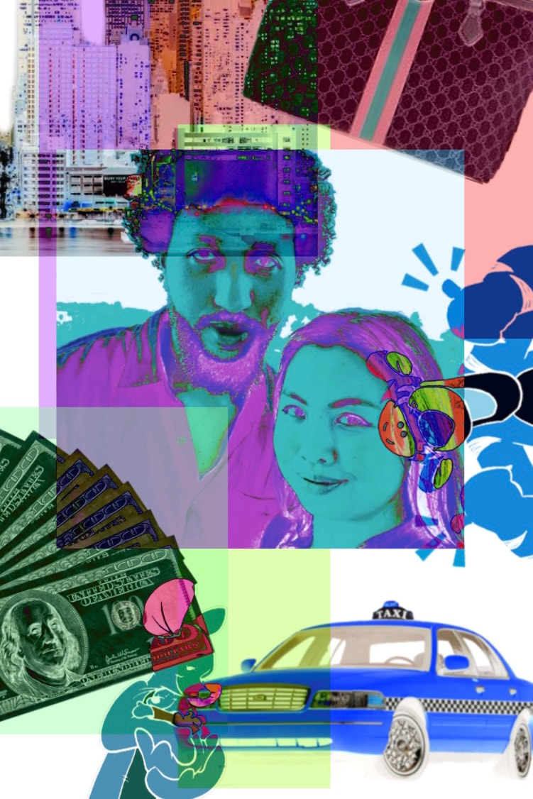
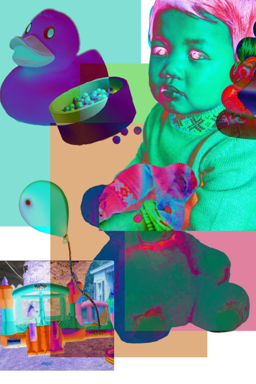
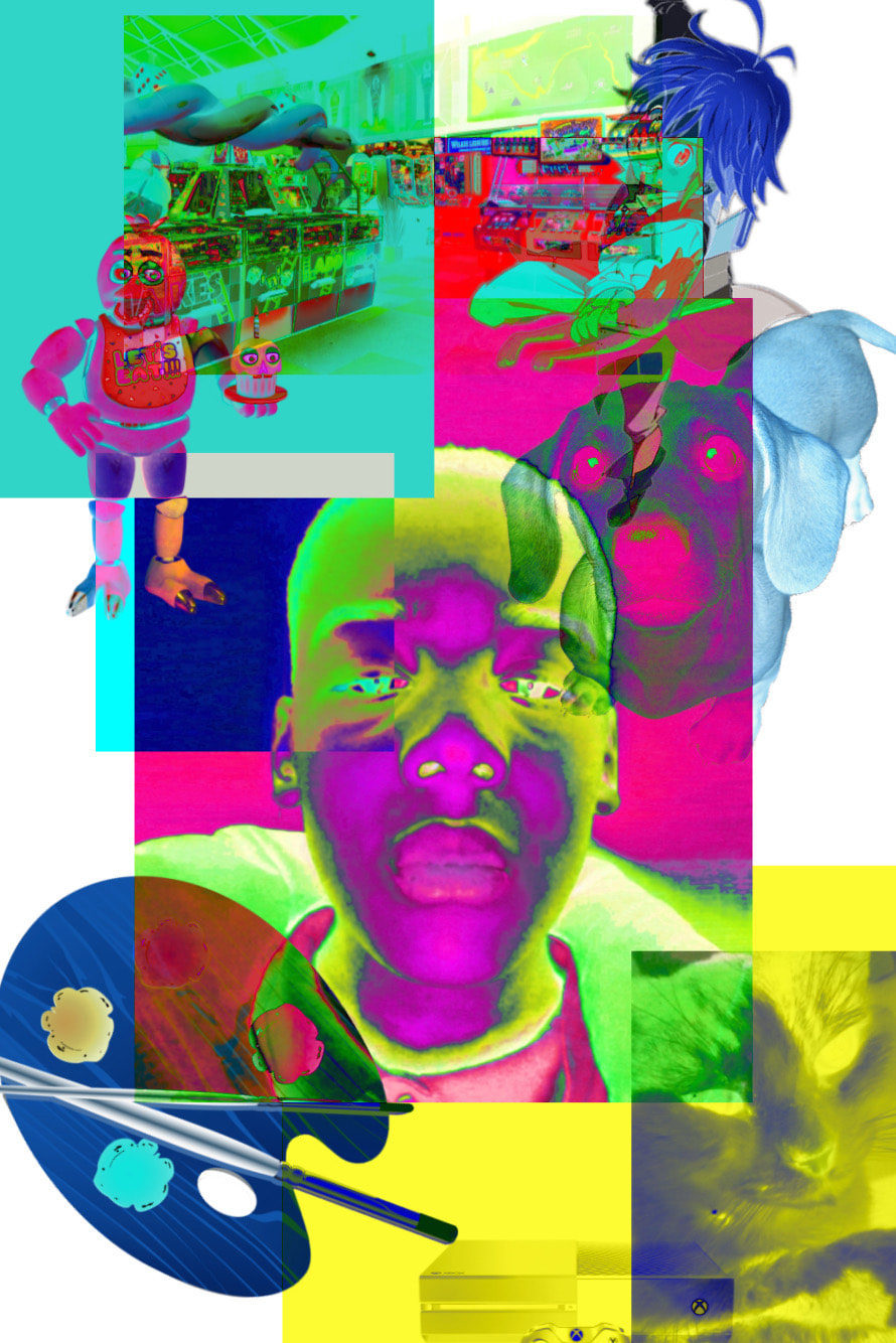
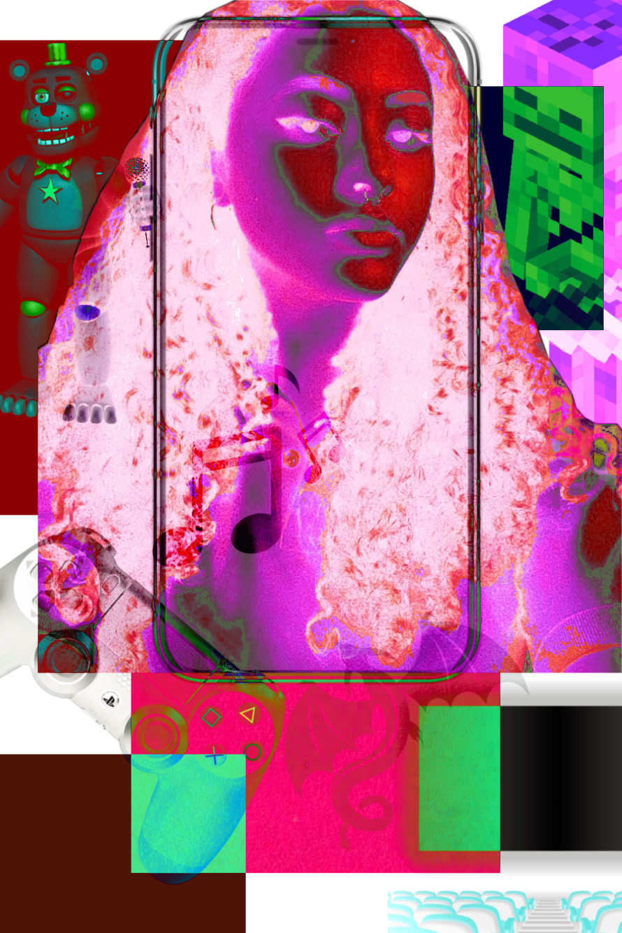
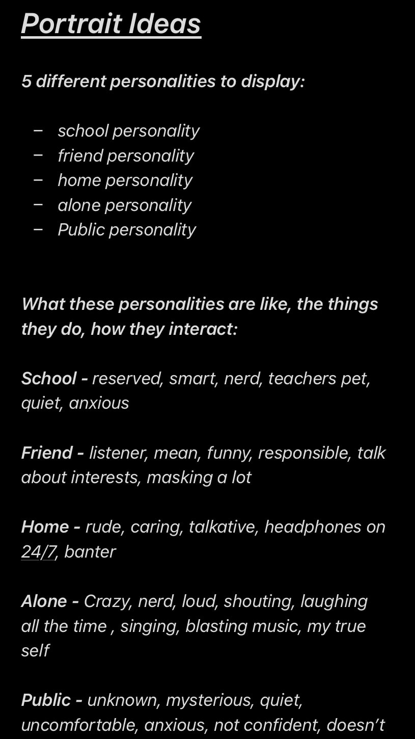
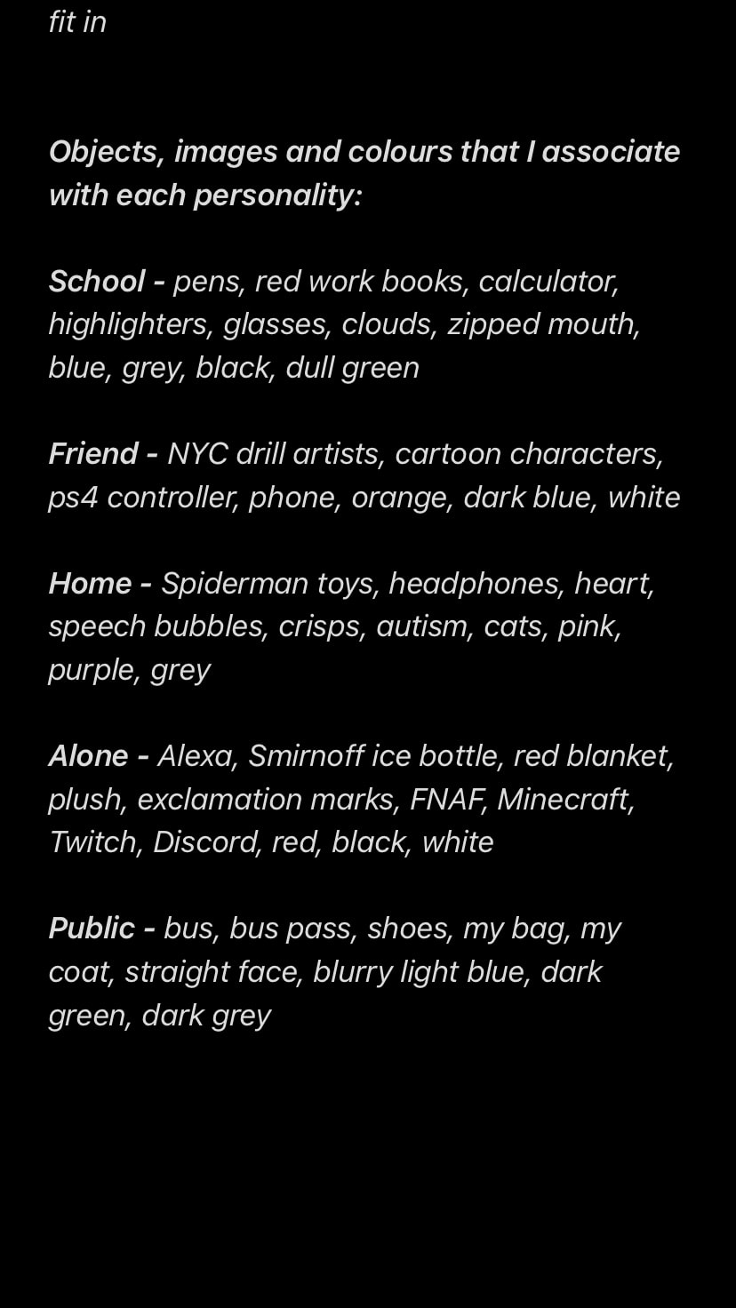
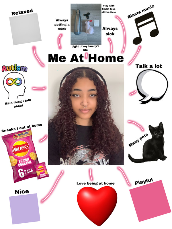
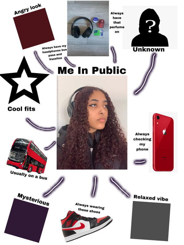
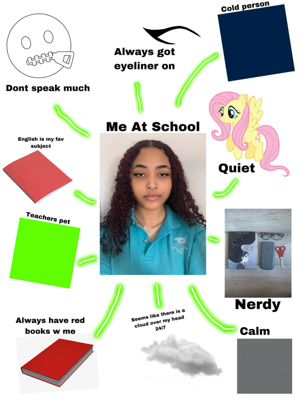
Portrait Ideas:
in order to gather ideas for the portrait images that I was going to create I started just noting down my thoughts and feelings towards each "personality" that I am trying to portray.
Making Day 1 And 2 Plan
My Aim For The Assessment:
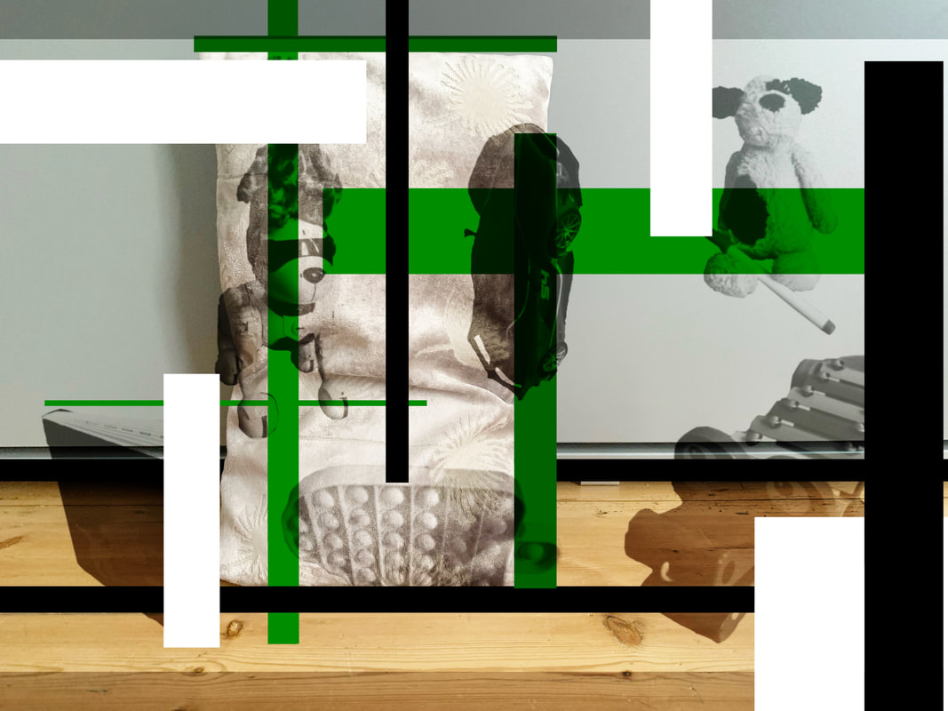
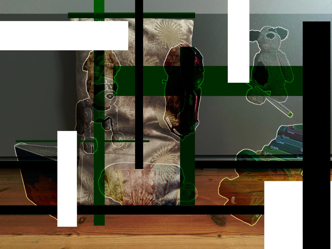
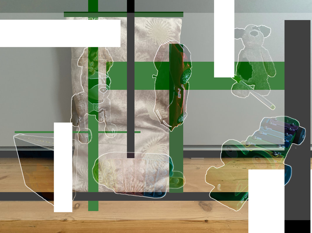
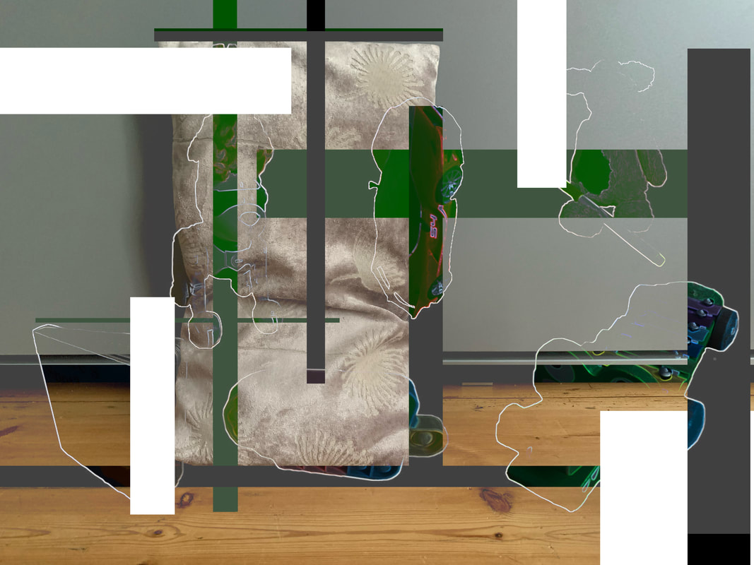
To create multiple 3D collages that incorporate edited/cut into/collaged portraits of me, along side personal objects of mine which are intended to represent the changeability of my personality/how people have layered personalities and can adapt according to their situations. I then want to photograph said collage, edit it to add further layering and colouring, which i then will edit into a pre-existing exhibition installation photographs.
Prep to do before the controlled assessment:
- Gather images of some objects that link to each photograph and print off A4
- Collect physical objects to bring in
- Find Installation images that I am going to edit my work onto
- Create collages of portraits
- Add all prep work onto website
Day One:
- Hour one ~ Print and mount images
- Hour two ~ Cut out all mounted images
- Hour three ~ Add stands to the cut out mounted portraits and objects
- Hour four ~ Create the arrangements of the mounted portraits, mounted object images, and the physical objects
- Hour five ~ Photograph each arrangement and record them as one
Day Two:
- Hour one ~ Edit the photographs of the arrangement (adding colour and layering on PicsArt)
- Hour two ~ Create a fake edited installation for the original photograph (using photoshop)
- Hour three ~ Create a fake edited installation for the edited collage (using photoshop)
- Hour four ~ Edit the video of the arrangement on Capcut
- Hour five ~ Make sure everything is documented properly and in the right place
Controlled Assessment Prep Work:
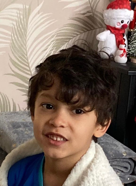
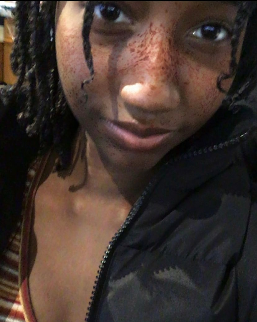
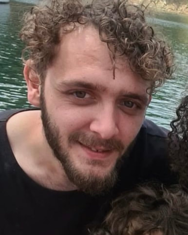
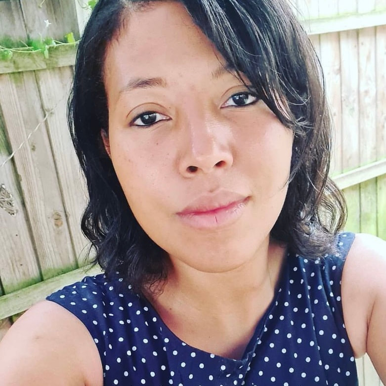
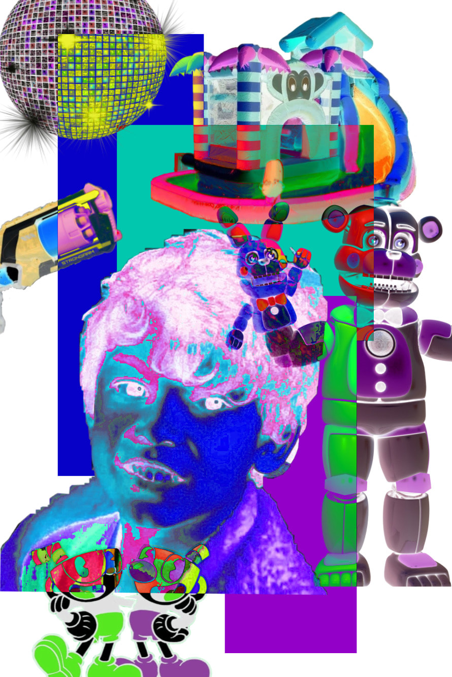
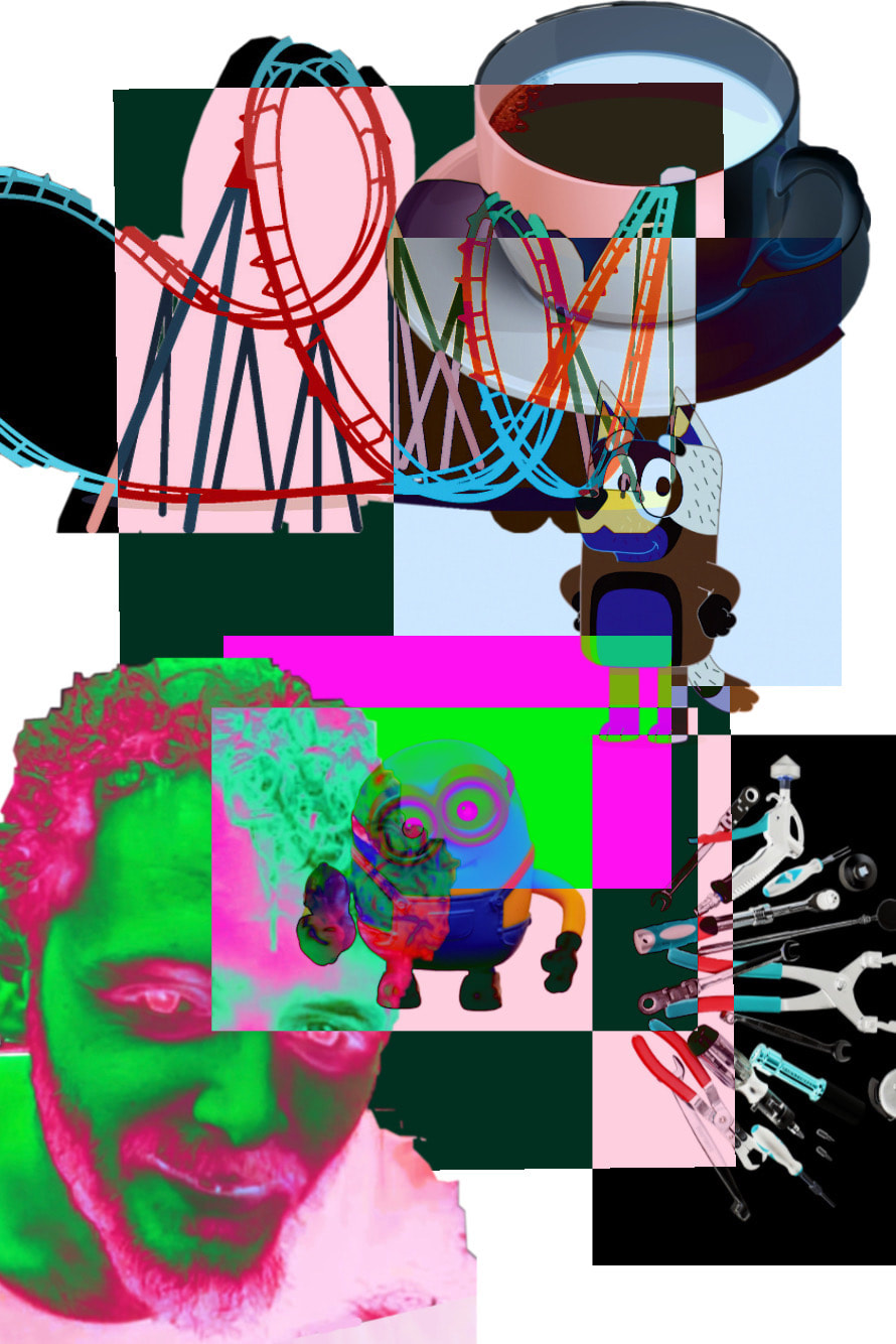
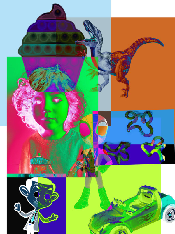
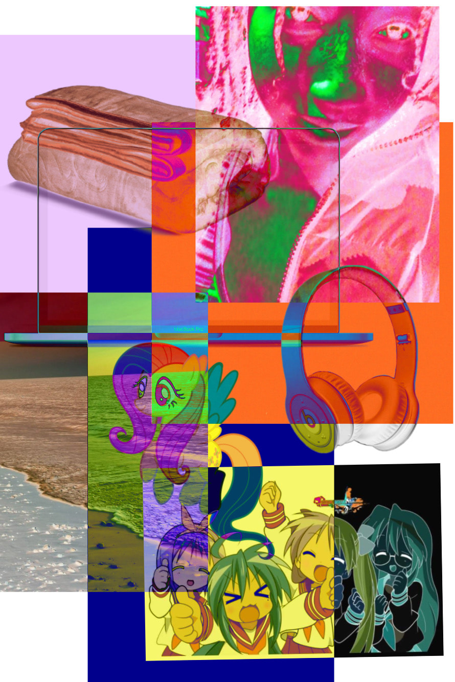
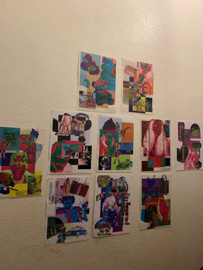
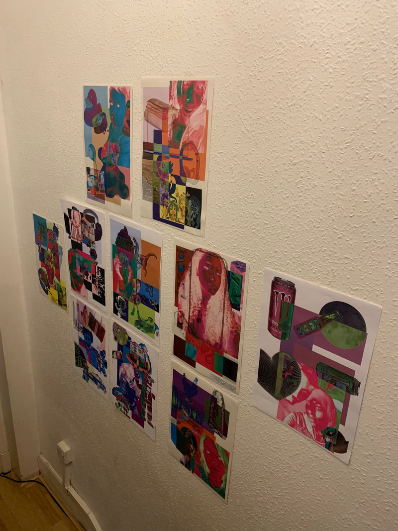
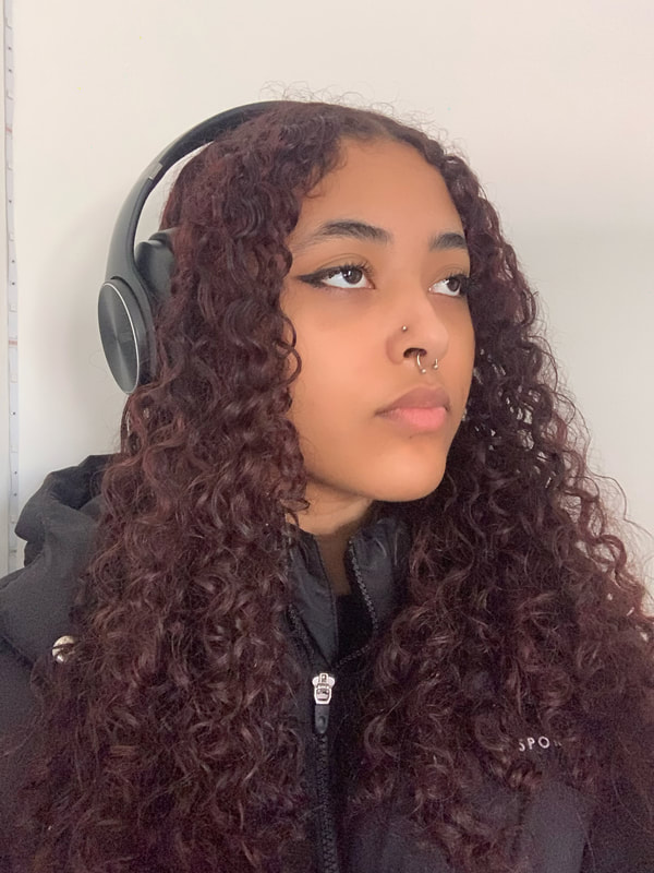
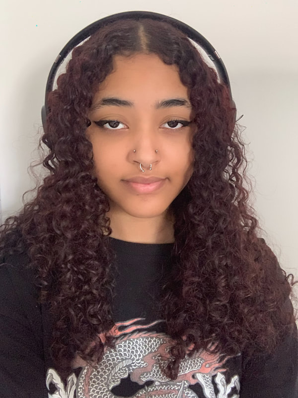
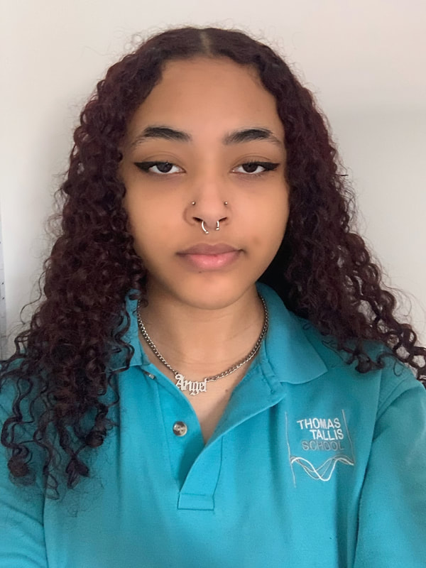
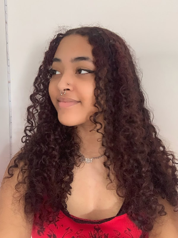
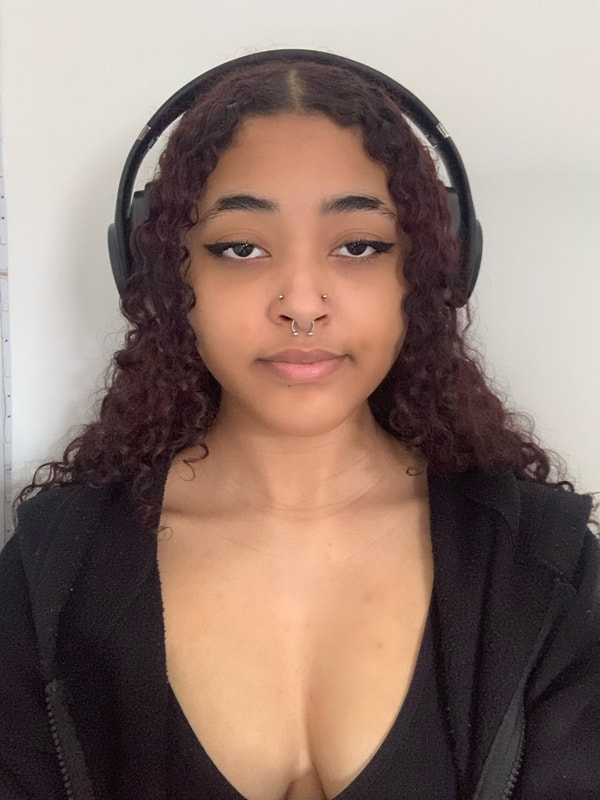
My Portraits:
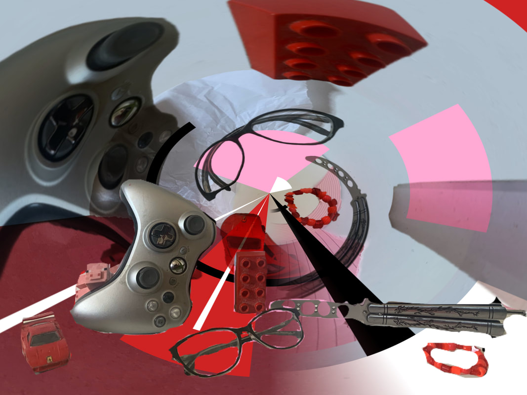
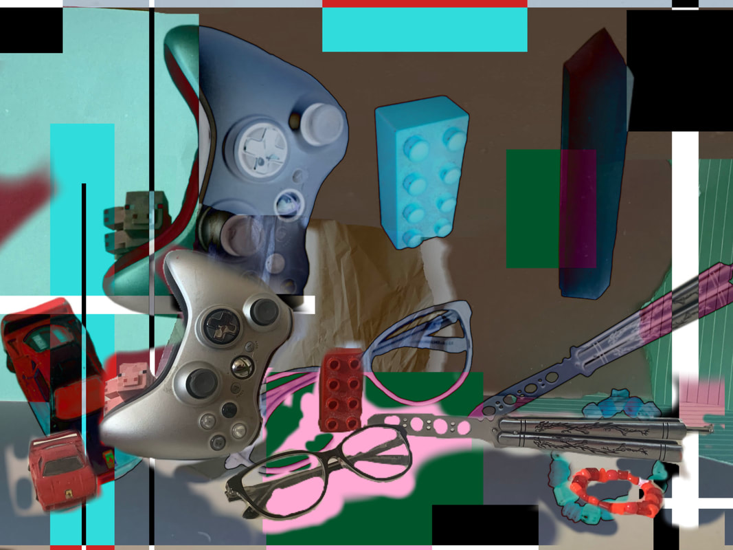
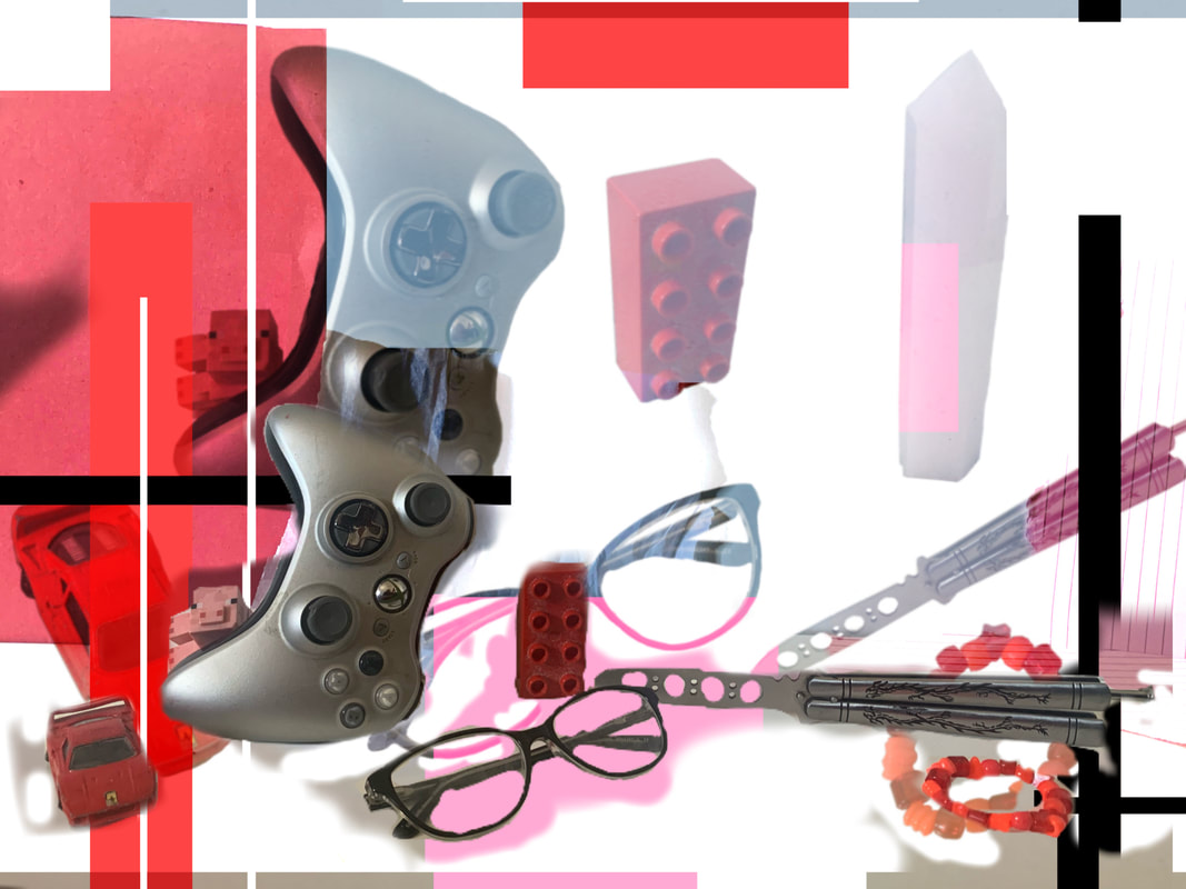
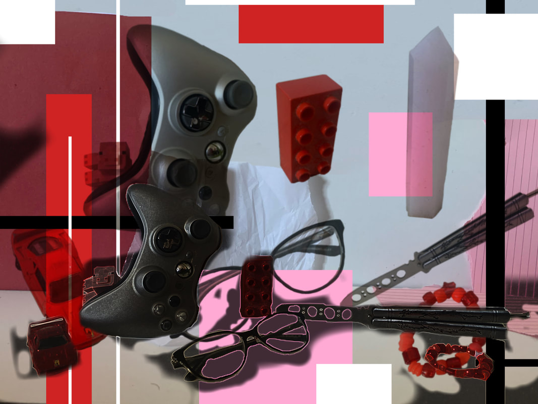
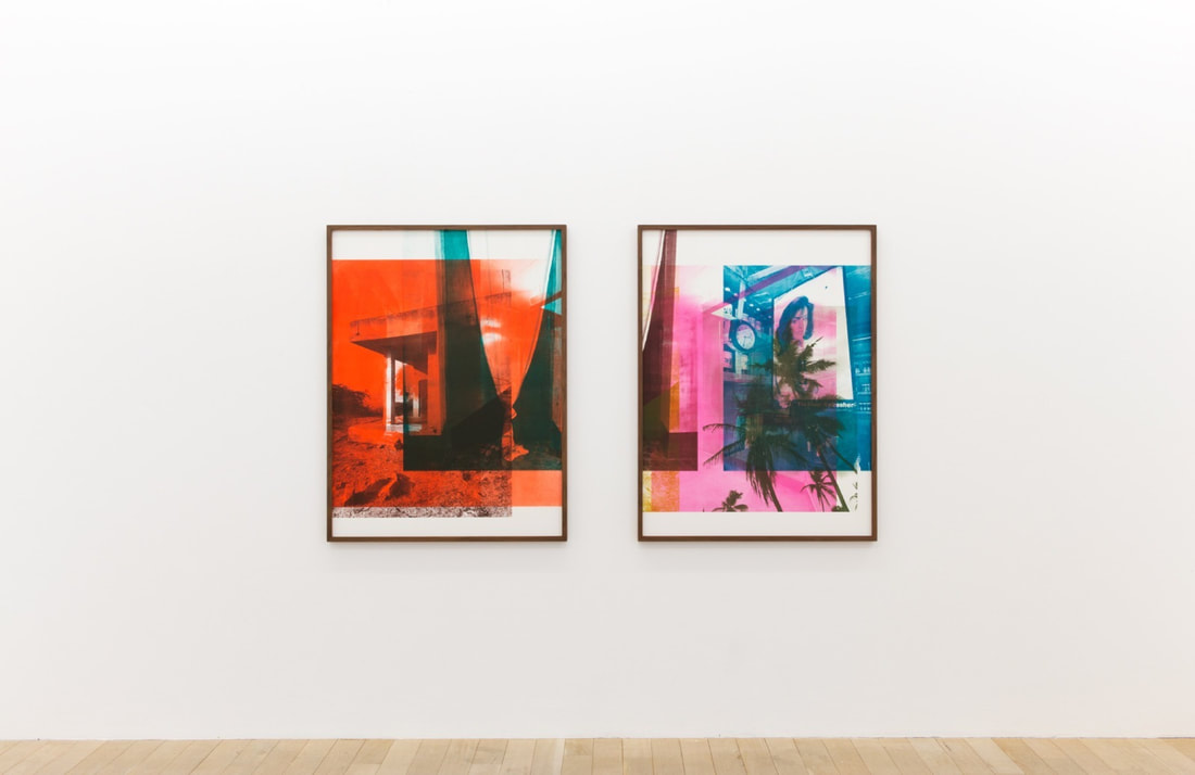
Object photographs:


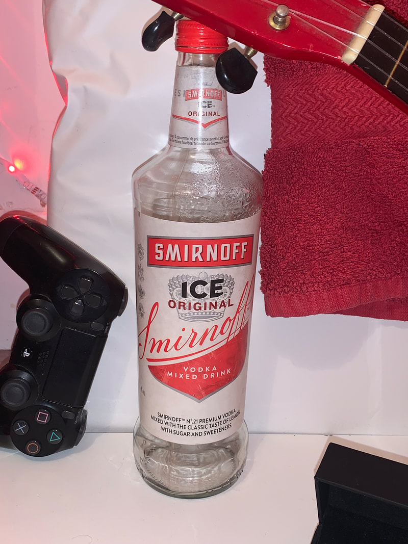
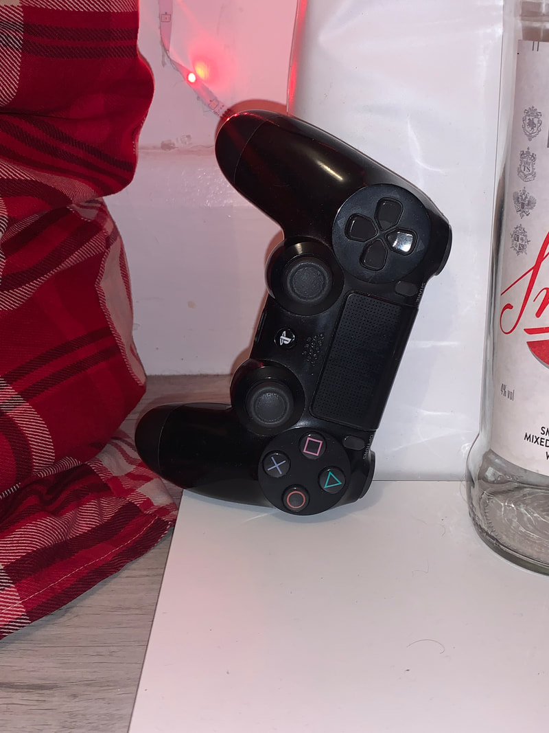
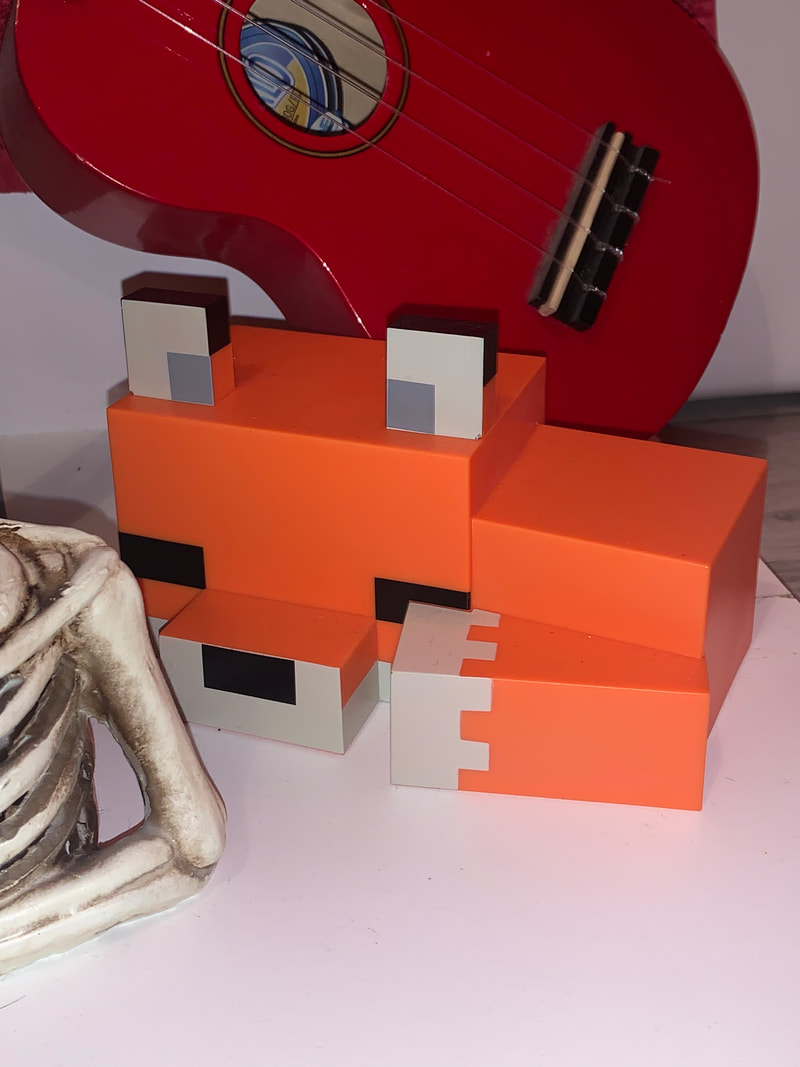
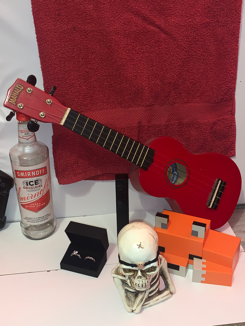
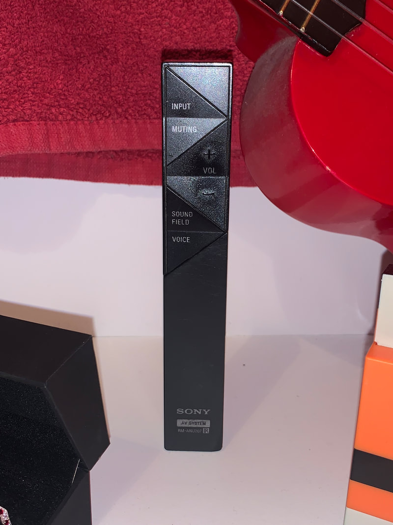
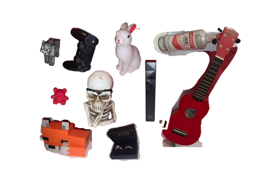
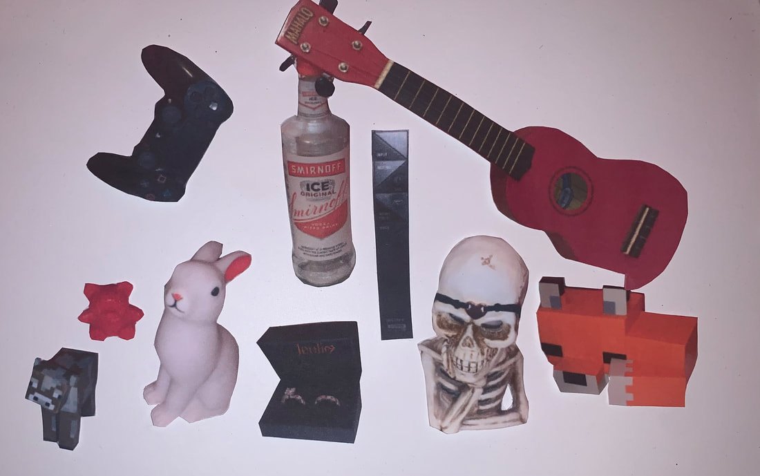
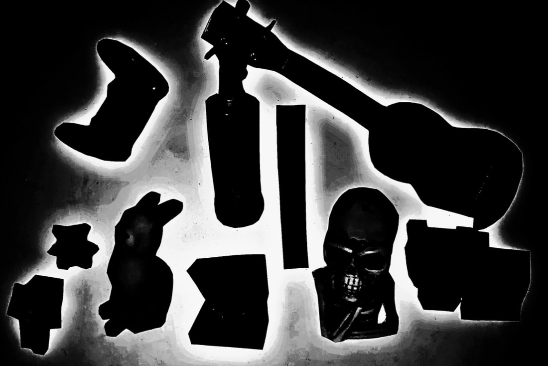
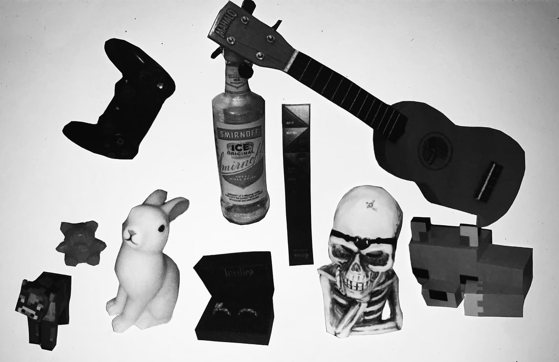
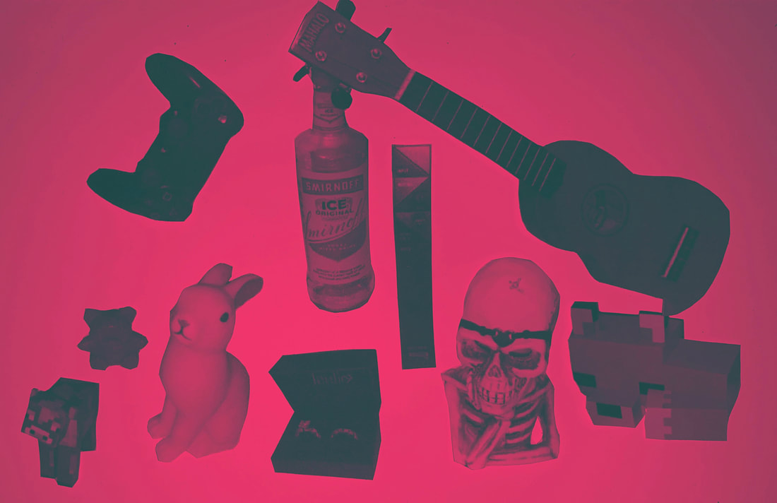
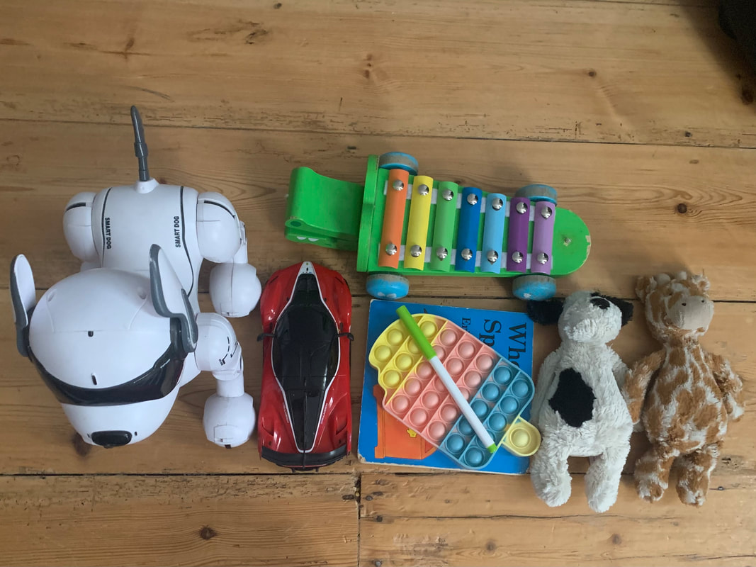
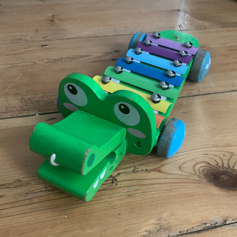
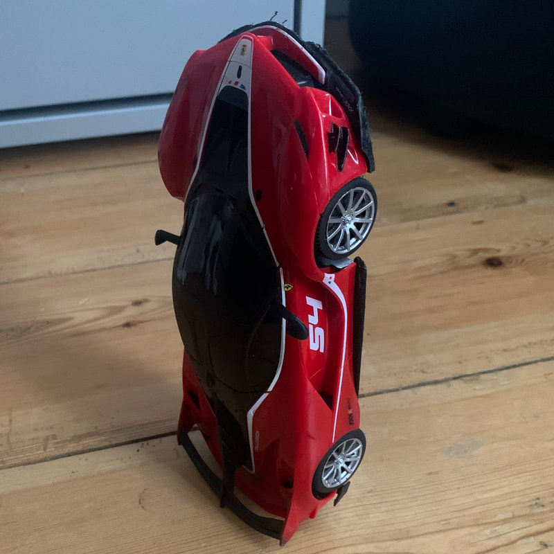
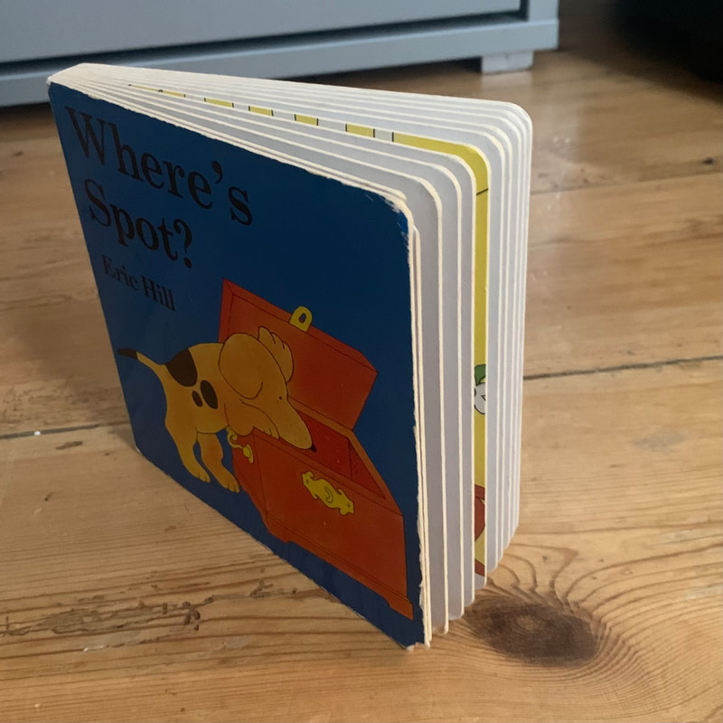
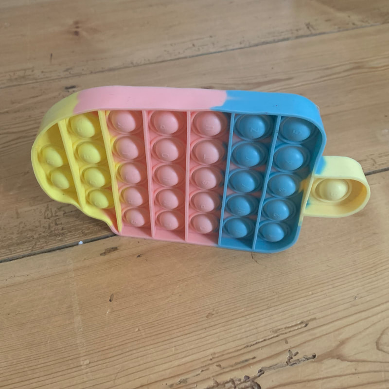
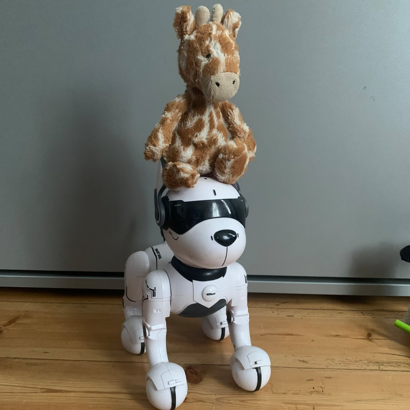
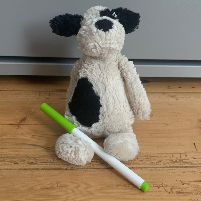
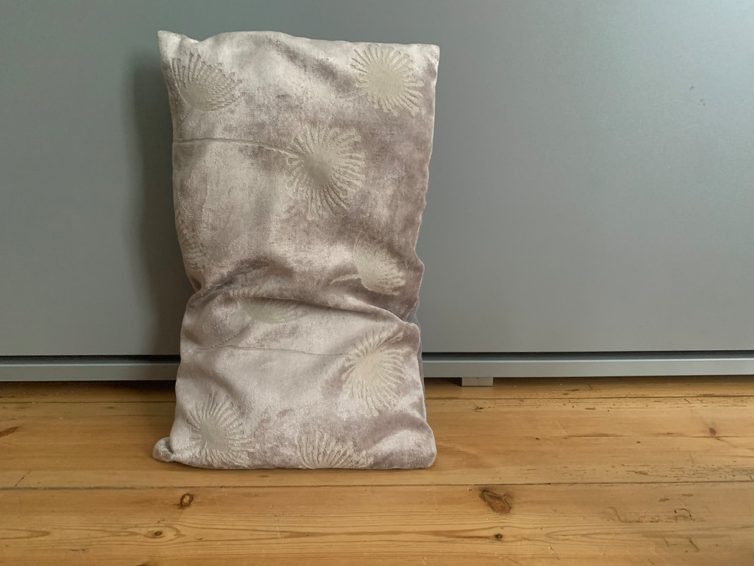
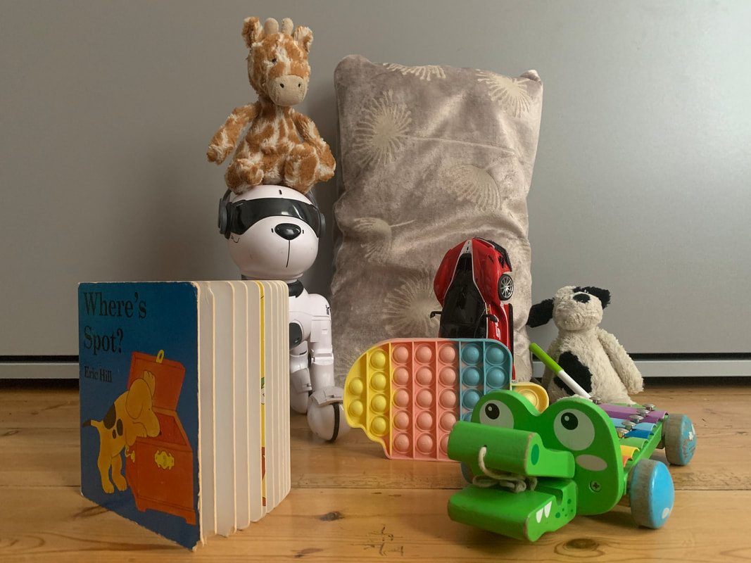
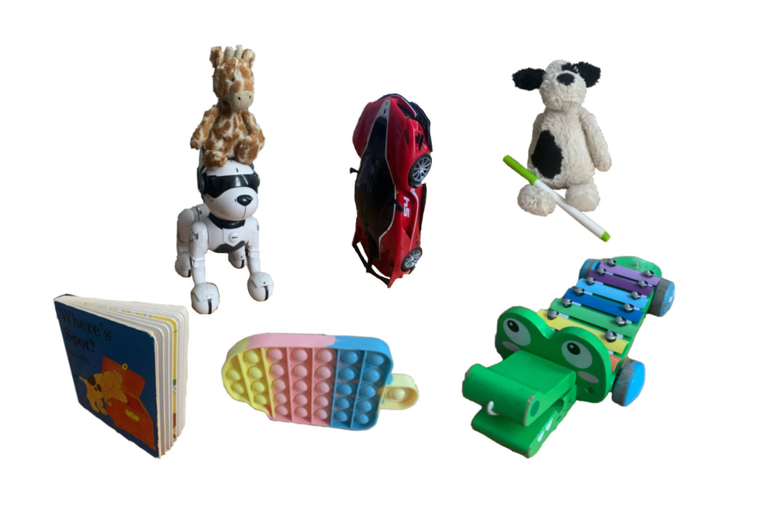
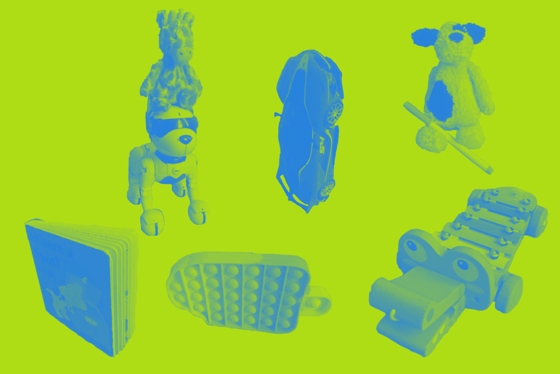
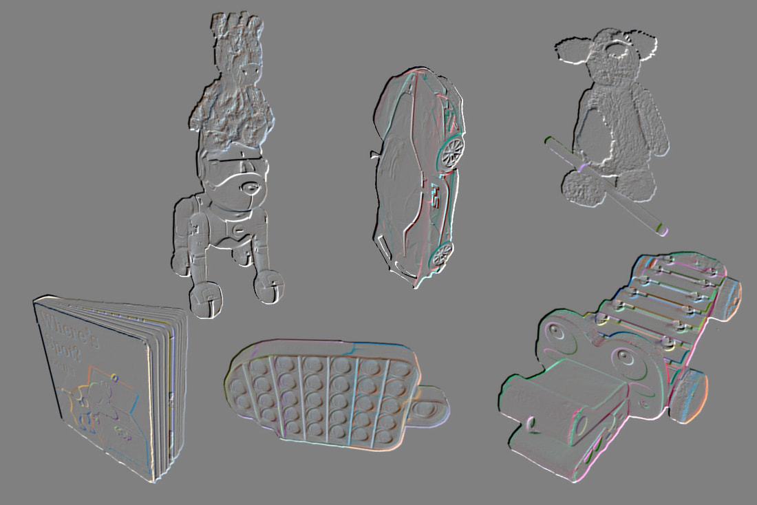
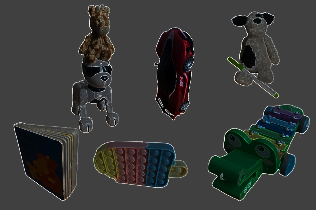
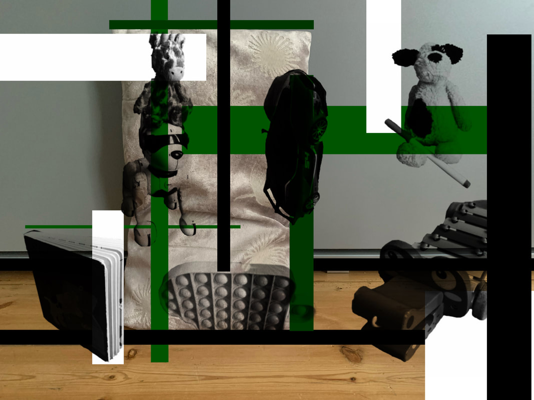
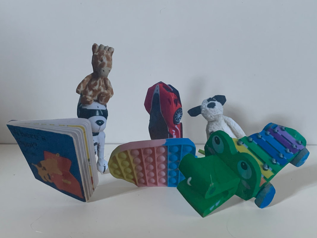
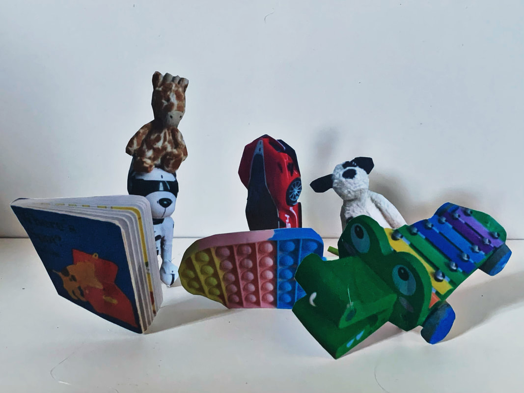
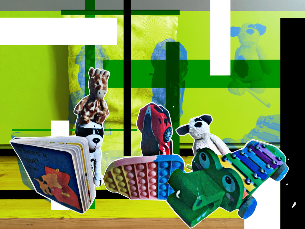
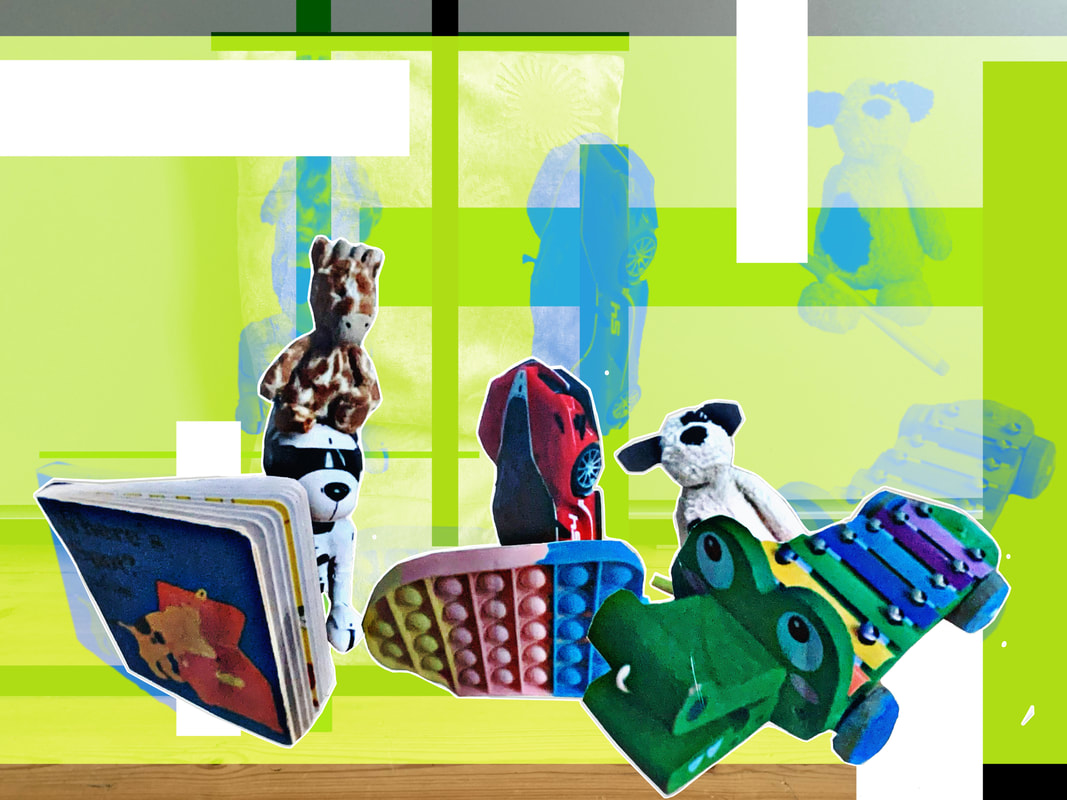
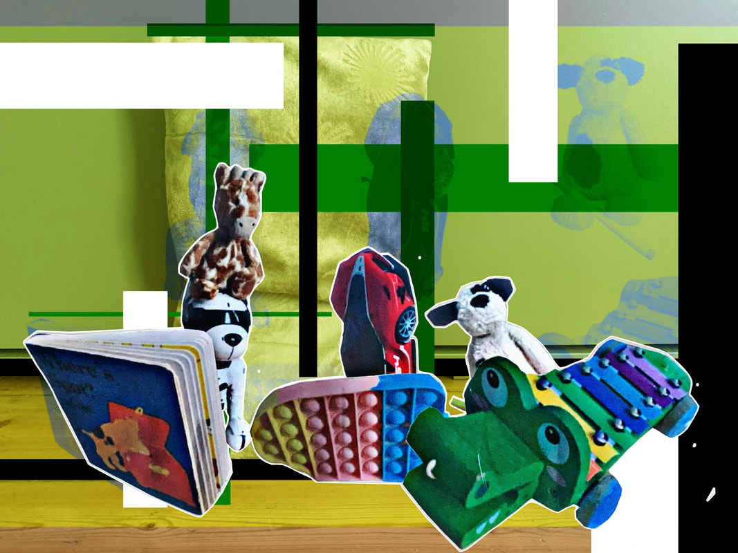
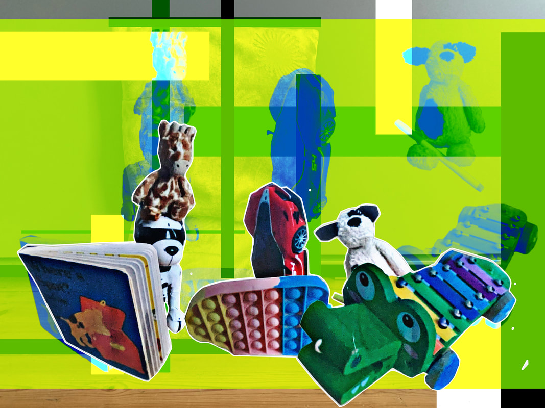
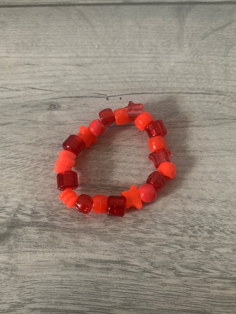
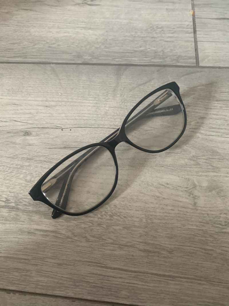
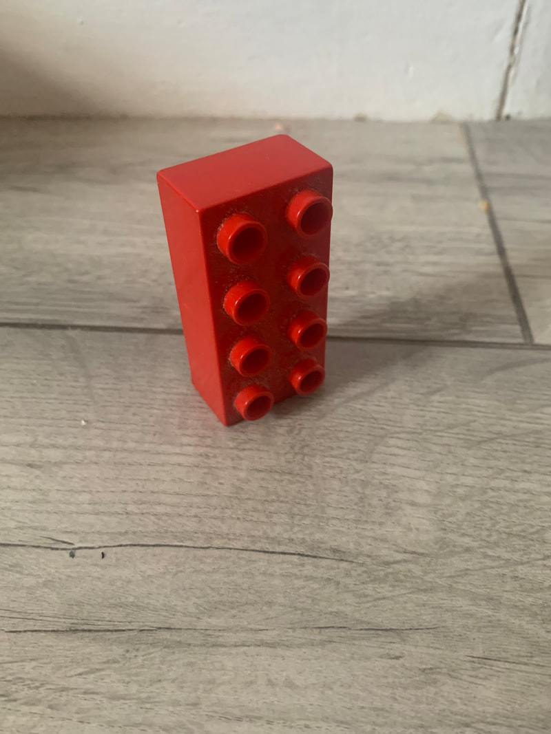
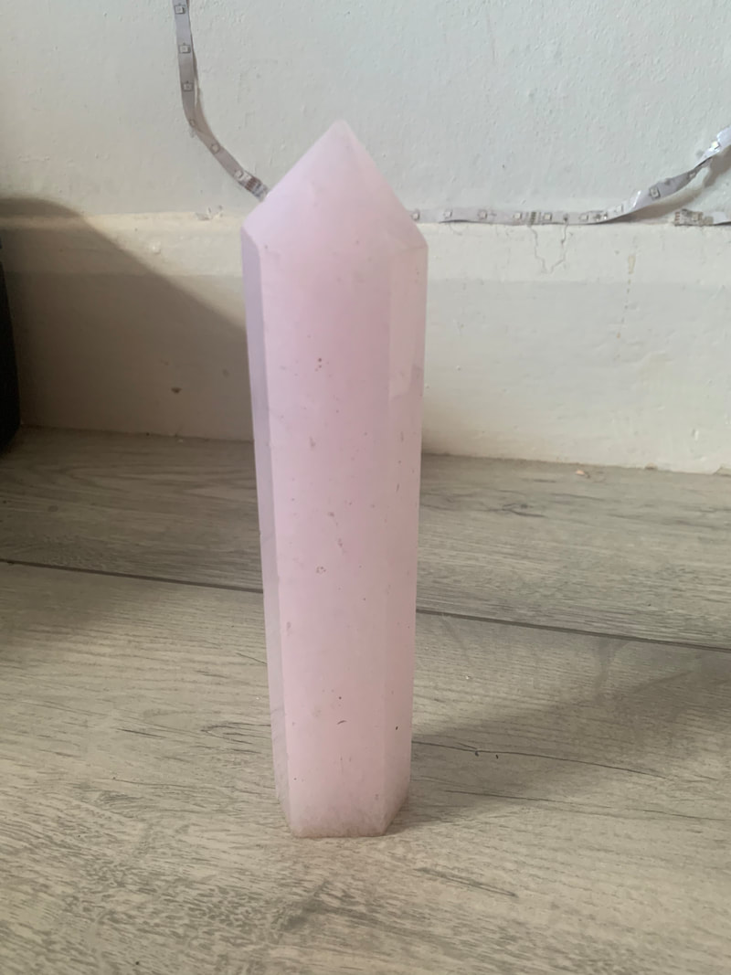
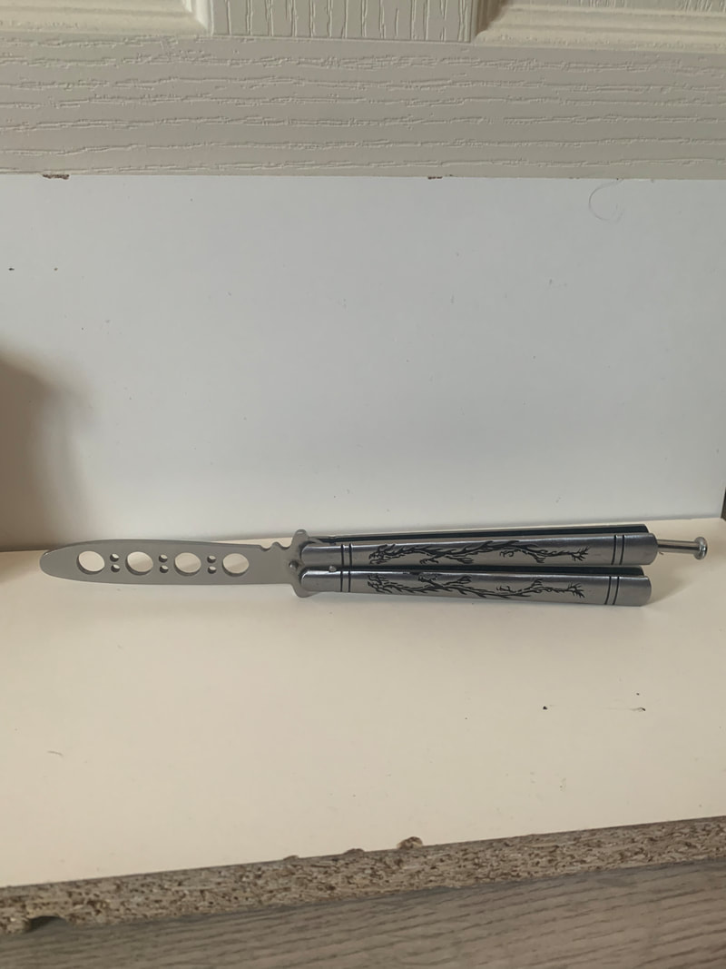
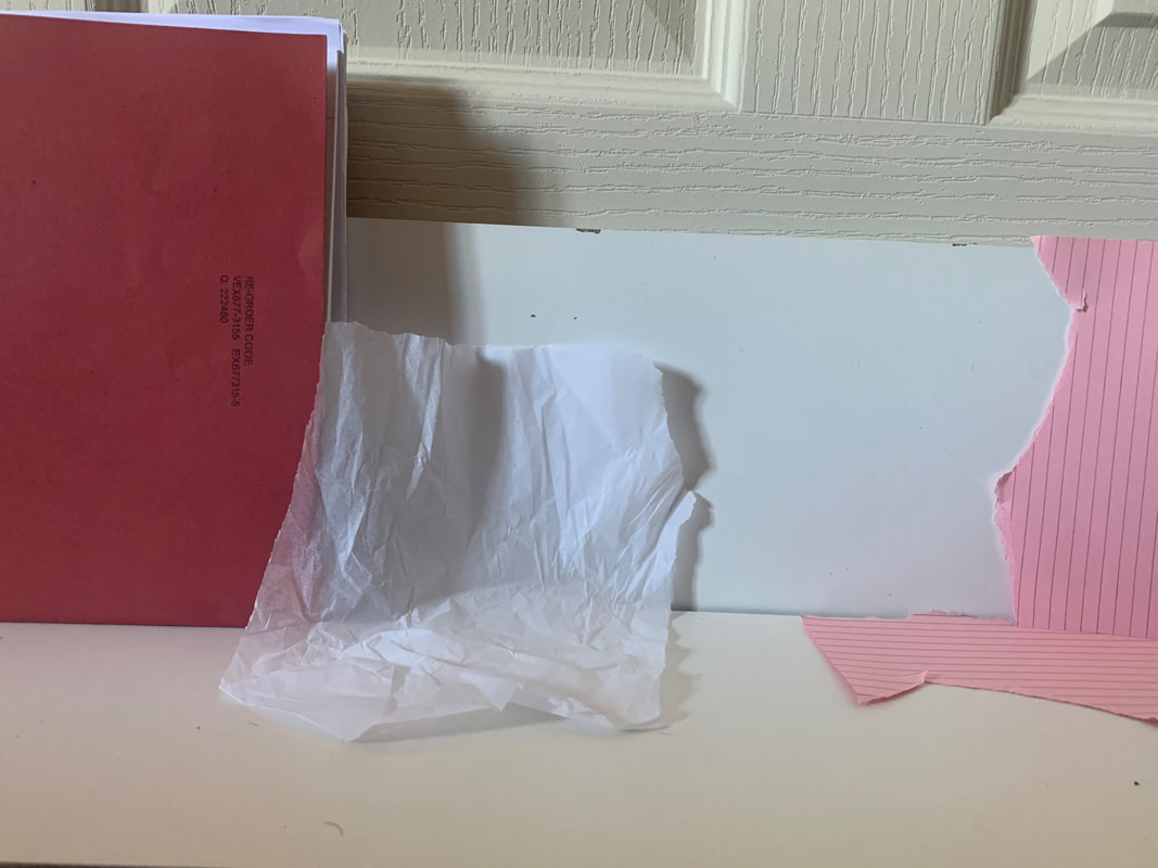
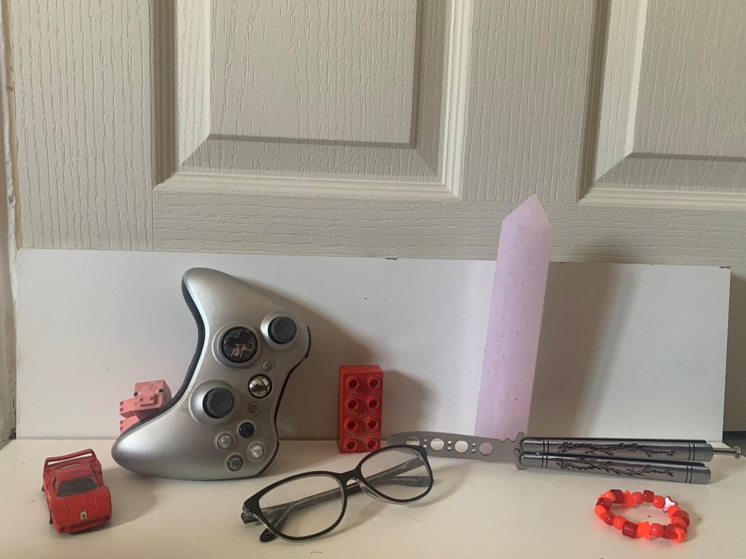
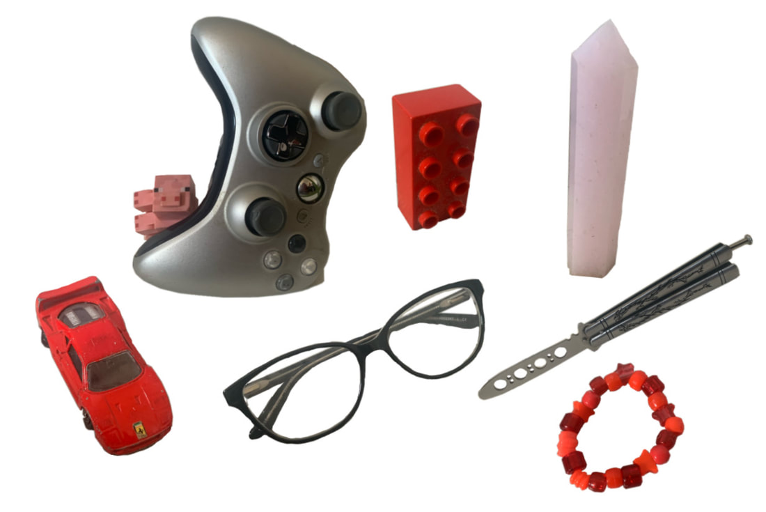
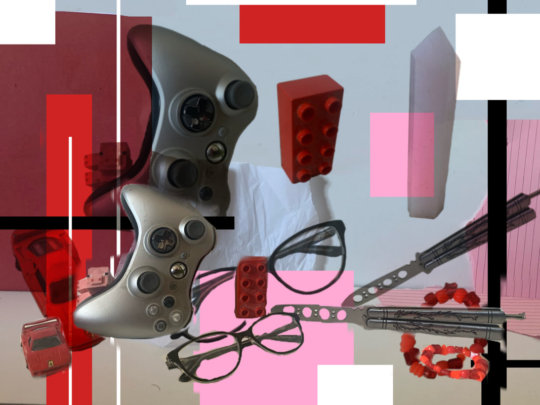
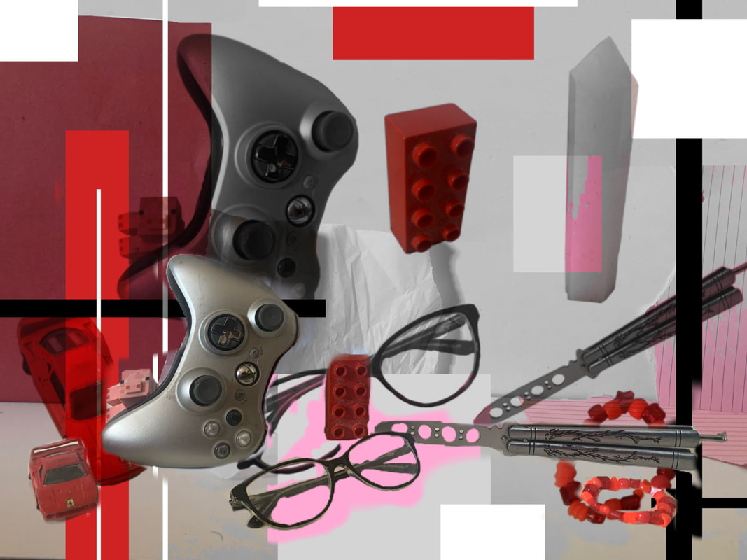
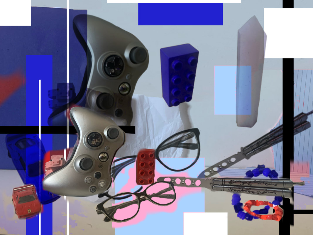
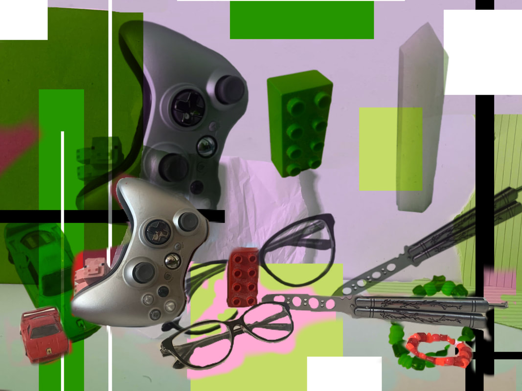
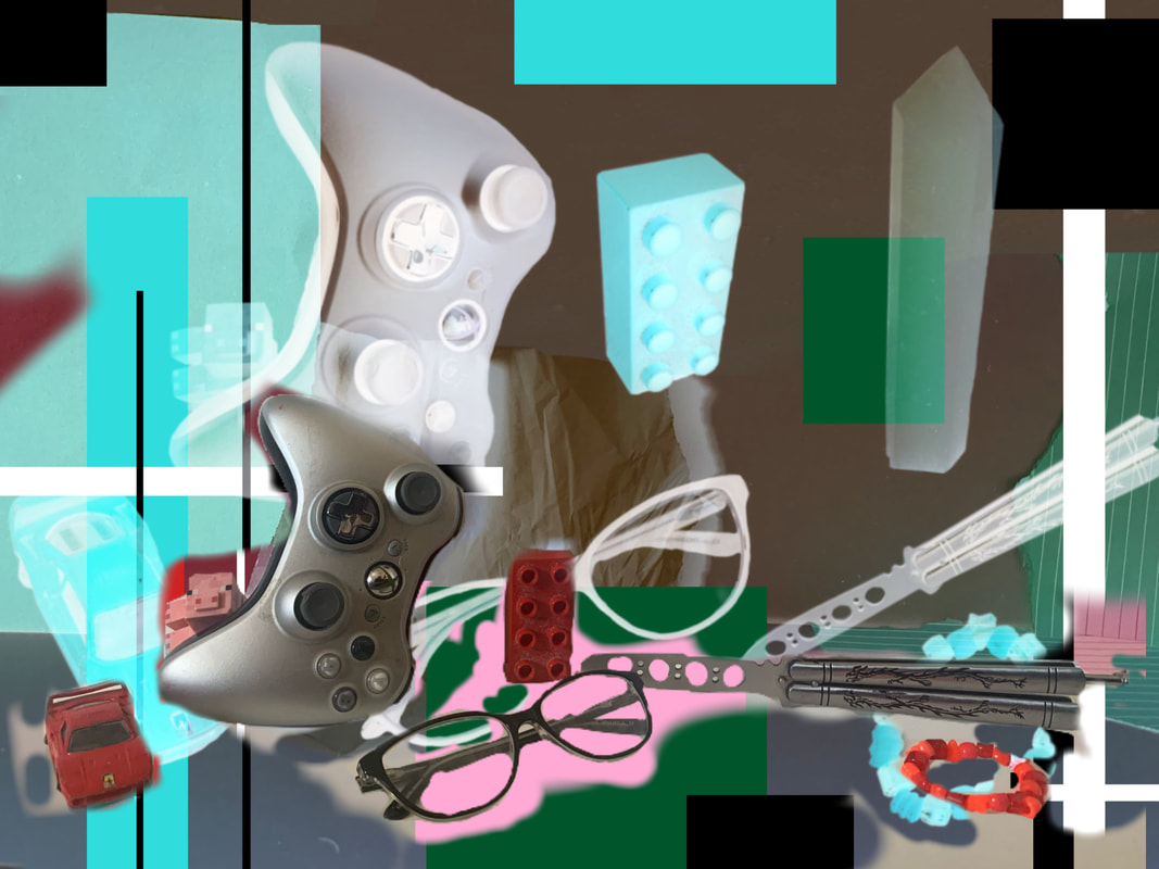
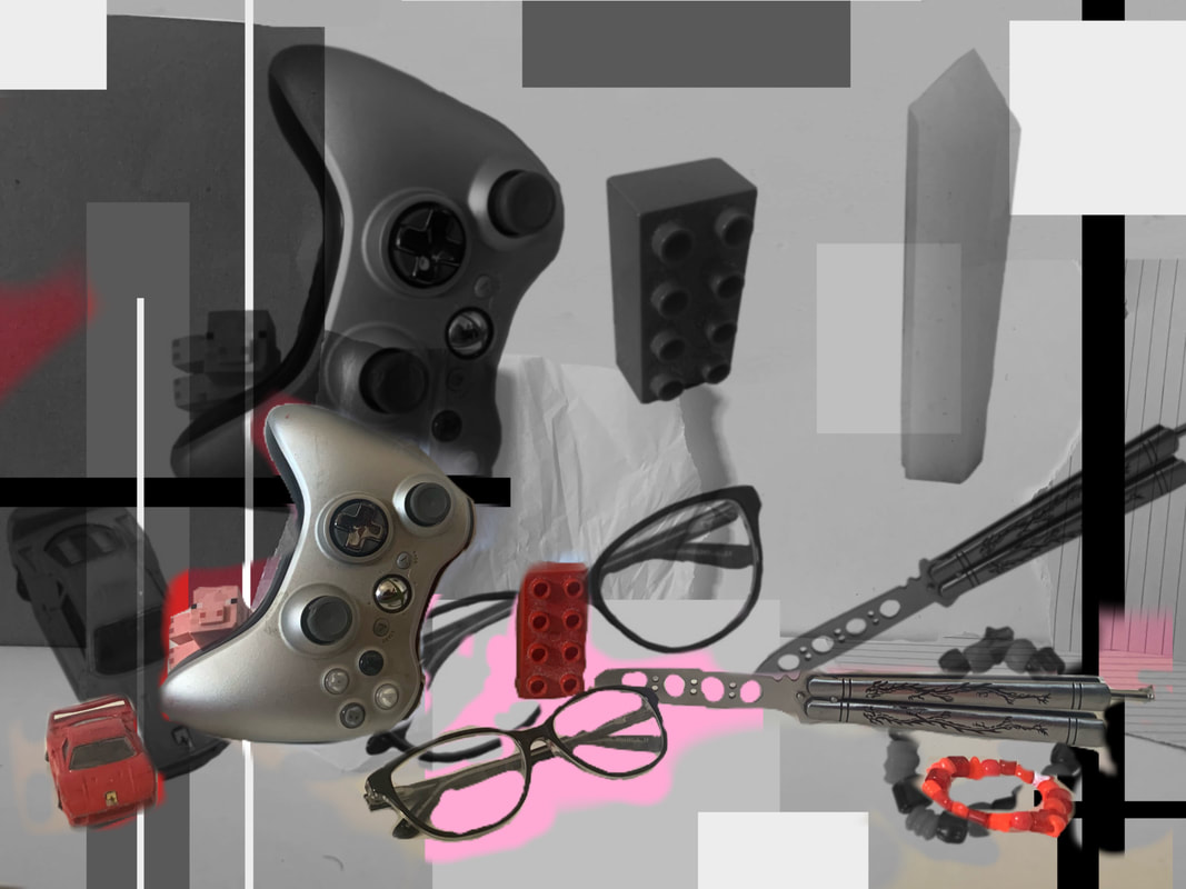
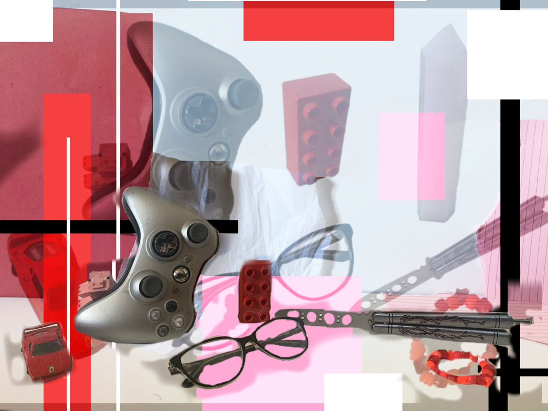
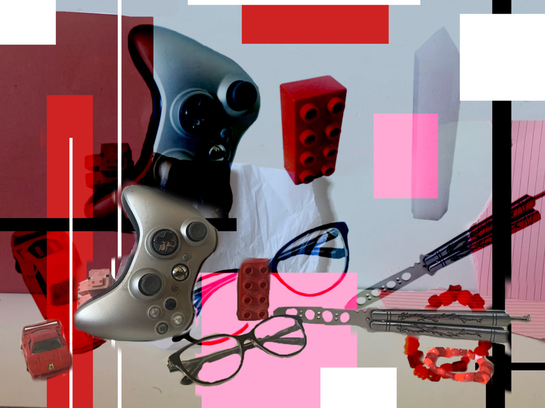
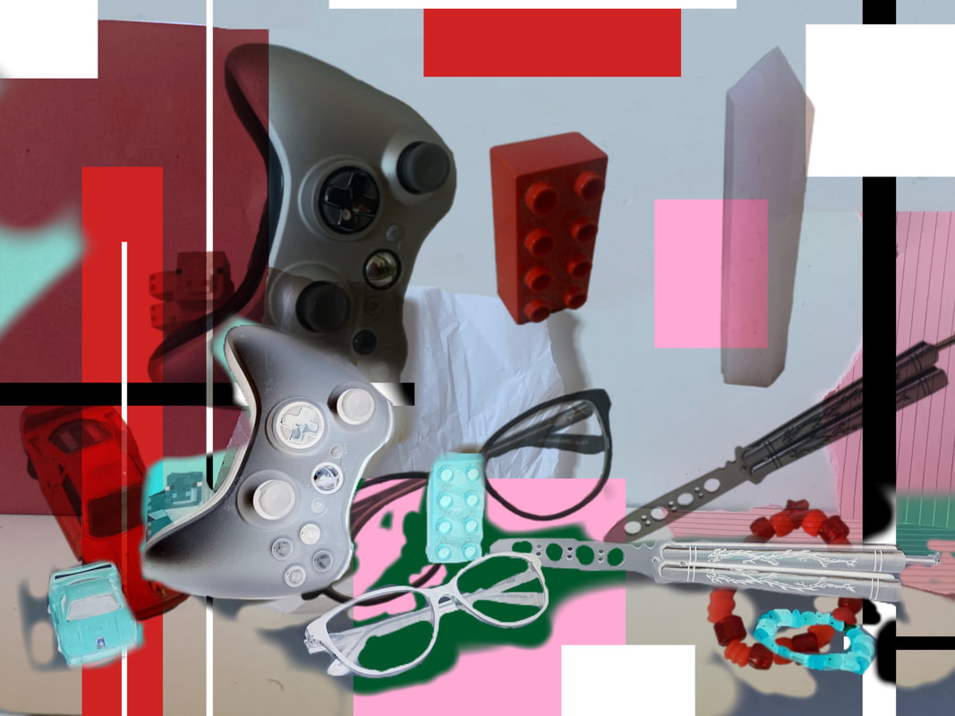
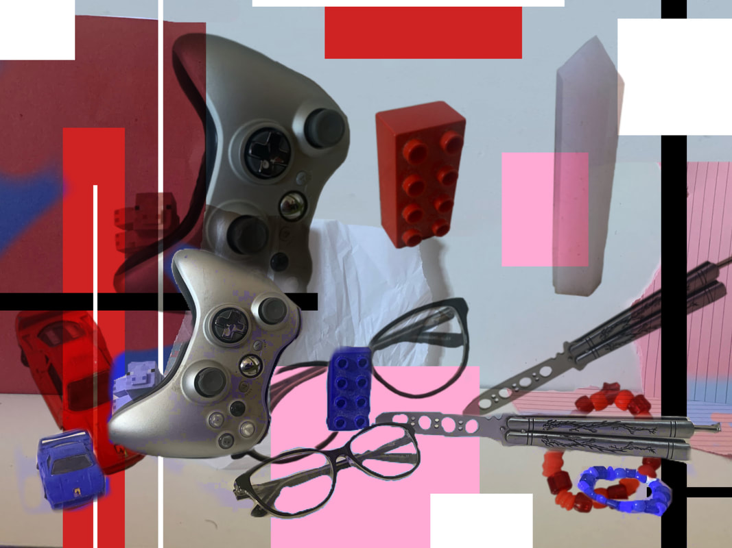
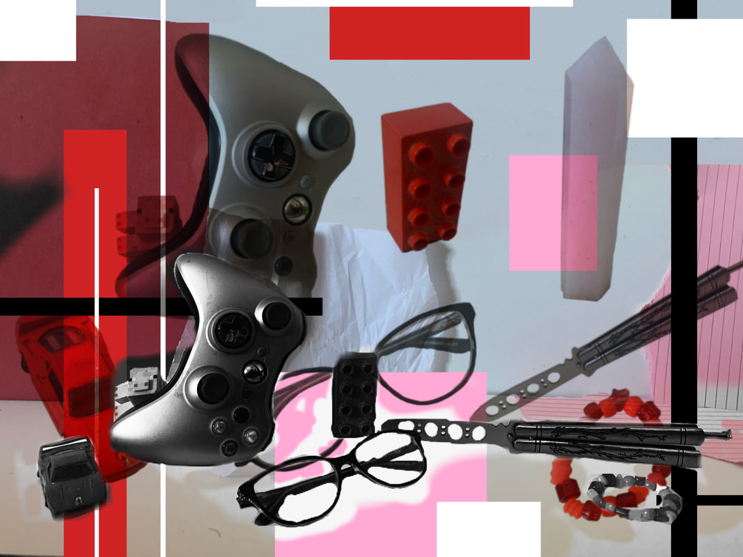
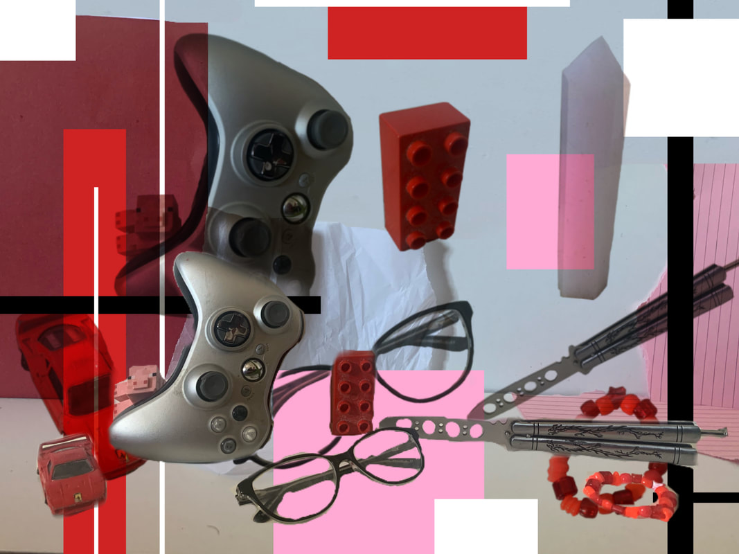
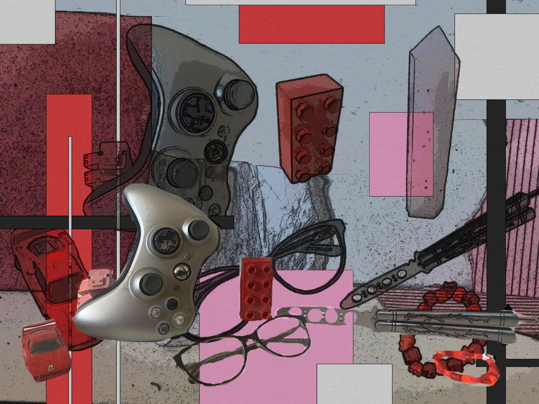
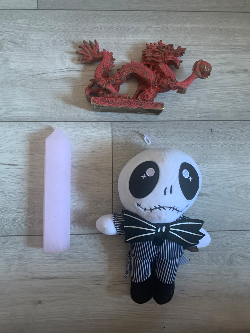
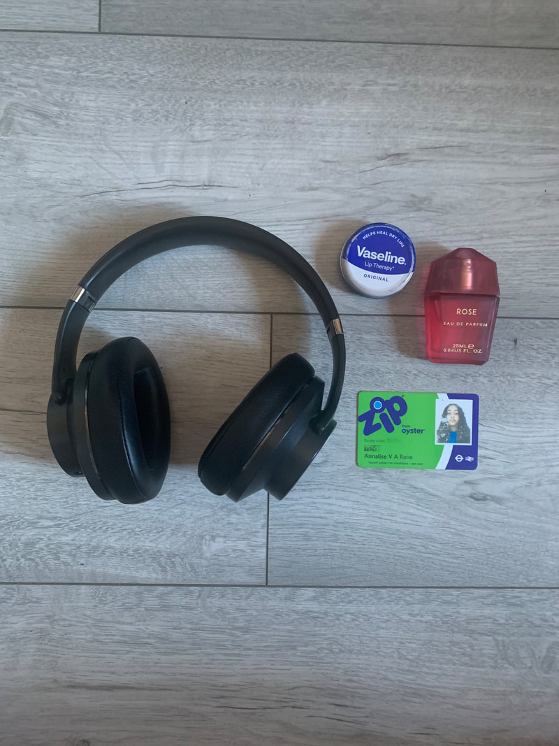
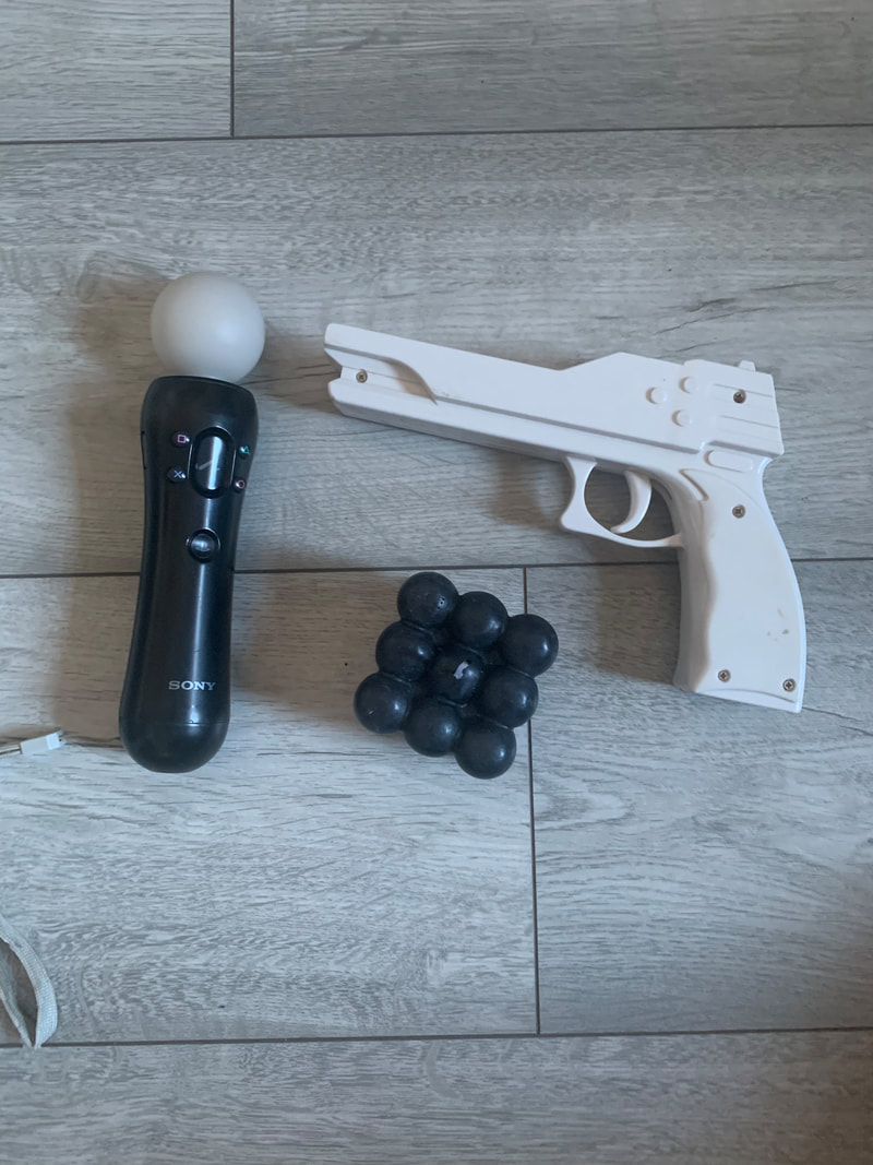
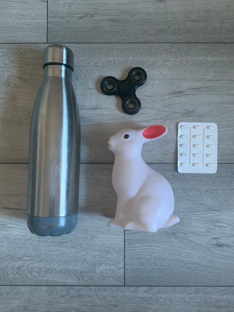
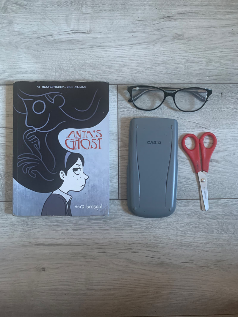
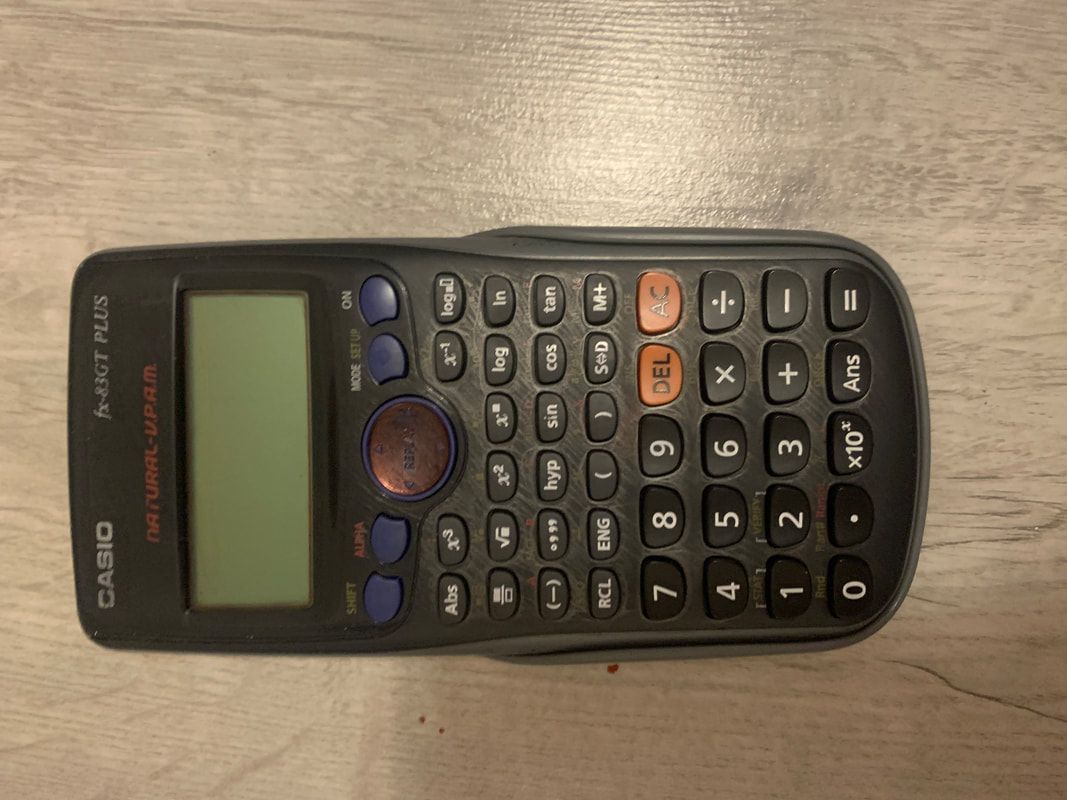
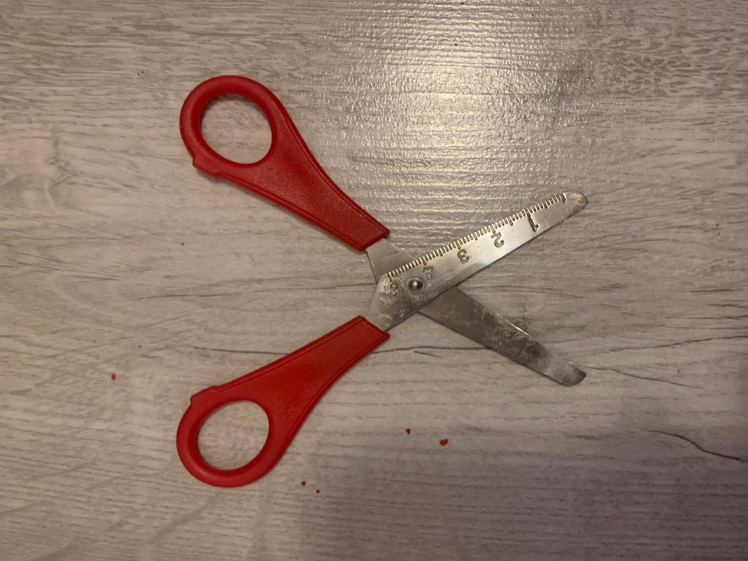
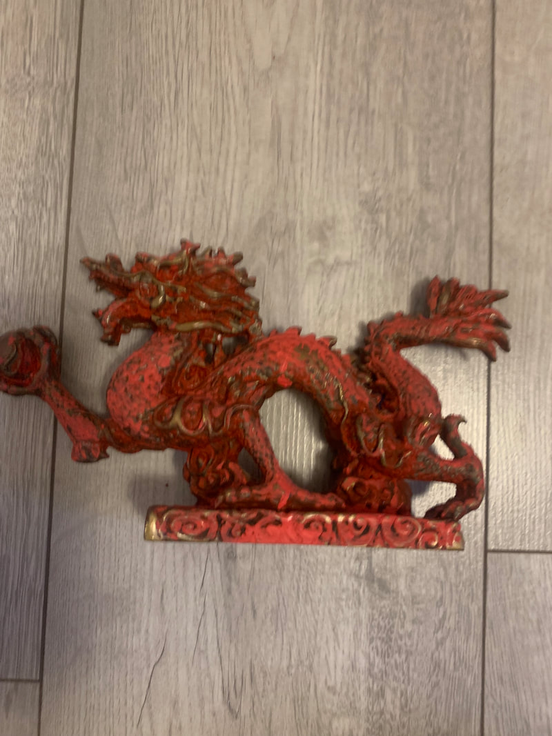
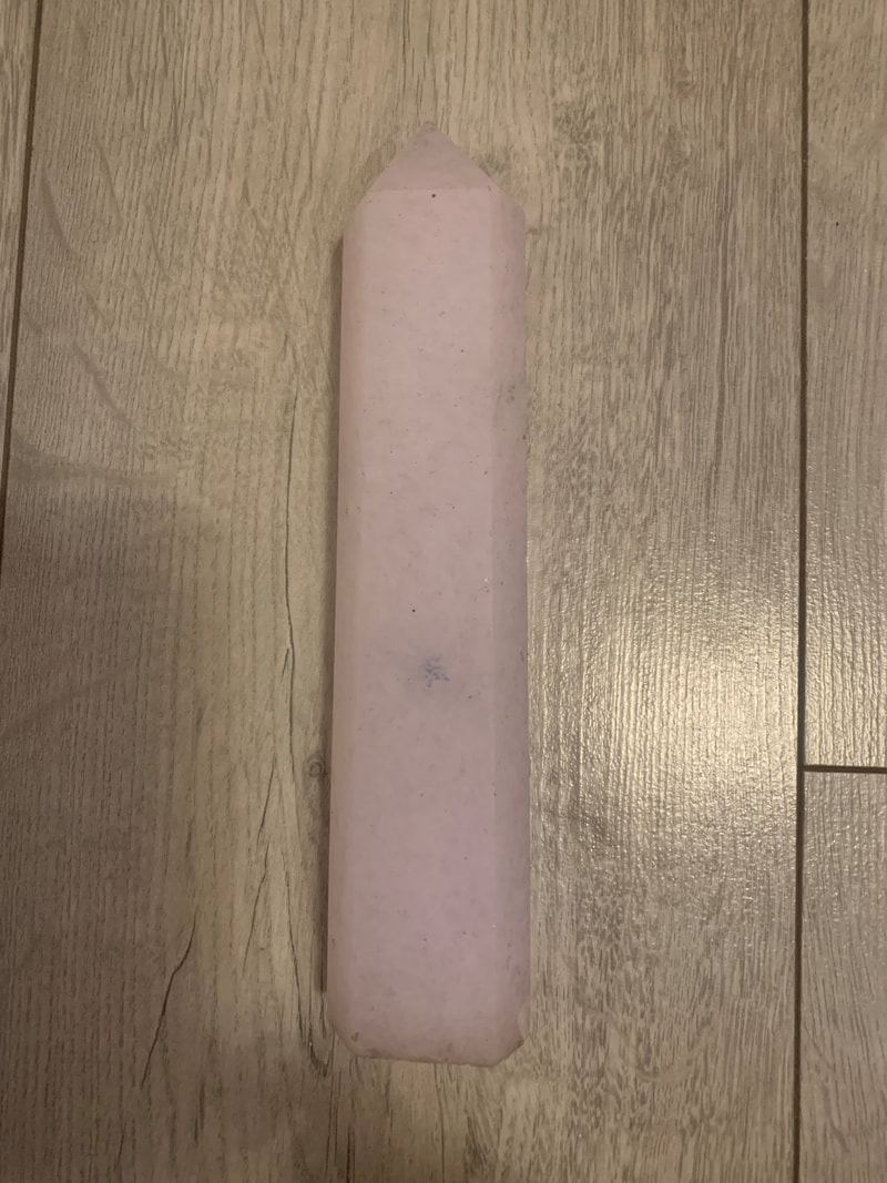
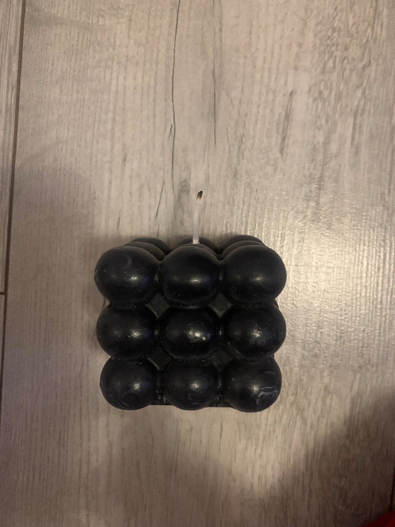
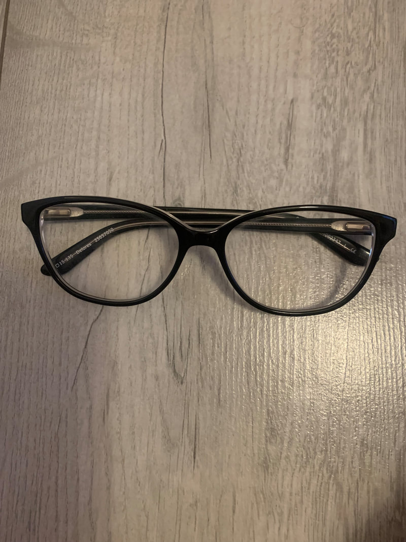
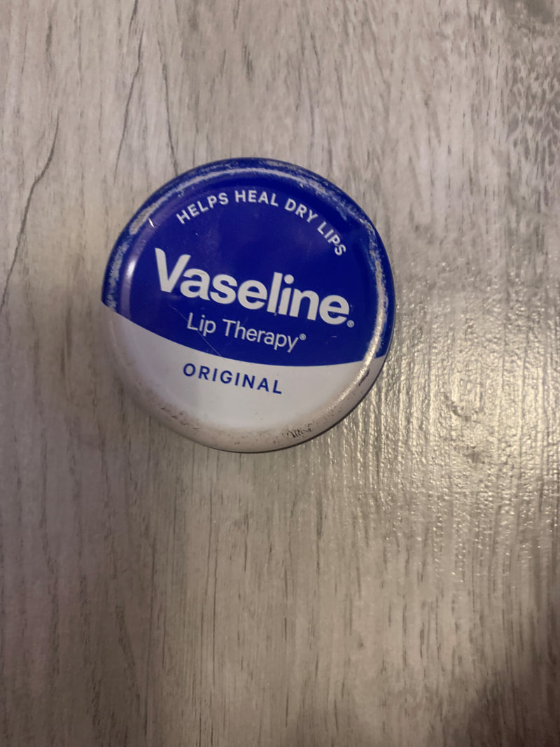
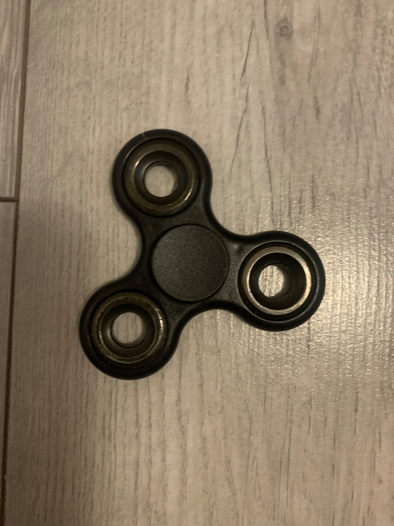
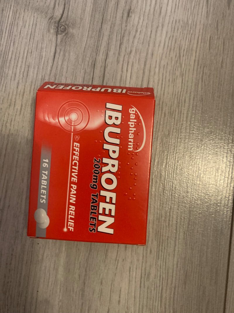
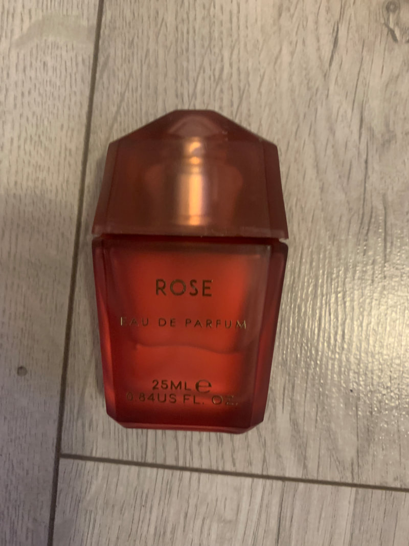
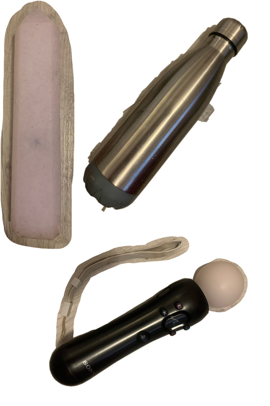
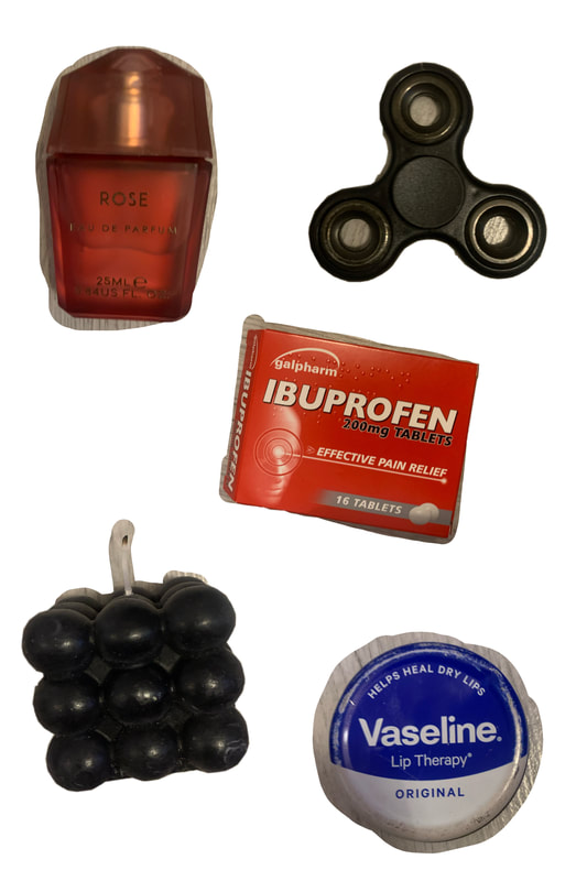
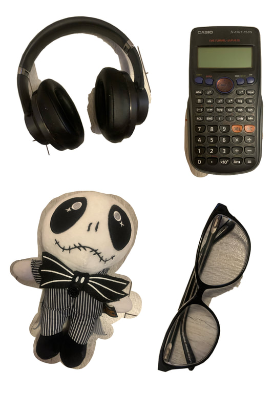
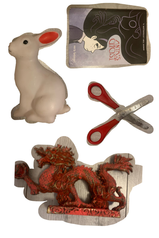
Physical objects that I collected:

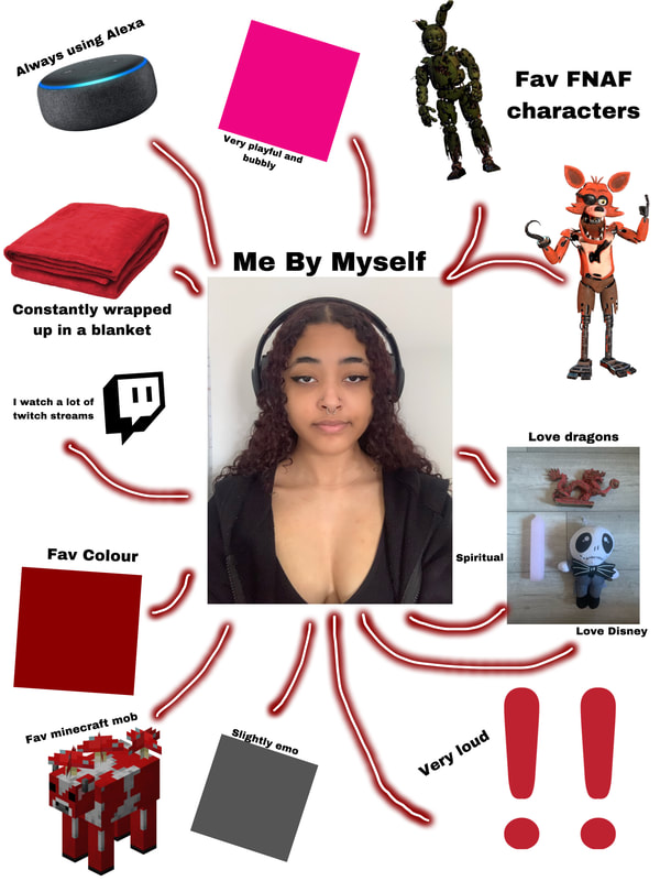
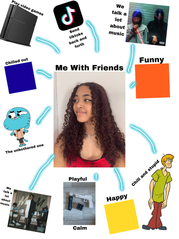
Mind maps:
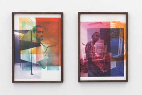
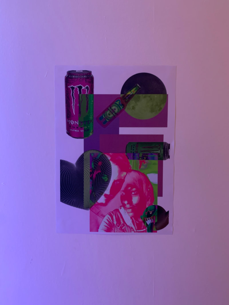
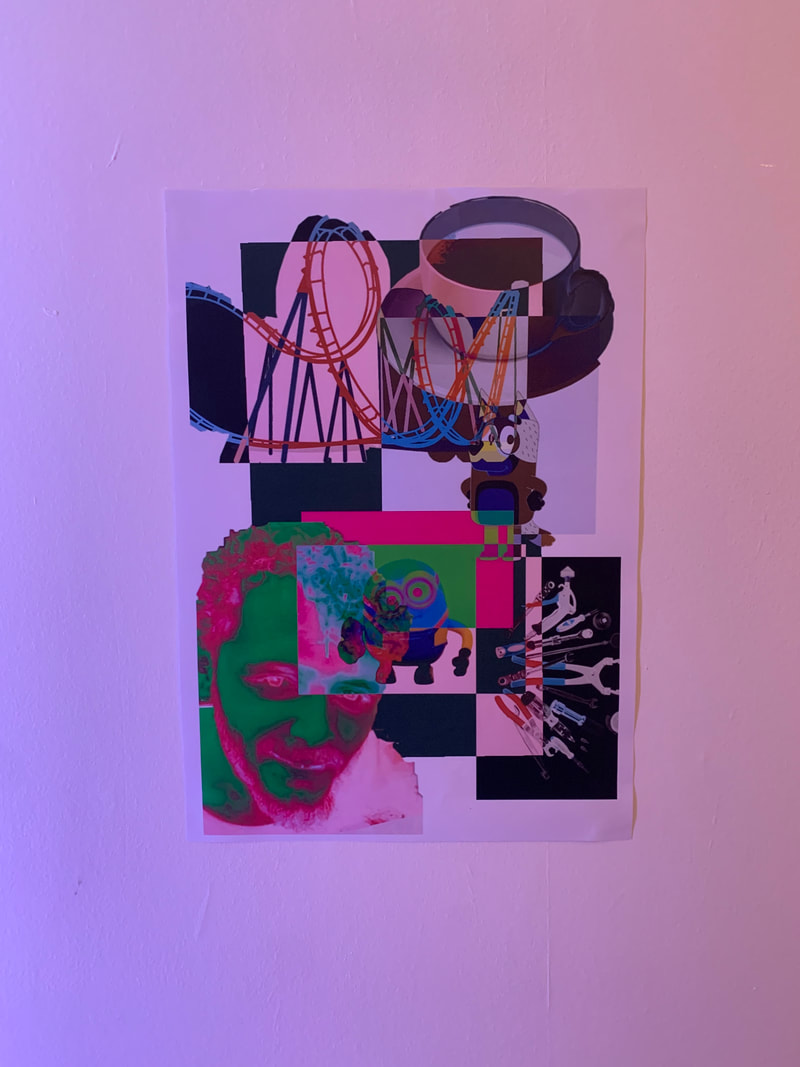
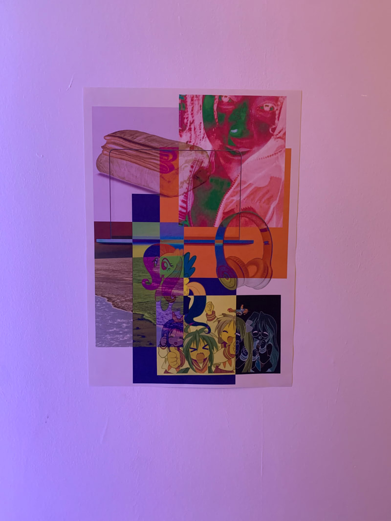
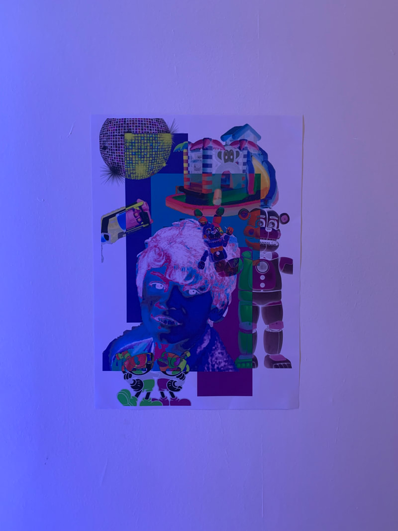
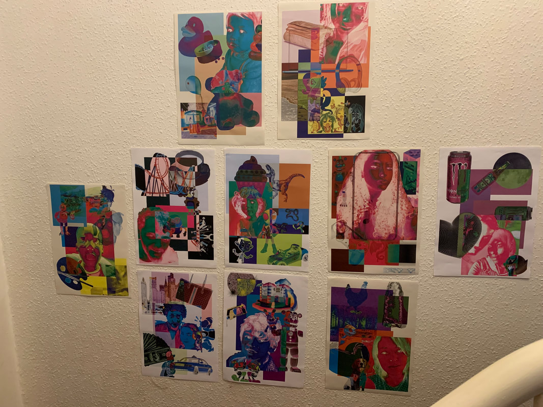
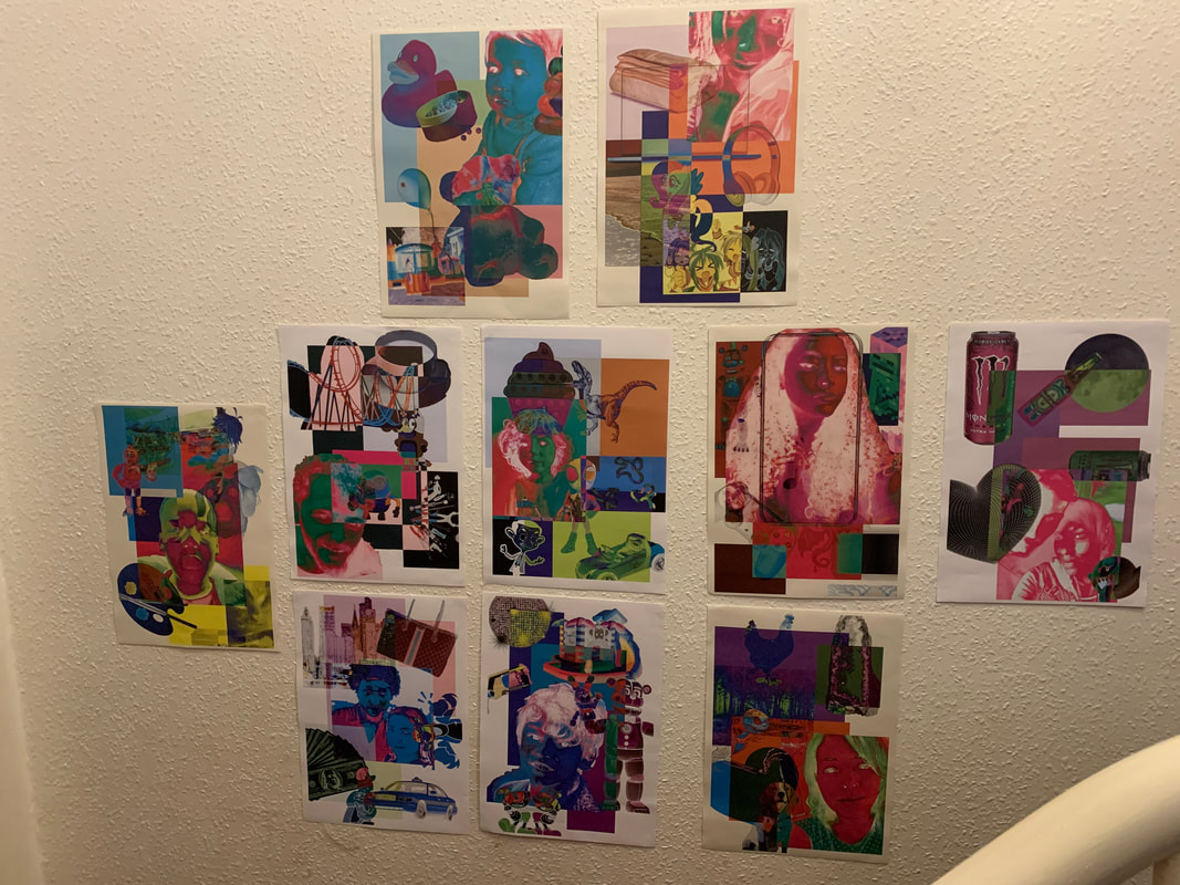
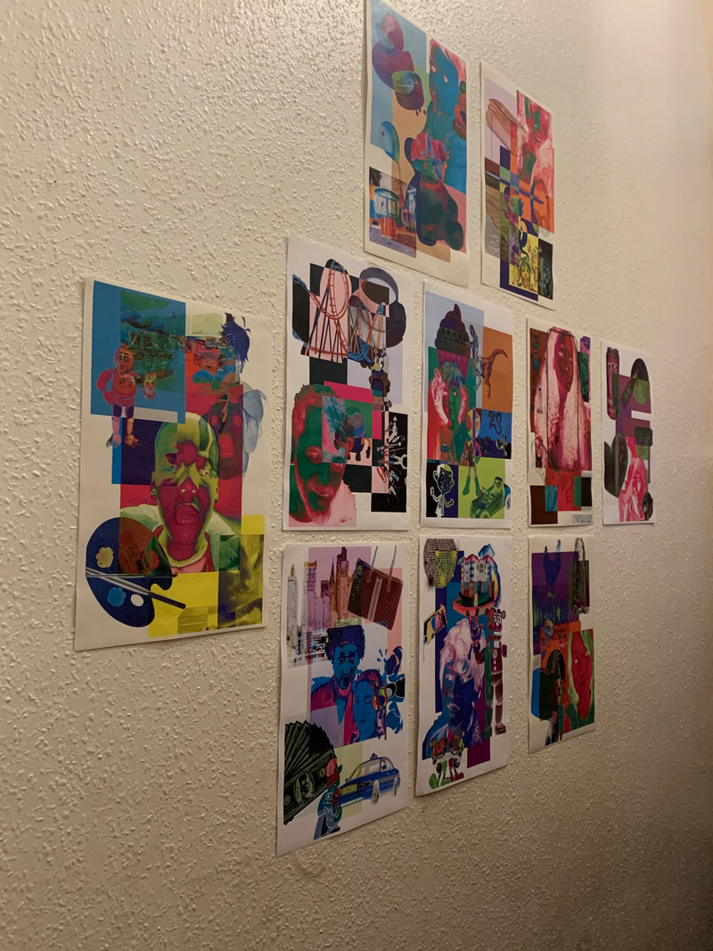
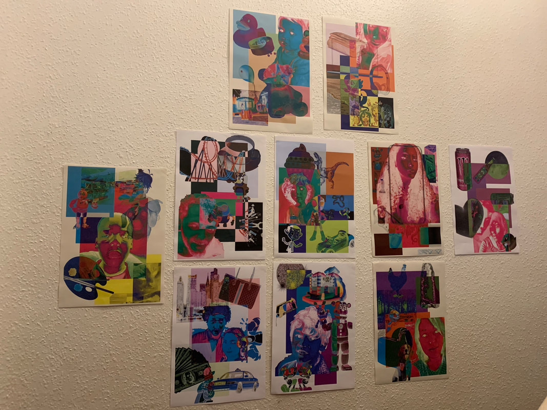
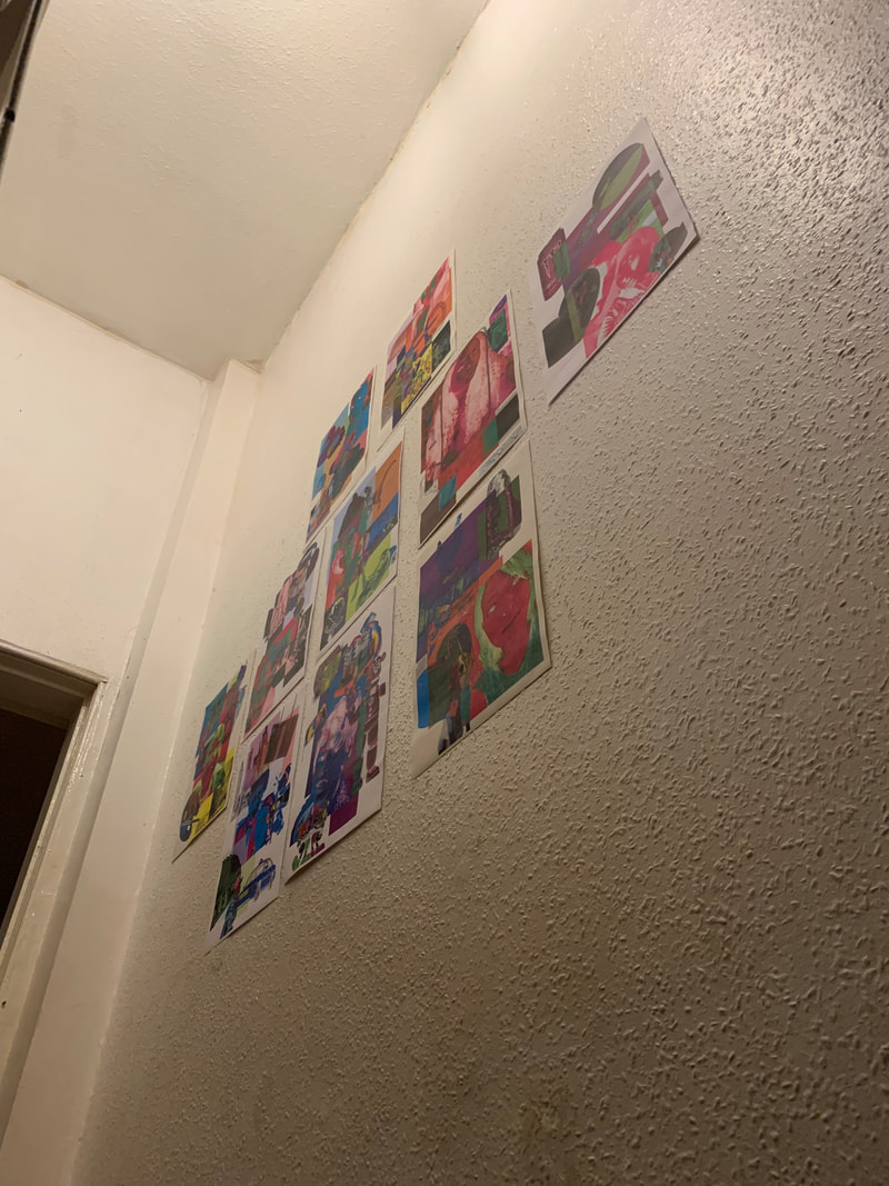
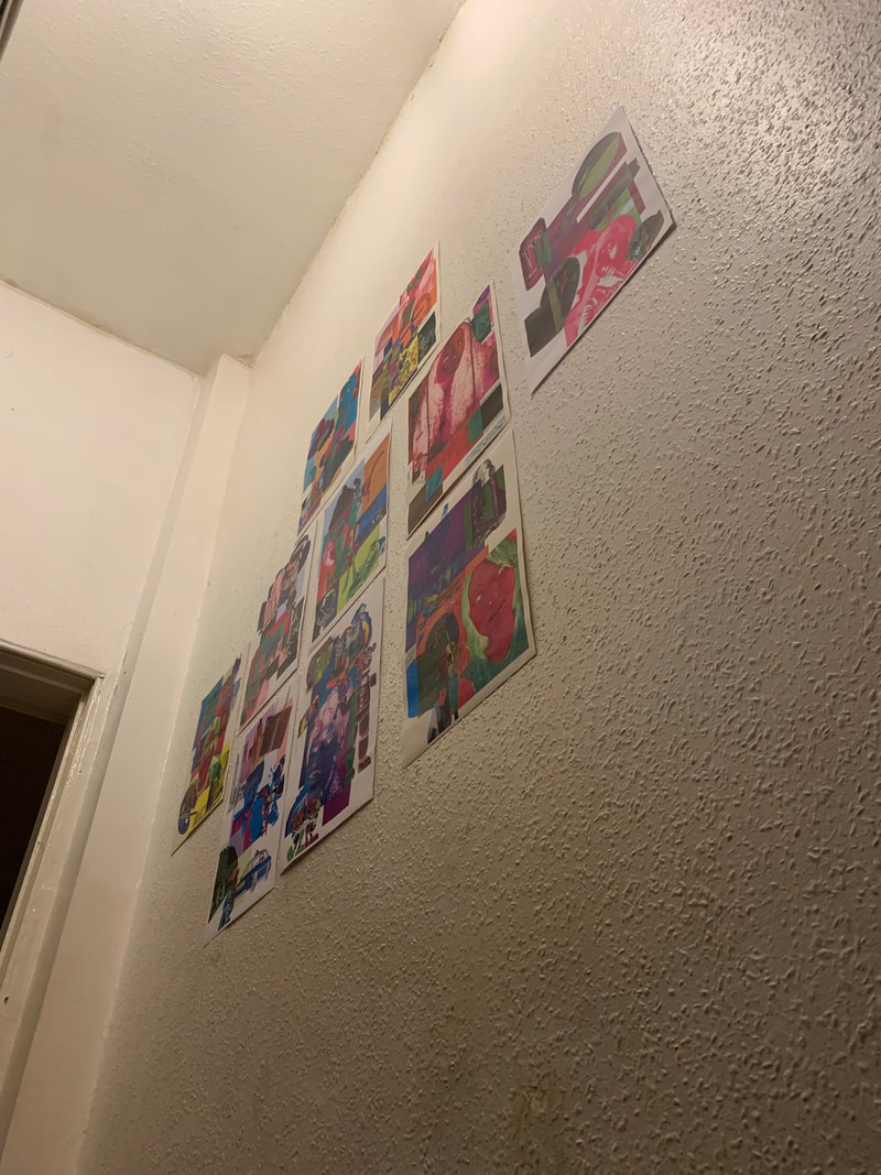
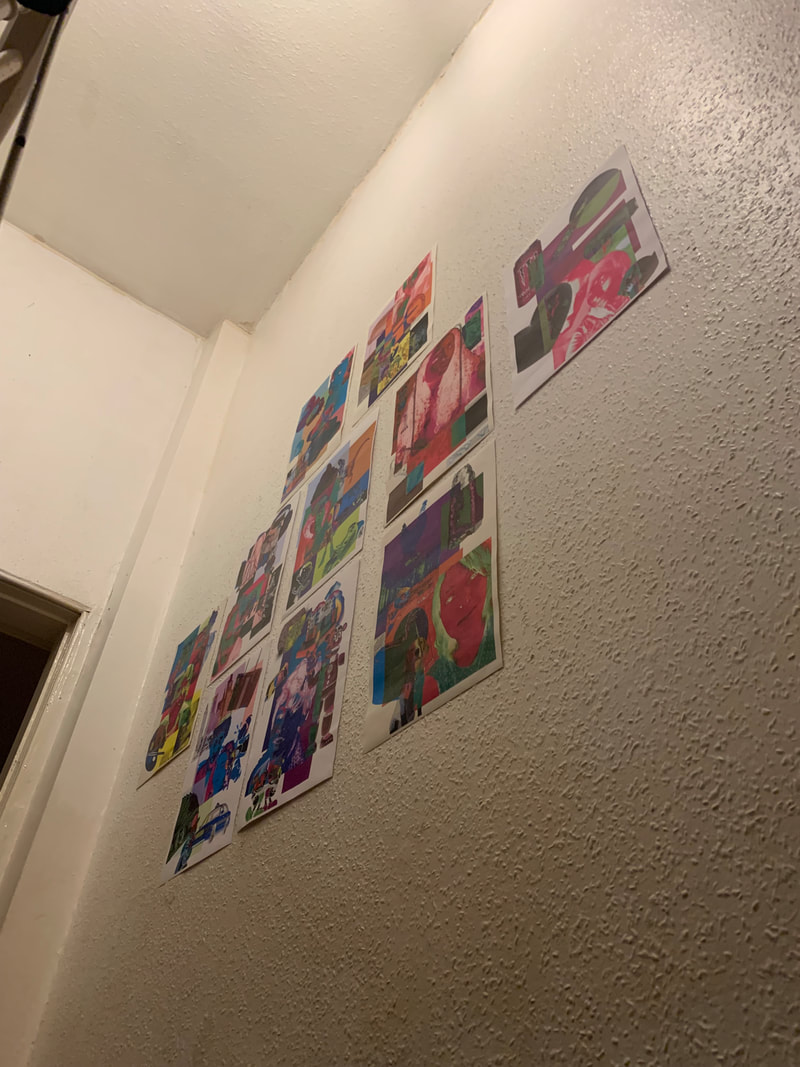
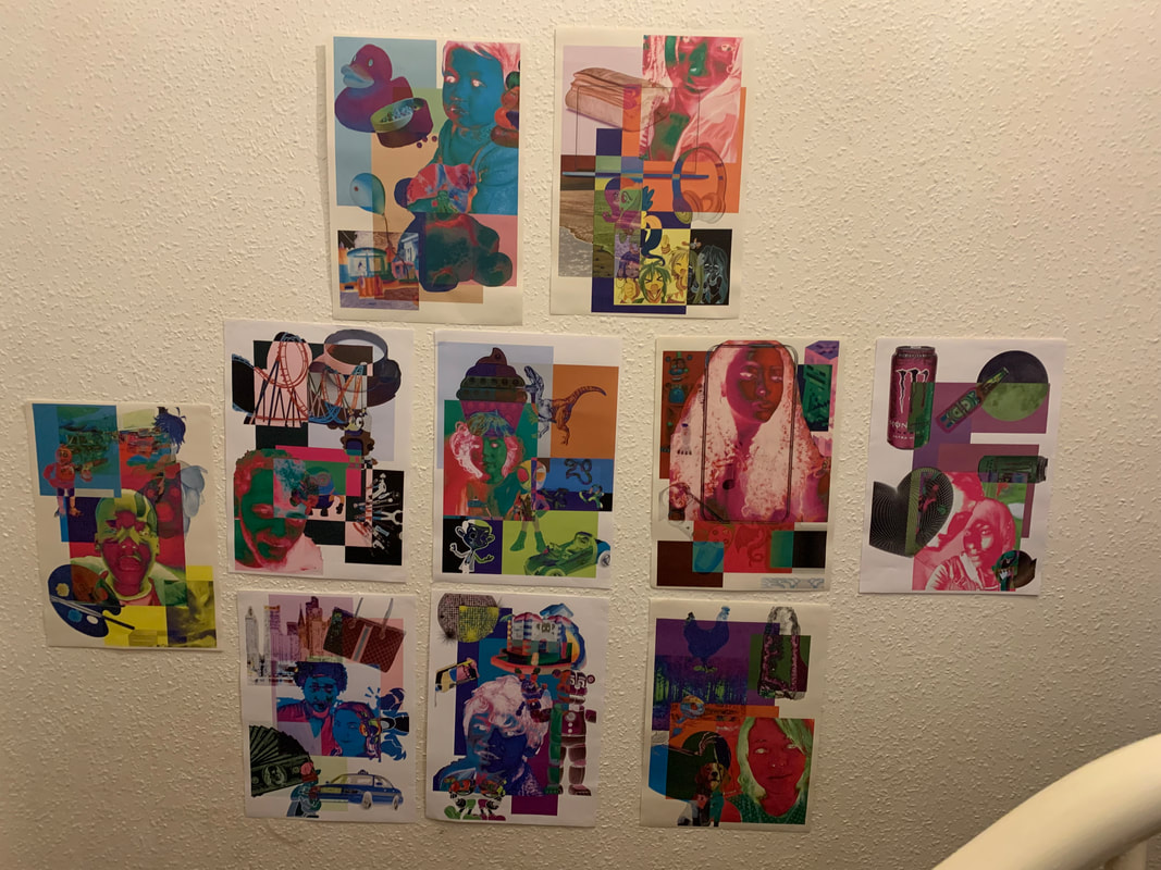
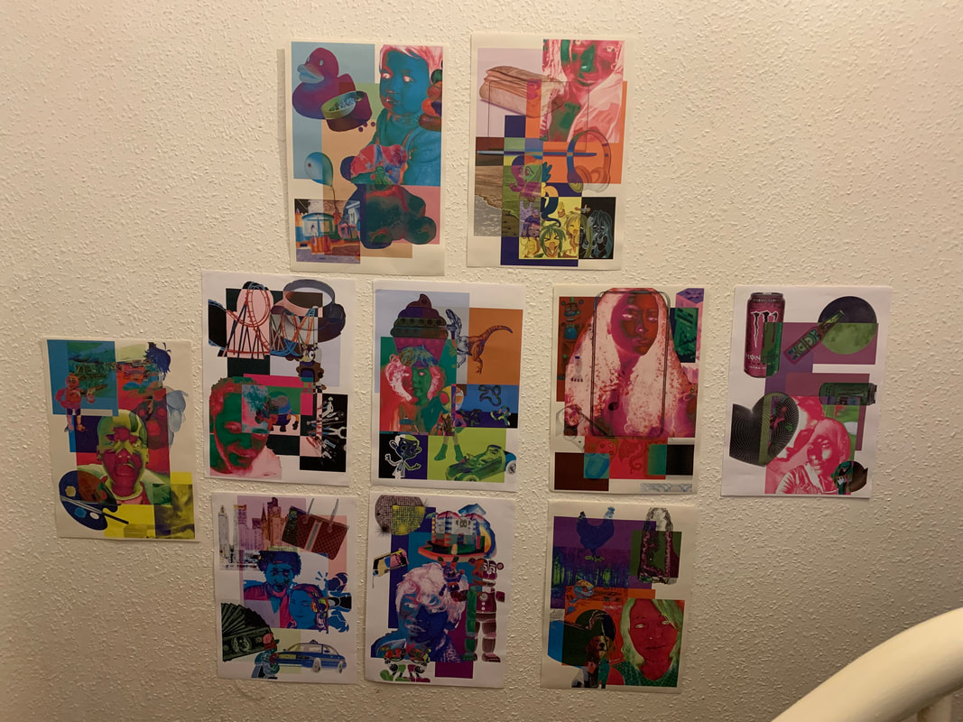
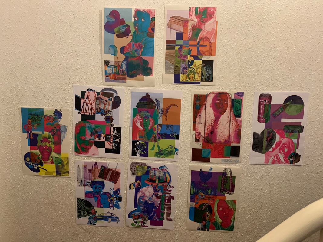
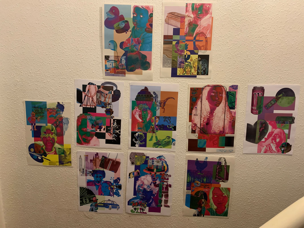
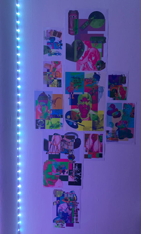
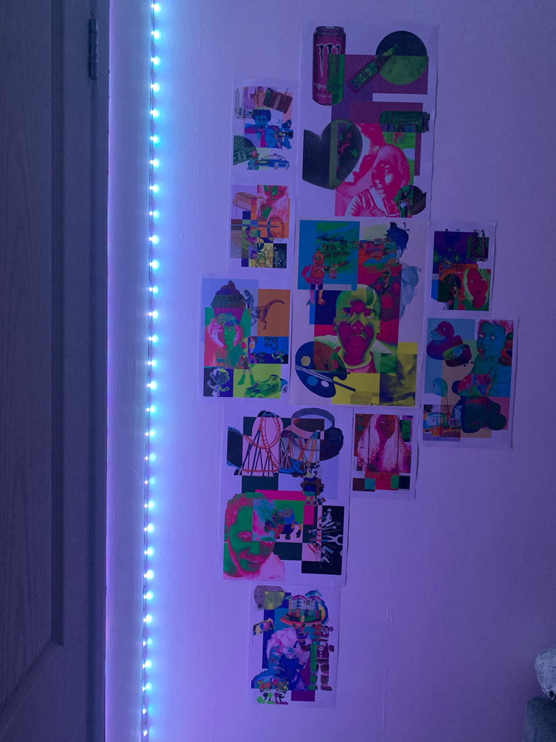
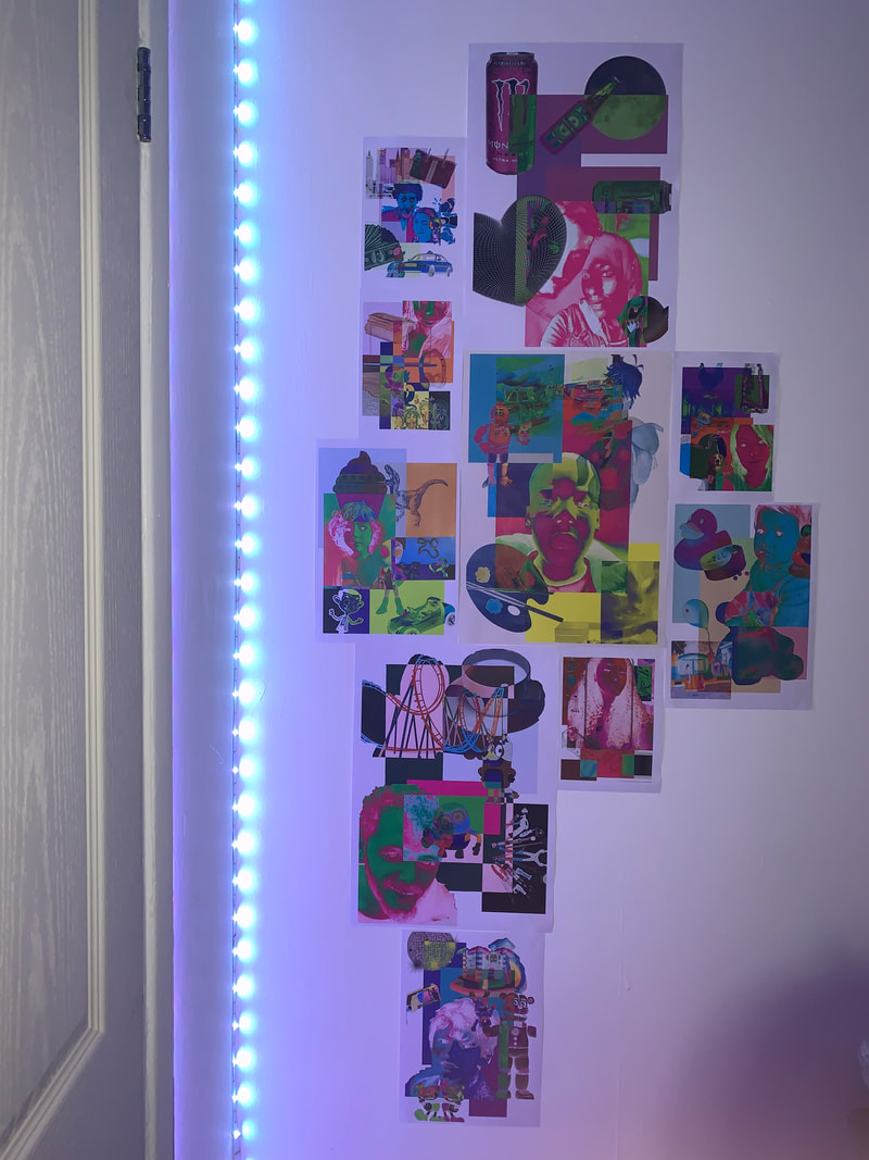
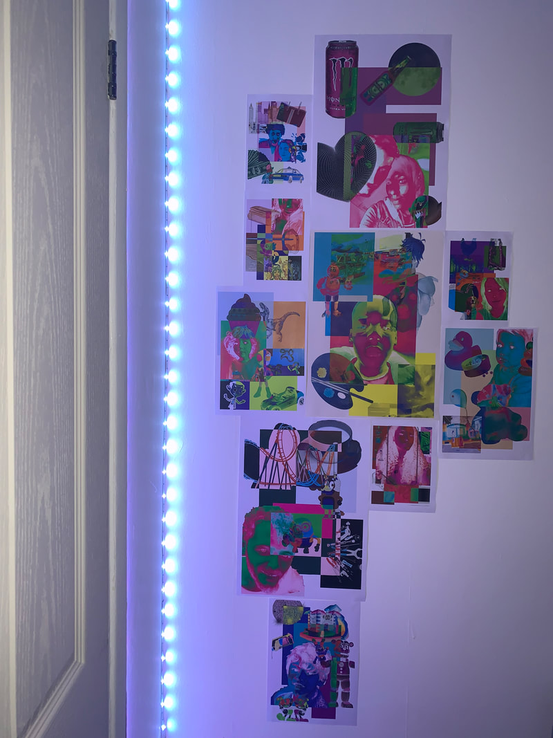
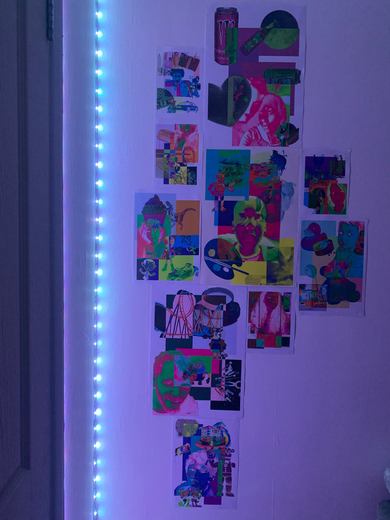
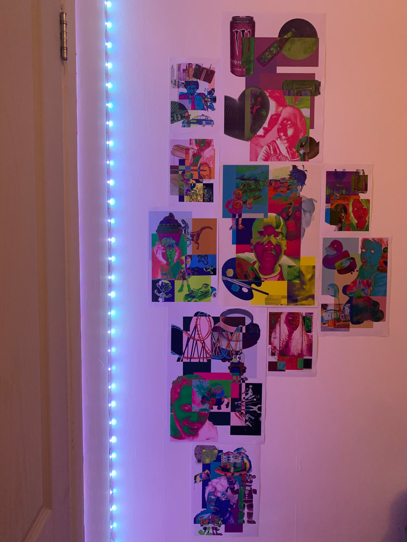
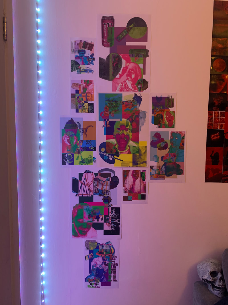
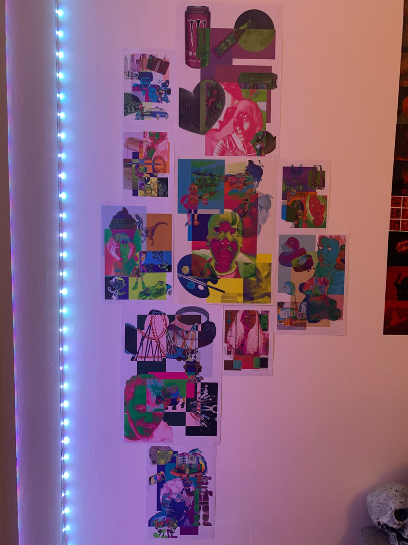
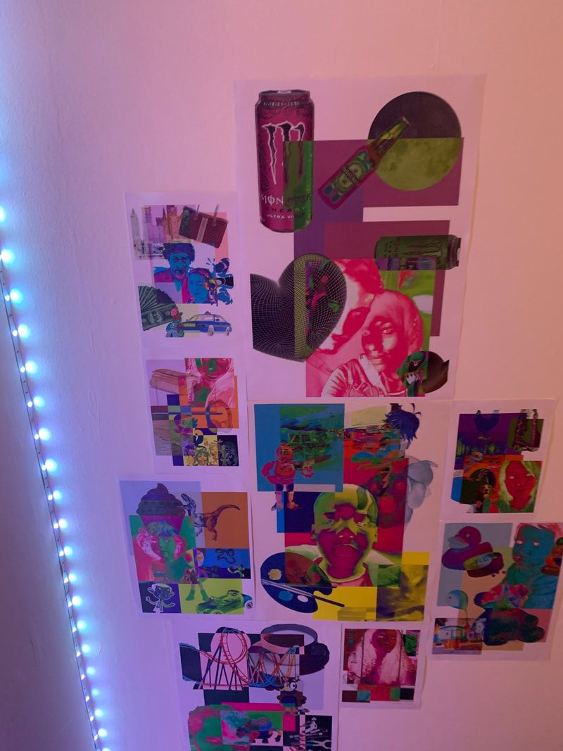
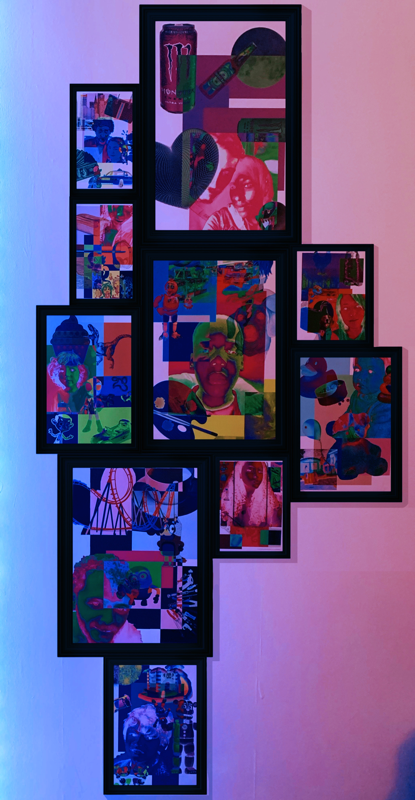
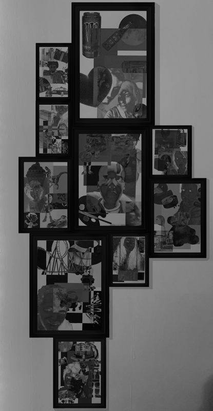
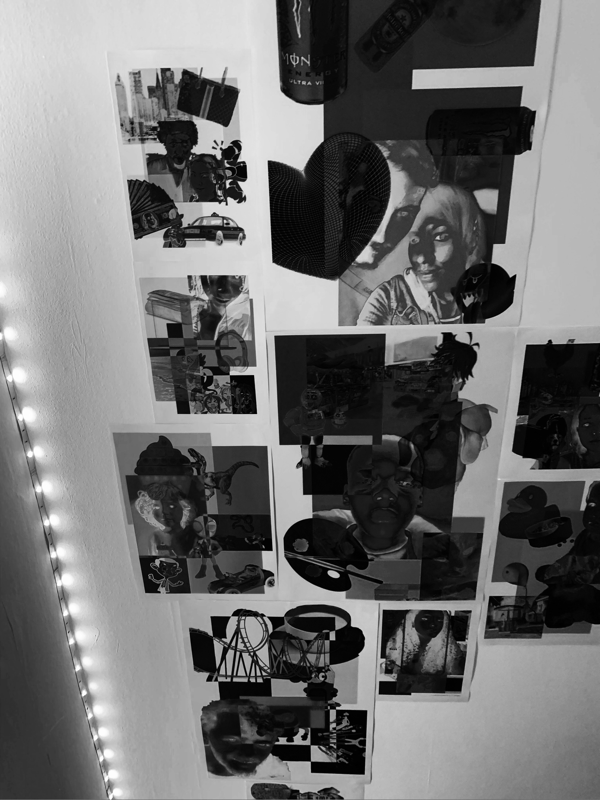
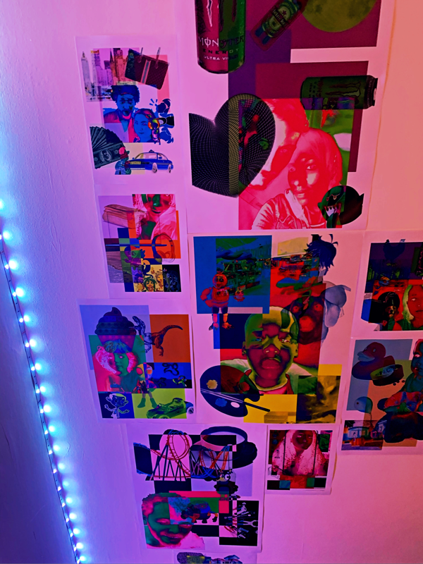
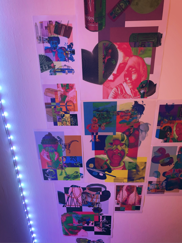
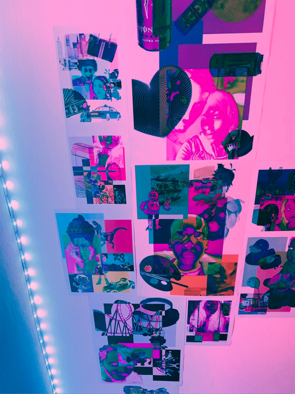
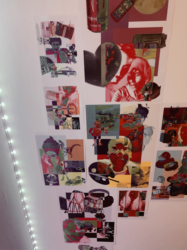
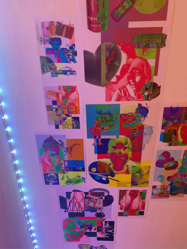
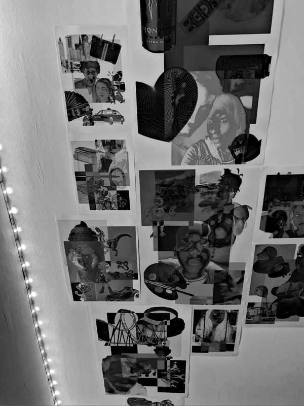
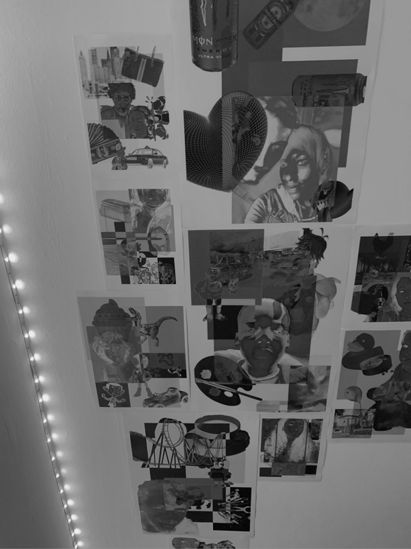
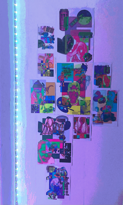
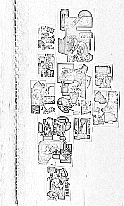
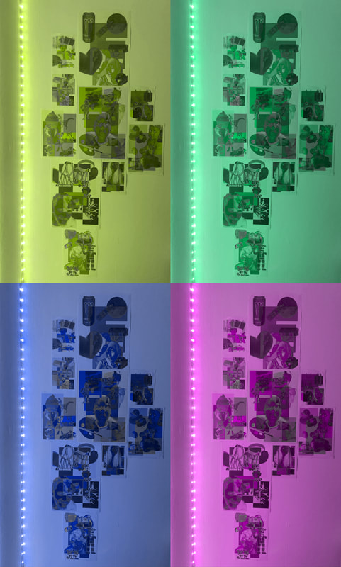
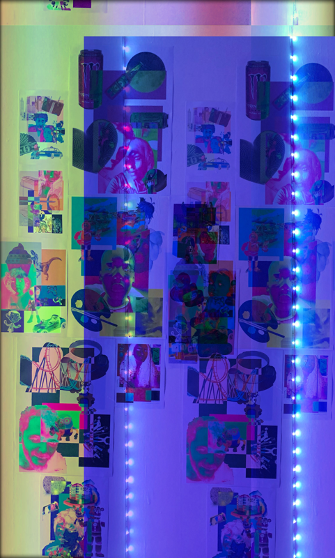
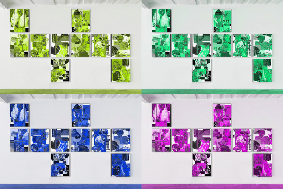
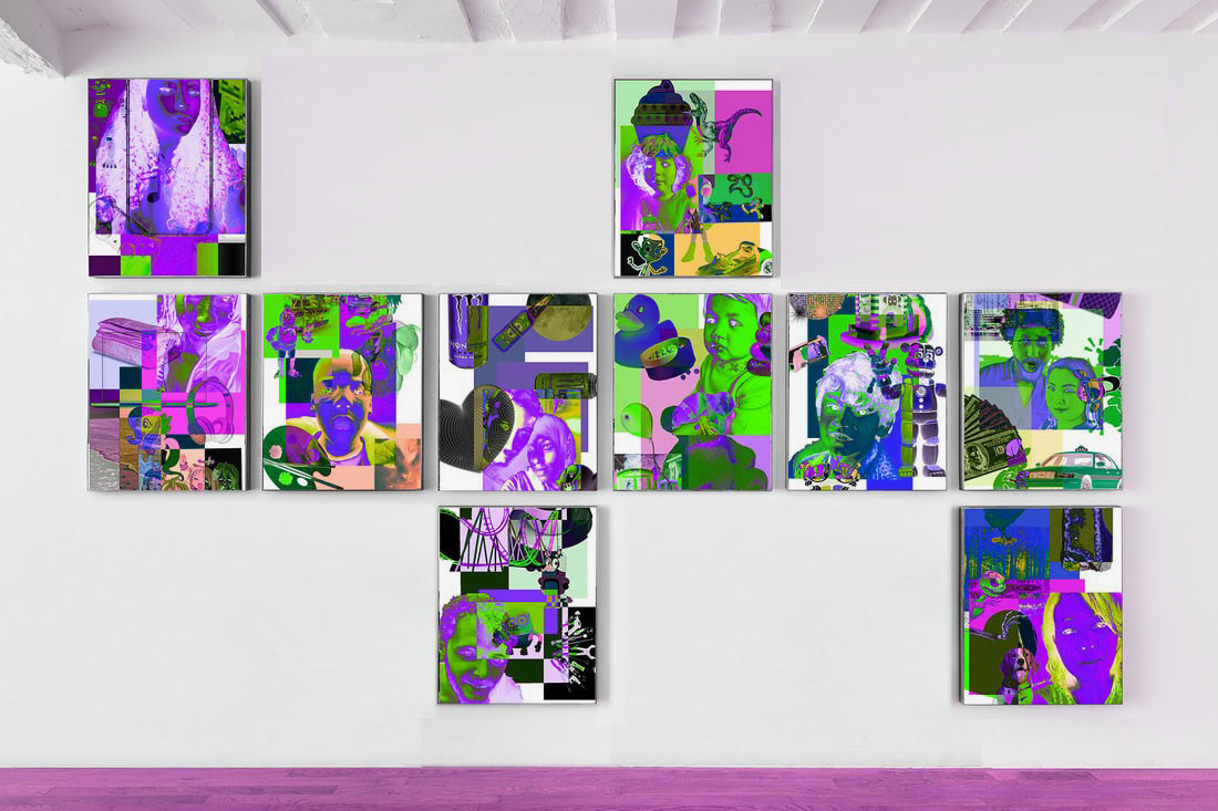
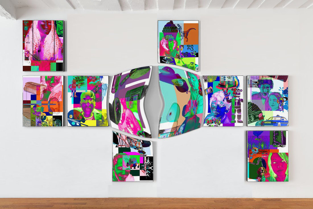
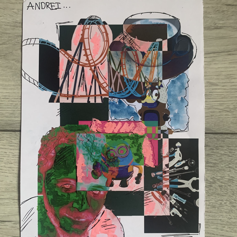
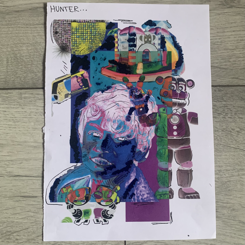
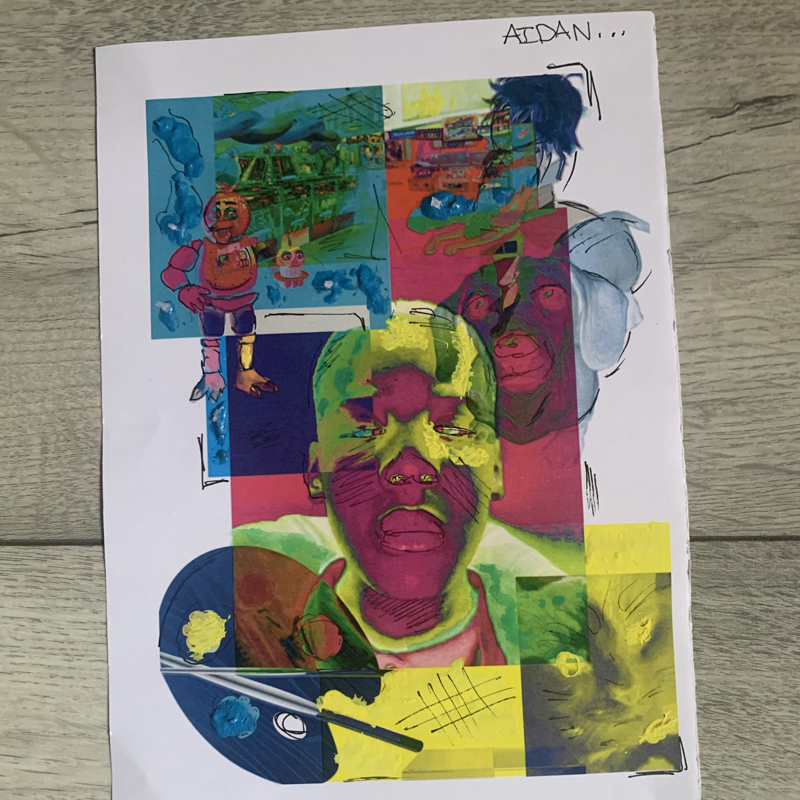
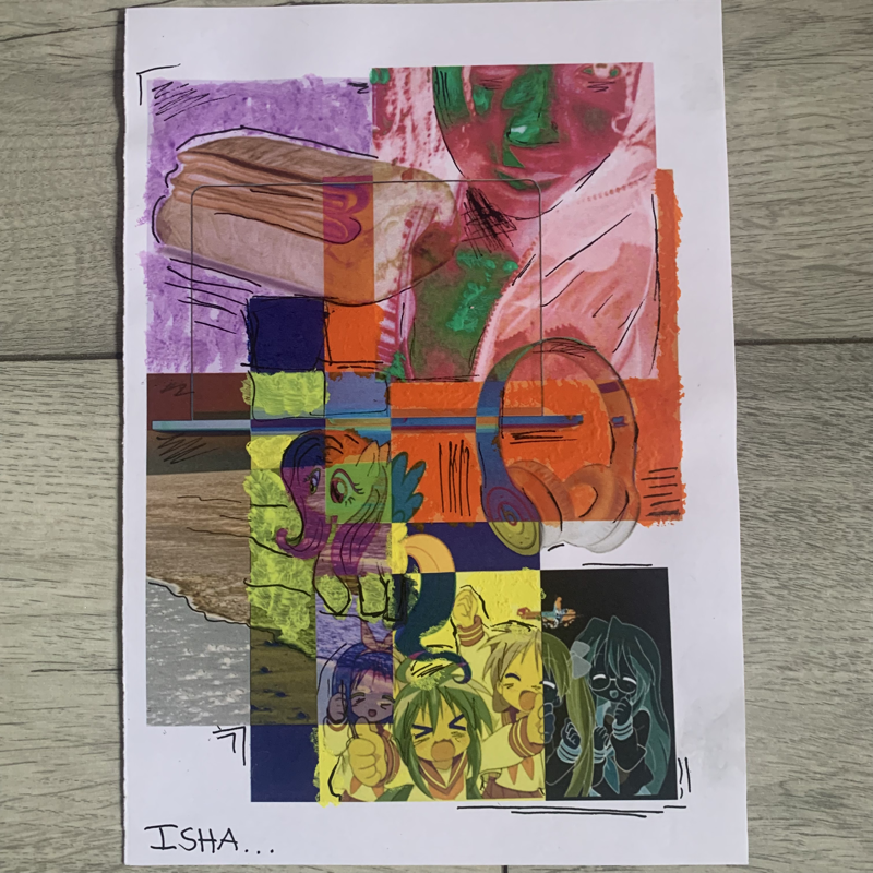
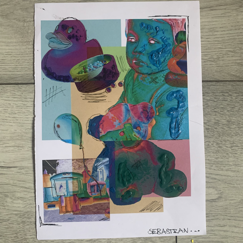
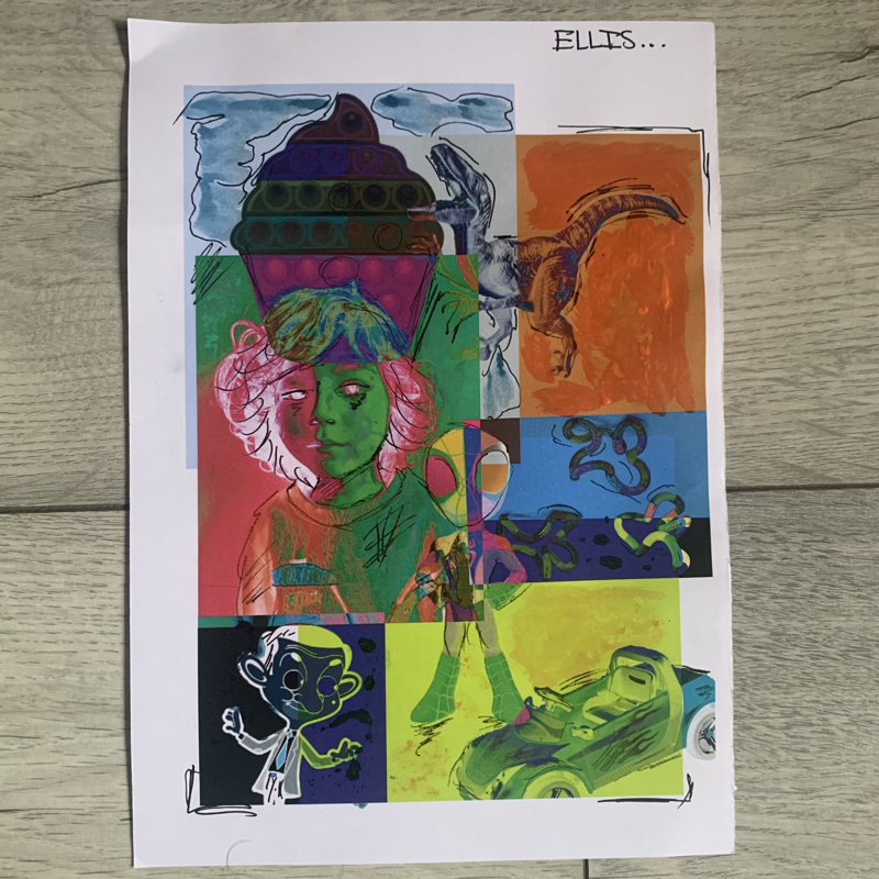
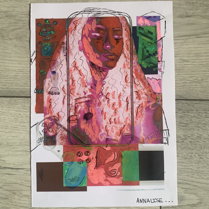
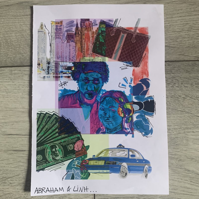
The Portrait Collages I made
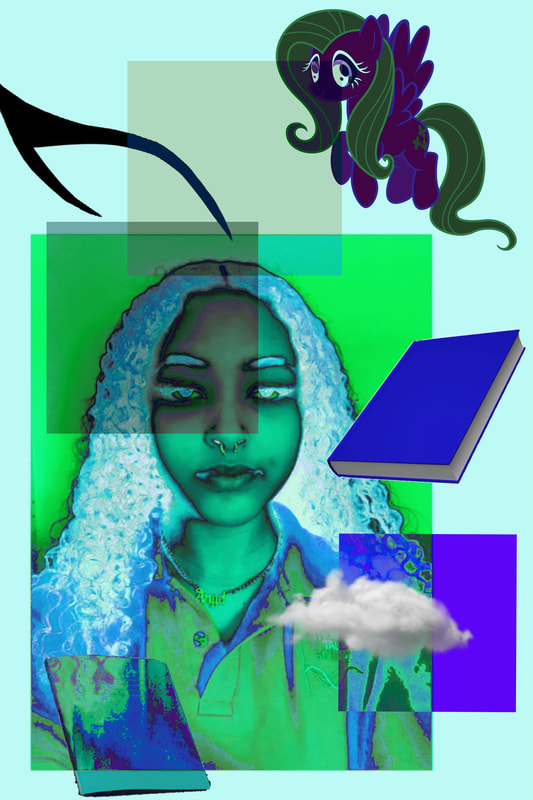
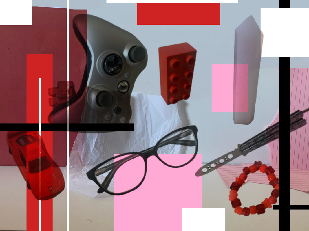
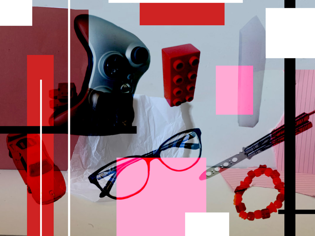
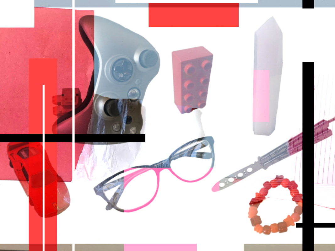
Portrait collage process:
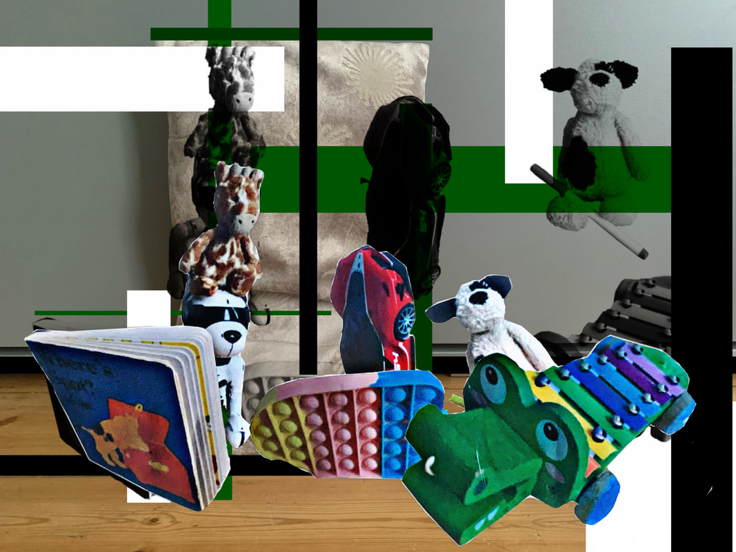
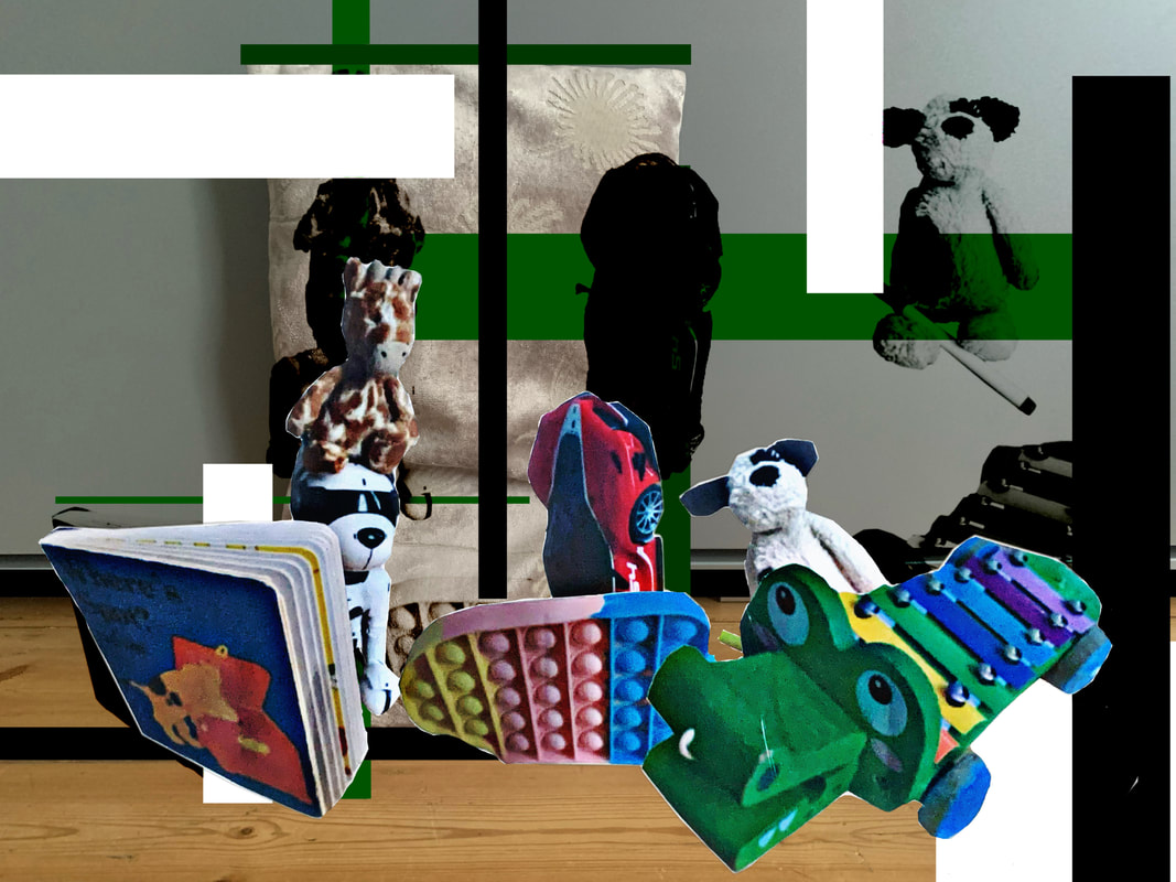
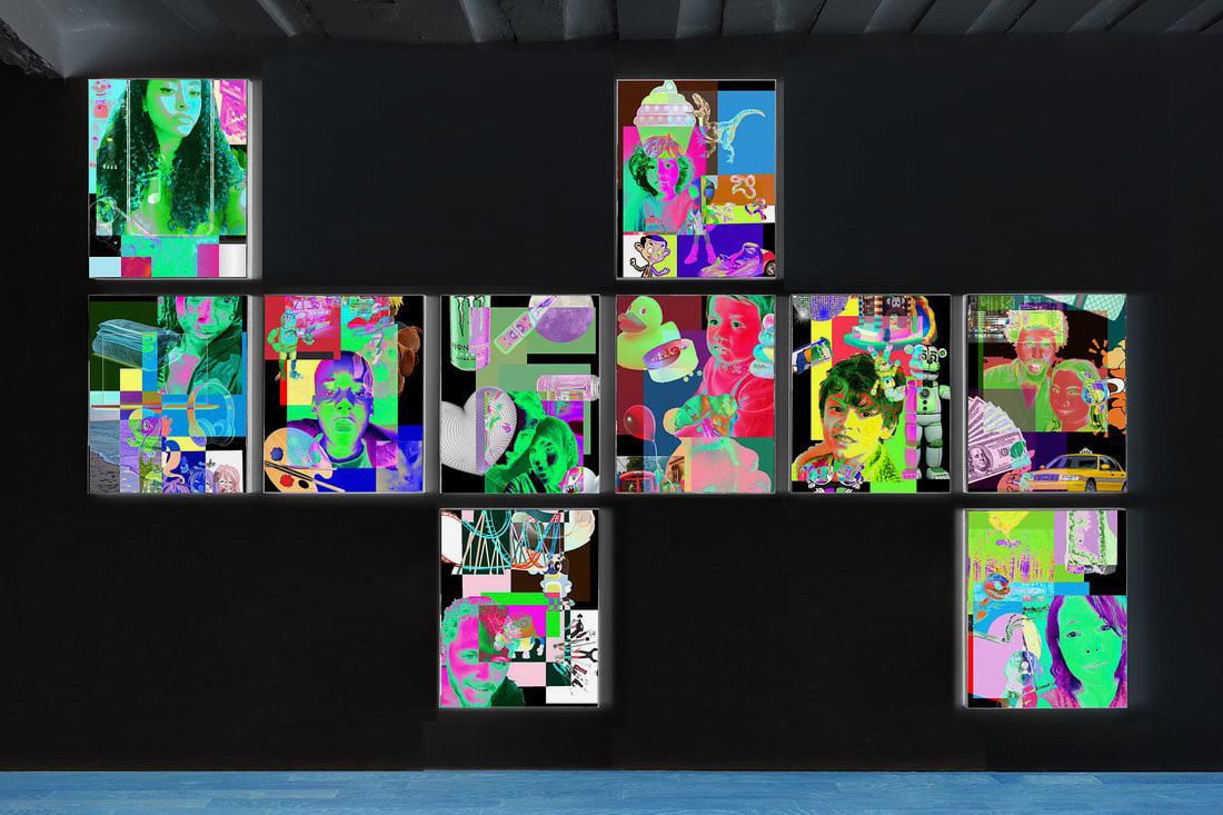
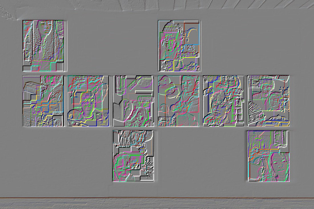
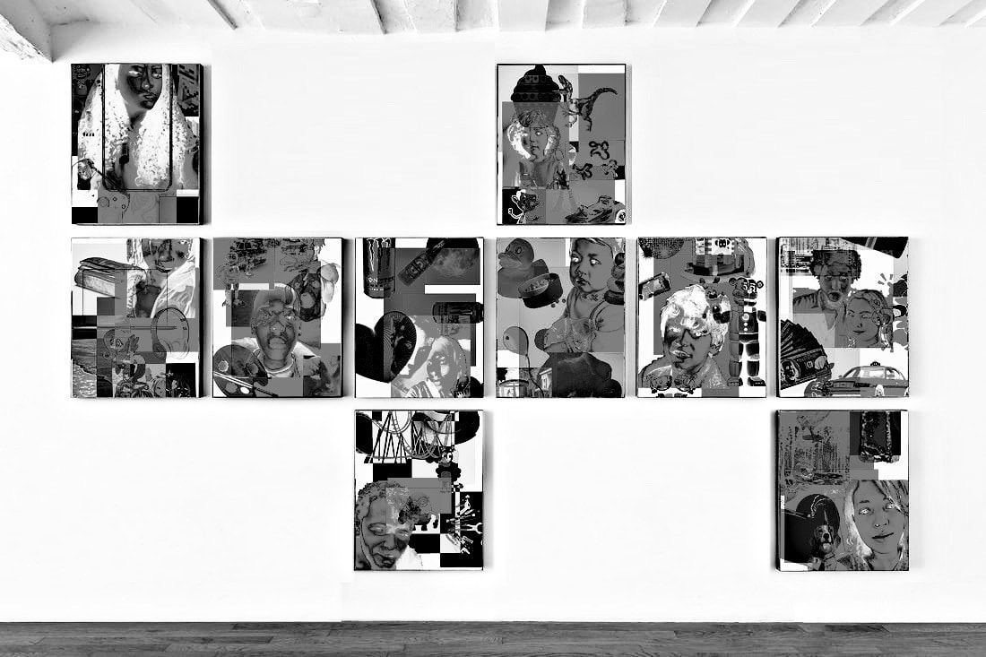
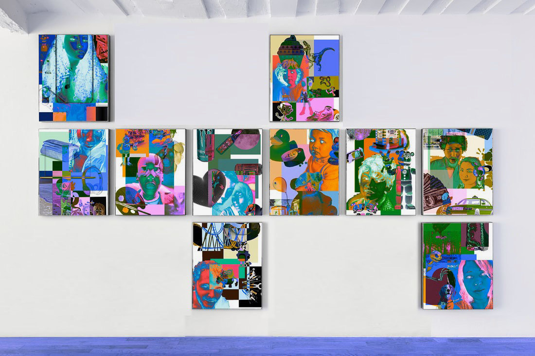
Chosen instillation images (sampled from Bertrand Cavalier's installations) :