Introduction
"Documentary photography is a style of photography that provides a straightforward and accurate representation of people, places, objects and events, and is often used in reportage" - Tate
I think documentary photographers do the photography they do because they want to show their world and tell their life story - which they do by taking pictures of their day to day lives. Or maybe to get rid of some stereotypes and misleading things said about where they live and their communities - which these photographers do by possibly because they could be concerned because of these harmful rumors spread about their communities and by taking pictures they are able to shed light on what their communities are actually like, and representing them in the right and best way.
I think documentary photographers do the photography they do because they want to show their world and tell their life story - which they do by taking pictures of their day to day lives. Or maybe to get rid of some stereotypes and misleading things said about where they live and their communities - which these photographers do by possibly because they could be concerned because of these harmful rumors spread about their communities and by taking pictures they are able to shed light on what their communities are actually like, and representing them in the right and best way.
Dawould Bey:
|
|
Thoughts and information:
This is a video on Dawoud Bey, a photographer who roams the streets of various American cities, but mainly his community in queens, photographing the people in said community. Some could argue that Bey's work links to street photography. However, although bey's work is photography that records everyday life in a public place, what makes his work different is that street photography is with strangers and Bey takes pictures of people he knows and has relationships with. All of his subjects are people within his community that he has made efforts to creates bonds with, so majority of them are comfortable with him taking pictures, which is reflected in his work. I think he does this type of photography to represent his community in the right way, rather than it being seen for its stereotypes. Queens is seen as a ghetto and crime filled place, and Dawould uses his photography to show that in reality it isn't like that at all. It's filled with normal people, who live life just like everyone else. |
First Experiment: Portrait Photography
For this task we had to take 12 pictures of our partner, 6 inside - with studio lights and a backdrop - and 6 outside - with natural lighting. In order to do this task we had to focus on the background, lighting and angles.
Unedited photos:


|
WWW: I completed the task. I like the turnout of the 1st, 2nd, 5th, 11th and 12th photos. In the pictures named, I think the lighting compliments the person and the outside backgrounds are fairly nice. Also the colours in the pictures work well together. I really liked taking the pictures outside, because the lighting was way easier to work with and it gives the pictures a natural sense. Also the blurred outside backgrounds look way better than the inside blurred backgrounds, which hardly look blurred at all. This task has given me a sense of the type of what photos I am going to take for this unit and for my homework, which I guess means it was helpful and useful.
|
EBI: I would like to retake some of these pictures. Even though i think the colours all work well together, I don't like the colours as individuals. I would rather have darker clothes with the black background or white, and blue clothes for outside rather than turquoise. Some of the lighting in the pictures are just absolutely terrible. They make the camera look blurry and, the wrong facial features have been highlighted and the others blurred which, makes the pictures look very low quality. But I will fix that after editing them. I think I would rather take pictures in black and white and outside, because I think that natural lighting is better and would look even better if it weren't in colour, because it really allows the shadows and highlights to pop. I need to work on the angles as well, they all look and feel very samey, it would be nice if they were more diverse. I also would rather not to take pictures at school and in the school all the time, because once again the pictures end up all looking the same I would 100% love to take more portraits, and try master it and improve my skills. Because I definitely think I could produce really great portraits if I took my time, and really took into account all the factors, but because there was a time constraint I couldn't explore all my ideas, but I think i could do that very well with no time restrictions or outside of school very well.
|
The Edited Photos:


|
WWW: I like the colouring on these pictures a lot more than the original ones, but that is about it.
|
EBI: The editing didn't really improve the lighting, so I would really like to re take the photos. Next time I am going to take my time and effort rather than rushing to finish. Also I would like to make edits that actually change the photos, because some of these don't look like they have been edited in the slightest, even though they have.
|
The Most Successful Photo:

|
WWW: I really like the angle of this picture, I took it with the camera lower down than all the other pictures and it just captures the light perfectly. Also, it looks like a school photo that you wish the school photographers would take for your school account, which I really like because it gives it a more professional vibe. I also quite like the colouring in this picture because of the shadows and dark parts of the t-shirt work well with the background. The lighting on the face hits perfectly, highlighting the important features. EBI: I would like this photo even more if it wasn't taken in school uniform, because the uniform isn't self expressive at all, so it would be nice to capture the persons personality through the photo. < I have chosen this photo to develop in the dark room because it is my favourite, and I'm interested to see how the lighting and shading will turn out after being inverted and printed and developed |
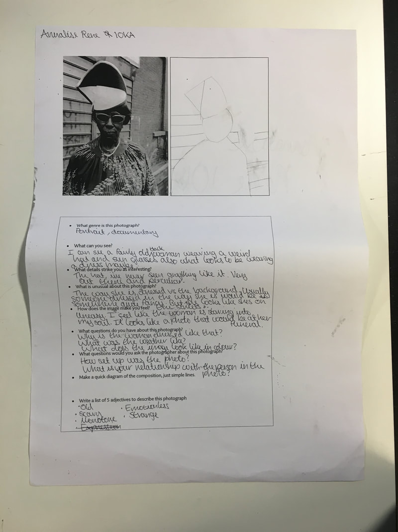
Dawould Bey Image Analysis
For this task we were given this photograph taken by Dawould Bey, and we had to answer the questions/do the tasks written of the sheet.
This was the photo we were analysing:
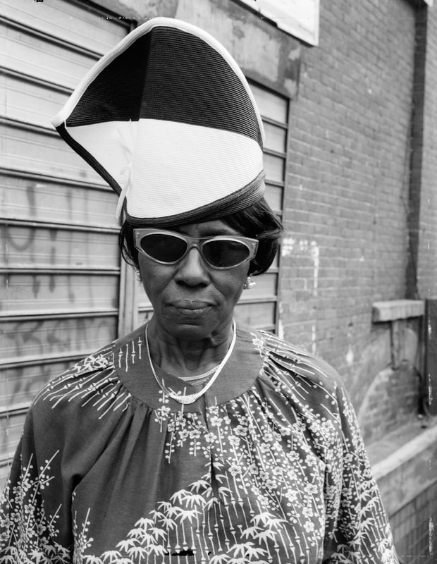
And this is the actual analysis:
Documenting my community
For this task I had to take a series of 6 photographs of someone or a group of people within my community. I had to think: Framing, composition, background, foreground and most importantly the subject.
I decided to take pictures of my baby brother, because I have anxiety and I don't have any community outside of my famiy, but also because I wanted the challenge of trying to work with a defiant 1 year old. He is my most favourite person in the world and he's a very important part of my life, so I just had to do this project on him,. I took the photos on my phone, which wasn't ideal because I think it's poor quality, but i got to work with what I have, and then I edited them.
I decided to take pictures of my baby brother, because I have anxiety and I don't have any community outside of my famiy, but also because I wanted the challenge of trying to work with a defiant 1 year old. He is my most favourite person in the world and he's a very important part of my life, so I just had to do this project on him,. I took the photos on my phone, which wasn't ideal because I think it's poor quality, but i got to work with what I have, and then I edited them.
The Unedited Pictures:


|
WWW: I really like the naturall look of some of the pictures, they were all just taken randomly whilst I was spending time with him, so they are very candid and spur of the moment which i think works well when doing documentary photography. Yet some look very set up, even though they aren't, which I think is quite interesting, it makes the pictures look good so I'm not that mad about it. .I like the lightitng in almost all of them, and the ones I don't I will just fix it after editing them. I love the colours, they work so well together and they are just nice colours in general. I think the composition of the photos are really good aswell, he is always the main focus, and where your eyes are drawn first, which is what I wanted so I'm glad it turned out well.
|
EBI: If I had more time and ideas I would take way more pictures from different angles and of different people as well. I would also do outfit changes for him, as the pictures all look a little too similar for my liking. Also I would prefer that the art in the 5th picture wasn't there, its distracting and ugly.
|
The Edited Pictures:


|
WWW: I still thtink everything from the previous www but then I also now love all the lighting and colouring in all the pictures, it's perfect and just how I invisioned they were going to turn out.
|
EBI: I think some of the filters could be a little too over bearing to other people, even though I really like them, so maybe I would tone it down a bit.
|
Interviews With Documentary Photographers
^ This video is about a photographer named Siân Davey.
She started documenting and photographing her daughters and their friends in a candid and natural way and then continued to do so more professionally after quitting her job to focus on photography.
I think she did this to try and capture them in the moment, and show them naturally, to capture the memories and encase them in a photograph. She definitely started photographing her young daughter, whom has a disability, to show her in a different light to her and other people. To show that she (the daughter) is not just her disability, she is "normal" and although she may be
different, it doesn't limit her, she can do just as much as the average person.
Siân's work is very effective because the subjects of the photos look/seem very comfortable with her taking the photos, which makes them look natural. She approaches her subjects by in fact not approaching them at all, she takes the pictures without them noticing. She likes to be almost invisible, she looks for openings of when the subjects aren't paying attention to her,, to take the most candid pictures she can.
With her work, I found it very interesting that in taking photographs, she was able to accept and come to terms with the fact that her daughter is the way she is, and that isn't a bad thing. Also that it resolved any perhaps guilt or shame of having a daughter with a disability. I think it's so incredible that her creative outlet allowed her to do that.
^This is a video about photographer Adama Jalloh.
Adama Jalloh does documentary photography because as she says "a lot of it is me retelling almost like a visual diary, rather than me speaking through word" which suggests that she does it to collect her days and capture them as a visual art rather than her keeping an actual diary where words can't always depict real events. She also does it to show people her world, as well as, to keep the memorys alive, memorys often get forgotten so pictures are a great way to preserve them.
Adama Jalloh does documentary photography because as she says "a lot of it is me retelling almost like a visual diary, rather than me speaking through word" which suggests that she does it to collect her days and capture them as a visual art rather than her keeping an actual diary where words can't always depict real events. She also does it to show people her world, as well as, to keep the memorys alive, memorys often get forgotten so pictures are a great way to preserve them.
^This video on the photographer Niall McDiarmid. In this video, photographers Niall McDiarmid and Daniel Meadows discuss Niall's work whilst setting up for his 'Town to Town' exhibition at The Martin Parr Foundation in late January 2018.
I find it interesting that McDiarmid focuses on colour when taking his photos. A lot of documentary photographers seem to use black or white, or just your average everyday colours. But Niall almost exaggerates the colours he uses, they look almost like he's taken the saturation and turned it all the way up, but managed to make the colouring of their skins' natural? It's hard to explain. You wouldn't tend to see something that bright and colourful during your day to day life, but Niall manages to incorporate it into his photographs and make them look natural as well.
Linking to colour, I think he purposefully uses strangers from the street who are wearing bright, bold colours. You can tell they are strangers because a lot of the look incredibly uncomfortable, and on edge, accept the few who are photogenic and confident and look like they know who McDiarmid is, but even so we know the are strangers.
My initial thoughts of his work was wow, thats um interesting. But after looking into more of his work, rather than just the one photo from the video, I was quite intrigued and quite fond of his work, definitely my favorite e documentary photographer so far.
Photographer Liz Johnson Artur, did an interview and this is the video.
Johnsons photography is interesting to say the least. My initial thoughts were that I don't like her photography and it's just not my thing, very weird and unique - its unlike any of the other documentary photographers. But after watching the video my ideas and views changed (slightly). She in fact uses her photography to represent. Wether that be her community or POC or LGBTQ+ people, she wanted to represent them as who they are rather than the hateful things spread about them. Liz goes out looking and searching for subjects, trying to find people to inspire photos rather than taking pictures in the moment and randomly.
Johnsons photography is interesting to say the least. My initial thoughts were that I don't like her photography and it's just not my thing, very weird and unique - its unlike any of the other documentary photographers. But after watching the video my ideas and views changed (slightly). She in fact uses her photography to represent. Wether that be her community or POC or LGBTQ+ people, she wanted to represent them as who they are rather than the hateful things spread about them. Liz goes out looking and searching for subjects, trying to find people to inspire photos rather than taking pictures in the moment and randomly.
Developing a Paper Negative
This is the process I took into creating a developed image in the dark room.

First I had to go into photoshop and creative a negative. The steps I took in order to create the negative, were firstly, I put the photo into the photoshop. Then I changed the photo into black and white, and inverted it
<--------- This was the result
And then with this photo, I had to print it off, which miss then changed into a photo that can be developed and then I had to go into the dark room and develop the photo, which will then change it back to its original state when it was black and white.
|
This is the paper negative -----> The process I took to developing this photo into a paper negative was that I took it into the dark room and put the shiny side of the image facing up and the same with the paper which is used to develop the photo onto. I then put that under the enlarger for 5 seconds. Then took the paper, not the paper negative, and dove that into a solution, where the picture then emerged. I then dove it into 2 other solutions, which i believe cleaned thte chemicals from the first dive. And then hung it u to dry. After i let it dry for a while. I used a photo squeegee to remove any access liquids. |
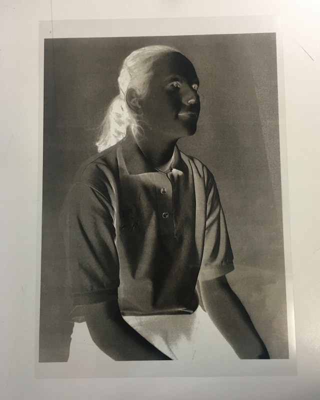
|
This is the developed photo result:
|
WWW:
EBI: |
Music in Photography
|
|
|
Thoughts and Information: These videos are work of a man named Roger Ballen. He is a fantastic photographer who creates terrifying and scary work. Looking at these videos has really given me an insight on the various different types of documentary photography there is. Very helpful when thinking about all the various things I can do with my work.
Response to music in photography
For this task I had to take 12 photos, 6 inside and 6 outside, of a person whilst listening to music to inspire the photos. I had to take into account framing, composition, background, foreground and the subject.
The Pictures:


|
WWW: I managed to use a different song for eah picture. I like all the ones that include the sun, because they work well with the subjects skin. Thde colouring in some of them are nice.
|
EBI : I don't like most of them if I'm honest. I hate the colouring, I hate the look of majority of them, they just look strange and the lighting in some of them are terrible. I would like to retake these and focus less on the songs and more on the overall look of the photots. I think this is some of my worst work yet.
|
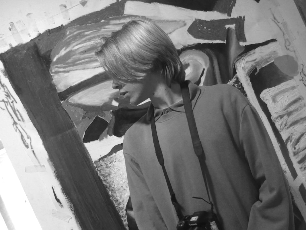
Portraits
For this task we had to take pictures of our partner, chosen by the teacher, whilst thinking about lighting, colouring, background, the subject, angles and more.
The Unedited photos:


|
WWW: I like the backgrounds in some of them. My favourites are the ones in front of the art (from the six form students), they give an interesting backgrounds and colouring. I also like the lighting on some of them, especially the ones that cast a shadow on one side of the face but highlights on the other. I think doing this task was helpful in building my confidence with working with people also it is practice for taking pictures.
|
EBI: These pictures will be even better once I edit them to change the colouring on some of them slightly, and the ratio of some of them too. They would have been even better if I had more time and was more comfortable whilst taking said photos. Also as I have said before, if the subject weren't in school uniform, because it restricts the creativeness and doesn't show the personality of the subject as much as the photos could. As well as all of that, the weather was defiently my downfall for the outside ones, it wasn't sunny, the wind was messing up the shots and it was incredibly difficult, so if I were to do it again, I would with better weather and then I am sure they would turn out much better.
|
The Edited Photos:


|
WWW: the lighting and shadows in majority look pretty good.
|
EBI: I feel like some of the collouriing looks off, and overbearing. But its difficult to get right because the colouring on my latop is different to my phone and I edit on my phone. But yeah i don't really like these edits all too much, and want to redo them, but maybe with an editing software on my laptop.
|
The Most Successful Photo:

|
Out of the photos from yesterday, this one is my favourite. It is effective because the background gives a very interesting and colourful aspect to the image, the colours although unusual, actually work quite well together. I also am quite fond of the lighting in the picture, it makes the picture work because majority of the image is filled with warm tones, and the lights are slightly yellow giving a nice subtle glow and highlights to the persons face and hair. Also the subject makes the picture effective, because he is looking away, making the photo seem natural and like he is not posing for the picture even though in reality he is. Despite all the small little aspects that make this photo effective, I think the average person would say this photo is alright, and that it's not that interesting other than the background - because it is definitely the most rememberable part of the image because its so wacky, abstract and unique (if someone were to identify this image by memory, they would remember the art first). Although people who take photography would most likely recognise the different elements that make it work so well.
This task and image has taught me the importance of background within pictures, because although the background may take away from the subject, that doesn't necessarily matter, even though it is a portrait |
Working with photoshop
For this task I had to doccument my process of using phottoshop, with explanations and screenshots.
The general process of photoshop:
- Go to photoshop = image = adjustments = black & white
- Image = adjustments = exposure
- Save as = save as JPEG
How I approached photoshop:
(watch in 2x speed)
This was the final outcome:
|
WWW: Photoshop was actually relatively easy to use and the balance of light and shadow works really well in black and white. I actually might actually prefer this image in black and white, rather than its original colour. EBI: Everything I said when i first evaluated this picture as well as the others remains true, other than the editing comment, because clearly it has been edited. I would prefer the subject to be more expressive of themself and who they are as a person rathehr than just another student at thomas tallis school |
Extended project:
For this I had to look at the project 'Documenting Communities' and create a body of work based on the theme.
The things I am required to do for this project are:
My thought process:
My initial idea for this project was to create a video showcasing my work and all the work stipulated by the requirements, whilst also giving my own insight and thoughts on documenting communities as a whole as well as my work. In order to do this well I think I am going to take reference from the 5 videos I analysed and studied previously, as well as taking ideas from the powerpoint provided.
- A selection of at leat 6 photographs of the location
- Preliminary photographs of the type of photoshoot that you would like to create
- Evidence of your initial research (library research, visual research, artist research, exhibitions)
- A photograph of the people within your photographs
- Evidence of some of the photographs that you have taken
- A minimum of 12 images.
My thought process:
My initial idea for this project was to create a video showcasing my work and all the work stipulated by the requirements, whilst also giving my own insight and thoughts on documenting communities as a whole as well as my work. In order to do this well I think I am going to take reference from the 5 videos I analysed and studied previously, as well as taking ideas from the powerpoint provided.
Extended project - Week 1:
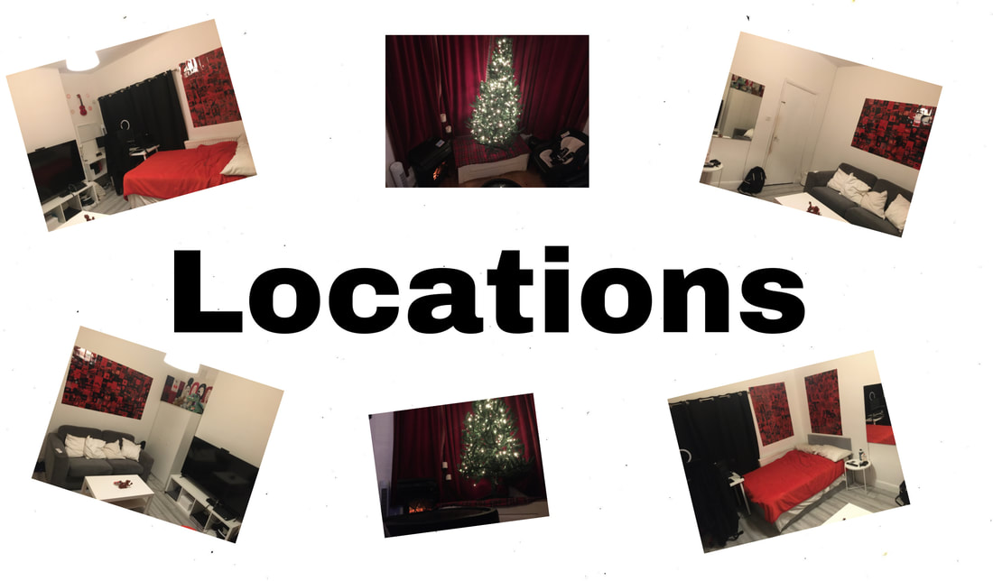
For this week I had to take a minimum of 6 photos of my location. I decided to take photos of my bedroom because that is my location almost all the time, except when I am at school.


Extended project - Week 2:
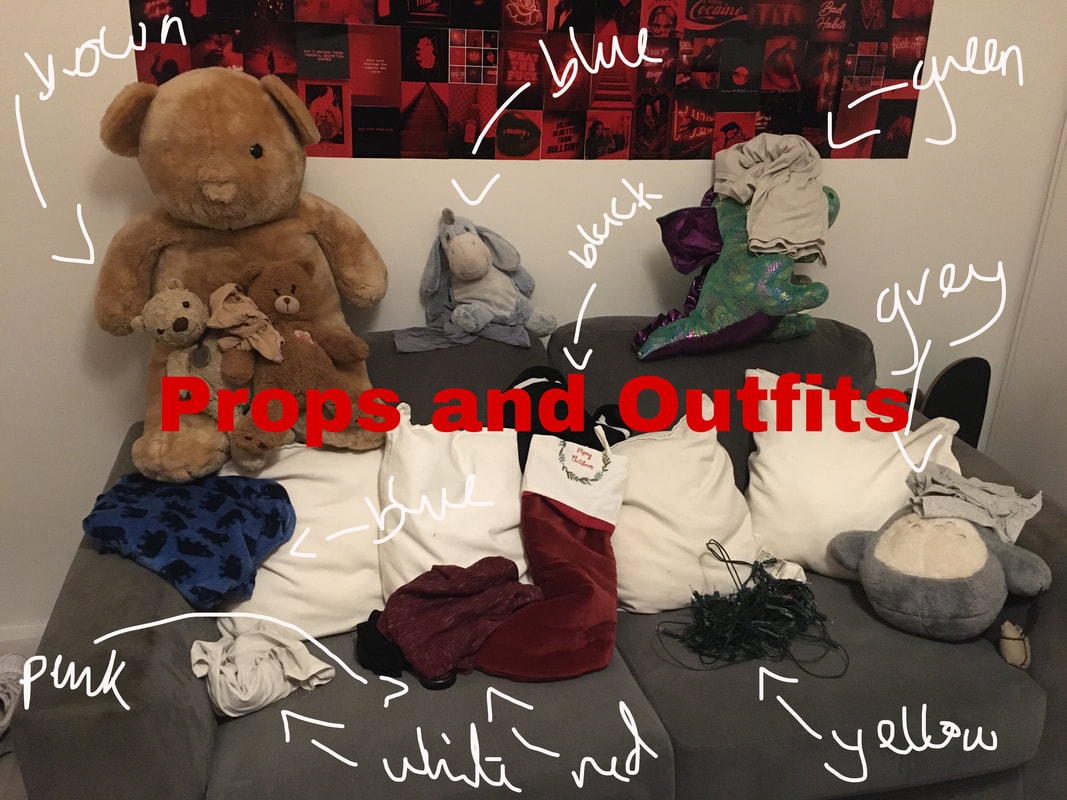
For this week I had to take preliminary photographs for ideas of a photoshoot that I would like to create so. I decided to take a few photos but then also add the aspects of what I'd like to add such as props and lighting.
Initial Planning
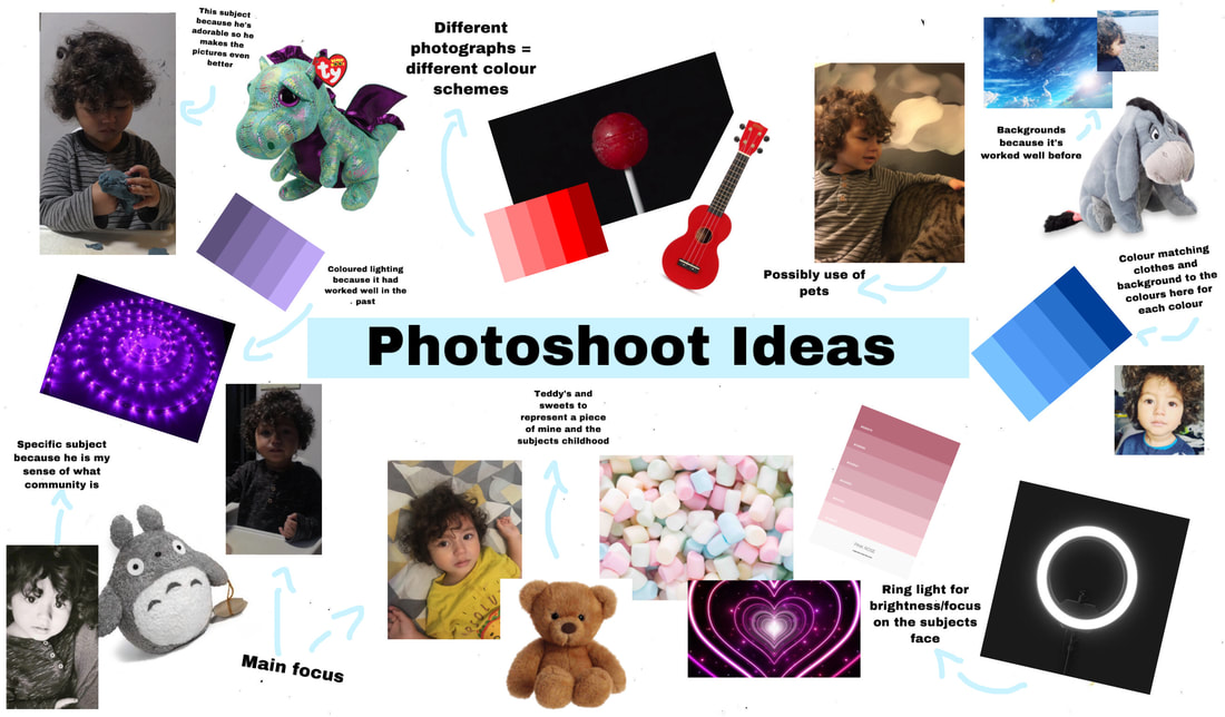
Further planning:
When it came to actually taking these photos, a lot of ideas shifted and I had limited resources so these are some photos of the planning process on the day.

|
|
Extended project - Week 3:
For this week I had to show evidence of my research on artists who do documentary photography and documentary photography itself. So i decided that I am going to screen record parts of this page of my website, showcasing the artists I have researched as well as cinematic shots of me researching in real life.
Website evidence:
Once I start editing the video for this final project I am going to add music and a voice over to this video explaining the research aspect of things.
Extended project - Week 4:
For this week I had to take photographs of the people within my photographs. So i decided to carry out my photoshoot ideas and take picttures of my baby brother, as he has been featured in many of my photographs before.
Photoshoot results:


|
WWW: Some photos look really nice and my visions were conveyed. Te colours are vibrant and work well with the subejcts age.
|
EBI: The lighting in some of these are actually atrocious, so I have to fix that when editing them. The lack of the subjects face is probably what I hate most about these pictures. Such an adorable subject and I can barely see his face. Framing and angles were not very varied and or interesting.
|
Edited pictures:


|
WWW: I love the warmer toned pictures, they give a home like, calming feel to them. I still love the colours. Also the choice of subject. I also brightened some of te photos so that the subjects features are more visible.
|
EBI: Everything I said in the previous ebi, remains the same, But honestly the only way for these to be better is to redo them all over again.
|
Footage and Documentation
I also filmed the process of taking these photo, which will be edited and added tot the final project video. But these are the raw videos, minus the audio
Tyler Mitchell

|
< This is Tyler Mitchell, a 23 year old, very influential and incredible photographer. He grew up in Georgia, America, but he didn't get inspired to do photography until he travelled to Cuba, where he was inspired by the colours and beauty of the county. Tyler focuses on portraying black people in the correct way (without the harmful stereotypes). Mitchell is very well known for being the first black person to photogrpah for the cover of vogue as well as his works with celbritys such as Beyonce and Harry Styles. As well as that he has done a lot for the black community with his work, and I think it is important to recognise that and recognise his work just as much. |
Analysis of his work:
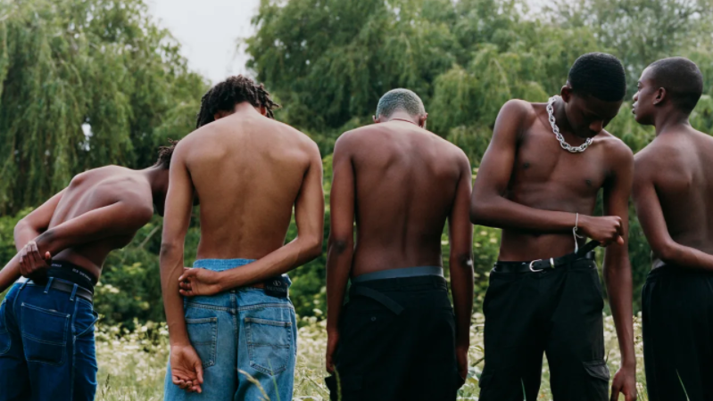
^ This is one of many of Tyler Mitchells incredible photographs. I really love this image because of its message. To me this picture is a representation of black people, not only modern black people but their history as well. In the image there are 5 black boys, with their heads bowed down, half dressed in modern clothes, surrounded by nature and one of them is wearing a chain and a sort of bracelet. These small details are significant, at least in my mind. The chain and bracelet could be representative of black history and how black people were trapped and enslaved. But it could also be interpreted as black people being almost shackled to the stereotypes given to them. Also the fact that the one man facing the camera is the one with the chain and bracelet could be trying to show/ represent how the media mainly shows black people who are criminals (relating to the being shackled to the stereotypes), normal black people, or even incredible black people who have accomplishments that would be recognised if they were white, don't get shown in the media, This image not only shows those ideas but also contradicts them. The image is of black people in nature, free and almost at peace, which is completely different to how they are portrayed in history and the media. Them being presented as half dressed could be interpreted as black people being seen as less than or half a person simply because they are black, but it also could be representative of black people being human (because you can see their skin), and not the criminals America portrays them to be. The significance of their heads being down, could be showing the oppression black people face, and how it's difficult for them to hold their heads up high when they are constantly being treated badly and immorally simply because of the colour of their skin. Not only is the ideas and "meanings" (these are all interpretations so not necessarily the true meanings) but also the composition and aesthetic of the image is incredible as well. The use of light and sun really captures the rich beautiful colours of black skin. The colour pallet correlates to nature, which ties into the idea of peace and freedom. As well as all of that, the image has also been spilt into 5 sections and the main focus is on the 4/5 - where the man is facing the camera rather than away from - which is interesting because I feel like most people would put him in the middle, like a centre piece but he's done his own thing, not only making for a more interesting photo but he is also defying norms. Overall the image is just refreshing, its nice seeing black people, especially young black people represented in a positive light, rather than a negative one in the media.
Tyler Mitchel Response
For this task we had to go around in pairs taking photos, inspired by Tyler Mitchells and how he uses light, colour and leisure within his photographs.


|
WWW: I like the use of light and shadow in these photos, and the various framing of the subject, the person isn't always in the middle of the photo which I really like, It just makes the pictures feel more varied even though majority are taken in the same space and they are all the same person in the same clothes.
|
EBI: I don't think I took enough photos, so I think it would have been better to take more, because it would increasingly get better as I went on. I also think these images would be better if we weren’t not in school, and not in school uniform, all the images taken in school look the same to me. Also Tyler Mitchell does close ups and head shots, and I did hardly any of those so next week when we refine this task and do it again, I am going to do that.
|
The Most Successful Photo:

|
This is my favourite photo for a couple of reasons. The idea for this photo really utilised the surroundings - the leaves were a great addition to the photo as is let us include colour whilst using natural lighting at the same time, which is difficult to do since majority of the colours are inside the building, far away from windows making them overpowered by artificial light. I also like the fact that subject is slightly hidden within the photos, although the subject is the main focus, the leaves are actually what is in focus which is slightly ironic but its also just refreshing to do something different rather than your standard picture where the subjects is in the middle and in focus.Speaking of being in the middle that is one thing I would really like to change with the photo Is the fact that the subject is in the centre, it gets boring, I want to try get out of that mindset of the subject being centred, which I tried to do in these set of photos but I want to do it more. Another thing that I don't like is as I've said many times is the school uniform, there is no personality and all my images taken at school look more or less the same, it gets boring. The colours in this image also don't work well together, the reds and oranges with turquoise ruins the image, so I would prefer to have the person in their own clothes, so that the turquoise wouldn't be there.
|
Tyler Mitchell Response pt.2
For this task we essentially re did the last task but using criteria that reflects Tyler Mitchells work, such as using props and coloured clothing.
Elements of Tyler Mitchell's work:
- Engaged in activities
- Black people
- Interesting
- Non stereotypical images of black youth
- Colours
- Fashion
- Props
- Light
- Greenery or plain vibrant colours, background
The Photos:


|
WWW: I really like that majority of these photos have no signs of uniform in them, the fabric being wrapped around the person was really effective in masking the fact that we were taking these in school, and I have said so many times how I hate the fact that the school is the main focus of the pictures I take usually, so it was so refreshing to see pictures with hardly, to no indication of them being taken in school. I really love the lighting in majority of these as well, especially the sheen the light gives the fabric. The colours work well together and with the subjects skin tone. The position of the subject within the photo varies which is probably my favourite aspect of the photos. Overall I give these pictures as a collection, a solid 7/10.
|
EBI: The lighting in some of the photos is way too much and the pictures are over exposed, some don't have enough lighting and look really plain and boring. So I would retake those specific photos if I could. They get repetitive after a while because we used the same fabric multiple times so if we were to do it again I would use something different each time. Also only one of the pictures include a leisure activity (running) and usually Tyler's photos include a lot of leisure activities within them. The props were using in a very boring and simplistic way as well.
|
The Most Successful Photo:

|
In my opinion this photo is my best and most successful photo, out of the ones I took in response to Tyler Mitchel. It is my most successful because of many things. The colours compliment each other very well, the pinks, greens and browns are reminiscent of nature (trees and flowers) which I think is a nice concept that matches the subjects mood and facial expressions, calm and relaxed. The subjects skin tone works well with the colours as well, they don't wash their skin tone out, the colours actually make the subjects skin look glow and less pale. The framing, although I don't like how subjects are usually dead centre of portraits, I think it works well in this instance. As well as that the picture only shows the subjects torso and head, which is exactly how Tyler fames his photos, majority anyway, so that met the criteria we had to follow. I also really like the casting of shadow on half the subjects face, it makes a strong contrast to the other half of the photo. Speaking of the other side of the photo, the light in it is so affective, especially on the fabrics folds and wrinkles. And obviously it contributes to the contrasting of the two sides. Another thing is the fact that you can not see the subjects uniform, which was probably the most important factor when it came to taking these photos, it makes it look as if it is part of a real photo shoot rather than school children playing around with cameras. Of course there are things I don't necessarily like about this photo, however overall I'm pleased with this photo as a whole.
|
Tyler Mitchell Response pt.3
This task was the exact same as last weeks, but this time we had to improve our framing and interesting use of props, as last week it wasn't the best use of them.
The Photos:


|
WWW: This weeks work, was much better than last weeks. The framing in all of these photos were head and torso which I think was the biggest win of this attempt. Also I love te ligting in all of these potos.
|
EBI: If these were more interesting. I can't stress this enough, these are so boring, better than last time, but they lack so much creativity. I need to learn how to take risks. There was a lack of coloured backgrounds and the prop use was abismal. I can identify where I go wrong, and have for the last 2 attempts, but I don't actually apply it when redoing the task. These photos look good but don't reflect the assignment properly, atleast in my eyes. 0 creativity, I hate it.
|
Collage Preparation:
For this task, I had to take my most successful/favourite images from my documenting communities page and make them into a collage using an interesting and unique display layout.
First Pictures Chosen For Collage:


I chose these images because they are my favourites out of all the ones I have taken, however there is not a lot of landscape and/or location images, which would give this collage a lot more variety, so I am going to add some of those and possibly remove some of the portraits.
Testing Different Collage Formations:


These were a few of my first attempts at creating an interesting layout for my collage, without any inspiration. However I am going to research and look on Pinterest for different display strategies.
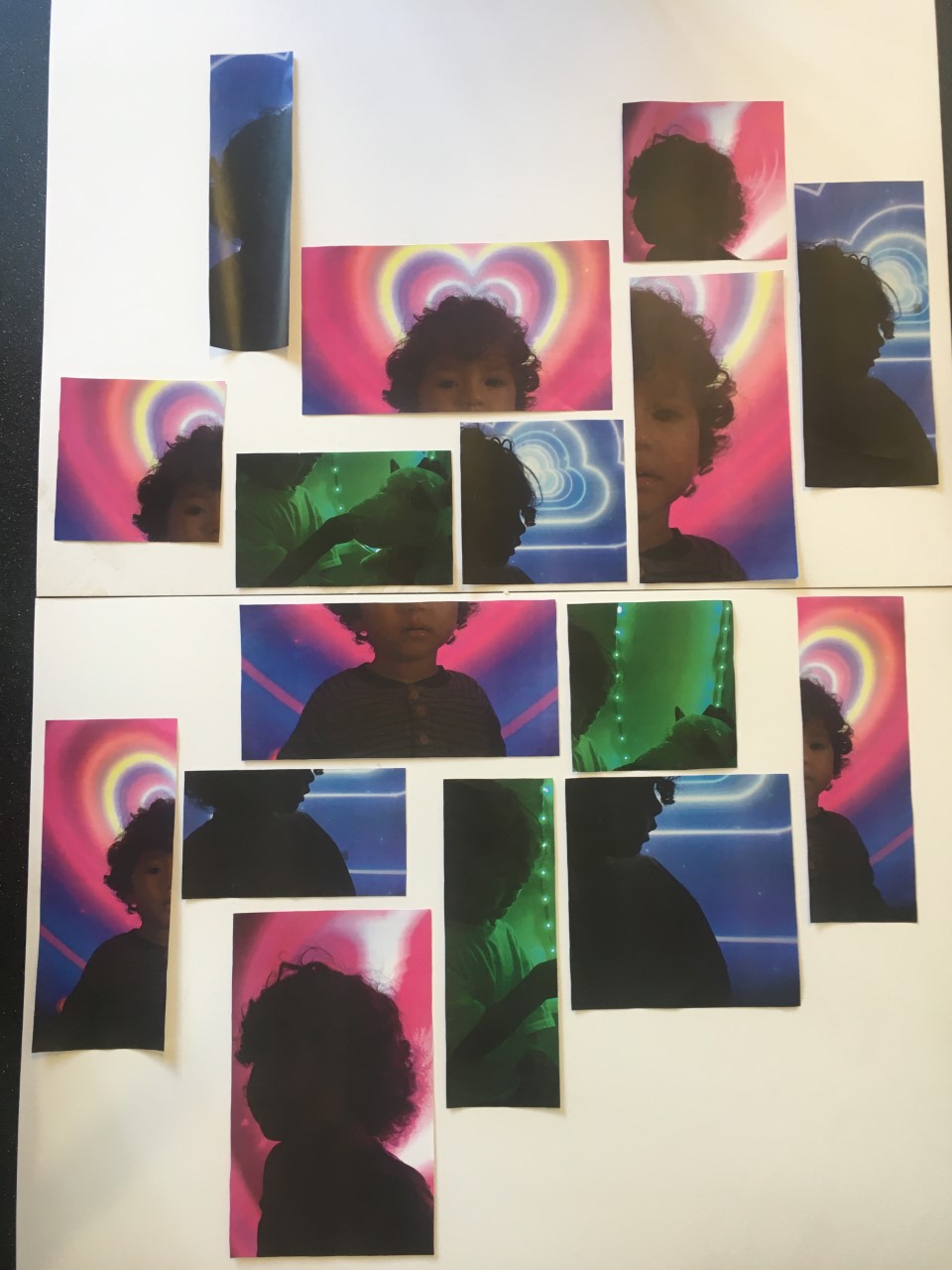
Final 12 Images Chosen For Collage:
|
|
|


I have chosen these photos 12 because they are some of my most successful and some of my favourites, also because i need more landscape ones. Also because fo the variety of colours and people, as well as the good representation of my two different communities, school and home. However I feel like there is way too many images of people. There are no locations or area photos but I am unable to change that as I have no location photos that I am happy with, on my website, however if I were to have images of location, I would have ones of the school and possibly my local area.
Display Strategy Research:


These are a select few of the collage layouts that I looked at on Pinterest, definitely the most successful/ interesting out of the ones I seen. I have been able to take inspiration from these and feel much more confident with coming up with a layout to use for the final collage. The most inspirational layout is definitely the first image, it's given me a solid idea on what I want to do, I'm not going to copy the layout (because i don't have photos of the same aspect ratios or the same amount of landscape and portrait images as them and then the collage wouldn't be original) but I'm definitely going to create one similar to it.
Testing Different Collage Formations (with various size images) :
|
|
These are 4 of the collage layouts I tried, with the different sized images. These were alright but didn't really work for my idea/vision. But definitely still decent. I tried different concepts with them like: splitting school life from home life, a mix of school and home and more. |


Final Collage Layout Design:

|
In the end I settled on this layout , it had a nice balance of the two concepts and feels very put together and cohesive. The colours vary well and the images have a very different type of image next to them, which was one of my main goal ( a mix and match type situation). |
^ This was my initial final idea, however, it was too similar to someone else's so I had to change mine / refine it to make it not look as similar.
Searching for a new design idea:


These idea were much more out there and creative. Not basic at all and definitely not the same as anyone else's in then class. These are all viable ideas that I would want to try but they aren't all actually possible to try out as i don't have all the resources but nevertheless, still inspiring.
Final Idea Inspiration:
|
Since I had to change mine, I wanted to do something like this, a mixed up collage of only a small select amount of images. This idea is much more interesting and original (as in not the same as others in my class) and it has a nice look to it. Mine however will be different because mine will be in colour, with have multiple images, and not the exact same shape, but it will definitely be heavily inspired by it. |

|
   |
These are the new final images I chose for the project. There is not much variety with these photos, but it works because it works with my idea. These photos do not actually represent any of the photographers some of my other work has inspired, and they don't follow the typical style of your average documenting communities photo, they are very staged. Which is why these are some of my favourite photos, they are very me, not heavily inspired by anyone, just purely my ideas. |
|
I started off by designing the layout and cropping the images in different ways on the computer. I ended up settling on this design and these images and the different ways they have been cropped. |

|

|
Then I changed the layout design slightly as one of the images didn't print and I didn't have time to print it again |
|
Then I printed the images, cut them out and then layed them out into the design in real life. |

|
|
I then layed the images onto a mounting board, ready for them to be sprayed and mounted |
The End Result:
The Final Evaluation:
I am somewhat pleased with the outcome of the final piece of this project.
I think that the reason this piece was successful was because of the time put into researching different layout ideas and trying out those said layouts. Also evaluating the images separately and collectively was very useful, as it allowed me to pick the best images for this final piece, however the images I pick don't really allow the final piece to show off/reflect the work I have put into the project (Documentary photography).
The variety of colouring within these photos are a big factor in the success of this collage. There is a range of bright and vibrant colours and values which are very cohesive which I believe works well with this piece. I feel like without the colourful and bright aspect of this piece it wouldn't look half as successful as it does, it really is a big factor in my eyes.
The ideas behind the collection of these specific photos were also very helpful. The idea to showcase part of my home like (my little brother) was definitely the right call whilst making these, he is one of the biggest parts of my life and feels like the only community I have sometimes, which highlights the lack of community I have, which is more what I wanted to demonstrate, rather than showing a "community" that isn't really mine. I was slightly thrown by the fact that I didn't have any images of surroundings / areas / landscapes however now that it has come together I'm glad that I did not use any, as they wouldn't have fit the theme or what I was going for - essentially the theme I created for this allowed me to pick the right photographs, just as the evaluations did. Not only did the theme help me choose the right images but it also is conveyed very well in the piece, or at least I think it does - mainly because of the use of my main subject my baby brother,.
I believe the prolonged amount of time given to me to do this piece allowed me to make this piece the best I could, as I wouldn't have done as much research and trying different layouts, images and designs if I were on very limited time. The time really allowed me to think and form a proper idea unlike most of the projects completed at school, which had to be done in an hour only.
I have definitely presented my ideas, thoughts and research well. It shows that I am capable of presenting work and demonstrating how to document processes and my skills to present. However I don't believe this final project accurately represents/ reflects majority of my work from this project, which is the entire point of having a final piece I would say, so I failed in that aspect. I would say this final piece is overall decent, it looks good but doesn't show all the work I have put into these pieces.
If I were to criticize this I would say that the final piece is somewhat boring as it is just a collage mounted on some card, there is hardly any different media used and it looks very plain. If I could I would add some interesting things to just spice up its look. Maybe some art, string, lights, anything really just to make it less basic. Or I would change my entire idea completely and try one of the other display ideas I looked at, as they were much less boring, I would have picked the others if they weren't so time consuming and if they didn't require materials that I didn't have access to.
Speaking of the look of the piece, I would say that there is not enough variety in image sizing, aspect ratios and landscape photos (not like images of the landscape). It's all too similar and not enough difference in look between the images. Everything looks very samey, and although that makes them look cohesive and well put together and like they all follow a theme, it doesn't demonstrated the wide range / variety of ideas and themes tried throughout this project
And as much as I can see the theme and intentions behind this piece, I feel like to the average person who doesn't take photography or art, may not understand the hidden meaning and it's not as obvious for them, actually not obvious at all. So if I could I would try and make the piece easy to interpret. Although art is meant to be interpreted differently by everyone, I would prefer my theme/idea was conveyed properly, as I put thought into it and want people to know what it means. I don't like the aspect of art where it can be whatever you see it as, the ideas and intentions should be clear. As well as that my work isn't like inspirational. For example like Dawould Bey uses his work to help the black community with representation, my work does nothing of the sort so it's kind of insignificant and useless in that department. There is no use for it, its not anything special.
Another thing I could have done better is document the attempts of layouts better, the images I took were very rushed and the angle they were taken at looks bad and also the lighting obscures some of the images. Also I think maybe taking images of more would have been more useful at displaying how much work I put into trying to get this layout right. As well as that the photos taken from Pinterest are not the best, some are blurred and to be honest most of them aren’t relevant to what inspired what I ended up doing in the final piece, I just added them because I had to. So the documenting the process side of things could have definitely been improved, nevertheless I was still some what happy with the documentation.
And my final complaint is that I don't think my work represents/ shows the inspiration taken from artists such as Tyler Mitchell that a lot of my work on this topic is heavily influenced by. As much as I have understood and looked these artists, the inspiration I have taken from them doesn't prevail in my work, credit to them isn't shown at all which I don't like at all, I wish It were obvious that I have been inspired by them and it showed in my work.
So overall this final piece was a slight success. but there is a lot of things that could be improved and changes to make it better but it's not a complete fail.
DOCUMENTING PLACE
This is a section of documenting communities where I am looking at photographers who specialize in the documentation of places and taking photographs/documenting my surroundings.
Nick Meyer
This is Nick Meyer, a very talented photographer, who often takes photos of his surroundings and objects, but also people too sometimes. He has some fantastic images of which I am going to look at and analyze.
This is is some of his work, specifically images taken from his collection called 'The Local' :
This is is some of his work, specifically images taken from his collection called 'The Local' :


My Thoughts: I think how varied his work is, is very interesting. I feel like majority of his work is made to reflect his location/ area however you get the odd few that just show peoples faces and barely show the background. at all. So there is a good variation of what his subjects are and how he frames his work. Another interesting things is the fact that none of the images correlate to each other. They all are different and don't seem like they would all be apart of the same collection. I feel like they represent nothing that significant, just his local area, it almost feels like I'm seeing the world through his eyes, during his average day, as these are so random and don't all match an aesthetic or theme really.
Image Analysis:

|
I wanted to analyse this image mainly because it is one of the few images that Nick Meyer has taken, which is focused on a singular person and not their surroundings. This image reminds me of a prisoner because of the woman's orange t-shirt (like a prison uniform) and face tattoos, which is what made me drawn to it. This photo looks very candid and unplanned and as if the woman in it looks so unprepared for her photo to be taken, which is probably why it is such a successful image, it doesn't look planned in the slightest. Another thing that stuck out to me is the blurred and minimal background, it really makes the woman the centre focus and doesn't take away from her presence at all. The colours in this photo are very coherent, they work very well together and are all similar colours, just in different shades. As well as all those things, another prominent and noticeable thing is the woman’s appearance/ age. All of Meyers images of people are of old, wrinkled, not conventionally attractive people - which is interesting because of the fact that most photographers would go out and look for "beautiful" people according to societies standards. What I'm getting at is its just refreshing to see photography of people who aren't just attractive and thats why they get the job, he's found interesting people who don't match the beauty standards but still make for an incredible photo. |
Zoe Leonard
|
This is Zoe Leonard, she is an American artist who works primarily with photography and sculpture. She has exhibited widely since the late 1980s and her work has been included in a number of seminal exhibitions. We are looking at her photography work of shop fronts/ documenting places in order to take inspiration from her and create a response to her work. I feel like she could be overlooked by the average person, but if we look at and analyze her images we can see that they look like they are from another time, even though they are contemporary. So I believe she is a useful artist to look at and study. She is very affective with her work and although it is a basic concept, just taking photos of shopfronts, she executes it brilliantly. |

|
Task: Choose a selection of 6 images and add them to your website and answer these questions.
- Why have you chosen these images. Are there similarities within the images?
- What are the differences with the images?
- What can you say about the colour within the shopfronts?
- Can photographing a series of shops document what may be happening within a community? Give reasons for your answers?
- What was the photographer trying to document with these images?
- How do these images make you feel?
- What would you like to ask the photographer about these images

|
I chose these images for no specific reason, they had a similar vibe and style to all of them so I thought it would be easier to evaluate as they can all be grouped together very easily/ there is many similarities between them all. They are all of shopfronts, they are all of closed shops with shutters, they are all taken from the same angle, they all have the same aspect ratios, they are all obscure shops that most people won't have heard of, they all look dull and neglected almost.
The main differences of these images is that they are in different locations as well as having different colouring. some are red, some are blue, some are in black and white, some have a sort of cream colour, others are more of a maroon - a good variety but still not in a colourful way. Other than that these images are almost exactly the same. I believe photographing a series of shops can document what may be happening within a community, however I don't believe these images do that. At first glance there doesn't seem to be a story or a narrative behind these images, they seem more like a collection. But if you want to think really hard, and this is a long shot, this could be representing that a lot of small business's are being shut down for what reason i don't know, maybe because of lack of income or because of covid or even both. So if that is the case then yes these images are doccumenting what is happening within |
Response To Zoe Leonard
For this task I had to take a series of at least 12 images of various shopfronts near where I live. I had to chose which shopfronts they were and wether they were all different, but they had to have something in common, for example all sweet shops, newsagents, laundrettes.
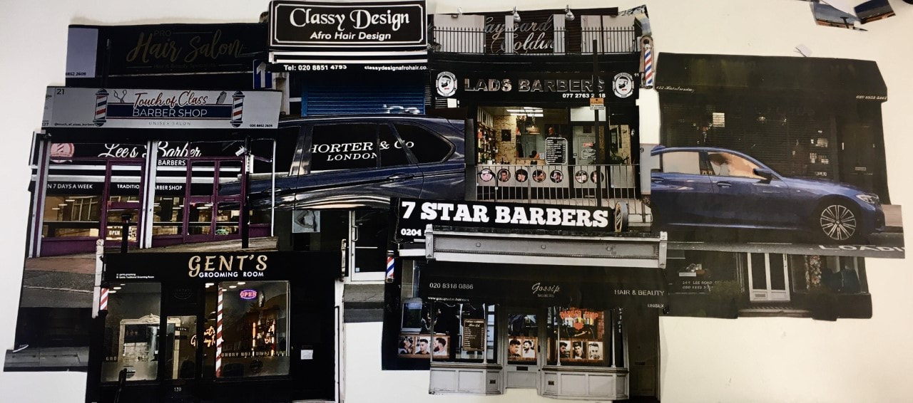
The Images:


|
WWW: I completed the task at hand, and it was easier than expected which was a major plus. The pictures are much better than usual as I didn't use my terrible Iphone 6s, I used a much newer iphone causing the photos to be much higher in quality. I managed to have a running theme within the photos which was "Barber's/Hairdresser's" and it is very clear and obvious which is good because then my idea was conveyed properly.
|
EBI: These photos would be even better if there were no ugly cars blocking the shops, if all of them were open, if they all shared a similar colour scheme and if it wasn't so cold outside when I had to take them. Also I think these shops would be quite interesting if photographed at night, which I would have done if they didn't all close so early.
|
Creating 3D Images
I had to revisit Matt Lipps work, in order to take inspiration from his 3D work to create my own 'City' using images I have taken, but in a similar layout/design as Lipps's work.
This is some of his sculpture work, which can also be seen elsewhere on my website but here is it again:


My thoughts: I think that Matt Lipps' pieces work very well because of the bright random colours, the random yet unified feel to it as well as the simplistic backgrounds that allow the artwork to shine / be showcased properly. All of these work very well because they are all cohesive pieces. The fact that he has taken various different images and made them all work incredibly well together is incredible, and I hope I can be able to do the same. Although each piece has a set theme to it ( like animals or statues or buildings ) the images still seem very random. They don't look like they belong together, yet work together perfectly. For once I can't really put into words exactly how a piece makes me feel. As well as that the bright coloured lights shone at the pieces are a great addition, as it allows the background to have some colour and life in it, whilst still being plain enough to let the focus of the pictures - the 3D collages - to be the main part. Overall Matt's work is very inspiring and well put together, definitely a good artist to look at for ideas.
My 3D 'City' / My Response To Matt Lipps
To create a response to Matt Lipps work I had to take various steps, in order to make my very own 3D project.
I first started off by printing the images from the Zoe Leonard and cutting them out in different ways to create variation:


I then cut out the windows in a couple of the images:


And then tried out different 2D layouts, until I settled on one, to form a rough idea of what I am going to do for the 3D layout:
|
WWW: I think the 2D collage is very cohesive and well constructed. The cut out windows allow the piece to come together as one. The colours are relatively similar which means they look like a singular image almost, not much like a collage. I like
|
EBI: I would rather they weren't barber shops, as they aren't really my style or thing I have never even been to a barber shop. I would much prefer if they were bright and colourful shops that I relate to in some way or another. Also the cars in the images almost ruin the feel to this project I think, so I would prefer them not to be there.
|
I then mounted each photo onto card, cut them out and made stands for them:

I then took a series of images, trying to get one that looks somewhat decent:


The Final Piece
I then set the cut out and standing images in the layout that I wanted it in and photographed it against a solid colour block background.

|
WWW: Not much went well, I am beyond unimpressed with this piece. The only decent thing about this piece is the colour scheme, I like the blacks and reds. EBI: These pieces look sloppy and so rushed, you can see how badly they have been cut but if take the image from a lower angle you can't see the shops behind the ones in the front. I also don't like that they are barber shops. A well as that I do not like the fact that I was unable to include the pieces with cut out windows; they took the most amount of time and looked the most interesting but when it came to making a cohesive piece they did not fit in well. The lighting of the pictures don't match each other giving it a somewhat less unified. The framing feels to tight but there was limited card to work with so I was unable to make the shot any wider, If i had more card I think the final image would look much better. In all honesty the initial flat collage I made was better than this final piece - the flat collage was coherent and harmonious, this 3D one looks to be an arts and crafts primary school project, its a mess. |
Creating A Collage
For this task we had to take our shopfront photographs and use them to create a collage.
First I had to make small different layouts to plan how the final collage would look:


|
I then picked which layout I was going to use which was this one, because I like the idea of creating a circle out squares, it's also unlike any collage I have done before so I thought I might as well give it a go and see wether it looks good ----> |
|
The Final Collage
I then picked my favourite layout and created a big final version of the piece:

|
WWW: The composition was somewhat interesting. The colours are cohesive
|
EBI: I could have included all the photos that I had taken of the shopfronts, if the card wasn't so plain and boring, if the images were brighter and less dull as the contrast I was trying to go for just didn't work and it made the photos look colourless rather than darkly coloured. It is also so boring, there is nothing too interesting about this piece; It looks like a school project
|
Final Evaluation
The theme of this entire project was Documenting Communities. At first I was terrified of this project - as I thought it was going to be impossible for me to document a community that I don't even believe or feel like I have - I really thought I was going to fail and be completely unable to complete any of the work but it ended up being an alright project, that I was able to formulate ideas for and complete work for it. I did have to problem solve at times for projects such as ones that involved photographing the public, however some of my best work came from that problem solving. And as time went on I began to love this project more and more - in comparison to make do and mend this was an incredible, fun-filled project. The more work I did, the more I began to understand the reasoning for this genre of photograph, and the links between it (the genre) and the work we were doing, which made the project that much greater. The artist research we conducted really helped me to understand the theme. The artists that we looked at were: Dawould Bey, Siân, Adama Jalloh, Nial McDiarmid, Liz Johnson Artur, Ballensque, Tyler Mitchell, Nick Meyer, Zoe Leonard and Matt Lipps. I had never heard of any of these photographers/artists until we learnt about them in photography lessons, which led to me comprehending this project and genre significantly more than if i were to not have done any artist research. I found Tyler Mitchells work the most helpful, it was incredibly intriguing and fascinating to evaluate and the meaning and messages portrayed behind his work was just so inspiring and moving; his work is what i think of when someone talks about documenting communities. Another artist worth mentioning is Dawould Bey, his work gave me the foundation of my understanding of documenting communities, which in hinds sight makes him rather important to my journey through this project. From doing this project I have tackled many of the threshold concepts, threshold concepts: 2, 6 and 7. Threshold concept 2 got explored when we created a camera obscura as an entire class, however I still do not believe that this threshold concept is true, we created a projection without a camera, not an image without a camera. Although I have not formally looked at threshold concept 6, I feel like the work we have done relates to it greatly - in majority of my work I take loads of pictures hoping that in at least 8 of them will have the lighting captured right and the framing good and expressions of the subject perfect - every photographs successfulness is by chance. And lastly threshold concept 7; once again we have not investigated this threshold concept formally, but much of the artist research portrays the idea that photographs do not have fixed meaning which is mainly proven when we have group discussions as a class on what we believe the meaning behind a specific photograph from an artist or when I look at an image myself, try to formulate an idea of what the meaning it is trying to convey is and then research the true meaning behind it. Not only have I done copious amounts of research and tackled threshold concepts, I have also used a range of media, materials, techniques and processes. I will admit I haven't experimented with media and techniques that much and I would like to play around with processes significantly more than I have but at least I have tried out some different ones such as: developing paper negatives/positives, 2D collages, 3D collages, portrait photography, Location photography and a camera obscura; I've used mount board, card, and I believe negative printing paper. It does not look like a lot, and I would completely agree, i have tested hardly any media and process/ techniques and in the next project I definitely need to explore more and just play around. I feel like overtime though, despite not using abundant amounts of techniques, processes, media and materials, my work has become more sophisticated and less childlike I'd say. The more and more we refined pieces the more professional they seemed to look. In the very beginning it was crystal clear that I am a student, an unexperienced child who just goes and takes pictures for lessons and homework, but I feel like a least some of my work has a more skilful feel to it, for example the Tyler Mitchell response project- the more we did that task the better and more polished and creative my work looked and seemed. So i believe with time the work for this project almost ages, but in a good way. This whole project has also allowed me to display Tallis habits such as inquisitive, collaboration, persistence and imagination. Iquisitiveness comes through in the artist research; Collaboration when having to work with a live subject and or a partner on the project; persistance when I had to keep trying at the tyler mitchell task (which we had to do 3 times); and imagination when trying to use various interesting new techniques in my work. The most difficult part of this all was definitely trying to step out of my comfort zone and try to take risks, as I am not a very adventurous but the more I kept trying the more bold techniques the better my work seemed to look. For my final pieces of this project though I must say I am rather dissapointed. My initial final collage never even got finished, not because of me though, I just never got mine mounted so I can't exactly critic a final piece that never got mounted. The 2nd Final piece, the 3D collage looked so scrappy and the framing was off due to the lack of card available. It was very rushed also and I don't entirely love the fact that they are all barber shops - as they don't have the greatest connection to me (I have never even been in a baber/hairdressers). As well as that my 3rd final piece - my 2nd collage - looks like a school show and tell project, It doesn't look developed and looks very plain and basic, I hate it with all m,y heart. I was hoping to create 3 beautiful well developed pieces, however I ended up with 2 sub-par pieces that look like a person in brimary school made them. Although my plans did not go the way that I inteded them to, If I had way longer and had the ability to take these projects home I feel like they would be much more developed and look pristine and clean, it would have much more interesting elements into them (especially with the first final project). Despite the unbelievably dissapointing final pieces I do believe however that I have managed to explore this theme very well, due to my copius amounts of research on different documentary photography artists as well as the various attempts at trying to create my own. If I had more time on this entire project as a whole I would have liked to take the Tyler Mitchell response a lot further and ofc make decent looking final pieces, as well as create an actual video for the extended homework project as I never finished it. I feel like my work does not yet have a personal feel to them and I hope over the next year that I am able to create that atmosphere to m,y images so that ppeople can identify me as the artist just by looking at my work. I hope viewers will look at my work and understand that photography is a process, it takes time and you won't always get everything right.
