Initial thoughts and ideas:
My relationship to the natural world is unclear to me; I have never considered it. I feel like I don't have a personal connection to nature, however people as a whole do. We as people rely on nature for life, oxygen. We depend on nature so heavily, not only for life but for resources as well. Although we depend on nature, we tend to destroy it - with our fossil fuels and cars and so on. We take so much from nature and leave it broken. So in terms of real human relationships one would describe the human relationship with nature as toxic. It depends on the landscape but I would go to central London for urban landscapes and somewhere closer to the coast for more natural landscapes. I feel like people take pictures of nature because they see it as beautiful and see taking a picture of nature as a way to "preserve" these landscapes, due to the direction we are going, these landscapes will end up being destroyed wether it be by construction of buildings or by global warming. And I do believe these landscape photos can make us see the world completely differently - when I look at nature in real life I feel so bored and uninterested, but in photos of landscapes i'm almost taken aback by how surreal they look.
What Is A Landscape Picture?

|
When I hear the word landscape I instantaneously think of landscapes of central London or just cities in general, which I feel like its the opposite of what |
majority of people think - I'd expect them to think of landscapes of nature, rural ones - but I think that's mainly because I am always in London in the city, I never even go to parks or anything like that.
When I think of rural landscapes I think of the words: natural, green, high quality, colourful, vibrant, unspoiled, nature, surreal, quiet, outdoor, irregular, astonishing, cohesive, colossal, untouched, alien, surprising, randomised, unknown, unfamiliar, plants, trees, rocks, beaches, forests, mountains, hills, ocean
When I think of urban landscapes I think of the words: tall, manmade, artificial, beautiful, homely, grey, cold, bustling, unnatural, permanent, known, enormous, height, cohesive, built, manufactured, sky line, alluring, pleasing, buildings, streets, sky, clouds, city, home, blocky, rich, modern
When you look up the word "Landscape" these images come up:


They are all very natural and nature filled - which is to be expected as most tend to think of images like this when they think landscape. Although they do differ from one another slightly (some are hills, some are gardens. some are mountains and also they have been taken at different times of day). But for me my ideal image to represent a landscape would be of the central London skyline.
Usually when i look out of windows at the landscape, I see other blocks of the school, the concourse sometimes and possibly some grass depending on what window I'm looking out of. However when I look out of my bedroom window i see a mix of houses and gardens, so really they are a mix of rural and urban but I believe they are mainly urban. And when I look out of car windows I see only buildings and road, the rare view of trees.
Surprisingly I have never taken a landscape photo in my entire life, so I am going to go and attempt it for the first time ever.
My First Attempt At Taking Landscapes
I decided to take my first ever landscapes in school and these are the results:


|
WWW: The colours are very cohesive and the buildings in the school make for quite interesting, aesthetically pleasing photos. I also quite like the lighting of all the images, the sun really captures the colours all around and especially the blue tinges in the windows of the buildings.
|
EBI: I went up closer to take some of these images, as many look blurred due to my far zoomed in approach to them. Also the framing of some of the photos could be better, there is too much happening in some thirds and not enough in others and I quite like to follow the rule of thirds. Some of the lighting in the pictures is too dull and makes the buildings near to the school look so drab whereas in real life they look like these massive cleverly designed giants, the images don't give them justice.
|
Homework: Taking More Landscapes
For this homework we had to take 12 landscape photographs of whatever landscapes we choose, wether it be urban or rural.


|
WWW: These photographs have very nice colour schemes and lighting. And the pictures of buildings give for a quite cool towering feeling to them, which i love and really wanted to capture in these images.
|
EBI: When I uploaded them the quality didn't deteriorate so much, the inital photos have a somewhat decent quality to them but after uploading them they look so blurry. Some of the lighting makes the images seem a bit dull so if there was better lighting I think I would like them that much more. Maybe if I stuck to urban landscapes as well rather than trying to change it up and include some nature, as I think those are the weakest photographs.
|
Dafna Talmor
|
This is Dafna Talmor she is an artist and lecturer from London whose practice includes photography, spatial interventions, curation and collaborations. Her photographs are included in collections such as the Victoria and Albert Museum, Deutsche Bank, Hiscox and in private collections internationally. We are looking at her landscape works specifically; she does something quite unique with them. She almost merges and fuses her landscape photographs together to form a new perspective of the original landscape. It is quite interesting to me as I have never seen such a process before, its like a collage but on an entirely new level. Talmor describes her constructed landscapes as “a virtual space that opens up behind the surface” which I find quite intuiging. Her work stems from a frustration with photographing landscapes For years, her work consisted of photographs taken in interior spaces, with the suggestions of outside spaces. But as soon as she went outside with her camera, she felt overwhelmed with the unlimited possibilities of photos and became aware of the lack of limitations (which one would have in an interior space). |

|
Dafna Talmor Video Notes
- She constructs landscapes by taking images from different views and merging them together
- She is conscious of being overwhelmed when outside
- No limitations outside
- Endless possibilities outside
- Interested in created spaces that don’t exist with real spaces that do exist merged together
- Hopes that in the reconstruction the personal connotations become stripped?
- Interested in contradiction and how it plays out in images
- concious of portraying the true picture of what has been taken whilst also constructing
- No ideal frame outside, endless view points
- dissorientating effect makes views aware that the active scene can change
- Resisting idea of fixed point of view
- Limitations with the frame
These are a few examples of some of her landscape photographs:


A lot of her constructed landscapes are actually seascapes. She takes various photos of landscapes at different angles and then merges them together to try and create a non existent space.
Dafna Talmor Response
In response to Dafna Talmors constructed seascapes/landscapes we decided to try and create our own constructed landscapes.
The Process:
- Get landscape slides
- Cut pieces out of said slides using a cutting mat and scalpel
- Compile the multiple altered landscape slides together
- add in coloured acetone (I believe that is what it is called)
- photograph the finished constructed image.
Process Images:


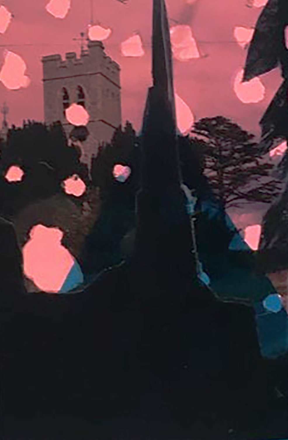
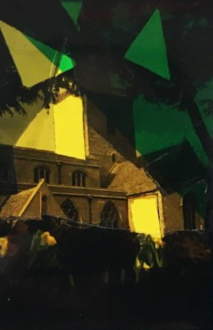
I picked 4 different images of landscapes (all of which include churches) and made various cuts in each of them to create variation, and then complied them together in twos with coloured acetate.
The Final outcome:
|
|
Side Evaluation:
This task was influenced by Dafna Talmors process and her intention with her constructed landscapes. I like her got some landscape photos and cute, scratched, modified these photos and merged them together. However dissimilarly to Talmor I did not take the landscapes that i used in the construction as well as that the landscapes I used were of various different landscapes unlike Talmor who used the same landscape just with different angles. I tried to adopt her perception of the point of this process, I tried to create this space that doesn't exist but has been created with reality, however I feel i couldn't ever grasp the deepness of her thoughts behind it. As well as this I feel like my slides could have been way more constructed; they were barely compiled, just 2 images and some coloured acetate with some marks, the word compilation feels more right to say. To improve I could take the landscape images myself and use multiple rather than just 2, as well as making various marks and using a range of coloured acetate in the images again rather than just 2.
Further Taking Of Landscapes
For this homework task we had to take a minimum of 20 landscape photos based on my ideal landscape/ my personal definition of a landscape


|
WWW: the colouring and vibrance of these photos are my favourite thing about them, the colours really pop and catch your eye.
|
EBI: the framing followed the rule of thirds, the image quality wasn't so incredibly bad, the framing was a wider angle, there was more variety rather than just my local area, the colours all correlated, a wider mix of urban and rural images and if these images looked more aesthetically pleasing.
|
The Idea of Landscape
I feel like the purpose of landscapes are to represent an area or a place and really convey beautiful scenery, in an accurate way. But the meaning of taking a landscape can vary from artist to artist.
The Valley Of The Shadow Of Death, 1855 - Roger Fenton

|
In this composition this photographer has chosen to include what appears to be mountains and the sky, a kind of rocky plain almost, very empty and open. The photographer has decided to exclude colour and make this image a more black and white/beige kind of hue. This seems like a very boring landscape, there is nothing particularly interesting or pretty or different - its just very plain which leads me to believe that the artist may have a personal connection with this space, possibly having memories of being there ( which links to the colouring of the images as when you think of the past you don't think of things in bright colours), it's impossible to tell though without context so thats just my inference. The photographer has taken this image from a kind of mid to low point whilst angling the camera slightly upwards, so that you can
see the rising of the mountain slopes. The photographer has taken this image in what |
seems to be within the vicinity of the landscape but also quite aways way from the furthest point of the mountain in the image. This framing makes us feel like we as viewers are right in the middle of this location. It personally gives me a feeling of being lost in the middle of nowhere. It makes me personally feel empty inside and almost sad, this is not a place that I would want to see or be in the middle of, especially alone with a lack of life, plants and or organisms - it would feel so lonely.
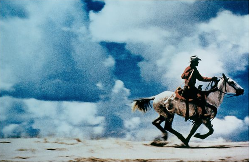
Untitled (Cowboy),1989 - Richard Prince
|
This photo is an almost complete contrast from the previous one, but there are some parallels between the two. Unlike the other photo this photograph has colour in it, as well as living organisms. Similarly to the other image, this one also features the sky and a rocky like plain. However where the horse and its rider are heading isn't included, which irks me slightly because I want to know. The view seems to be dead on which makes me feel like the photographer is incredibly high up as the sky takes up almost the entirety of the background, without it being taken from an upwards angle (which almost makes me feel like this is fake as the ground isn't usually so flat so high up). The photographer seems quite close to the subjects as you can see quite a lot of detail on the horse, which you can't really capture when at a far distance. Both of
these photos contain this grainy, olden days feel - it makes me feel |
|
almost nostalgic like i'm back in 2011 watching a western cowboy movie. The image feels so fake and intense, like its a set from a movie, it has a way too unnatural feel to it, there is no way that it is real.
Bad Landscapes
For this experiment we took all our knowledge of how to create a good landscape, disregarded them and purposely tried to take terrible landscape photographs.


In order to do this I: blurred the photos, zoomed in way too much, didn't zoom in enough, took photos at a sideways angle, angled it too far up, angled it too far down, over exposed some of them, took photos with things in the way, chose uninteresting things to photograph. Taking these photographs felt kind of freeing as I wasn't thinking about making them look right or worrying that they are not good enough, it was nice almost therapeutic. If I could I would change the colouring in the photos to make them feel that much more wrong as well as changing the contrasting and brightness - it would just take it that much further.
My Favourite Landscape Photographer - Mark Rive:
I had to research and look at various different landscape photographers and settle on one as my favourite and evaluate and give my thoughts on their work. I picked Mark Rive.

|
This is Mark Rive. He is a landscape photographer who creates landscapes by combining real life scenes with photoshop. He creates a unique style of work which feels almost disorientating - as if it's photographs of a world I am familiar with but at the same time can't recognise or comprehend. I picked him because not only does his work look incredibly well crafted, it also is very creative - as there feels as if all landscape photographers do the same thing and just photograph the real world so its refreshing to see photographers that take that step further and refine their work. |
Here is some examples of his work:


My thoughts on his work: I really love the vibrancy of his work, It's usually quite a challenge to capture the pure intensity of the colours and sights of what you are seeing in real life so by combining the photoshop and editing it really works to create such high quality photographs. The framing of these photos are so pleasing to me, I find my eyes just wondering across the whole of the images (as there is so much to look at) rather then being completely drawn into one point - which I dislike sometimes ( especially with landscapes ) as it doesn't allow me to look in depth and analyse a photo as a whole. Not only is the lighting of each of the photos brilliant and complimentary, it also manufactures moods to fit the photos such as: ominous, mystical, terrifying, depressing
My favourite photo of his:
This is my favourite pieces of his. It is so captivating and wowing. I love the composition of this image, there is not a central focus point which is good because I like to see variation (as many photographers have a focus point in their images), as well as the fact that there is no heavy focus of the image at all, your eyes can travel freely without being drawn to a certain point - which allows for detailed studying of the image. The colours also work very well together, despite there being a mix of warm and cool tones which i tend to dislike but in this concept its acceptable and works brilliantly. The fact I can't tell wether this is a real landscape I'm seeing or one that has been edited and photoshopped blows my mind - I'm usually very good at noticing, however this image is so real looking but fake at the same tinme that I don't know. The natural element is of course fantastic, natural/rural landscapes always captivate me despite me loving urban landscapes way more. It is just a really fabntastic, well composesed, and coloured image that shocks me and almost leaves me speechless. Its incredible.
Dionne Lee's Constructed Landscape
Dionne Lee took, what looks to be various types of landscape images, ripped out of some sort of magazine (due to the slightly jagged sides, text, double sided aspect and shiny/glossy look to them) and essentially collaged them together. She has done this by either cutting precisely with scissors and/or ripping the images with her hands, placing them atop one another, with a mix of unaltered and altered images. She tried out many different layouts - with a clear sense of thought and care behind her decisions, due to her meticulous and subtle alterations she makes throughout the video with each piece. However she never finalises a single decision about the arrangement. - which demonstrates a record of playing around and experimenting, creating multiple collaged pieces in the process.
My Response - First Draft
In response to Dionne Lee, I took a series of photographs of abstract landscapes that I constructed out of other peoples photographs of landscapes (from books and magazines).
The Product


Images of the mess


|
WWW: I like the cohesive aspect of quite a few of these. The colour coordination is also to my liking - it makes the collages significantly more aesthetically pleasing to look at. I quite enjoy the abstract formation to these collages - its different to most collages ive created.
|
EBI: I feel like this process would have been better represented in a video/time lapse, rather than as photographs. I think next time I will make a video of some sorts to capture my thought process and decision making as well as the final products.
|
My Response - Second Draft
I decided to repeat the process of my first response, however this time I made a time lapse instead of taking a series of photographs.
|
WWW: I liked this process a lot more than the taking photographs one, as it allowed me to play around a lot more and its something I have never tried out before - so it was new and fun. I also thought the work produced was more out there, as I had more time to really think and manipulate the images.
|
EBI: the framing were better positioned and if it were a normal video and not a time lapse, as you would be able to see my thinking and care when placing and deciding what to do much more than you can in this video.
|
My Response - Third Draft
As a third step, I decided to create collages whilst making them 3D with the rule that I am only allowed to manipulate the images by folding them.


|
WWW: I think my idea to experiment with folding and making things 3D was a good idea. I think this has sparked an idea for various different experiments and processes to try out. The main idea that has branched from this is the idea to play with the delicateness my work has been given by making them 3D. And although I do not like to mix black and white photos with coloured ones, in this context I think it works rather well.
|
EBI: I think this would be even better if the images were all in order and all there, as I had camera difficulty which resulted in the use of 3 different cameras, which led to the loss and corruption of some images. Also if I were to take some of the pieces I have already created in response 1 and 3 and possibly distort or recolour them and create some more 3D pieces that look really fragile. Also videoing this process whilst inserting final arrangements would be a good idea.
|
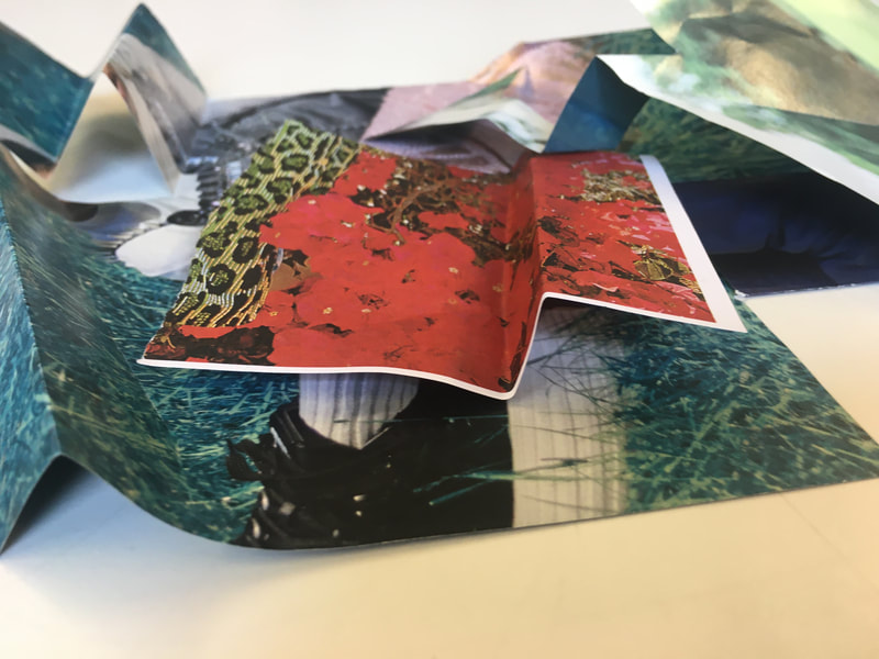
My Most Successful Image
|
This is the image that made me want to refine this process even further. The colours, the composition, the folds and creases all intrigue me and gather my attention. It made me think more into depth about what I was doing and how I could make that process significantly better/pleasing to the eye. The slight blur to the photographs - more in the background - also helped me create a link between this idea of collaging landscape photographers and the blurred landscape artists we have been looking at. This difficult to mess up this process has also made me want to take this idea to the next step, as it is very hard to get wrong and you are almost always likely to create some interesting outcomes. |
Uta Barth
|
Uta Barth is a contemporary German-American photographer who uses her work to address themes such as perception, optical illusion and non-place. Barth's main process is: she takes all of her photographs with a traditional film camera, she then digitizes her images and carries out all her manipulations on a computer. The process that I'm looking at however is that of the out of focus process. For this process she does everything I just said but whilst having the camera out of focus. I decided to look at Barth, because of a video of hers that we looked at in class, as it was quite captivating to say the least. |

|
This is the video of Uta Barth, explaining her reasonings for why she does the photography she does - that sparked my interest:
My thoughts on the video:
First of all, I was very blown away by how analytical and articulate Utah Barth was - she has a fantastic wide vocabulary, which was the main aspect of the video that hooked my interest. I also love how her idea is to create awareness amongst the viewers of their own perception. I had never thought about any kind of photography in that way until Barth. Its a very interesting way of thinking as most photographs, you see what you see and that is what it is, but with the blurry aspect that she has used, it is all up for interpretation. With normal photographs, there are always perceptions of many different things (why the photographer took it, whether its candid or staged etc) but there hardly ever is discrepancy on what the image is of. As well as that I quite like the idea of just capturing light, as it allows us to fill in the information that is missing and create an unblurred image of what we are seeing.
First of all, I was very blown away by how analytical and articulate Utah Barth was - she has a fantastic wide vocabulary, which was the main aspect of the video that hooked my interest. I also love how her idea is to create awareness amongst the viewers of their own perception. I had never thought about any kind of photography in that way until Barth. Its a very interesting way of thinking as most photographs, you see what you see and that is what it is, but with the blurry aspect that she has used, it is all up for interpretation. With normal photographs, there are always perceptions of many different things (why the photographer took it, whether its candid or staged etc) but there hardly ever is discrepancy on what the image is of. As well as that I quite like the idea of just capturing light, as it allows us to fill in the information that is missing and create an unblurred image of what we are seeing.
These are some of her out of focus creations from the collection 'Field 1995-1998':


I love how Utah managed to create aesthetically pleasing images whilst having them blurry. I find myself staring for prolonged amounts of time, trying to come to a solid understanding of what the image is - which I think may have been a hidden motive of hers. I quite like the composition of these images as well, despite the blurriness, as there is a wide range/variety. I love how I can scan the entire image rather than being drawn to a singular part of the image, again it just really makes me look. I quite like the colouring of these images as well - especially the warm toned ones as it creates a feeling of familiarity somehow.
Out Of Focus Landscape
For this homework task we had to "Make at least 20 out of focus landscape photographs and upload them to your website" . I decided to take a lot more and just see what I ended up with.


|
WWW: the blurriness is definitely there. The sunset images with the trees are the only half decent ones, as they look pleasing to the eye despite being blurry - as well as the compositions of them.
|
EBI: These images just aren't pleasing to the eye at all. They look like blurry messes. The process was really difficult to get right, so it was hard to take nice looking images - so maybe if I mastered the process the images would look better. The main issue was the exposure of my phone, it would almost fluctuate when I locked the focus to my finger - very frustrating.
|
Ray Metzker’s ‘Pictus Interruptus’ series
|
Ray K. Metzker was (he died in October 2014 at 83) an American photographer known mainly for his bold, experimental B&W cityscapes and for his large "composites". His work is held in various major public collections. We are looking at the ‘Pictus Interruptus’ series - that he created from 1976 and 1981 - specifically as it follows the out of focus theme we have been experimenting and playing with in class. To create this series he simply incorporated a single object, an "interrupter", is held up between the camera's lens and the subject, in every photograph.Metzker views landscapes as " fragments and distortions " which he then feeds into by adding his own distortions to them. He makes these images by essentially putting various different objects close to the lens of a camera whilst simultaneously photographing the landscapes behind the objects. He makes sure that the objects are out of focus whilst the landscape is in focus to mask the identity of said object.
|

|
These are the Pictus Interruptus images:


The black and white filter applied to these photographs are arguably the most effective aspect of these photographs - as they take away a massive part of our ability to recognise what the images are off (as we associate colours with certain things, so by removing the colour we are left even more confused). Furthermore, the lack of colour really shows the contrast of light and dark in the images, which I personally really like, as it makes the images appear more professional - if that makes sense. The fact that you can't tell what is interrupting the image as well, makes these images that much more mysterious. I honestly can't choose a favourite, as they are all so brilliant.
Pictus Interruptus Response
For this exercise I had to go out with a camera and my own versions of 'interrupters' that I made, and make some of my own versions of Pictus Interruptus.
The Product:


|
WWW: The pictures are definitely disrupted. I also got to use one of the more advanced cameras - which is all I have ever wanted to use on this course - which led me to be more in control of focusing and exposure, which in turn made me feel more in control.
|
EBI: However, the new use of the fancy cameras was difficult to get used to - it was a major challenge to figure out how much exposing and focusing and zooming to do - which I feel may be a significant factor on why these images aren't the best. The most important factor however was the lack of risk taking. I picked some materials and cut them up slightly, that is all. In my opinion it was not enough, the images look bland and very similar to one another. I think I will retry this process out of school, with more materials, more risks. It goes without saying that risk taking is the most important part of photography, that being said it is definitely a skill that I need to work on majorly.
|
The Pictures In Black And White:


|
WWW: I much prefer the images in black and white, there feels like there is more detail within the images - they look less blurred to me. The black and white aspect, to me, makes it feel more connected to the original Pictus Interuptus pieces - which in turn makes me feel confident in it being an accurate response.
|
EBI: They were more adventurous, with a wide range of different things used to 'interrupt' the landscapes.
|
Projecting And Manipulating
I decided to project the Pictus Interruptus response images that I created last weak and decided to interrupt them even further with some boards.
The Results:


|
WWW: They make for quite interesting photographs, and definitely make the viewer think quite long and hard about what they are looking at. It is also a more interesting process to use to create interrupted images.
|
EBI: I think these will look better in black and white, as these looked quite bland and blurry, whereas in black and white there is a strong contrast created with an illusion of less blur. I also think it would be incredibly interesting to record this activity and create video documentation of the process - as I think it would give better context to the reader about what is going on.
|
The Pictures In Black And White:


|
WWW: I like the images significantly more in black and white - it feels more linked to the Pictus Interruptus original pieces and I love the massive contrast in shades it creates. I feel like it gives the images more depth as well, you can really see the different layers.
|
EBI: Again, a video of this process would make this response 10 times better, I think that may be a solid next step.
|
Suprise Homework
For this homework task i had to take matters into my own hands and get creative. I decided to photograph videos of landscapes on my tv, one in focus the other out of focus and try splice the images together in interesting ways.


|
WWW: I think this was a solid idea that linked well to the work we have already done for this project (fir example, the out of focus landscapes. I think this was a step in the right direction with trying to be more creative with my work as well. I love the colours and the beautiful views - both of which i can't take credit for but it still helpred create some pleasing images.
|
EBI: If i used my own landscape images - that way it would be more personalised. As well as that, if i maybe spliced together different landscapes it would make for more interesting images. Or maybe if i used a mix of my own landscapes of the city with these type of landscapes to demonstrate a sort of contrast between the two.
|
Brea Souders' Vistas series
|
Brea Souders works in photography, text, painting and collage, often blending digital phenomena with physical objects. I have been looking at her work with google maps - the vista series- specifically. How does google collect these images for google maps? Well they collect Street View imagery by driving, pedaling, sailing and walking around and capturing imagery with special cameras that simultaneously collect images in multiple directions. The images are later overlapped and stitched together into a single 360-degree image. Saunders is interested in this because there are many mistakes made in the overlapping of these images. They create interesting views of: peoples limbs being detached/ floating, shadows without people, random objects ect. Saunders takes these mistakes, specifically the shadow ones and I believe she photographs them and then recolous them. I feel like google maps has distorted our ideas and how we percieve landscapes, because if it can make mistakes like that with full on glitches of people and objects how do we know that we are seeing isnt a less obvious distored version of the landscape. |

|
These are the images from the "Vistas" series:


I think this work is very well made as it makes you really question what you are seeing, because its not obvious in the slightest. As well as that you are so focused on the very obviously distorted shadows that you barely notice the recolouring of the images,which supports my idea that people could be viewing google maps images thinking they are seeing the true visuals of the landscape, but in fact they are not and there are many hidden distortions. Whether that was Saunders intention i have no idea, but it does work in that kind of sense.
Google Glitches
I went around the world on google maps and looked for glitches - similarly to Brea Sounders work - as a response to the "Vistas series"


|
WWW: I managed to find a wide range of different types of glitches around the world, whilst capturing some really interesting views. The images are generally interesting to look at and to try work out what has happened and whats been removed and stretched and changed.
|
EBI: I definitely think that I should edit or manipulate these photographs even more than they already have been. I may possibly try splicing these together with other landscapes or mix in an out of focus element. I think printing them out could work well as a further manipulation. Or even recolouring it or editing them on some sort of software. Essentially just take these images and distort them further.
|
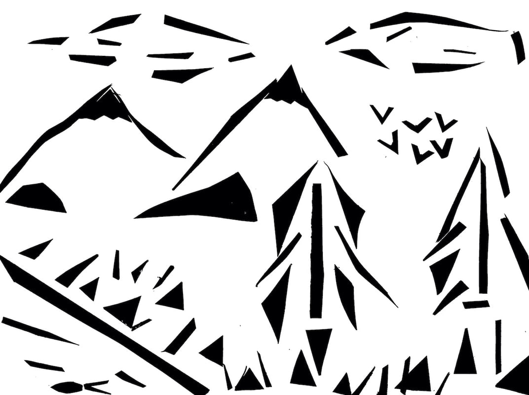
Minimalist Landscapes: What Remains
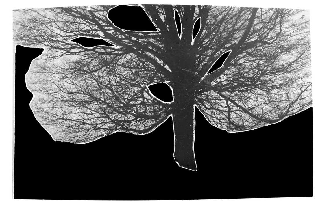
Geraldo de Barros - from the series Sobras, 1996
|
In this image I can see an image of a tree with parts of it blacked out. This is unusual as people don't usually try to hide parts of the photographs they have taken, they usually try to showcase how brilliant they are at taking photographs, and like to make very conventional landscapes. I get an almost eerie feeling when I look at this image, as it is in black and white which has gothic connotations. As well as that the missing parts, make me feel as if I am lost or almost stuck between a sort of liminal space, where its not fake but at the same time it's not real, like a sort of limbo. And i feel like he has done that - taken out parts of the image - to maybe toy with the idea of what makes a landscape, trying to push that boundary and make people reevaluate what the true definition of a landscape is. If i were going to make a picture like this I feel like I would get a negative of the original tree photo, cut out some black card and place it atop the original photograph. I would then photocopy that, print it and create a photogram out of it. I am unsure what process Geraldo de Barros used but personally that is what I would do.
|
|
I can see shapes that have been placed together to create a sort of bush looking object with what looks to be gardening tools and possibly a person, depending on how you look at it. This is a very unconventional version of a landscape, as in reality there is no actual/real landscape in the piece so once again this isn image that is pushing those boundaries and limits of what a landscape is/can be. I feel like I am back in reception when i look at this image, as we would make things like this all the time. Not to create collaged landscapes, we would just stick random pieces of card onto paper and say it was a some sort of object or animal, that it certainly did not look like. However I feel like the artist/photographer had a different intention and thought process behind creating this than 5 year old me did. I think they were trying to create a memory/ portray a scene in the least obvious way possible - that being said, least obvious does not mean unrecognisable, as it is very easy to interpret what has been created. If I were to create an image like this, I would probably get a white piece of paper, cute and stick pieces of black card to depict an image of a landscape. I would then take that, photocopy and print it out.
|

Liz Nielsen - Gardening with You, 2020, Photogram
|
Out of the two of these photographs, my favourite one is "Gardening With You." This is due to the sheer simplicity of it. Although it is simple, it is so clearly a landscape - which in my eyes makes it more successful. It relies solely on the use of shapes to create an abstract version of a landscape rather than including a piece of real landscape like the image from the "Sobras" series. I like how it reminds me of being in primary school, as we would do projects just like this. So the nostalgia mixed with the successfulness of using just shapes and still being an obvious landscape makes it the better piece in my eyes.
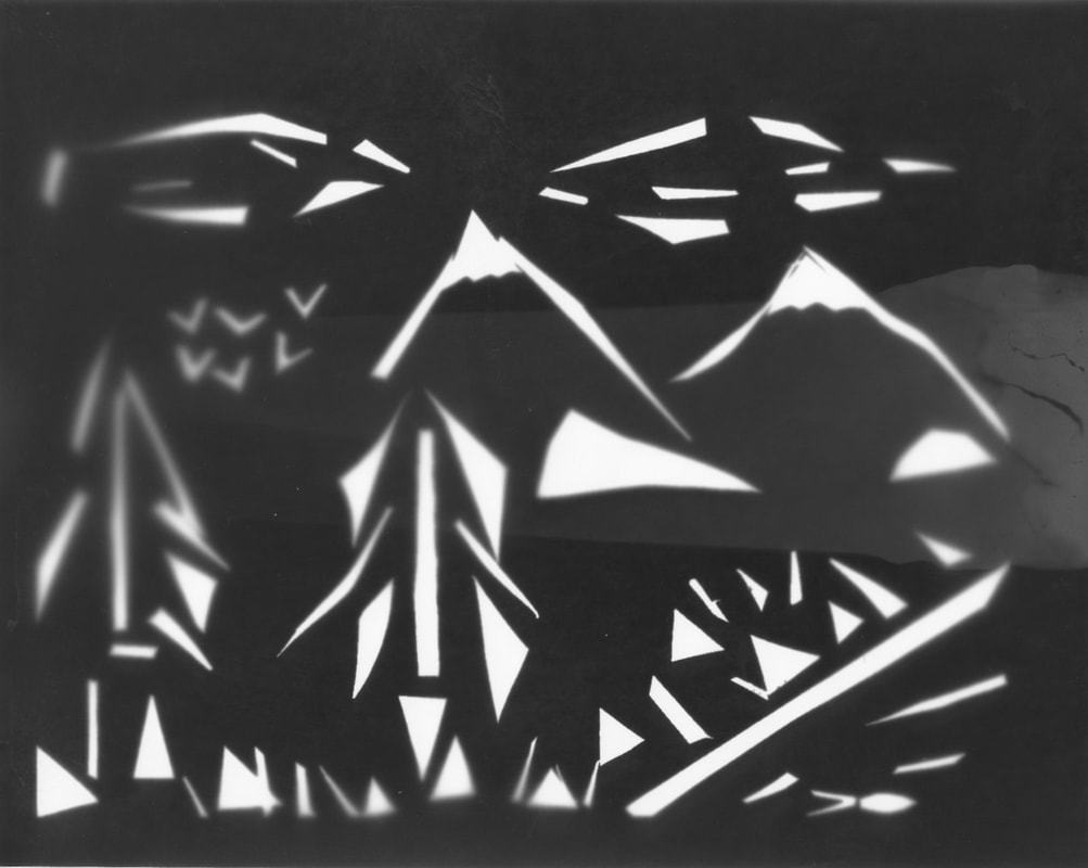
My Minimalist Landscape Response
|
To create this I:
This piece was heavily influenced/inspired by Liz Nielsen's, gardening with you work. I took their idea of using shapes to create a landscape and make my own version of it. However with mine I didn't make it as abstract I feel, and there is much more black card than in theirs. I'm quite satisfied with mine, as I managed to keep that abstract quality, whilst also setting a very recognisable seen. The mix of thin and thick pieces of black card also make for an interesting contrast - however their could be a much greater contrast. |
|
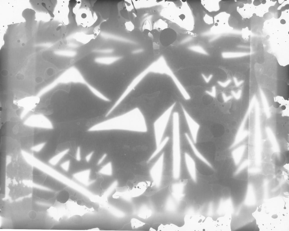
The process for making this was:
|
I think that this photogram is alright, I'll be honest I am not the most pleased. I don’t think I really grasped how the image was going to look inverted and it looks completely different to the original collage in terms of the bold contrast the original had. I don’t like the blurriness of it and I’m heavily debating whether this could be classified as a landscape or not. If i were to think about how it looks to someone who didn't make it, I feel like only the trees and mountains are recognisable, the rest looks too bitty if that makes sense. I feel like I got too wrapped up in trying to make it look as minimal and abstract as the 'Gardening with you piece' that i made it too abstract. I especially hate the 'clouds, if you can even call them that, they look really weird snd just off. I feel like if they (the 'clouds') were solid it would create a better contrast and more pleasing image.
|
I think that this photogram is interesting in its own way - whether thats good or bad I am unsure, but I definitely prefer it to the first one I made, as it contains more elements to it rather than being just a plain simple picture, however I am still not pleased with this one. I feel like the experimentation of how I added the developer has not been conveyed in the best way. You can see some of the dots and splashes that i made by flicking the developer on with a paintbrush but that is about it. I feel like I didn't leave the image long enough to develop, as it is very grey, rather than having that bold black, the first one I created has. However I do believe the blurry greyness to it does give a feeling/sense of weather - as if it is foggy and a cold, cloudy day. Although, again I wish the clouds were more solid/bold and recognisable - just to get that little bit more contrast between thin and thick white bits
|
The process for making this was:
|
Landscape Collage
For this homework I had to try and create a landscape by collaging different pieces of paper. I decided to make a collage representative of a seascape, using coloured pieces of paper specifically.
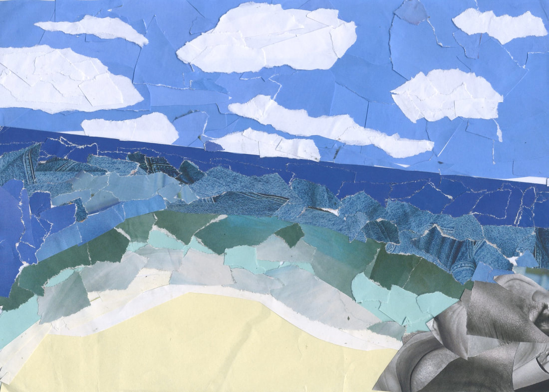
|
WWW: The colours are fantastic, as well as that you can very clearly see that is is a depiction of a seascape, so in that sense it is very successful. The layers of having a foreground, middle-ground and background definitely adds something to the image, as it makes it feel more realistic and 3D even though it is a flat 2D image.
|
EBI: I feel like if I added more rocks, or birds or maybe even more colours and textures to the sand, this work would be a million times better. It feels very void, and there are definitely more things I could and should have added.
|
Personal Response
In the next 5 weeks I have to think of, develop, and create work that I am proud of, by myself, for a sort of final piece for the end of this project.
This is a mind map of the ideas and artists that I thought of and took a liking to:

All The Artists That Inspired Me:
Sarah Anne Johnson
Johnson takes photographs in the forests of her native Manitoba. The artist transforms her pigment prints into active grounds by applying (to the surfaces) fine art and unconventional materials, such as: oil paint, gold or brass leaf, sparkly holographic stickers, and photo-spotting ink. In her eyes, Johnson’s added forms represent with paint and brush what the eye and camera cannot apprehend.


The main aspect of Johnson's work that I am drawn to is the magical feeling created by the colours and shapes. It almost triggers memories of childhood and tv shows I'd watch back then - especially in the night garden. I feel like it's a cool concept to do in general anyway, mixing colourful shapes with reality. It's almost reminiscent of stained glass windows as well, and I find those so beautiful as well. In terms of what I want to take from her work to mix into mine: the vibrancy of the colours, the collaging of real and fantasy. As well as that I may take the uniformity of the work and apply it to my own as well, as I like when all the work feels connected.
Gary Emrich
Emrich's process is that he layers a hard, transparent plastic with the packaging off of bottled water on a light table, he then fills the plastic depressions with bottled water and photographs the composition with a view camera. He does this to address the impact of branding by the bottled water industry on consumers and to call out the hypocrisy of consumer culture. Basically he is calling out how industries profit off of using landscape images in their packaging, as it sells better due to the associations/ connotations landscapes have.


I particularly like the natural colours of his work - the greens and blues - as they almost represent the earth and nature just by being used together (as if the shapes aren't even required). I like the art style of these pieces as well, due to their more art feel to them rather than just being photographs of real landscapes. I feel like plain landscapes are boring, there has to be some sort of manipulation - and i feel like these pieces are filled with manipulation, which just creates a bigger appeal for me. From these pieces I will definitely try to match the level of vibrancy in my work, as well as the crumpled and odd structure of them. I would also like my work to have some sort of meaningful message just as Emrich's has.
Gerraldo De Barros
Gerraldo De Barros has used many old photos that he has taken throughout his life; from family holidays, previous early works and darkroom experiments - and he cuts, splices and paints into them. I believe he then develops these images in a darkroom. Leaving them with missing sections and interesting outlines. Barros does this to, as he says, "revitalise the missing parts, to allow himself and the viewer to fall into the image, to find oneself in that space.” His photos are very old so they aren't the freshest in his memories in removing parts of it, it engages his brain to try and remember those missing parts and the memories attached with it.


I like the idea of removing parts of landscape images as it allows one to explore the idea of "what constitutes a landscape" and how far can I go until you can't classify it as one. I like the fact that his work plays into the ideas of memories and past as well, as it is definitely and interesting route that I would be willing to go down. As much as I love colour, I also can't get enough of black and white images, they just give a massive contrast that coloured images could never create in my mind - so maybe I'll try work with black and white images as well.
Anastatia Samoylova
Samoylova searches online for copyright-free image libraries of various kinds of landscape pictures, such as: deserts, glaciers, tropics, storms, forests, waterfalls, and mountains. These images then get collated, printed out, cut, folded, and assembled as three dimensional studio sculptures. Those sculptures are then re-photographed. Anastatia Samoylova does this because she believes the results of when you search for landscapes online are all glorifying images, that are just too perfect. She believes such depictions are less about real landscapes and more about the feelings they are meant to evoke. She tries to combat this idea by making these structures that represent a world of imperfection. A world with creases, props, dust ect.


I love the idea of creating 3D shapes out of landscapes and then assembling them, so maybe I will try incorporate that into my own work, however I think I would possibly use my own landscape images or instead of using images that all follow the theme of the pictures being the same type of landscapes, I'd make ones with similar colours and a mix of different types of landscapes. I also love that there is an actual message behind her work, rather than the idea of all landscapes are beautiful and ideal/perfect being pushed as it is time and time again. I want my work to be impactful and meaningful even if its subtle like this work.
Joe Rudko
Rudko's process is to collect thousands of personal snapshots from friends, family, and anonymous internet vendors, deconstruct them and then arrange them into large vibrant colour fields. These photomontages are intended to evoke intimate memories and strong personal associations. Each work brings together diverse imagery, while using colour to create a sense of unity. They are arranged within a structural grid, which I believe is because of the influence of both Mesopotamian mosaics and the digital pixel.


I love when pieces follow colour themes, as it feels more put together to me if that makes sense. It feels more structured in a way. The main thing i like about this work is the colours and the sheer complexity as there are hundreds and hundreds of landscapes incorporated into one image - which is lightly mind blowing. I would like to play with colaging in my work definitely, and colour schemes 100%. I like how this work is meant to evoke emotion as well - I would like my work to create emotion but also convey a message (so I will need to find a balance).
Experimenting
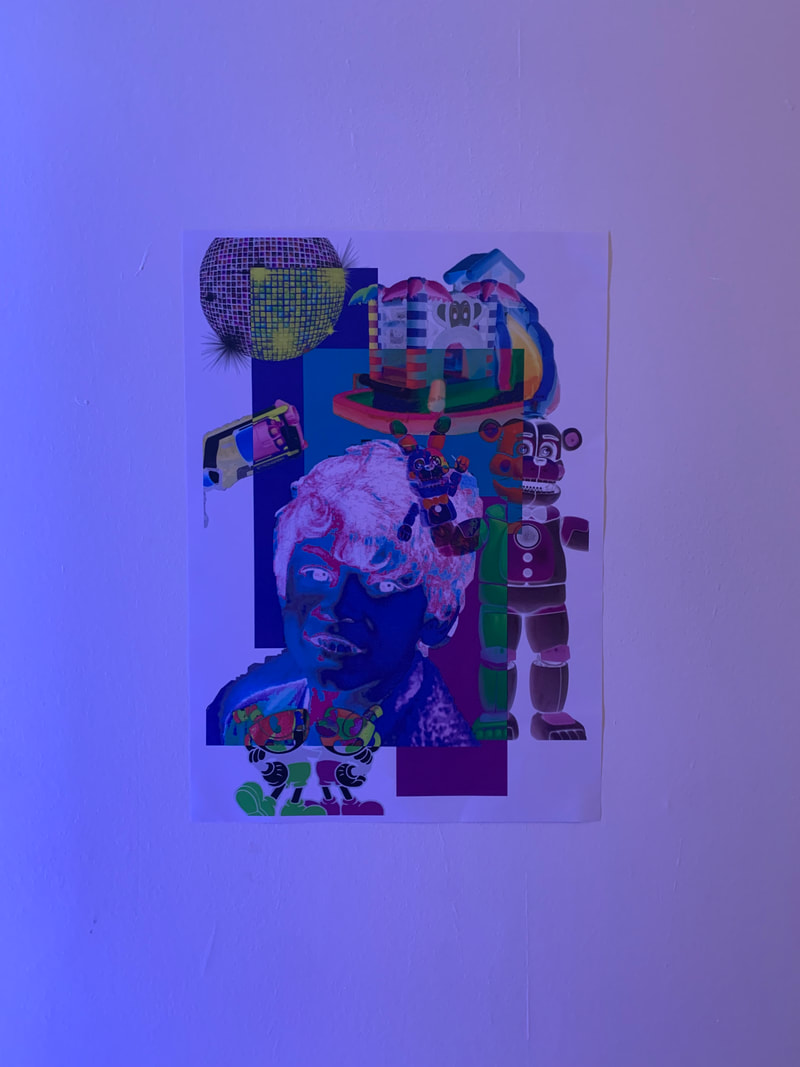
I think as a first idea/experiment, I want to make some collages similar to Joe Rudko's in a colour sense, (on a much smaller scale though), place them onto 3D shape nets, cut into those collages to create missing parts which i will put coloured plastic behind them create multiple different 3D shapes (each of a different colour) and then arrange them to create some sort of collaborative 3D collage piece.
Finding Images and Shapes
RED


ORANGE


YELLOW


GREEN


BLUE


PURPLE


PINK


Collaging Onto The Shapes
First I created some collages out of the images that I had sourced from the internet:


I then started to crop and arrange those collages onto the 3D shape nets:


These are the finished 3D nets with the collages on them:


I then printed off the images, stuck them onto cartridge paper (which is a thicker type of paper) and cut them out:


After that, I used a scalpel to cut into the images:


At this point I decided that I wanted to play with scale, as i realised all the shapes were going to be very similar sizes and may hide one another if placed with some in front and some behind. So by making smaller ones, the larger ones will be more visible in the background with the smaller ones in front, not hiding them too much. So i began the process all over again, but making smaller ones, with even more colours:
A4 3D SHAPES:
White:


Cyan


Black


Hot Pink


Grey


Light Blue


Dark Purple


I created some more collages out of the images that I had sourced from the internet:


These are the finished 3D nets with the collages on them:


I then printed off the images, and cut them out:


Making Photograms:
As a little side quest, I decided to make a few photograms of the smaller nets that I created, these were the results:


The Process:
- First I got some photographic paper and placed it under the enlarger with the shiny side up.
- The I placed the nets on top of the photographic paper
- I then adjusted the projected light (with the red filter on) and adjusted the the positioning of the papers to ensure all of it was getting exposed to light
- Next I exposed the papers under the enlargers white light for roughly 4-6 seconds
- After that, I took my image and slid it into the developer, where I left it for about 1 minute as I swished the chemical by tipping the tray back and fourth.
- I then picked it up with tongs and slid it into the stop tray for around 30 seconds, again tipping the tray back and fourth
- I used another pair of tong to take it out of that tray and move it into the tray with fixer in it, where I swished the chemicals on it and then let it rest for around 3 minutes
- Finally, I used tongs once again to take the image out of the fixer tray and place it into water, where I washed it by rubbing the water into it.
- I then took it out and dried it well with a squidgy.
- Once dry to the best of my ability, I pegged it up to dry further.
For the A4 and A5 shapes, I decided to go straight to cutting into them, rather than mounting them onto thicker paper, as it made it harder for them to be cut into.


As a side experiment I decided to do some more photograms of the now cut into, smaller nets:


|
WWW: I like these photograms more than the previous ones i created. The overlapping element i added definitely made for a more interesting outcome. As well as that the holes cut into the nets add a nice touch to them. The blur also adds a sort of mystery element, however I can't tell whether thats interesting and good or if thats more of a fault.
|
EBI: Although the blurriness adds a mystery element, it also masks the landscape element. Without seeing the landscapes within the nets of the shapes, they are just shapes with 0 relevance. I definitely need to work on my photogram development skills.
|
As I started to assemble the shapes, I had to decide how to construct them;

|
For example I had to pick wether to used a combination of pritt-stick and cello-tape or to just use tape, or just use pritt-stick. For this shape I used a mixture of tape and pritt-stick |
|
Whereas on the smaller shapes, such as this one, I used just cello-tape as it worked better on the smaller, normal paper ones. |

|

|
I also decided, the smart thing to do was leave a flap open on each shape - so as to give easy access to the LED candles inside. |
I then assembled the 3D shapes:


|
WWW: I managed to assemble the shapes in a way that allowed for the insertion of an led tea light and the removal as well. Majority of the shapes are recognisable and accurate. The colours of the shapes really pop, as well as that the images used on the nets are sharp enough to be recognisable.
|
EBI: I had found some other way to assemble them. The glue and tape didn't give it that clean look i was going for, it almost made them look scrappy and primary school project like. However this factor didn't end up affecting the final outcome, as it's hard to spot from afar.
|
Finally, I arranged and photographed the 3D shapes using: no tea lights, tea lights, electronic projector, slide projector, studio lights. I created a range of photos with different combinations of the resources listed:


I was pleasantly surprised by quite a few of these images. However most of them are way too low quality for my liking, or have a weird angle. Nevertheless, I got a final piece out of playing around as well as a few that I'm generally proud of/like to look at.
I went on to slightly edit and enhance the select few images that I liked:


For fun I also did some random edits (which i screen recorded) that i thought looked cool, but aren't really linked to my work:


|
My Final Response/Favourite Image: |

|
The theme we were exploring for this specific project was landscapes and how photography affects them. At first i thought: "How could photography possibly affect landscapes?". My peers then started suggesting things such as "paper that photos get printed on are made from cut down trees" and "they don't capture the true view" and i was convinced that photography affects landscapes significantly. I then started doing some research on photographers who use their work to demonstrate the affects we have on landscapes and how we use them to benefit us. I researched artists such as: Anastasia Samoylova, Gary Emrich, and Gerraldo De Barros - who all have strong opinions on how people are affected by photographs how their memories and minds alter. I also researched: Sarah Anne Johnson and Joe Rudko who more inspired the visual aspect of the images rather than the connotations of the piece. This piece allowed me to tap into the "Photographs are not fixed in meaning; context is everything" threshold concept - as this image can look like a bunch of shapes to the average person, but once they learn the context the story comes to life. I'd also say in delving deeply into trying to create a solid meaning behind this piece I also tackled threshold concept number 8 "Photographs have their own visual language and 'grammar' - i believe that the story I am trying to tell is prevalent if you look hard enough. I'll be honest and say that the meaning behind this piece can be confusing to understand, in a sense that it's not obvious what it is meant to mean at first glance however it is not impossible to understand the meaning. Is that a bad thing? The answer is unclear. On one hand the lack of obviousness
|
forces viewers to engage with the work and think very hard. But at the same time people may not bother to do that and completely miss the ideas behind it. The main idea pushed in this photograph is how manufactured landscapes are. Let me break it down. I used 3D shapes specifically because a human needs to assemble them/construct them. The images I used on the shapes are in no way realistic, they have been edited and coloured to fit an aesthetic, real landscapes don't look like that (again showing the editing humans do to landscapes). I arranged the shapes in a way that would cast an almost city silhouette upon the background to represent the more physical alteration that humans cause to landscapes. I projected bright fun colours onto them which acts as a sort of representative of the hidden aspect of the altercations humans do to Landscapes. Its similar to the saying "seeing with rose-tinted glasses" - we see the bright fun colours and think wow that's so cool rather than realising that that's not real life - or when we destroy landscapes and think wow yes new buildings for us and completely ignore the fact that we are destroying more and more nature. The photo-gram on top of the shapes almost seem to represent the blueprints of modification in a way - the plan to create the shapes which cast the city like image. There are a lot of layers to what it means but if I am too sum it up: Humans modify landscapes in photographs, in real life, in peoples minds and it is all damaging - some more than others but nonetheless all damaging. People substitute experiencing authentic landscapes by looking at images of them, messing with their sense of reality which creates a real disconnect between people and nature. People build their buildings and city’s on top of nature, forever destroying the beauty which once lived there. But if we cut away these habits (much like i cut into the shapes), we will see the pureness of nature and landscapes (the LED candle with white light represents this as white is usually associated with purity). Although my Ideas behind the photograph is deep and meaningful, that doesn't mean it is necessarily well executed. Not the execution of the meaning but the execution of the visuals. I hoped to create some massive well lit 3D shapes that were secure, neat and stunning to look at. Did i create that? No, no i did not, however I did create a somewhat pleasing image that looks cool and has interesting elements to it. Over the course of this part of the constructed landscape project, I made changes and edit, added in new ideas as I went a long, tried some things on the side (which I photographed and uploaded here) which I believe is more important than executing the first idea perfectly. Development is key in photography, without it the work created by photographers wouldn't be nearly as good. Although In this particular image, i feel like it has a number of downsides such as: not all the shapes can be seen, I wish the angle was more panned towards the left, I'm unsure of the tables involvement whether it adds or takes away, as well as that the wide range of colours isn't the most visible (you can mainly see yellow, red, orange, purple and pink), adding on to that no real cool tones can be seen within the shapes. However there are quite a few aspects that I do like about this image such as: I like that you can see the entirety of the photo-gram being projected, the colour scheme is very cohesive, you can't tell how scrappy/messy the 3D images are in this specific image,The shadow of the shapes is so effective and recognisable, the variety of size of the 3D shapes is apparent as well, I feel like the fact that the shapes are off-centered is interesting and not a usual go to position for me, but i think it works well here. I also am in love with the fact that I went into creating the arrangement of the shapes without a clue and by coincidence I made it look like a city, and then I ran with that Idea, tweaked a few things and got photographing. No matter whether or not the final image is good, or well crafted, I am 100% sure that I explored this theme successfully, no doubt about it. Essentially, I like to look at this image, I find it enjoyable and I can understand the meaning behind it, there is certainly room for improvement, but overall I'm pleased and I hope viewers will be able to understand the message I am trying to convey and appreciate the image for how abstract and unique it looks.
Abstract Advent 2022
Abstract advent is the taking of photographs each day of December, inspired by the shape for that day. I am going to take a new image each day, following the theme of constructed landscapes whilst also sticking to the prompts/shapes given.

Unedited Response:


Edited Responses:


Final Evaluation
The theme explored for this part of the course, was constructed landscapes. My initial thoughts were that this could be interesting and that it was very different from what we had previously done, as we were focusing a lot on people in photographs during our documenting communities project - so transitioning to landscapes was going to be new and a challenge. I also was skeptical at how good my landscape skills were, as I don't believe I had taken more than 10 landscape photographs in my life before this. As I developed my work, I kept that same skeptical view, Ill be the first to admit I am not the best at taking landscape images, nor do I enjoy taking them. I believe as the course went on, my feelings for it soured, until I started messing with other peoples =landscapes rather than taking photographs of my own. I also think my feelings towards this part of the course were improved when we viewed/researched many artists such as: Dafna Talmor, Mark Rive, Dionne Lee, Uta Barth, Ray Metzker, Brea Souders, Sarah Anne Johnson, Gary Emrich, Gerraldo De Barros, Anastasia Samoylova, Joe Rudko. Some of those artists were given to research, others I hand picked due to my liking of their work - nevertheless they all inspired me one way or another. The main takeaway I got from all of these artists collectively,was that Landscapes are subjective and not just plain photographs of nature or buildings - landscapes could be almost anything. And with this realisation I started to tackle the fifth threshold concept, "Photographs are abstractions, shaped by technology". The entire existence of landscape photography and constructed landscapes proves that threshold to be true, and I prove it even further with pieces such as my final one, as well as various other like my: out of focus landscapes, Dionne Lee response, Surprise homework landscapes and Photo-grams. I have created these pieces with techniques such as: editing, collaging, photographing, projecting, developing photo-grams, constructing 3D shapes, obstructing, merging, manipulating and more. However I have used a somewhat limited amount of resources/materials/media with mainly just paper and printed out images. Despite the lack of media, I did however manage to refine some of these pieces by combing the techniques/processes together and repeating processes over and over until satisfied. The refinement of my work definitely developed what this whole theme was about for me. I started to investigate the true meaning behind constructed landscapes and how it relates to the damage humans have done on landscapes and how they utilize landscapes to capatilise - and this realisation strengthened my work in a whole new way, that the average experimenting and artist research could not. I decided to dedicate my work to those deeper meanings and that made it feel more sophisticated in a way, as if my work had true and important meaning and that I had to convey that through developed pieces. I would definitely say the quality of work improved over time but as well as that the style changed. I stopped trying to do what I thought was right - taking conventional landscapes - which I was bad at, and started editing other peoples work to create my own - something I am decent at. Collaboration was definitely the route I should've taken from the beginning (collaborating with other peoples work in order to create something new), however I think the contrast in what was my work, and what the final piece ended up being definitely shows growth which is important in any project so maybe it's not so bad after all, starting with something you suck at. Although i did manage to grow and change, I definitely found it difficult and I struggled. I started to dislike this project heavily and the only way that attitude changed was with the exploration I did on my own (the surprise homework) which I feel was a real turning point for me. I definitely believe I could have improved this projects outcome with a more well documented page. I have provided many pictures, many detailed explanations, however I love incorporating videos into my proof of work, but I do not do so nearly enough - so with component 2 I am hoping to make some more videos of my processes. I do also believe I could have improved on my exhibition page, it feels bleak and empty/lacking however I'm unsure how to rectify these things, so I have done my best to give it an abstract layout with a linking title that is obvious but also not at the same time. All in all I was happy with the work i produced during this project especially my final piece. In the last project i was unable to finish my final piece, for reasons unknown to me but we move, dwelling is useless - so I was very pleased to have a very unique and well thought out final piece that truly reflected me as a photographer and my deeper ideas of this theme. My final project was a well constructed 3D collage of landscapes turned into 3D shapes - sounds bizarre but It really seemed to work - at least in my eyes, I was even more pleased with my work due to it being an almost perfect demonstration of my original idea - and although development is very important, I absolutely fell in love with my original idea, so seeing it come together relatively how i wanted it was a big win for me. On top of it being a somewhat accurate representation of what I wanted to create, and being unique and actually completed, my final piece portrays my exploration of the theme perfectly, as you can tell that I have gone so deep into the constructing aspect whilst holding onto the landscape component. Although I am pleased, there of course is room for improvement. If I had a longer time with this project I would make bigger and better 3D shaped with possible card instead of paper, I would also include a more obvious human connection to it to really convey my ideas of humans altering landscapes that much more. While I hope that viewers can already look at my work and already understand my ideas behind it, I do think its not the most obvious and the average person may not understand - photographers could but not the average person unless they looked really hard. Overall this work feels like mine, I'm proud of it and I enjoyed exploring this theme.
